
Dropdown component
Code example
Basic example
html
<html>
<template id="layout-template">
    <webpdf>
        <div>
            <dropdown icon-class="fv__icon-toolbar-shape" text="Dropdown">
                <xbutton icon-class="fv__icon-toolbar-square">Square</xbutton>
                <xbutton icon-class="fv__icon-toolbar-circle">Circle</xbutton>
                <li class="fv__ui-dropdown-separator"></li>
                <file-selector>Select a file</file-selector>
                <li class="my-dropdown-list-item">
                </li>
            </dropdown>
        </div>
        <div class="fv__ui-body">
            <viewer></viewer>
        </div>
    </webpdf>
</template>
</html>
<style>
    .my-dropdown-list-item {
        padding: 10px 0;
        text-align: center;
    }

    .fv__ui-dropdown {
        width: auto;
    }
</style>
<script>
    var CustomAppearance = UIExtension.appearances.Appearance.extend({
        getLayoutTemplate: function () {
            return document.getElementById('layout-template').innerHTML;
        },
        disableAll: function () {
        }
    });
    var libPath = window.top.location.origin + '/lib';
    var pdfui = new UIExtension.PDFUI({
        viewerOptions: {
            libPath: libPath,
            jr: {
                licenseSN: licenseSN,
                licenseKey: licenseKey
            }
        },
        renderTo: document.body,
        appearance: CustomAppearance,
        addons: []
    });
</script>
json
{
  "iframeOptions": {
    "style": "height: 500px"
  }
}
Separation
A dropdown button can split into a left area (icon and text) and a right chevron. When separate is false, either side opens the menu; when true, only the chevron opens it.
The demo below shows two dropdown buttons:
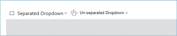
Click the Separated Dropdown button and notice that the list opens only when you click the chevron—the button is split, so only the chevron toggles the menu. Click anywhere on Un-separated Dropdown to open its list.
html
<html>
<template id="layout-template">
<webpdf>
<div>
<!-- By default, the value of dropdown's 'separate' option is true -->
<!-- Set selected="0" means when you click on the dropdown button, it will trigger the event for the first item in the dropdown list -->
<dropdown name="separate-dropdown" icon-class="fv__icon-toolbar-square" text="Separated Dropdown"
selected="0">
<xbutton name="separate-dropdown-square-btn" icon-class="fv__icon-toolbar-square">Square</xbutton>
<xbutton icon-class="fv__icon-toolbar-circle">Circle</xbutton>
<file-selector>Select a file</file-selector>
<li class="my-dropdown-list-item">
html <li> tag
</li>
</dropdown>
<dropdown name="non-separate-dropdown" icon-class="fv__icon-toolbar-shape" text="Un-separated Dropdown"
separate="false">
<xbutton icon-class="fv__icon-toolbar-square">Square</xbutton>
<xbutton icon-class="fv__icon-toolbar-circle">Circle</xbutton>
</dropdown>
</div>
<div class="fv__ui-body">
<viewer></viewer>
</div>
</webpdf>
</template>
</html>
<style>
.my-dropdown-list-item {
padding: 10px 0;
text-align: center;
}
.fv__ui-dropdown {
width: auto;
}
</style>
<script>
var CustomAppearance = UIExtension.appearances.Appearance.extend({
getLayoutTemplate: function () {
return document.getElementById('layout-template').innerHTML;
},
getDefaultFragments: function () {
return [{
target: 'separate-dropdown-square-btn',
config: [{
callback: function () {
alert('Click on separate Dropdown');
}
}]
}];
},
disableAll: function () {
}
});
var libPath = window.top.location.origin + '/lib';
var pdfui = new UIExtension.PDFUI({
viewerOptions: {
libPath: libPath,
jr: {
licenseSN: licenseSN,
licenseKey: licenseKey
}
},
renderTo: document.body,
appearance: CustomAppearance,
addons: []
});
</script>json
{
  "iframeOptions": {
    "style": "height: 500px"
  }
}
Use as a select component
html
<html>
<template id="layout-template">
    <webpdf>
        <div>
            <!-- Specify selected="0" that is the initial value -->
            <dropdown name="separate-dropdown" icon-class="fv__icon-toolbar-square" text="Separated Dropdown"
                      selected="0">
                <xbutton name="separate-dropdown-square-btn" icon-class="fv__icon-toolbar-square">Square</xbutton>
                <xbutton icon-class="fv__icon-toolbar-circle">Circle</xbutton>
            </dropdown>
            <dropdown name="not-separate-dropdown" icon-class="fv__icon-toolbar-shape" text="not separated Dropdown"
                      separate="false" selected="0">
                <xbutton icon-class="fv__icon-toolbar-square">Square</xbutton>
                <xbutton icon-class="fv__icon-toolbar-circle">Circle</xbutton>
            </dropdown>
        </div>
        <div class="fv__ui-body">
            <viewer></viewer>
        </div>
    </webpdf>
</template>
</html>
<style>
    .my-dropdown-list-item {
        padding: 10px 0;
        text-align: center;
    }

    .fv__ui-dropdown {
        width: auto;
    }
</style>
<script>
    var CustomAppearance = UIExtension.appearances.Appearance.extend({
        getLayoutTemplate: function () {
            return document.getElementById('layout-template').innerHTML;
        },
        getDefaultFragments: function () {
            return [{
                target: 'separate-dropdown @xbutton,not-separate-dropdown @xbutton',
                config: [{
                    callback: function () {
                        this.component.parent.select(this.component);
                    }
                }]
            }];
        },
        disableAll: function () {
        }
    });
    var libPath = window.top.location.origin + '/lib';
    var pdfui = new UIExtension.PDFUI({
        viewerOptions: {
            libPath: libPath,
            jr: {
                licenseSN: licenseSN,
                licenseKey: licenseKey
            }
        },
        renderTo: document.body,
        appearance: CustomAppearance,
        addons: []
    });
</script>
json
{
  "iframeOptions": {
    "style": "height: 500px"
  }
}
Editable dropdown
html
<html>
<template id="layout-template">
    <webpdf>
        <div>
            <dropdown name="font-editable-dropdown" editable>
                <xbutton>Helvetica</xbutton>
                <xbutton>Courier</xbutton>
                <xbutton>Times-Bold</xbutton>
                <xbutton>宋体</xbutton>
            </dropdown>
            <dropdown name="zoom-editable-dropdown" editable @controller="custom:ZoomPageController">
                <xbutton @controller="custom:ScaleRatioController" scale="0.5">50%</xbutton>
                <xbutton @controller="custom:ScaleRatioController" scale="0.75">75%</xbutton>
                <xbutton @controller="custom:ScaleRatioController" scale="1">100%</xbutton>
            </dropdown>
        </div>
        <div class="fv__ui-body">
            <viewer></viewer>
        </div>
    </webpdf>
</template>
</html>
<style>
    .fv__ui-dropdown {
        width: 80px;
    }
</style>
<script>
    UIExtension.PDFUI.module('custom', [])
            .controller('ScaleRatioController', {
                handle: function () {
                    const scaleRatio = parseFloat(this.component.element.getAttribute('scale'));
                    debugger;
                    this.component.parent.setEditValue(scaleRatio);
                }
            })
            .controller('ZoomPageController', {
                mounted: function () {
                    const component = this.component;
                    const firstChild = component.childAt(0);
                    const scaleRatio = parseFloat(firstChild.element.getAttribute('scale'))
                    component.setEditValue(scaleRatio);
                    component.on('change', function (newValue, oldValue) {
                        if (isNaN(parseFloat(newValue))) {
                            alert('Illegal scale value: ' + newValue);
                            component.setEditValue(oldValue);
                            return;
                        }
                        alert('scale value changed to: ' + newValue)
                    })
                }
            });
    var CustomAppearance = UIExtension.appearances.Appearance.extend({
        getLayoutTemplate: function () {
            return document.getElementById('layout-template').innerHTML;
        },
        getDefaultFragments() {
            return [{
                target: 'zoom-editable-dropdown',
                config: {
                    editOptions: {
                        type: 'number',
                        min: 0,
                        max: 10,
                        step: 0.01
                    }
                }
            }];
        },
        disableAll: function () {
        }
    });
    var libPath = window.top.location.origin + '/lib';
    var pdfui = new UIExtension.PDFUI({
        viewerOptions: {
            libPath: libPath,
            jr: {
                licenseSN: licenseSN,
                licenseKey: licenseKey
            }
        },
        renderTo: document.body,
        appearance: CustomAppearance,
        addons: []
    });
</script>
json
{
  "iframeOptions": {
    "style": "height: 500px"
  }
}
Position the dropdown list
html
<html>
<template id="layout-template">
    <webpdf>
        <div class="flex-with-gap">
            <dropdown text="Align left,bottom(default position)" align="left" valign="bottom">
                <li>left bottom</li>
            </dropdown>
            <dropdown text="Align right,bottom" align="right" valign="bottom">
                <li>right bottom</li>
            </dropdown>
            <dropdown text="Align center,bottom" align="center" valign="bottom">
                <li>center bottom</li>
            </dropdown>
        </div>
        <div class="flex-with-gap">
            <dropdown text="Align out-right,bottom" align="out-right" valign="bottom">
                <li>out-right bottom</li>
            </dropdown>
            <dropdown text="Align client-center,bottom" align="client-center" valign="bottom">
                <li>client-center bottom</li>
            </dropdown>
            <dropdown text="Align out-left,bottom" align="out-left" valign="bottom">
                <li>out-left bottom</li>
            </dropdown>
        </div>
        <div class="flex-with-gap">
            <dropdown text="Align left,client-center" align="left" valign="client-center">
                <li>left client-center</li>
            </dropdown>
            <dropdown text="Align client-center,client-center" align="client-center" valign="client-center">
                <li>client-center</li>
            </dropdown>
            <dropdown text="Align left,top" align="left" valign="top">
                <li>left top</li>
            </dropdown>
        </div>
        <div class="fv__ui-body">
            <viewer></viewer>
        </div>
    </webpdf>
</template>
</html>
<style>
    .fv__ui-dropdown {
        width: auto;
    }

    .flex-with-gap {
        display: flex;
        flex-direction: row;
        justify-content: center;
    }

    .flex-with-gap > .fv__ui-dropdown {
        margin: 0 20px;
        flex: 1 1 auto;
    }
</style>
<script>
    var CustomAppearance = UIExtension.appearances.Appearance.extend({
        getLayoutTemplate: function () {
            return document.getElementById('layout-template').innerHTML;
        },
        disableAll: function () {
        }
    });
    var libPath = window.top.location.origin + '/lib';
    var pdfui = new UIExtension.PDFUI({
        viewerOptions: {
            libPath: libPath,
            jr: {
                licenseSN: licenseSN,
                licenseKey: licenseKey
            }
        },
        renderTo: document.body,
        appearance: CustomAppearance,
        addons: []
    });
</script>
json
{
  "iframeOptions": {
    "style": "height: 500px"
  }
}
Dynamic dropdown list
html
<html>
<template id="layout-template">
    <webpdf>
        <div>
            <dropdown separate="false" @controller="custom:DropdownItemListController as ctrl"
                      text="Dynamic dropdown list">
                <li style="padding-left: 1em;">Click button to create more</li>
                <li @foreach="item in ctrl.items track by id">
                    <text @sync.text="item.text"></text>
                </li>
                <xbutton icon-class="fv__icon-toolbar-add-sign" @controller="custom:AddItemController">Add dropdown
                    item
                </xbutton>
            </dropdown>
        </div>
        <div class="fv__ui-body">
            <viewer></viewer>
        </div>
    </webpdf>
</template>
</html>
<style>
    .fv__ui-dropdown {
        width: auto;
    }
</style>
<script>
    UIExtension.PDFUI.module('custom', [])
            .controller('DropdownItemListController', {
                init: function () {
                    this.items = [{
                        id: Date.now().toString(16),
                        text: new Date().toLocaleString()
                    }];
                },
                addItem: function (data) {
                    this.items = this.items.concat(data);
                    this.digest();
                }
            })
            .controller('AddItemController', {
                handle: function () {
                    const itemListCtrl = this.data.ctrl;
                    itemListCtrl.addItem({
                        id: Date.now().toString(16),
                        text: new Date().toLocaleString()
                    });
                }
            })
    var CustomAppearance = UIExtension.appearances.Appearance.extend({
        getLayoutTemplate() {
            return document.getElementById('layout-template').innerHTML;
        },
        disableAll() {
        }
    });
    var libPath = window.top.location.origin + '/lib';
    var pdfui = new UIExtension.PDFUI({
        viewerOptions: {
            libPath: libPath,
            jr: {
                licenseSN: licenseSN,
                licenseKey: licenseKey
            }
        },
        renderTo: document.body,
        appearance: CustomAppearance,
        addons: []
    });
</script>
json
{
  "iframeOptions": {
    "style": "height: 500px"
  }
}
API
Dropdown component template
Template example:
html
<dropdown text="" icon-class="" editable align="left" valign="bottom" separate="true" selected="0"></dropdown>Template attributes:
| Attribute | Description | Type | Default | Version |
|---|---|---|---|---|
| text | Dropdown button label | string | '' | 7.0 |
| icon-class | CSS class for the icon | string | '' | 7.0 |
| editable | Whether the dropdown is editable | boolean | false | 7.0 |
| align | Horizontal alignment | `'left' | 'right' | 'out-right' |
| valign | Vertical alignment | `'top' | 'bottom' | 'center' |
| separate | Whether the dropdown button is split | boolean | true | 7.0 |
Configure dropdown properties with fragments
Except for editOptions, fragment config properties match the template attributes.
javascript
{
    target: 'dropdown-name',
        config
:
    {
        editOptions: {
            type: 'text',
                min
        :
            0,
                max
        :
            0,
                step
        :
            0,
                vallue
        :
            ''
        }
    }
}| Property | Description | Type | Default | Version |
|---|---|---|---|---|
| editOptions.type | Edit mode: 'text' or 'number' | string | 'text' | 7.0 |
| editOptions.min | Minimum value (number mode only) | number | 7.0 | |
| editOptions.max | Maximum value (number mode only) | number | 7.0 | |
| editOptions.step | Step increment (number mode only) | number | 7.0 | |
| editOptions.value | Initial value for the edit field | `string | number` |
Dropdown object properties
| Property | Description | Type |
|---|---|---|
| disabled | Whether the dropdown is disabled | boolean |
| isVisible | Whether the dropdown is visible | boolean |
| isActive | Whether the dropdown list is open | boolean |
Methods
| Method | Description | Version |
|---|---|---|
| `setEditValue(text: String | number): void` | Set the input value without firing change |
disable(): void | Disable the dropdown | 7.0 |
enable(): void | Enable the dropdown | 7.0 |
show(): void | Show a hidden dropdown | 7.0 |
hide(): void | Hide the dropdown | 7.0 |
active(): void | Open the dropdown | 7.0 |
deactive(): void | Close the dropdown | 7.0 |
destroy(): void | Destroy the component | 7.0 |
Events
| Name | Description | Example | Version |
|---|---|---|---|
| active | Fired when the dropdown list opens | dropdown.on('active', () => {}) | 7.0 |
| deactive | Fired when the dropdown list closes | dropdown.on('deactive', () => {}) | 7.0 |
| change | Fired on mouse enter and focus loss | dropdown.on('change', (newValue,oldValue) => {}) | 7.0 |