Customizing top/bottom toolbar using Foxit PDF SDK for Web
Foxit PDF SDK for Web’s customization possibilities are endless and easy to implement in your online viewer. In this article, we will show you how to easily add a simple toolbar to a HTML page and create multiple types of buttons within the library’s present functionality.
Contents
Create a simple toolbar
Let’s start with the basics. Working with a full javascript PDF viewer has the advantages of quick compiling and less setup to do modifications. We will create a simple HTML page and add the includes Foxit PDF SDK for Web requires to run. If you are not sure what scripts are needed, go to your SDK package and see the HTML script tags in your index.html file.
Now, we will create a div tag within the body tags, assign ‘docViewerId‘ as its ID and add a simple toolbar.
First, let’s add a $(document)ready function and define the optionsParams object with parameter options for the viewer like font references, language and your license key file:
        //Assign a variable to hold your div
        var docViewerId = 'docViewer';
$(document).ready(function(){
    var optionsParams = {
        language: window.getLanguage(),
            fontUrl: 'http://webpdf.foxit.com/webfonts/',
            licenseKey: window.demoLicenseKey,
    };
Now, let’s set up our WebPDF.ready function to display the viewer:
WebPDF.ready(docViewerId, optionsParams, false).then(function(){
      window.toolbarConfig.top = {
                type: 'panel',
                name: 'toolbar',
                layout: 'flow',
                gap: 'md',
                sub: [{
                    extend: 'hand'
                },{
                    extend: 'save'
                }, {
                    extend: 'distance'
                }, {
                    extend: 'screen'
                }]
            };
    new WebPDF.Toolbar(window.toolbarConfig, docViewerId).initialize();
});
The toolbar is divided into ‘top’ and ‘bottom’. In the case above, we will only customize the top, which is why you see the top property appended (toolbarConfig.top) instead of toolbarConfig. The structure to load the layout for top and bottom, use the format below.
window.toolbarConfig = {
    top: {...},
    bottom: {...}
}
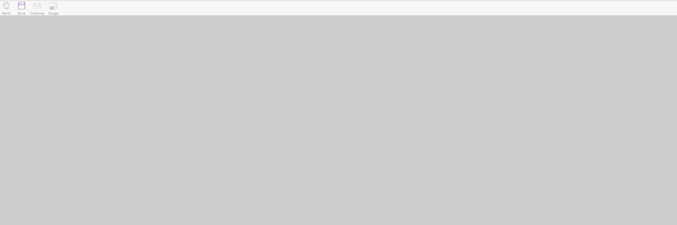
At the end, we instantiate the new toolbar object to be displayed in the viewer. Now, load your browser. The result should look as below:
We have our very simple toolbar all set to work with. Now, let’s go to a more advanced stage and do some customized elements into our toolbar. First, we need to understand the structure of components and layouts provided by PDF SDK for Web. You may find information about Foxit PDF SDK for Web components in the Foxit PDF SDK for Web Components Structure’ article.
Customizing Toolbar Components
Once you have created your own custom components, you need to register them to WebPDF.Toolbar.getRegistry and assign a new unique name to it, like the examples below will show:
Register Component
WebPDF.Toolbar.getRegistry().registerComponent('custom_button', {
    'constructor': function(options){
        this.superclass.call(this, options);
        this.text = options.text;
    },
    methods: {
        doActive: function() {
            this.$element.css('background', '#d7bae7');
        },
        doDeactive: function() {
            this.$element.css('background', 'transparent');
        },
        mounted: function() {
            var self = this;
            this.$element.click(function(){
                self.trigger('handle');
            });
        },
        render: function(){
            return $('').addClass('button-custom').text(this.text);
        }
    }
});
Parameter description:
custom_button: The name of the button to use for configuration and needs to guarantee uniqueness.
doActive: Call when the button is activated. Mainly being used to switch the style state.
doDeactive: Call when the button is deactivated. Mainly being used to switch the style state.
mounted: Call when the button is created. Mainly being used for event binding and initialization.
render: Returns a rendered jQuery object for insertion into DOM.
Register Layout
WebPDF.Toolbar.getRegistry().registerLayout('custom_layout', {
    'constructor': function(options){
        this.superclass.call(this, options);
    },
    methods: {
        render: function(elements) {
            var $container = $('
'); $container.addClass('custom_layout'); elements.forEach(function(elm){ var $item = $('

'); $item.addClass('custom_layout_item') $item.append(elm); $container.append($item); });
             return $container; } } });
Register Controller
WebPDF.Toolbar.getRegistry().registerController('myswitcher', {
    'constructor': function(application) {
        this.superclass.call(this, application);
    },
    methods: {
        initialize: function(){
            var self = this;
            self.uber.initialize.call(self);

            self.watch('currentToolName', function(toolName) {
                self.components.forEach(function(component) {
                    var componentToolName = component._config.params.toolname;
                    if (componentToolName == toolName) {
                        component.active();
                    } else if (component.isActive) {
                        component.deactive();
                    }
                });
                self.updateComponentsPermission(); // do deactive if has no permission
            });
        },
        handle: function(component, config, data) {
            var toolname = config.params.toolname;
            WebPDF.ViewerInstance.setCurrentToolByName(toolname);
        },
    }
});
Parameter description:
myswitcher: The name of the controller for configuration and needs to guarantee uniqueness.
initialize: Will be called when the toolbar initialized. Mainly used for event monitoring and state update.
hndle: Will be invoked when this control is triggered. Mainly being used for business logic writing.
Activate and you use your customized component
In order to use your custom button, add the new button to the window.toolbarConfig.top as below:
window.toolbarConfig.top = {
    type: 'panel',
    layout: 'custom_layout', // custom layout's name
    sub: [{
        type: 'custom_button', // custom button's name
        handler: 'myswitcher', // custom handler's name
        text: 'Hand',
        params: {
            toolname: 'Hand'
        }
    }, {
        type: 'custom_button',
        handler: 'myswitcher',
        text: 'Distance',
        params: {
            toolname: 'Distance Tool'
        }
    }]
};
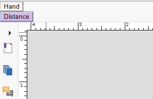
This is how the toolbar will look like:
Please note:
Before registering components, layouts and controllers, you must ensure that WebPDF SDK is ready.
After the component’s status is updated, the this.updateComponentsPermission() function needs to be called to check permissions. If there is no permission, the components will be disabled. See Customize controller example.
Permissions and Default Configuration
Permissions
[table id=28 /]
Default Configurations
[table id=30 /]
Updated on October 30, 2018

