Developer Guide for Foxit PDF SDK for Web (10.0)
Contents
- Foxit PDF SDK for Web Overview
- Getting Started
- Example
- Features
- Digital Signature
- Import and Export
- Stamp and Customization
- Custom Speech Synthesizer
- Snapshot Tool
- Compare PDFs by overlaying PDF pages
- Compare PDF Files
- Customize Dynamic Stamps
- The Edit Modules in Foxit PDF SDK for Web
- AnnotationAuthorityManager
- PDFViewer Multiple Instances
- Customize StorageDriver
- ViewerUI
- Progress Bar Component
- Collaboration
- Best Practice
- I18n Entries Resources Management
- Font
- Technique
- Troubleshooting
- Basics
- Components
- Directives
- Addons
- Customization
- Customize the UI
- Customize annotation context menu
- Customize page context menu
- Customize the Floating Text Selection Tooltip
- Customize Internationalization Resources
- Make the Web Viewer Adaptive to the Device
- Customize Thumbnail
- Customize Shortcuts
- Extensible Components and Usage Guide
- Custom Theme Colors
- Customize bookmark
- Framework Integration
- Accessibility
- Support
Foxit PDF SDK for Web Overview
Foxit PDF SDK for Web is a lightweight powerful PDF library for web applications developed taking all advantages of Foxit’s signature core rendering engine. Using the SDK, developers can deploy and customize a complete PDF viewer to display, annotate, fill forms and sign documents in a web browser. Integrating Foxit PDF SDK for Web into a zero-footprint web application allows end users to view PDF documents on any type of device without installing anything.
Why Foxit PDF SDK for Web is your choice
Foxit is a leading software provider of solutions for reading, editing, creating, organizing, and securing PDF documents. Foxit PDF SDK for Web is a cross-platform solution for PDF online viewing. Foxit PDF SDK for Web enterprise edition has been chosen by many of the world’s leading firms for integration into their solutions. Customers choose this product for the following reasons:
Fully customizable
Developers can easily design a unique style for their Foxit PDF SDK for Web user interface, making it consistent to their own branding and other web applications.
Easy to integrate
Developers can easily integrate Foxit PDF SDK for Web by referring to the product’s knowledge base and writing a small amount of code to display and edit PDF files. The web-based pdf viewer also provides a large amount of interfaces to connect users and user data.
Standard and consistent annotation data
The annotations in Foxit PDF SDK for Web are consistent when viewing and editing in other applications, as well as following industry-leading professional standards for quality and compliance.
Powered by Foxit’s high fidelity rendering PDF engine
The core technology of Foxit PDF SDK for Web is based on Foxit’s PDF engine, which is trusted by a large number of well-known companies. Foxit’s powerful engine makes document viewing fast and consistent in all environments.
In addition, Foxit’s products are offered with the full support of our dedicated support engineers if support and maintenance options are purchased. Updates are released on a regular basis. Foxit PDF SDK for Web is the most cost-effective choice if you want to develop a cross-platform web PDF document viewer.
Audience and Scope
This document is primarily intended for developers who need to integrate the Foxit PDF SDK for Web into their web applications. It includes the direct reference examples as well as custom front-end APIs for customization.
Your Web Application
Foxit PDF SDK for Web provides a solution that enables a web viewer to interact with PDFs seamlessly without any plugins or local applications. Developers should prepare a PDF hosting server like Nginx, Apache or the HTTP server in Node.js platform and do the usual configuration before using Foxit PDF SDK for Web.
Browser Support
Foxit PDF SDK for Web currently supports all modern browsers. From version 9.0, Internet Explorer browser is no longer supported.
Evaluation
Foxit PDF SDK for Web allows users to download the trial version to evaluate the SDK. The trial version is the same as the standard version except for the 15-day limitation for free trial and the trial watermarks in the generated pages. After the evaluation period expires, customers should contact the Foxit sales team and purchase licenses to continue using Foxit PDF SDK for Web.
License
Developers are required to purchase licenses to use Foxit PDF SDK for Web in their solutions. Licenses grant users permission to release their applications based on Foxit PDF SDK for Web. However, users are prohibited to distribute any documents, sample codes, or source codes in the released packages of Foxit PDF SDK for Web to any third party without the permission from Foxit Software Incorporated.
Getting Started
Understanding the Package Structure
Package Introduction
Before version 10.0, Foxit PDF SDK for Web provides three packages as follows:
Light package: FoxitPDFSDKForWeb_9_XXX_NoFonts.zip (excludes font resources)
Standard package: FoxitPDFSDKForWeb_9_XXX.zip (includes font resources)
Full package: FoxitPDFSDKForWeb_9_XXX_Full.zip (includes font resources, document comparison, advanced editor and dynamic XFA)
If you already have the font resources or only want to use online fonts, you can choose the light package if you don’t want to make any changes to the font library and don’t care about the size of the package, choose the standard package. If you want some advanced features, such as document comparison, advanced editor or dynamic XFA, choose the full package.
Starting from version 10.0, Foxit PDF SDK for Web only provides a full package, with separate authorized features loaded according to the license, and adds 3D feature.
Full package: FoxitPDFSDKForWeb_10_XXX.zip
The package contains the following folder structure:
| Folder/File | Description |
| docs: | Contains API reference documents and Foxit PDF SDK for Web’s developer guide. Note: Our HTML developer guide is built using VuePress, which does not support double-click to open directly. It requires starting an HTTP server and accessing it through a web browser. Additionally, it includes some runnable examples that need WebPDFJRWorker.js enabled which must run in an environment that supports an HTTP server to function correctly. |
| examples: | A series of demos and examples of how to take advantage of all Foxit PDF SDK for Web features. |
| external | Font resources. |
| lib | Foxit PDF SDK for Web core libraries. |
| server | http-server and the Node.js scripts for a series of server-based utility applications to use in the viewer. |
| legal.txt | Legal and copyright information. |
| package.json | Project description file. |
The “lib” folder’s file structure is provided as follows:
| jr-engine | Front-end rendering engine. |
| locales | Internationalized entries data for using the viewer in different languages. Every language is placed in a different directory with its own label. |
| PDFViewCtrl | Plugins for the PDFViewCtrl library. |
| stamps | Stamps resources, image files and templates. |
| assets | Contains the template resource files needed by the document comparison function, currently only included in the full package. |
| uix-addons | All plugins for the UIExtensions project. |
| PDFViewCtrl.css | CSS file for the PDFViewCtrl viewer UI style. |
| PDFViewCtrl.full.js | Complete script file for the PDFViewCtrl viewer library. |
| PDFViewCtrl.js | Script file for the PDFViewCtrl viewer library without third-party libraries. |
| PDFViewCtrl.polyfills.js | Browser-adapted polyfill script file for the PDFViewCtrl viewer library. |
| PDFViewCtrl.vendor.js | Third-party libraries script used by PDFViewCtrl (See the lists later). |
| preload-jr-worker.js | Worker script for loading resources of JS engine in parallel to the UI for improving the viewer loading speed. |
| UIExtension.css | The default CSS file of the UI. |
| UIExtension.dark-variable.css | The style file for dark theme. |
| UIExtension.vw.css | The CSS file using vmin unit. |
| UIExtension.full.js | Complete script file for the UIExtension full-featured viewer library. |
| UIExtension.js | Script file for the UIExtension viewer library without third-party libraries |
| UIExtension.polyfills.js | Browser-adapted polyfill script file for the UIExtensions viewer library. |
| UIExtension.vendor.js | Third-party libraries script used by UIExtension (See the lists later). |
| WebPDFJRWorker.js | Script files running in the Web Worker, which are used for calling the front-end rendering engine. |
| WebPDFSRWorker.js | Script files running in the Web Worker, which are used for calling the server rendering engine. |
| *.d.ts | “*.d.ts” files are used to provide TypeScript (version 3.3 or higher) with type information about APIs written in JavaScript. The purpose is to enable IDEs to recognize it and provide us with code hints, as well as perform static type checking during compilation, providing convenience while ensuring the accuracy of calling APIs. |
Basic Features and Separately Authorized Features
Basic Features:
View
Bookmark
Annotation
Form
Security
Signature
Separately Authorized Features:
Redact
Advanced Edit (Adv Edit)
Compare
Dynamic XFA
3D
Static Library and Dynamic Library
Before version 10.0, the underlying library used in Foxit PDF SDK for Web is a static library.
From version 10.0, the underlying library used in Foxit PDF SDK for Web is a dynamic library.
Division of Dynamic Library Modules
From version 10.0, the dynamic library modules are divided into main module and side module.
Main module:
gsdk.wasm
Side module: (Lazy loading)
compare.wasm
pageeditor.wasm
touchup.wasm
xfa.wasm
3d.wasm
lr.wasm
Pageformat.wasm
docprocess.wasm
| Module Name | Functionality | Dependencies |
| gsdk.wasm | Wrappers features authorized by the Standard license and Redact. | pageformat.wasm lr.wasm docprocess.wasm |
| compare.wasm | The Overlay Compare feature, authorized by the Compare license. | lr.wasm |
| pageeditor.wasm | The Paragraph-based editor (Advanced Editor), authorized by the AdvEditor license. | lr.wasm |
| touchup.wasm | The EditText and AddText of Advanced editor, authorized by the AdvEditor license. | lr.wasm |
| xfa.wasm | The dynamic XFA form, authorized by the XFA license. | lr.wasm |
| 3d.wasm | The PDF 3D feature, authorized by the 3D license. | none |
| lr.wasm | The Layout Recognition engine module provides fundamental support for high-level features. It gets loaded when the related modules depending upon are triggered. | none |
| Pageformat.wasm | This module gets loaded when the main module is triggered. It provides fundamental codes for the Header&Footer and Watermark features. | none |
| docprocess.wasm | This module gets loaded when the main module is triggered. It provides fundamental codes for processing article box and web links on the text. | none |
Package.json
Foxit PDF SDK for Web provides a package.json file to help developers quickly deploy and use the SDK, and make it easy to integrate into their project. The content is as follows:
{
“name”: “@foxitsoftware/foxit-pdf-sdk-for-web-library”,
“version”: “10.0.0”,
“description”: “Foxit pdf sdk for web.”,
“author”: “Foxit Software Inc.”,
“main”: “./lib/UIExtension.full.js”,
“types”: “./lib/UIExtension.full.d.ts”,
“typings”: “./lib/UIExtension.full.d.ts”,
“scripts”: {
“start”: “concurrently –kill-others \”npm run start-http-server\” \”npm run start-snapshot-server\””,
“start-snapshot-server”: “node ./server/snapshot/src/index -p 3002”,
“start-http-server”: “node ./server/index”
},
“license”: “Commercial”,
“devDependencies”: {
“boxen”: “^4.1.0”,
“chalk”: “^2.4.1”,
“concurrently”: “^8.2.2”,
“http-proxy-middleware”: “^3.0.0”,
“koa”: “^2.7.0”,
“koa-body”: “^4.0.4”,
“koa-body-parser”: “^1.1.2”,
“koa-cors”: “0.0.16”,
“koa-router”: “^7.4.0”,
“koa-serve-list”: “^1.0.1”,
“koa-static”: “^5.0.0”,
“koa2-connect”: “^1.0.2”,
“lru-cache”: “^4.1.3”,
“raw-body”: “^2.3.3”,
“require-dir”: “^1.0.0”,
“serve-handler”: “^6.0.2”,
“sockjs”: “^0.3.21”,
“ws”: “^7.3.1”
},
“dependencies”: {
“@csstools/normalize.css”: “^10.1.0”,
“@types/hammerjs”: “^2.0.36”,
“@types/jquery”: “^3.3.29”,
“bootstrap-datepicker”: “^1.9.0”,
“core-js”: “3.35.1”,
“dayjs”: “^1.11.1”,
“dayjs-plugin-utc”: “^0.1.2”,
“dialog-polyfill”: “^0.4.10”,
“dom4”: “^2.1.4”,
“es6-promise”: “^4.2.5”,
“eventemitter3”: “^3.1.0”,
“fast-printf”: “^1.6.9”,
“flatpickr”: “4.6.9”,
“hammerjs”: “^2.0.8”,
“human-format”: “^0.11.0”,
“i18next”: “^23.8.1”,
“i18next-chained-backend”: “^4.6.2”,
“i18next-localstorage-backend”: “^4.2.0”,
“i18next-xhr-backend”: “^3.2.2”,
“jquery”: “^3.4.1”,
“jquery-contextmenu”: “^2.7.1”,
“jszip”: “^3.7.1”,
“lodash”: “^4.17.21”,
“papaparse”: “^5.4.1”,
“print-area”: “^0.1.4”,
“punycode”: “^2.1.1”,
“sortablejs”: “~1.9.0”,
“whatwg-fetch”: “^3.0.0”
},
“resolutions”: {
“jquery”: “^3.4.1”,
“core-js”: “3.35.1”,
“qs”: “>=6.0.4”
},
“overrides”: {
“jquery”: “^3.4.1”,
“core-js”: “3.35.1”,
“qs”: “>=6.0.4”
},
“serve”: {
“port”: 8080,
“public”: “/”,
“proxy”: {
“target”: “http://127.0.0.1:3002”,
“changeOrigin”: true
}
},
“files”: [
“lib”,
“server”,
“legal.txt”,
“locales_changelog.txt”,
“MigrationNode.txt”,
“ReleaseNote.txt”
]
}
The third-party libraries used in Foxit PDF SDK for Web
Foxit PDF SDK for Web provides its script files in two versions: the full version script that includes the third-party libraries, and the regular script without any third-party libraries. If your project already uses the dependencies included in the SDK’s third-party libraries, you don’t need to re-install them.
The PDFViewCtrl.full.js script contains:
PDFViewCtrl.full.js Complete script file for the PDFViewCtrl viewer library.
PDFViewCtrl.polyfills.jsBrowser-adapted polyfill script file for the PDFViewCtrl viewer library.
PDFViewCtrl.vendor.jsThird-party libraries script used by PDFViewCtrl (See the list of vendors below this section).
PDFViewCtrl.jsScript file for the PDFViewCtrl viewer library without third-party libraries.
So, PDFViewCtrl.polyfills.js + PDFViewCtrl.vendor.js + PDFViewCtrl.js = PDFViewCtrl.full.js.
Essentially, the two scripts below are the same thing:
<script src="../FoxitPDFSDKForWeb/lib/PDFViewCtrl.full.js"></script>
<script src="../FoxitPDFSDKForWeb/lib/ PDFViewCtrl.polyfills.js"></script>
   <script src="../FoxitPDFSDKForWeb/lib/PDFViewCtrl.vendor.js"></script>
   <script src="../FoxitPDFSDKForWeb/lib/PDFViewCtrl.js"></script>
The third-party libraries contained in PDFViewCtrl.vendor.js are outlined below:
jquery
i18next
i18next-chained-backend
i18next-localstorage-backend
i18next-xhr-backend
jquery-contextmenu
dialog-polyfill
hammerjs
eventemitter3
The UIExtension.full.js script contains:
UIExtension.full.js Complete script file for the UIExtension viewer library.
UIExtension.polyfills.js Browser-adapted polyfill script file for the UIExtension viewer library.
UIExtension.vendor.jsThird-party libraries script used by UIExtension (See the list of vendors below this section).
UIExtension.jsScript file for the UIExtension viewer library without third-party libraries.
So, UIExtension.polyfills.js + UIExtension.vendor.js + UIExtension.js = UIExtension.full.js.
Essentially, the two scripts below are the same thing:
<script src="../FoxitPDFSDKForWeb/lib/UIExtension.full.js"></script>
<script src="../FoxitPDFSDKForWeb/lib/UIExtension.polyfills.js"></script>
   <script src="../FoxitPDFSDKForWeb/lib/UIExtension.vendor.js"></script>
   <script src="../FoxitPDFSDKForWeb/lib/UIExtension.js"></script>
The third-party libraries contained in UIExtension.vendor.js are outlined below:
jquery
i18next
i18next-chained-backend
i18next-localstorage-backend
i18next-xhr-backend
dialog-polyfill
hammerjs
eventemitter3
spectrum-colorpicker
file-saver
Quickly Run Examples
Foxit PDF SDK for Web comes with a lot of example projects and files for building the viewer and/or implementing additional functionality. These examples are provided in the examples folder of Foxit PDF SDK for Web. To run them, initialize your (local) web server, open your browser and add the localhost (https://localhost:port) or corresponding IP number URL. The directory list of files will be displayed and you can choose which sample to use.
To quickly get a web server running on your local system, you can use node.js http-server:
http-server
Additionally, you can append the ‘-o’ command to open directly in your browser window:
http-server –o
You can also use Python’s SimpleHTTPServe module:
python -m http.server 8000
You may want to refer to Set up local server for more information.
See also
Start Http Server using Nginx
Start Http Server using Nodejs
Integration
This section will help you to quickly get started with using Foxit PDF SDK for Web to build a simple web PDF viewer and a full-featured PDF viewer with step-by-step instructions provided.
Preparations
Create a new web project
Create a new directory as a project folder, such as “D:/test_web”.
Copy the “lib“, “server“, and “external” (if you need to use the font resources) folders, as well as the “package.json” file from Foxit PDF SDK for Web package to “D:/test_web”.
Copy a PDF file (for example, the demo guide in the “docs” folder) to “D:/test_web”.
Create a html file (index.html) in the “D:/test_web” folder. Then the directory structure is:
test_web
+– lib (copy from the Foxit PDF SDK for Web package)
+– server (copy from the Foxit PDF SDK for Web package)
+– package.json (copy from the Foxit PDF SDK for Web package)
+– index.html
The whole content of the index.html is:
<html>
<head>
<meta charset=”utf-8″>
<style>
.fv__ui-tab-nav li span {
color: #636363;
}
.flex-row {
display: flex;
flex-direction: row;
}
</style>
<!– ignore other unimportant code –>
</head>
<body>
</body>
</html>
Integrate the basic webViewer into your project
This section will describe how to integrate the basic webViewer sample using PDFViewCtrl based on the above created project. Just follow the steps below:
Add styles (/lib/PDFViewCtrl.css) to the <head> tag of the HTML page:
<link rel=”stylesheet” type=”text/css” href=”./lib/PDFViewCtrl.css”>
Import the “PDFViewCtrl.full.js” library found in the “lib” folder:
<script src=”./lib/PDFViewCtrl.full.js”></script>
In the HTML <body> tag, add the <div> elements as the web viewer container:
<div id=”pdf-viewer”></div>
Initialize PDFViewCtrl:
<script>
var licenseSN = “Your license SN”;
var licenseKey = “Your license Key”;
</script>
<script>
var PDFViewer = PDFViewCtrl.PDFViewer;
var pdfViewer = new PDFViewer({
libPath: ‘./lib’, // the library path of Web SDK.
jr: {
licenseSN: licenseSN,
licenseKey: licenseKey,
}
});
pdfViewer.init(‘#pdf-viewer’); // the div (id=”pdf-viewer”)
<script>
Note: The trial values of licenseSN and licenseKey can be found in the examples/license-key.js file of Foxit PDF SDK for Web package.
Open a PDF document:
// modify the file path as your need.
fetch(‘/FoxitPDFSDKforWeb_DemoGuide.pdf’).then(function(response) {
response.arrayBuffer().then(function(buffer) {
pdfViewer.openPDFByFile(buffer);
})
})
The above steps are the key points of integrating the simple demo to your created project using PDFViewCtrl. After finishing it, refresh your browser (<index.html>).
Now, in this simple web PDF viewer, you can zoom in/out the PDF document by right-clicking anywhere on the page to select the zoom in or zoom out options.
The whole content of the index.html is:
<html>
<head>
<meta charset=”utf-8″>
<link rel=”stylesheet” type=”text/css” href=”./lib/PDFViewCtrl.css”>
<!– You can delete the following style because it doesn’t work in this project –>
<style>
.fv__ui-tab-nav li span {
color: #636363;
}
.flex-row {
display: flex;
flex-direction: row;
}
</style>
<!– ignore other unimportant code –>
</head>
<body>
<div id=”pdf-viewer”></div>
<script src=”./lib/PDFViewCtrl.full.js”></script>
<script>
var licenseSN = “Your license SN”;
var licenseKey = “Your license Key”;
</script>
<script>
var PDFViewer = PDFViewCtrl.PDFViewer;
var pdfViewer = new PDFViewer({
libPath: ‘./lib’, // the library path of Web SDK.
jr: {
licenseSN: licenseSN,
licenseKey: licenseKey,
}
});
pdfViewer.init(‘#pdf-viewer’); // the div (id=”pdf-viewer”)
// modify the file path as your need.
fetch(‘/FoxitPDFSDKforWeb_DemoGuide.pdf’).then(function (response) {
response.arrayBuffer().then(function (buffer) {
pdfViewer.openPDFByFile(buffer);
})
})
</script>
</body>
</html>
Integrate the complete webViewer into your project
The previous section introduces how to integrate the basic webViewer sample using PDFViewCtrl, which is just a simple web PDF viewer. In this section, we will show you how to integrate the advanced webViewer using UIExtension based on the Preparations. Follow the steps below:
Add styles (/lib/UIExtension.css) to the <head> tag of the HTML page.
<link rel=”stylesheet” type=”text/css” href=”./lib/UIExtension.css”>
Import the “UIExtension.full.js” library found in the “lib” folder:
<script src=”./lib/UIExtension.full.js”></script>
In the HTML <body> tag, add the <div> elements as the webViewer container:
<div id=”pdf-ui”></div>
Initialize UIExtension:
<script>
var licenseSN = “Your license SN”;
var licenseKey = “Your license Key”;
</script>
<script>
var pdfui = new UIExtension.PDFUI({
viewerOptions: {
libPath: ‘./lib’, // the library path of web sdk.
jr: {
licenseSN: licenseSN,
licenseKey: licenseKey
}
},
renderTo: ‘#pdf-ui’ // the div (id=”pdf-ui”).
});
<script>
Note: The trial values of licenseSN and licenseKey can be found in the examples/license-key.js file of Foxit PDF SDK for Web package.
Open a PDF document:
// modify the file path as your need.
fetch(‘/FoxitPDFSDKforWeb_DemoGuide.pdf’).then(function(response) {
response.arrayBuffer().then(function(buffer) {
pdfui.openPDFByFile(buffer);
})
})
The above steps are the key points of integrating the advanced webViewer to your created project using UIExtension. After finishing it, refresh your browser (<index.html>).
Now, it is a full-featured web PDF viewer, you can view/edit/comment/protect the PDF document as desired.
The whole content of the index.html is:
<html>
<head>
<meta charset=”utf-8″>
<link rel=”stylesheet” type=”text/css” href=”./lib/UIExtension.css”>
<style>
.fv__ui-tab-nav li span {
color: #636363;
}
.flex-row {
display: flex;
flex-direction: row;
}
</style>
<!– ignore other unimportant code –>
</head>
<body>
<div id=”pdf-ui”></div>
<script src=”./lib/UIExtension.full.js”></script>
<script>
var licenseSN = “Your license SN”;
var licenseKey = “Your license Key”;
</script>
<script>
var pdfui = new UIExtension.PDFUI({
viewerOptions: {
libPath: ‘./lib’, // the library path of web sdk.
jr: {
licenseSN: licenseSN,
licenseKey: licenseKey
}
},
renderTo: ‘#pdf-ui’ // the div (id=”pdf-ui”).
});
// modify the file path as your need.
fetch(‘/FoxitPDFSDKforWeb_DemoGuide.pdf’).then(function (response) {
response.arrayBuffer().then(function (buffer) {
pdfui.openPDFByFile(buffer);
})
})
</script>
</body>
</html>
Integration Modes
Integrate as a Global Variable
You can integrate the Foxit PDF SDK for Web to your project as a global variable:
<script src=”./lib/PDFViewCtrl.full.js”></script>
var PDFViewer = PDFViewCtrl.PDFViewer;
var pdfViewer = new PDFViewer(…)
For a working example, check out the complete_WebViewer demo in the “examples/UIExtension” folder.”
Integrate as module
For more integration modes, you may want to check our working examples in the “examples/UIExtension/integrate-as-module/” directory.
Example
Example Projects
UIExtension
Complete webViewer
It is a ready-to-go application that you can run directly or integrate into your project with full features provided by Foxit PDF SDK for Web. This application uses the full-featured package “UIExtension.full.js” for the PDF view and document parsing.
Source folder: /examples/UIExtension/complete_webViewer.
Integration Examples
These examples walk you through integrating Foxit PDF SDK for Web as an es-module, amd or commonJS module. For a global variable integration sample, refer to the code on /examples/UIExtension/complete_webViewer/index.html
Source folder: /examples/UIExtension/integrate-as-module.
Customize Global Annotation Properties
Provide an example to show how to set default annotation properties by using either of the constructor option or the function.
Source folder: /examples/UIExtension/default_annot_config.
Customize Tooltips Example
Provide an example to show how to customize tooltips on sidebar and toolbar.
Source folder: /examples/UIExtension/tooltip.
Asynchronous/Synchronous annotation loading
This demo shows how the annotations in a PDF can be automatically loading in both options, async and synchronous by using the ‘lazy’ property on the ‘<commentlist-sidebar-panel>’ tag to true or false.
Source folder: /examples/UIExtension/commentlist-loadmode.
Customize Text Selection
This demo provides an example to show how to create a custom controller for text selection.
Source folder: /examples/UIExtension/custom-text-selection-tool.
Customize Annotations Pop-up
The default behavior of double clicking an annotation in webViewer is to trigger the comment panel. This demo guides you how to change the default event by adding the pop-up layer and overwriting the onDoubleTap event.
Source folder: /examples/UIExtension/custom_annotations_popup.
Customize User Interface
Provide code examples to show how to customize user interface. One introduces a non-adaptive sample for PC browser, the other guides how to set up adaptivity for across browsers. webViewer detects the ‘navigator.userAgent’ in browser when initializing and determines the UI layout accordingly – PC or mobile.
Source folder: /examples/UIExtension/custom_appearance.
Customize Layout by Templates
Provide examples to show the built-in templates in UIExtension and the reference methods. This example is suitable for users who need to fine-tune the template.
Source folder: /examples/UIExtension/layout_templates.
Customize Components by Fragments
Provide examples to show how to modify components and set up components configuration by using fragments.
Source folder: /examples/UIExtension/fragment_usage.
Annotation Data Migration Example
Provide an example to show how to migrate annotations JSON data from v6 to v7 to avoid data lost.
Source folder: /examples/UIExtension/migrateAnnotData.
PWA Example
Provide an example to show how to implement a progressive web app
Source folder: /examples/UIExtension/pwa.
UI Widgets Examples
These are examples referenced by UIExtension.components.widget in API Reference. Each sample shows the usage of a component (including how to pass parameters, event binding, and so on).
Source folder: /examples/UIExtension/tutorials/widgets.
Addon Usage Examples
With this example, you will learn how to merge addons and reference the merged-add.js in your code.
Source folder: /examples/UIExtension/use-merged-addon.
Webpack Scaffold Project
This project provides an open-source code of UI addon for customization.
Go to Project Page
Customize Annotation Tooltip Example
Annotation Tooltip refers to a floating box that appears when the user hovers the mouse over an annotation. This demo demonstrates how to customize the Annotation Tooltip with the AnnotTooltip parameter, including how to display content, specify the position of the floating box, and show or hide it.
Source folder: /examples/UIExtension/custom_annotations_tooltip/index.html
Set the Identity Information for a Digital Stamp
This demo demonstrates how to set the identity information using the setIdentityInfo interface of the DigitalStampUIXAddon.
Source folder: /examples/UIExtension/custom-digital-identity
Preset Custom Fonts
This demo demonstrates how to configure and load custom fonts, and ultimately reflect them in the opened document.
Source folder: /examples/UIExtension/custom-font/index.html
Customize Area Measurement Tool
This demo demonstrates how to customize a StateHandler that can create measurement rectangle area tool.
Source folder: /examples/UIExtension/custom-measurement/index.js
Customize Progress Bar
This demo demonstrates how to customize a progress bar which can update progress information before opening a document or after closing a document.
Source folder: /examples/UIExtension/custom-percentage-process/index.html
Customize to Create Redact tool
This demo demonstrates how to customize a StateHandler to select text on the page and create a Redact based on the selected text rectangle box.
Source folder: /examples/UIExtension/custom-redaction/index.js
Signature Process Example
This demo demonstrates the complete signature process, including loading preset images, drawing a signature image, signing, and verifying and so on.
Source folder: /examples/UIExtension/custom-signature-flow/index.js
PDFViewCtrl
Basic webViewer
It is a basic webViewer that demonstrates how to call Foxit PDF SDK for Web API to load a PDF document, and zoom in/out the document. This demo uses the “PDFViewCtrl.full.js” package in the “lib” folder.
Source folder: /examples/PDFViewCtrl/basic_webViewer.
Overwrite PDFPageRendering Example
Provide an example to show how to add a custom UI to the nodes of each PDF page by overwriting the PDFPageRendering class, such as a UI of adding a loading dynamic figure or a similar progress bar.
Source folder: /examples/PDFViewCtrl/override-rendering.
Preload Worker Example
Provide an example to show how to load the worker scripts of the JR engine in advance, to get performance benefit of reducing initializing time.
Source folder: /examples/PDFViewCtrl/preload-worker.
Asynchronous Loading Example
Provide an example to show how to async opening files from URL.
Source folder: /examples/PDFViewCtrl/url.
Offline Example
This example demonstrates how to register the “service-worker.js” found in the “examples/PDFViewCtrl/service-worker” folder to better cache the core dependency files “gsdk.js” and font files in a browser supported by the service worker, in order to speed up the reloading time or use the offline mode.
Source folder: /examples/PDFViewCtrl/service-worker.
Inline DIV Example
This example renders the simple UI of Foxit PDF SDK for Web to a div container with a specified size.
Source folder: /examples/PDFViewCtrl/div.
FileOpen Plugin Example
Provide an example for opening a fileOpen protection file.
Source folder: /examples/PDFViewCtrl/fileopen.
Page Layout Rewriting Example
This example shows how to create a single view page layout and navigate page by up and down arrow keys without scrolling feature. By this example, you will learn how to register and inherit IViewMode to implement your own layout and customize navigating page postures.
Source folder: /examples/PDFViewCtrl/view-mode.
Document Password Re-encryption Example
Provide an example to show how to open a document with password re-encryption. The password re-encryption node.js example can be found at … \server\encrypt-password.
Source folder: /examples/PDFViewCtrl/encrypt-password.
Page Manipulation Example
Provide an example to show how to manipulate pages.
Source folder: /examples/PDFViewCtrl/ppo.
Form Widgets Adding Example
Provide an example for creating supported form widgets.
Source folder: /examples/PDFViewCtrl/add-form-fields.
Annotation Creating Example
Provide examples to show how to inherit a StateHandler class of link, screen and textMarkup annotation to implement the annotation creating class.
Source folder: /examples/PDFViewCtrl/create-annot.
License Validation Tool
Provide a tool for verifying license validation.
Source folder: /examples/PDFViewCtrl/check-license.
Screen Reader Example
Provide an example to show how to read the content of a PDF document for a screen reader.
Source folder: /examples/PDFViewCtrl/accessibility/read-content/index.html
Customize PageCustomRender Example
This demo demonstrates how to control whether a page is rendered by customizing PageCustomRender, and how to insert custom content into the DOM node of the PDF page to be rendered.
Source folder: /examples/PDFViewCtrl/load-before-rendering/index.html
Multiple instances
This demo demonstrates how to create multiple instances of PDFViewer on the same page based on PDFViewCtrl.
Source folder: /examples/PDFViewCtrl/multiple-case/index.html
Compare image pixel differences
This demo is developed based on React, which demonstrates how to use APIs to calculate and display the pixel differences of PDF pages.
Source folder: /examples/PDFViewCtrl/overlay-comparison/
Note: Unlike other demos, this demo needs to be compiled by yourself before running. For specific instructions, please refer to </examples/PDFViewCtrl/overlay-comparison/READMME.md>
Text search
This demo demonstrates how to use the PDFDoc.getTextSearch interface to search for text content and display search results.
Source folder: /examples/PDFViewCtrl/text-search/
HTTP Server Configuration Examples
Start Http Server using Nginx
Using Windows as an example, assume that Nginx was installed on your system already. When you have Nginx server running, you can directly modify the ‘nginx.conf’ in the conf directory, here we directly modify the configuration file to make webViewer run. Please follows the steps below:
Download Foxit PDF SDK for Web package, unzip it to a folder.
Locate to the Nginx/conf folder, open the nginx.conf file, add the following listening information:
| server { listen 8080; server_name 127.0.0.1; location / { alias “gotopath/FoxitPDFSDKForWeb/”; charset utf8; index index.html; } } |
Restart Nginx server, now you can access the webViewer at
Complete webViewer address: http://localhost:8080/examples/UIExtension/complete_webViewer/
Basic webViewer address:
http://localhost:8080/examples/PDFViewCtrl/basic_webViewer/
Note: You can run the webViewer according to the above configuration, but at that time the snapshot feature cannot work correctly. The snapshot cannot be cached to clipboard, so that you cannot paste it to the location as desired. Please follow the steps below to build the snapshot server:
Install node.js 9.0 or higher, if it is already installed, skip it.
In a command prompt, navigate to the root directory of Foxit PDF SDK for Web.
Type npm install to install the required dependencies.
Type npm run start-snapshot-server to start the snapshot server (the default port is 3002).
Note: If you want to specify the port for snapshot server as desired, you can change it in the “server/snapshot/package.json” file of Foxit PDF SDK for Web package. To find the default port 3002, and change it as you wish:
Configure Nginx reverse proxy in nginx.conf:
| server { listen 8080; server_name 127.0.0.1; location / { alias “gotopath/FoxitPDFSDKForWeb/”; charset utf8; index index.html; } location ~ ^/snapshot/(.+)$ { proxy_pass http://127.0.0.1:3002/snapshot/$1$is_args$args; proxy_redirect off; proxy_request_buffering on; proxy_set_header Host $host; proxy_set_header X-Real-IP $remote_addr; proxy_set_header X-Forwarded-For $proxy_add_x_forwarded_for; } } |
Restart Nginx server, and refresh your browser, the snapshot feature should work correctly.
Start Http Server using Nodejs
Assume that Node.js 9.0 or higher is available on your system already. Then follow the steps below to run the webViewer:
Download Foxit PDF SDK for Web package, unzip it, navigate to the root folder and execute to install dependencies:
npm install
Run the web server with the command below:
npm start
The webViewer can be assessed with the following address:
Complete webViewer address: http://localhost:8080/examples/UIExtension/complete_webViewer/
Basic webViewer address:
http://localhost:8080/examples/PDFViewCtrl/basic_webViewer/
Note: Using this method, you do not need to configure the proxy, the snapshot feature can be used normally. If you want to specify the ports for http-server and snapshot server as desired, you can change the two ports in the package.json file of Foxit PDF SDK for Web package.
To change the port for http-server and snapshot server, find the default port 8080 and 3002 as below, and change it as you wish:
“serve”: {
“port”: 8080,
“public”: “/”,
“proxy”: {
“target”: “http://127.0.0.1:3002“,
“changeOrigin”: true
}
}
Scaffold Demo
This is a scaffold demo for UIExtension, including an open-source UI addon. It shows how to customize UI and how to use declaration file. The demo can be accessed at ./examples/UIExtension/scaffoldDemo.
How to run this demo
Setup library
Execute command npm run setup in the demo root folder.
This setup would:
Add the lib directory to the dependency list as a local npm repository..
install all npm package that needed.
Run Demo
Execute command: npm start
Source code
The structure of src folder:
│ addons.js — shows how to use foxit addons.
│ index.js — entry.
│
└─addonExample — an addon example.
│ addon.info.json — addon entry file, which specified all related file in an addon.
│ index.css — style sheet
│ index.js — addon script entry. DON’T modify it’s file name.
│
├─locales — i18n files
│ en-US.json
│ zh-CN.json
│
├─stateHandlers — State Handler Classes which extend IStateHandler
│ addTextField.js
│
└─templates
custom-dialog.art — Art template for customized dialog.
tab-template.art — Art template for customized tool bar.
Entry file
The src/addonExample/index.js file is the script entry of addon. View source file for more details.
Features
Digital Signature
In this section, you will learn about the general steps to sign and verify signature, related signature APIs, ways to interact with the digital signature, and the test signature service routes we provided.
Steps to sign and verify digital signature on PDF
To sign and verify a digital signature on PDF, you should go over the following procedures:
Sign Document
Generate a file stream which contains signature’s byteRange. You may refer to PDF Reference 1.7+ for details.
Calculate the message digest of the content covered by signature’s byteRange. This can be implemented by calling PDFUI.registerSignHandler(signerInfo) or PDFDoc.sign(signInfo,digestSignHandler).
Get signedData by signing the digest using certification. This can be implemented by calling PDFUI.registerSignHandler(signerInfo) or PDFDoc.sign(signInfo,digestSignHandler).
Write the signedData into the file stream. The signedData’s position is specified in byteRange.
Verify signature
Get the original(unmodified) file content, the byteRange of signature, the signed data and signer.
Calculate the message digest of the content covered by signature’s byteRange. This can be implemented by calling PDFUI.setVerifyHandler(verifyFunction) or PDFDoc.verifySignature(signatureField, verifyHandler).
Verify the digest and signed data, and output the verified state result which includes information about document changes, issuer and timestamp status, ect.. This can be implemented by calling PDFUI.setVerifyHandler(verifyFunction) or PDFDoc.verifySignature(signatureField, verifyHandler).
Related digital signature APIs
PDFUI.registerSignHandler(signerInfo)
Currently, Foxit PDF SDK for Web supports two formats of signature filter: adbe.pkcs7.detached and adbe.pkcs7.sha1.
The digest algorithms supported by adbe.pkcs7.detached are: ‘sha1’, ‘sha256’, and ‘sha384’.
The digest algorithm supported by adbe.pkcs7.sha1 is: ‘sha1’.
This method is used to register signer data. Here are the examples code:
Use adbe.pkcs7.detached and sha256:
pdfui.registerSignHandler({


  filter: "Adobe.PPKLite",


  subfilter: "adbe.pkcs7.detached",


  flag: 0x100,


  distinguishName: "[email protected]",


  location: "FZ",


  reason: "Test",


  signer: "web sdk",


  showTime: true,


  sign: (setting, plainContent) => {


 return requestData("post", "http://localhost:7777/digest_and_sign", "arraybuffer", {


      subfilter: setting.subfilter,


      md: "sha256", // "sha1", "sha256", "sha384"


      plain: plainContent,


    });


  },


});
Use adbe.pkcs7.sha1 and sha1:
pdfui.registerSignHandler({


  filter: "Adobe.PPKLite",


  subfilter: "adbe.pkcs7.sha1",


  flag: 0x100,


  distinguishName: "[email protected]",


  location: "FZ",


  reason: "Test",


  signer: "web sdk",


  sign: (signInfo,plainContent) => {


    //sign handler which complete the signing action, return a Promise with signed data;


    //function getDigest() and sign() should be completed by user.


    let digest = getDigest(plainContent); //plainContent is a Blob data


    let signData = sign(digest);


    return Promise.resolve(signData);


  },


});
PDFUI.setVerifyHandler(verifyFunction)
This method is used to set verification handler which will be called when a signature is being verified. Verification handler returns a verifying result state called Signature_State. Here is the example code:
pdfui.setVerifyHandler((signatureField, plainBuffer, signedData) => {


  //function getDigest() and verify() should be completed by user.


  let digest = getDigest(plainBuffer);


  let verifiedStatus = verify(


    signatureField.getFilter(),


    signatureField.getSubfilter(),


    signatureField.getSigner(),


    digest,


    signedData


  );


  return Promise.resolve(verifiedStatus);


});
PDFDoc.sign(signInfo,digestSignHandler)
This method is used to sign the document. A message digest and sign function are required. Here is the example code:
/**


 * @returns {Blob} - File stream of signed document.


 */


const signResult= await pdfdoc.sign(signInfo, plainContent) => {


    //function getSignData() should be completed by developer.


    return Promise.resolve(getSignData(signInfo,plainContent)) // plainContent is a Blob data.


});
PDFDoc.verifySignature(signatureField, verifyHandler)
This method is used to verify the signature. A callback function is required. Here is the example code:
/**


 * @returns {number} - Signature state.


 */


var result = await singedPDF.verifySignature(


  pdfform.getField("Signature_0"),


  function verify(signatureField, plainBuffer, signedData, hasDataOutOfScope) {


    //function verifySignData() should be completed by developer.


    let signInfo = {


      byteRange: signatureField.getByteRange(),


      signer: signatureField.getSigner(),


      filter: signatureField.getFilter(),


      subfilter: signatureField.getSubfilter(),


    };


    return Promise.resolve(verifySignData(signInfo, buffer));


  }


);
PDFSignature Class
PDFSignature.isSigned() – Check if the current signature is signed or not.
PDFSignature.getByteRange() – Get byte range which specifies scope of file stream of current signature.
PDFSignature.getFilter() – Get the current signature filter.
PDFSignature.getSubfilter() – Get the current signature subfilter.
Interact with the digital signature feature
You can try our signature workflow by the way of using API or UI. This workflow is based on the Node.js backend which can be accessed at ./server/pkcs7 in our package.
Method 1 Programmatically place a signature on the current document
Run https://webviewer-demo.foxitsoftware.com/ with starting a service.
Run the following code on the console. A signature field will be automatically created and a digital signature will be placed on it.
A signed document will be downloaded and reopened in your viewer. You can click on the signature field to verify it.
// this code example assumes you are running the signature service on a local host and using the default port 7777.
var pdfviewer = await pdfui.getPDFViewer();
var pdfdoc = await pdfviewer.getCurrentPDFDoc();
var signInfo = {
  filter: "Adobe.PPKLite",
  subfilter: "adbe.pkcs7.sha1",
  rect: { left: 10, bottom: 10, right: 300, top: 300 },
  pageIndex: 0,
  flag: 511,
  signer: "signer",
  reason: "reason",
  email: "email",
  distinguishName: "distinguishName",
  location: "loc",
  text: "text",
};
const signResult = await pdfdoc.sign(signInfo, (signInfo, plainContent) => {
  return requestData(
    "post",
    "http://127.0.0.1:7777/digest_and_sign",
    "arraybuffer",
    { plain: plainContent}
  );
});
// open the signed PDF
const singedPDF = await pdfviewer.openPDFByFile(signResult);
var pdfform = await singedPDF.loadPDFForm();
var verify = (signatureField, plainBuffer, signedData, hasDataOutOfScope) => {
  return requestData("post", "http://127.0.0.1:7777/verify", "text", {
    filter: signatureField.getFilter(),
    subfilter: signatureField.getSubfilter(),
    signer: signatureField.getSigner(),
    plainContent: new Blob([plainBuffer]),
    signedData: new Blob([signedData]),
  });
};
var result = singedPDF.verifySignature(pdfform.getField("Signature_0"), verify);
Method 2 Place a signature from the UI
Let’s use our online viewer https://webviewer-demo.foxitsoftware.com/ to experience how it works.
Preparation
Open https://webviewer-demo.foxitsoftware.com/ on your browser.
Add and sign a signature
Click the signature button in the Form tab to switch to the addSignatureStateHandler.
Click to draw a rectangle field on the page.
Click Hand tool or press Esc key to switch to the handStateHandler.
Set the sign information on the pop-up box and click Ok to sign it. The signed document will be downloaded and re-opened automatically.
Verify signature
Click the signed signature field with the hand tool to verify it. A prompt box will be pop-up reporting the verifying result.
Note: To make this signature workflow work, we have referenced the following callback code in the index.html file of the complete_webViewer, and run a signature service on our backend.
//the variable `origin` refers to the service http address where your signature service is running.


//signature handlers


var requestData = (type, url, responseType, body) => {


  return new Promise((res, rej) => {


    var xmlHttp = new XMLHttpRequest();


    xmlHttp.open(type, url);


    xmlHttp.responseType = responseType || "arraybuffer";


    let formData = new FormData();


    if (body) {


      for (let key in body) {


        if (body[key] instanceof Blob) {


          formData.append(key, body[key], key);


        } else {


          formData.append(key, body[key]);


        }


      }


    }


    xmlHttp.onload = (e) => {


      let status = xmlHttp.status;


      if ((status >= 200 && status < 300) || status === 304) {


        res(xmlHttp.response);


      }


    };


    xmlHttp.send(body ? formData : null);


  });


};


//set signature information and function. This function can be called to register different algorithm and information for signing


//the api `/digest_and_sign` is used to calculate the digest and return the signed data


pdfui.registerSignHandler({


  filter: "Adobe.PPKLite",


  subfilter: "adbe.pkcs7.sha1",


  flag: 0x100,


  distinguishName: "[email protected]",


  location: "FZ",


  reason: "Test",


  signer: "web sdk",


  showTime: true,


  sign: (setting, plainContent) => {


    return requestData("post", "origin", "arraybuffer", {


      plain: plainContent,


    });


  },


});


//set signature verification function


//the api /verify is used to verify the state of signature


pdfui.setVerifyHandler((signatureField, plainBuffer, signedData) => {


  return requestData("post", "origin", "text", {


    filter: signatureField.getFilter(),


    subfilter: signatureField.getSubfilter(),


    signer: signatureField.getSigner(),


    plainContent: new Blob([plainBuffer]),


    signedData: new Blob([signedData]),


  });


});
About signature HTTP service
If you don’t have backend signature service available, you can use the following HTTP service routes which we provide for the test purpose.
http://webviewer-demo.foxitsoftware.com/signature/digest_and_sign
http://webviewer-demo.foxitsoftware.com/signature/verify
Import and Export
Annotation
The Annotation supports three types of files to import/export data: XFDF, FDF and JSON. The following table lists what annotations currently don’t support to import/export.
| File Type | If all annots support | What not support |
| XFDF/FDF | Mostly | Screen Image, Link, Sound |
| JSON | Mostly | Screen Image, Link, Sound |
API
The following table list APIs that Foxit PDF SDK for Web provides to import/export data file.
| Method | XFDF/FDF | JSON | JSON |
| Import | PDFDoc.importAnnotsFromFDF() | PDFDoc.importAnnotsFromJSON(annotsJson) | PDFPage.addAnnot(annotJson) |
| Export | PDFDoc.exportAnnotsToFDF() | PDFDoc.exportAnnotsToJSON() | Annot.exportToJson() |
It is recommended to use a corresponding method to import and export data. For example, If PDFDoc.exportAnnotsToJSON() is called to export data, then it would better the PDFDoc.importAnnotsFromJSON(annotsJson) is used to import.
Note: Adding exported JSON data to the document via the PDFPage.addAnnot method can lead to loss of binary data streams for some annotations, such as Stamp and fileAttachment. This is because the PDFPage.addAnnot method does not support JSON data that contains binary streams. Therefore, if the data exported by PDFDoc.exportAnnotsToJSON contains binary streams, then it cannot be passed to the PDFPage.addAnnot method.
var pdfViewer = await pdfui.getPDFViewer();
var test = {ExportDataFile:'http://pathToSourceFile.pdf',ImportDatafile:'http://pathToTargetFile.pdf'};
var resp = await fetch(test.ExportDataFile);
var file = await resp.blob();

var pdfdoc = await pdfViewer.openPDFByFile(file);
var annotJson = await pdfdoc.exportAnnotsToJSON();
var newResp = await fetch(test.ImportDatafile);
var newFile = await newResp.blob()

var newPdfdoc = await pdfViewer.openPDFByFile(newFile);
for(var i=0;i<annotJson.length;i++){
    var newPage = await newPdfdoc.getPageByIndex(annotJson[i].page);
    var newAnnot = await newPage.addAnnot(annotJson[i]);
}
Form
The Form supports three standard types of files to import/export data: XFDF, FDF and XML.
API
The following table list APIs that Foxit PDF SDK for Web provides to import/export data file.
PDFDoc.exportFormToFile(fileType)
PDFDoc.importFormFromFile(file, isXML)
Stamp and Customization
Foxit PDF SDK for Web provides a wide range of stamp features that users can implement with the APIs and default icons. This section will walk you through how manage stamps and add a stamp into PDF.
Default stamp list
Foxit PDF SDK for web provides a default stamp list in Viewer as follows:
{


    "stamp": {


        "Static": {


            "Approved": {


                "url": "xxx://url.url",


                "fileType": "pdf"


            },


            "Completed": {


                "url": "xxx://url.url",


                "fileType": "pdf"


            },


            "Confidential": {


                "url": "xxx://url.url",


                "fileType": "pdf"


            },


            "Draft": {


                "url": "xxx://url.url",


                "fileType": "pdf"


            },


            "Revised": {


                "url": "xxx://url.url",


                "fileType": "pdf"


            },


            "Emergency": {


                "url": "xxx://url.url",


                "fileType": "pdf"


            },


            "Expired": {


                "url": "xxx://url.url",


                "fileType": "pdf"


            },


            "Final": {


                "url": "xxx://url.url",


                "fileType": "pdf"


            },


            "Received": {


                "url": "xxx://url.url",


                "fileType": "pdf"


            },


            "Reviewed": {


                "url": "xxx://url.url",


                "fileType": "pdf"


            }


        },


        "SignHere": {


            "Accepted": {


                "url": "xxx://url.url",


                "fileType": "pdf"


            },


            "Initial": {


                "url": "xxx://url.url",


                "fileType": "pdf"


            },


            "Rejected": {


                "url": "xxx://url.url",


                "fileType": "pdf"


            },


            "SignHere": {


                "url": "xxx://url.url",


                "fileType": "pdf"


            },


            "Witness": {


                "url": "xxx://url.url",


                "fileType": "pdf"


            }


        },


        "Dynamic": {


            "Approved": {


                "url": "xxx://url.url",


                "fileType": "pdf"


            },


            "Confidential": {


                "url": "xxx://url.url",


                "fileType": "pdf"


            },


            "Received": {


                "url": "xxx://url.url",


                "fileType": "pdf"


            },


            "Reviewed": {


                "url": "xxx://url.url",


                "fileType": "pdf"


            },


            "Revised": {


                "url": "xxx://url.url",


                "fileType": "pdf"


            }


        }


    }
Manage Stamp list
The default stamp list doesn’t allow changes. However, you can create your own stamps to replace the default ones, and then edit them. The first step is to make a PDF and corresponding svg file. You can refer to the examples in lib\stamps\en-US\DynamicStamps folder.
Create a custom stamp list
A custom stamp list can be predefined by calling the API pdfViewer.initAnnotationIcons() and loaded into the viewer. Once the following code runs, the default stamp list will be overwritten.
var initIcons = {


    MyCategory1: {


        StampName1: {


            filetype: "jpg",


            url: "http://stamp.jpg"


        }


    },


    MyCategory2: {


        StampName2: {


            fileType: "png",


            url: "stamp.png"


        }


},


   ...


};


var pdfViewer = await pdfui.getPDFViewer();


await pdfViewer.initAnnotationIcons({ stamp: initIcons });
Remove custom stamps
//remove a stamp with the category and name as 'MyCategory1' and 'StampName1' from you stamp list


var pdfViewer = await pdfui.getPDFViewer();


await pdfViewer.removeAnnotationIcon('stamp','MyCategory1','StampName1')


//clear the whole stamp list


var pdfViewer = await pdfui.getPDFViewer();


await pdfViewer.removeAnnotationIcon('stamp','','StampName1')


//clear all stampes under 'MyCategory1'


var pdfViewer = await pdfui.getPDFViewer();


await pdfViewer.removeAnnotationIcon('stamp','MyCategory1','')
Add a new custom stamp
var icons = {


    annotType: "stamp",


    fileType: "png",


    url: "http://stamp.png",


    // width:80,


    // height:30,


    category: "MyCategory",


    name: "MyStamp"


};


var pdfViewer = await pdfui.getPDFViewer();


await pdfViewer.addAnnotationIcon(icons);
About the stamp category and name
Stamps are organized by category and name. To find out what stamps already exist in your list, the easy way is to check the category and name information by calling pdfui.getAnnotationIcons(). Here are code samples.
Get the stamp category and name
//list all available stamps


await pdfui.getAnnotationIcons("stamp", false);


//list only custom stamps


await pdfui.getAnnotationIcons("stamp", true);
You also execute the following code to output the existing stamps.
var allIcons = pdfui.getAnnotationIcons("stamp", false);


var iconNames = [];


for (var categoryKey in allIcons) {


    var category = allIcons[categoryKey];


    for (var name in category) {


        iconNames.push({


            category: categoryKey,


            name


        });


    }


}


console.log(iconNames);
Add a stamp onto page in Viewer
The stamp list can be found by dropping down the stamp tool under Comment tab in Viewer. You can click a stamp icon and place it to a desired place on the page.
If you want to create a custom stamp and add it onto page, follow the steps below:
1. In Advanced Web Viewer, drop down the stamp tool under Comment tab,select Custom Stamps.
2. In the pop-up Create Custom Stamp dialog box, click File -> Browse… and choose an image file, or click File -> Enter File URL, input the URL address where the PDF and svg files are stored.
3. Fill in the category, name, width and height, as well as choose a type from drop-down menu to create a stamp. Then, the created stamp will appear in the Stamp list.
4. Click the created stamp icon and place it to a desired place on the page.
Add a custom stamp onto page by API
Before calling the PDFPage.addAnnot to add a custom stamp which doesn’t exist in your stamp list, you should call PDFViewer.addAnnotationIcon() to add it into stamp list. If not doing this, the stamp appearance will display incorrectly on the page.
var icons = {


    annotType: "stamp",


    fileType: "png",


    url: "http://stamp.png",


    // width:80,


    // height:30,


    category: "MyCategory",


    name: "MyStamp"


};


var stamp = {


    type:'stamp',


    rect:{left:0,bottom:0,right:200,top:100},


    icon:'MyStamp',


    iconCategory:'MyCategory'


};


var pdfViewer = await pdfui.getPDFViewer();


var pdfDoc = await pdfViewer.getCurrentPDFDoc();


var page = await pdfDoc.getPageByIndex(0);


await pdfViewer.addAnnotationIcon(icons);


await page.addAnnot(stamp)
If you only want to add a new stamp onto the page without adding the stamp icon in your stamp list of your viewer, you can run the following code:
pdfpage.addAnnot({


    type: PDFViewCtrl.PDF.annots.constant.Annot_Type.stamp,


    rect: { left: 0, right: 300, top: 450, bottom: 0 },


    iconInfo: {


        annotType: PDFViewCtrl.PDF.annots.constant.Annot_Type.stamp,


        category: "category",


        name: "name",


        fileType: "pdf",


        url: "http://path/file.pdf"


    }


});
Set the default tool to a particular stamp in Viewer
Use the PDFUI constructor option to define a stamp as the default tool handler:
pdfui = new UIExtension.PDFUI({


    customs: {


        defaultStateHandler: PDFViewCtrl.STATE_HANDLER_NAMESSTATE_HANDLER_CREATE_STAMP


    handlerParams: {


            category: 'SignHere',


            name: 'SignHere'


        }


    };


})
Use the API StateHandlerManager.switchTo() to set default tool:
pdfui.getStateHandlerManager().then(handlerManager =>


    handlerManager.switchTo(


        PDFViewCtrl.STATE_HANDLER_NAMES.STATE_HANDLER_CREATE_STAMP,


        {


            category: "SignHere",


            name: "SignHere"
            url: "http://xxx/xx.png", // or "blob:http://xxxxx"
            showUrl: "http://xxx/xx.png", // or "blob:http://xxxxx"
            fileType:'png',
            width: 80,
            height: 30,
        })


);
Related APIs
| APIs | Description |
| PDFViewer.initAnnotationIcons(icons) | Initialize the icon of the annotation (after setting, the default icon will not be displayed) |
| PDFViewer.addAnnotationIcon(icon) | Add a single icon |
| PDFViewer.removeAnnotationIcon(type,category,name) | Remove a single icon |
| PDFUI.getAnnotationIcons(annotType,onlyCustomized) | Get custom icon |
| StateHandlerManager.switchTo(name,params) | Switch to addStampStateHandler |
| PDFViewer.setFormatOfDynamicStamp(seperator,timeFormat) | Set the format of dynamic information |
| PDFPage.addAnnot(json) | Add stamp with specifying the existing icon as the style of stamp |
Custom Speech Synthesizer
The speech synthesizer is a text-to-speech service that is used to convert text into sounds that approximate the sound of human speech. It can work with the Read Aloud feature to provide a powerful text-to-speech function which can read aloud page contents.
Depending on the speech technology, the sounds generated may be somewhat stilted and artificial sounding, or sound very much like the voice of a real person.
To better demonstrate how you could use different text-to-speech technology with our Foxit PDF SDK for Web, we take browser native Web Speech API as an example in the following section Customize PDFTextToSpeechSynthesis, and use the Google cloud text-to-speech API in the section of Integrating 3rd Party TTS Service.
Speech Synthesizer APIs
PDFTextToSpeechSynthesis Interface Specification
interface PDFTextToSpeechSynthesis {
    status: PDFTextToSpeechSynthesisStatus;
    supported(): boolean;
    pause(): void;
    resume(): void;
    stop():void;
    play(utterances: IterableIterator<Promise<PDFTextToSpeechUtterance>>, options?: ReadAloudOptions): Promise<void>;
    updateOptions(options: Partial<ReadAloudOptions>): void;
}
status Properties
The status enumerates the current reading aloud state. It can be defined as below:
enum PDFTextToSpeechSynthesisStatus {
    playing, paused, stopped,
}
The default value is stopped.
supported():boolean Method
This method is used to detect if the PDFTextToSpeechSynthesis is supported in your current client environment. If there is a 3rd party speech service running in the background, you only need to check if HTML<audio> is supported on your client side.
Note: The client here could either be a browser, or something others such as Electron, Apache Cordova, etc.
Code Example:
class CustomPDFTextToSpeechSynthesis {
    supported(): boolean {
        return typeof window.HTMLAudioElement === 'function';
    }
    // .... other methods
}
pause(), resume and stop() Methods
These methods are used to control the state of reading aloud. Through these methods, the PDFTextToSpeechSynthesis can manage the voice media to pause, resume, stop, and specify the status property.
updateOptions(options: Partial<ReadAloudOptions>) Method
This method is used to update the PDFTextToSpeechSynthesis in the reading aloud state, such as change the voice volume.
play(utterances: IterableIterator<Promise<PDFTextToSpeechUtterance>>, options?: ReadAloudOptions): Promise<void> Method
Parameter Description:
utterances: This is an IterableIterator that contains the content of the text to be read as well as the page number and coordinate information, which can be used with for…of to iterate.
options: This is an optional parameter that contains the speed, pitch, volume of the playback and the ‘external’ parameter, where ‘external’ is the parameter object passed to the third party speech synthesizer service.
Customize PDFTextToSpeechSynthesis
Method 1: Implement PDFTextToSpeechSynthesis interface
Notice: This demo only supports in Chrome, Firefox, Chromium Edge.
<html>
</html>
<script>
    const PDFTextToSpeechSynthesisStatus = UIExtension.PDFViewCtrl.readAloud.PDFTextToSpeechSynthesisStatus;
    class CustomPDFTextToSpeechSynthesis {
        constructor() {
            this.playingOptions = {};
            this.status = PDFTextToSpeechSynthesisStatus.stopped;
        }
        supported() {
            return typeof window.speechSynthesis !== 'undefined';
        }
        pause() {
            this.status = PDFTextToSpeechSynthesisStatus.paused;
            window.speechSynthesis.pause();
        }
        resume() {
            this.status = PDFTextToSpeechSynthesisStatus.playing;
            window.speechSynthesis.resume();
        }
        stop() {
            this.status = PDFTextToSpeechSynthesisStatus.stopped;
            window.speechSynthesis.cancel();
        }
        /**
         * @param {IterableIterator<Promise<PDFTextToSpeechUtterance>>} utterances
         * @param {ReadAloudOptions} options
         *
         */
        async play(utterances, options) {
            for await (const utterance of utterances) {
                const nativeSpeechUtterance = new window.SpeechSynthesisUtterance(utterance.text);
                const { pitch, rate, volume } = Object.assign(
                    {}, this.playingOptions, options || {}
                );
                if(typeof pitch === 'number') {
                    nativeSpeechUtterance.pitch = pitch;
                }
                if(typeof rate === 'number') {
                    nativeSpeechUtterance.rate = rate;
                }
                if(typeof volume === 'number') {
                    nativeSpeechUtterance.volume = volume;
                }
                await new Promise((resolve, reject) => {
                    nativeSpeechUtterance.onend = resolve;
                    nativeSpeechUtterance.onabort = resolve;
                    nativeSpeechUtterance.onerror = reject;
                    speechSynthesis.speak(nativeSpeechUtterance);
                });
            }
        }
        updateOptions(options) {
            Object.assign(this.playingOptions, options);
        }
    }
    var libPath = window.top.location.origin + '/lib';
    var pdfui = new UIExtension.PDFUI({
            viewerOptions: {
                libPath: libPath,
                jr: {
                    licenseSN: licenseSN,
                    licenseKey: licenseKey
                }
            },
            renderTo: document.body,
            appearance: UIExtension.appearances.ribbon,
            addons: [
                libPath + '/uix-addons/read-aloud'
            ]
    });
    pdfui.getReadAloudService().then(function(service) {
        service.setSpeechSynthesis(new CustomPDFTextToSpeechSynthesis());
    });

</script>
Method 2: Use AbstractPDFTextToSpeechSynthesis to customize the speech synthesizer
<html>
</html>
<script>
    const PDFTextToSpeechSynthesisStatus = UIExtension.PDFViewCtrl.readAloud.PDFTextToSpeechSynthesisStatus;
    const AbstractPDFTextToSpeechSynthesis = UIExtension.PDFViewCtrl.readAloud.AbstractPDFTextToSpeechSynthesis;
    const CustomPDFTextToSpeechSynthesis = AbstractPDFTextToSpeechSynthesis.extend({
        init(){},
        supported() {
            return typeof window.speechSynthesis !== 'undefined';
        },
        doPause() {
            window.speechSynthesis.pause();
        },
        doResume() {
            window.speechSynthesis.resume();
        },
        doStop() {
            window.speechSynthesis.cancel();
        },
        /**
         * @param {string} text
         * @param {ReadAloudOptions | undefined} options
         */
        async speakText(text, options) {
            const nativeSpeechUtterance = new window.SpeechSynthesisUtterance(utterance.text);
            const { pitch, rate, volume } = Object.assign(
                {}, this.playingOptions, options || {}
            );
            if(typeof pitch === 'number') {
                nativeSpeechUtterance.pitch = pitch;
            }
            if(typeof rate === 'number') {
                nativeSpeechUtterance.rate = rate;
            }
            if(typeof volume === 'number') {
                nativeSpeechUtterance.volume = volume;
            }
            await new Promise((resolve, reject) => {
                nativeSpeechUtterance.onend = resolve;
                nativeSpeechUtterance.onabort = resolve;
                nativeSpeechUtterance.onerror = reject;
                speechSynthesis.speak(nativeSpeechUtterance);
            });
        }
    })
    const libPath = window.top.location.origin + '/lib';
    const pdfui = new UIExtension.PDFUI({
            viewerOptions: {
                libPath: libPath,
                jr: {
                    licenseSN: licenseSN,
                    licenseKey: licenseKey
                }
            },
            renderTo: document.body,
            appearance: UIExtension.appearances.ribbon,
            addons: [
                libPath + '/uix-addons/read-aloud'
            ]
    });
    pdfui.getReadAloudService().then(function(service) {
        service.setSpeechSynthesis(new CustomPDFTextToSpeechSynthesis());
    });

</script>
The Difference of PDFTextToSpeechSynthesis and AbstractPDFTextToSpeechSynthesis
The Method 1 customizes speech synthesizer by implementing the interface PDFTextToSpeechSynthesis. It needs to manually manage state changes as well as iterate the list of ‘utterances’ by for await…of. Each item in the ‘Utterance’ list is a text block obtained from PDFPage. In some cases, the text block may just contain a part of a word or sentence, which requires merging text blocks to build up a complete word and sentence for better speech synthesizing. This merging operation can be completed in the play() method.
The Method 2 customizes speech synthesizer by inheriting the AbstractPDFTextToSpeechSynthesis abstract class. It doesn’t require to manually manage state and iterate utterances list, but needs correctly call window.SpeechSynthesisUtterance to generate speech and play the voice based on the received text and parameters. These received text blocks will be automatically merged by AbstractPDFTextToSpeechSynthesis. However currently it is tough to guarantee that all the combined text blocks in different language environments would comprise complete words or sentences, as such if you are strict with reading correctness with each sentence and word, you are recommended to use Method 1.
Integrate with 3rd Party TTS Service
We take @google-cloud/text-to-speech as an example in this section.
Server
To start with Google Cloud Text-to-Speech server library with favorite programming language, refer to https://cloud.google.com/text-to-speech/docs/quickstarts.
Client
var readAloud = UIExtension.PDFViewCtrl.readAloud;
var PDFTextToSpeechSynthesisStatus = readAloud.PDFTextToSpeechSynthesisStatus;
var AbstractPDFTextToSpeechSynthesis = readAloud.AbstractPDFTextToSpeechSynthesis;
var SPEECH_SYNTHESIS_URL = '<server url>'; // the server API address

var ThirdpartyPDFTextToSpeechSynthesis = AbstractPDFTextToSpeechSynthesis.extend({
    init: function() {
        this.audioElement = null;
    },
    supported: function() {
        return typeof window.HTMLAudioElement === 'function' && document.createElement('audio') instanceof window.HTMLAudioElement;
    },
    doPause: function() {
        if(this.audioElement) {
            this.audioElement.pause();
        }
    },
    doStop: function() {
        if(this.audioElement) {
            this.audioElement.pause();
            this.audioElement.currentTime = 0;
            this.audioElement = null;
        }
    },
    doResume: function() {
        if(this.audioElement) {
            this.audioElement.play();
        }
    },
    onCurrentPlayingOptionsUpdated: function() {
        if(!this.audioElement) {
            return;
        }
        var options = this.currentPlayingOptions;
        if (this.status === PDFTextToSpeechSynthesisStatus.playing) {
            if(options.volume >= 0 && options.volume <= 1) {
                this.audioElement.volume = options.volume;
            }
        }
    },
    speakText: function(text, options) {
        var audioElement = document.createElement('audio');
        this.audioElement = audioElement;
        if(options.volume >= 0 && options.volume <= 1) {
            audioElement.volume = options.volume;
        }
        return this.speechSynthesis(text, options).then(function(src) {
            return new Promise(function(resolve, reject) {
                audioElement.src = src;
                audioElement.onended = function() {
                    resolve();
                };
                audioElement.onabort = function() {
                    resolve();
                };
                audioElement.onerror = function(e) {
                    reject(e);
                };
                audioElement.play();
            }).finally(function() {
                URL.revokeObjectURL(src);
            });
        });
    },
    // If the server API request method or parameter form is not consistent with the following implementation, it will need to be adjusted accordingly.
    speechSynthesis: function(text, options) {
        var url = SPEECH_SYNTHESIS_URL + '?' + this.buildURIQueries(text, options);
        return fetch(url).then(function(response) {
            if(response.status >= 400) {
                return response.json().then(function(json) {
                    return Promise.reject(JSON.parse(json).error);
                });
            }
            return response.blob();
        }).then(function (blob) {
            return URL.createObjectURL(blob);
        });
    },
    buildURIQueries: function(text, options) {
        var queries = [
            'text=' + encodeURIComponent(text)
        ];
        if(!options) {
            return queries.join('&');
        }
        if(typeof options.rate === 'number') {
            queries.push( 'rate=' + options.rate );
        }
        if(typeof options.spitch === 'number') {
            queries.push('spitch=' + options.spitch);
        }
        if(typeof options.lang === 'string') {
            queries.push('lang=' + encodeURIComponent(options.lang));
        }
        if(typeof options.voice === 'string') {
            queries.push('voice=' + encodeURIComponent(options.voice));
        }
        if(typeof options.external !== 'undefined') {
            queries.push('external=' + encodeURIComponent(JSON.stringify(options.external)));
        }
        return queries.join('&');
    }
});
Use the custom speech synthesizer:
pdfui.getReadAloudService().then(function(service) {
    serivce.set(new ThirdpartyPDFTextToSpeechSynthesis());
});
Snapshot Tool
API
Capture screenshot image
const pageRender = pdfViewer.getPDFPageRender(pageIndex);
pageRender.getSnapshot(left, top, width, height).then(imageBlob => {
    // Get the image stream.
});
Capture screenshot image of the specified page
pdfViewer.takeSnapshot(pageIndex, left, top, width, height).then(imageBlob=>{
     // Get the image stream.
});
Copy image data to clipboard
pdfViewer.copySnapshot(imageBlob).then(function(){
    // Succeed to Copy image data to clipboard.
});
Image storage service
The API for image storage service
The API for uploading images
pdfViewer.uploadImage(imageBlob).then(function(imgURL){
    // Succeed to upload image blob data to the snapshot server.
});
request method: POST, request address: /snapshot/upload?filefield={}, BODY is the image stream, return: /snapshot/image/{imageid}
The API for downloading images
request method: GET, request address: /snapshot/image/{imageid}
Customize image storage service
Foxit PDF SDK for Web provides a built-in image storage service implementation, allowing you to modify the image uploading behavior by configuring specific parameters, as demonstrated below:
new PDFViewer({
    snapshotServer: new SnapshotServer({
        // The API for uploading images.
        uploadSnapshotAPIPath: 'snapshot/upload',
        // Parse the contents that responds from the server, and parse it to an image URL. The default implementation is return resp.

        // Assuming that the server returns {success: true, data: {url: '/snapshot/image/xxx'}}, then you need to implement it as follow:
        render: function(resp) {
            return resp;
        }
    })
})
If you need to customize additional features, such as adding custom request headers, pre-request permission validation, and more, you can implement your own SnapshotServer object:
new PDFViewer({
    snapshotServer: {
        render(_) {
            return _;
        },
        uploadImage(imageBlob) {
            return fetch(`/snapshot/upload/?filefield=file`, {
                method: 'POST',
                headers: {
                    'Content-Type': 'multipart/form-data',
                    'X-File-Name': 'snapshot.png'
                },
                body: imageBlob
            }).then(response => {
                return response.text();
            })
        }
    }
})
Example
// If you need to upload images to a specified server, then you need to create a custom image storage service.
const SnapshotServer = PDFViewCtrl.SnapshotServer;
const pdfui = new PDFUI({
    ...
    viewerOptions: {
        snapshotServer: new SnapshotServer({
            origin: location.origin,
            uploadSnapshotAPIPath: 'snapshot/upload',
            payloadFieldName: 'file',
            method: 'POST',
            render: function(resp) {
                return resp;
            }
        })
        ...
    }
})
var pdfviewer = await pdfui.getPDFViewer();
// Capture a screenshot of a specified area on a designated page.
var imageBlob = await pdfviewer.takeSnapshot(0, 0, 0, 200, 200);
// Upload images to a specified server.
var uploadResult = await pdfviewer.uploadImage(imageBlob);
// Capture the image and copy it to the clipboard.
var copyResult = await pdfviewer.copySnapshot(uploadResult);
Compare PDFs by overlaying PDF pages
Starting from version 9.0.0, Foxit PDF SDK for Web provides APIs to support comparing PDFs by overlaying PDF pages, and then generate a new comparison result image which can intuitively display the differences between the two PDF pages.
A Simple Example
In this section, a simple example will be provided to show you how to compare PDFs by overlaying PDF pages. It includes: open document, create document, get PDF page, compare pages, generate result page, and export the result document.
First, initialize a blank project, and then the subsequent operations will be done based on this project.
const libPath = window.top.location.origin + '/lib';
const pdfViewer = new PDFViewCtrl.PDFViewer({
    libPath: libPath,
    jr: {
        licenseSN: licenseSN,
        licenseKey: licenseKey
    }
});
pdfViewer.init(document.body);
Load the documents that need to be compared
async function loadFiles() {
    const sourcePDFDoc = await pdfViewer.loadPDFDocByHttpRangeRequest({
        range: {
            url: '/assets/test-doc1.pdf'
        }
    });
    const targetPDFDoc = await pdfViewer.loadPDFDocByHttpRangeRequest({
        range: {
            url: '/assets/test-doc2.pdf'
        }
    });
    return { sourcePDFDoc, targetPDFDoc };
}
Foxit PDF SDK for Web provides two ways to load documents:
loadPDFDocByHttpRangeRequest: using this API, you can asynchronously load PDF documents as required from remote.
loadPDFDocByFile: using this API, you can load the file stream in the memory, or select files on the hard disk via <input type=”file”>.
The purpose of loading documents is that you can edit and read the documents without rendering them. Here is just for demonstration, so we use this method. In an actual project, you can also do further operations by getting the current opened document (PDFViewer.getCurrentPDFDoc).
Create a blank document
The blank document will be used to save the comparison result.
function createBlankDoc() {
    return pdfViewer.createNewDoc();
}
Get the bitmaps of the pages that need to be compared
async function getPageBitmaps(loadedFiles) {
    const { sourcePDFDoc, targetPDFDoc } = loadedFiles;

    const sourcePage = await sourcePDFDoc.getPageByIndex(0);
    const sourceBitmap = await sourcePage.render(1);

    const targetPage = await targetPDFDoc.getPageByIndex(0);
    const targetBitmap = await targetPage.render(1);

    return { sourceBitmap, targetBitmap };
}
If you need to use other options (for example scale and rotation), please input parameters (scale, rotate) in the render method, and refer to the PDFPage.render interface in the API Reference.
Start to compare documents
function comparePageBitmap(sourceBitmap, targetBitmap) {
    const DiffColor = PDFViewCtrl.overlayComparison.DiffColor;
    const service = pdfViewer.getOverlayComparisonService();
    const resultCanvas = service.compareImageData({
        sourceBitmap,
        targetBitmap,
        combinePixelsOptions: {
            showDiffColor: true,
            sourceDiffColor: DiffColor.RED,
            targetDiffColor: DiffColor.BLUE,
            sourceOpacity: 0xFF,
            targetOpacity: 0xFF
        },
        transformation: {
            translateX: 0,
            translateY: 0,
            rotate: 2 / 180 * Math.PI
        }
    });
    return new Promise(resolve => {
        resultCanvas.toBlob(blob => {
            const fr = new FileReader();
            fr.onloadend = () => {
                resolve({
                    buffer: fr.result,
                    width: resultCanvas.width,
                    height: resultCanvas.height
                });
            };
            fr.readAsArrayBuffer(blob);
        });
    })
}
Note:
The differences between the documents will be marked only when shouldShowDiff is set to true.
sourceDiffColor and targetDiffColor do not support all colors, you must select one of the colors in the DiffColor enumeration.
The value range of sourceOpacity and targetOpacity is 0~0xFF.
Insert the comparison result into the PDF page
async function insertResultIntoNewDoc(newDoc, resultImageData) {
    const page = await newDoc.getPageByIndex(0);

    // resultImageData is the return object of the comparePageBitmap function mentioned in the above example.
    // Convert the unit of width and height from pixel to point.
    const newPageWidth = resultImageData.width / 4 * 3;
    const newPageHeight = resultImageData.height / 4 * 3;
    // Reset the size of PDF page to make it the same size as the comparison image.
    await page.setPageSize(newPageWidth, newPageHeight);
    // Last, insert it into the PDF page as a PDF image object.
    await page.addImage(resultImageData.buffer, {
        left: 0,
        right: newPageWidth,
        bottom:0,
        top: newPageHeight
    });
}
Export the result document
async function exportResultPDFDocFile(newDoc) {
    return newDoc.getFile();
}
PDFDoc.getFile interface will return the blob object of the document. You can use the general method to download this file stream or open the document by PDFDoc.openPDFDocByFile interface to see the effect.
The final effect
Integrate all the above code, the final effect is as follows, please click run button to run the example:
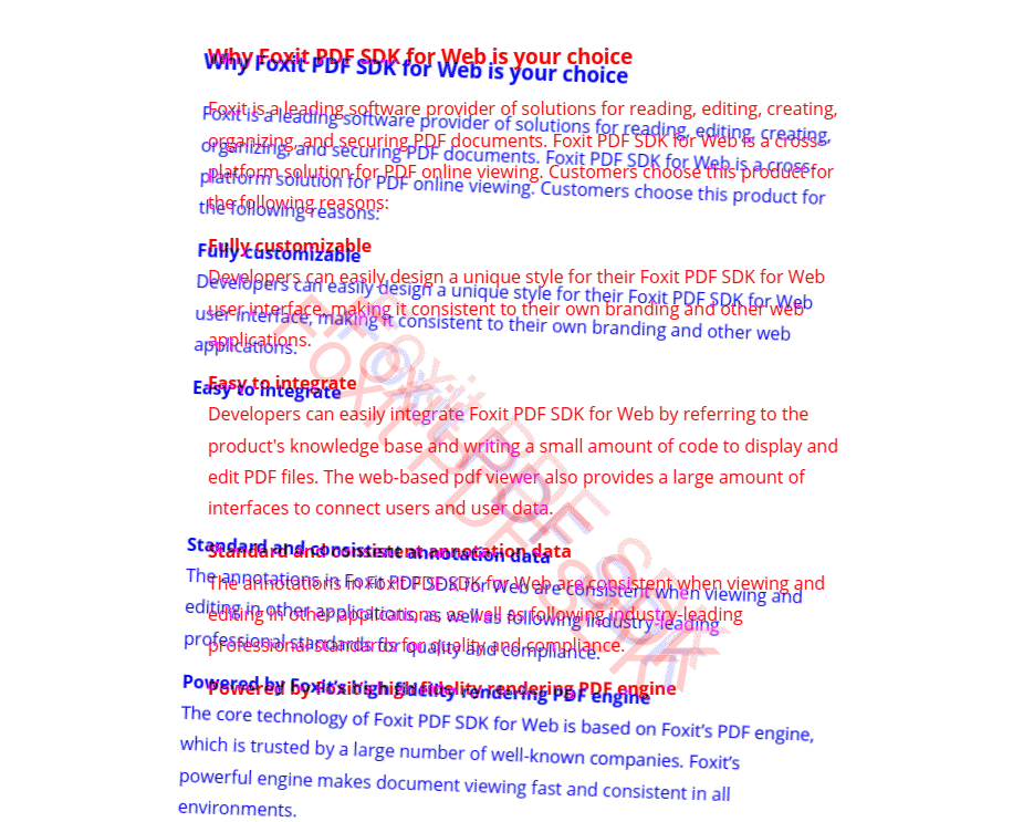
<html>
</html>
<script>
    const libPath = window.top.location.origin + '/lib';
    const pdfViewer = new PDFViewCtrl.PDFViewer({
        libPath: libPath,
        jr: {
            licenseSN: licenseSN,
            licenseKey: licenseKey
        }
    });
    pdfViewer.init(document.body);

    (async () => {
        const loadedFiles = await loadFiles();
        const newDoc = await createBlankDoc();

        const { sourceBitmap, targetBitmap } = await getPageBitmaps(loadedFiles);
        const resultImageData = await comparePageBitmap(sourceBitmap, targetBitmap);

        await pdfViewer.zoomTo(1);

        await insertResultIntoNewDoc(newDoc, resultImageData);
    })()

    async function loadFiles() {
        const sourcePDFDoc = await pdfViewer.loadPDFDocByHttpRangeRequest({
            range: {
                url: '/assets/test-doc1.pdf'
            }
        });
        const targetPDFDoc = await pdfViewer.loadPDFDocByHttpRangeRequest({
            range: {
                url: '/assets/test-doc2.pdf'
            }
        });
        return { sourcePDFDoc, targetPDFDoc };
    }
    function createBlankDoc() {
        return pdfViewer.createNewDoc();
    }
    async function getPageBitmaps(loadedFiles) {
        const { sourcePDFDoc, targetPDFDoc } = loadedFiles;

        const sourcePage = await sourcePDFDoc.getPageByIndex(0);
        const sourceBitmap = await sourcePage.render(1);

        const targetPage = await targetPDFDoc.getPageByIndex(0);
        const targetBitmap = await targetPage.render(1);

        return { sourceBitmap, targetBitmap };
    }
    function comparePageBitmap(sourceBitmap, targetBitmap) {
        const DiffColor = PDFViewCtrl.overlayComparison.DiffColor;
        const service = pdfViewer.getOverlayComparisonService();
        const resultCanvas = service.compareImageData({
            sourceBitmap, targetBitmap,
            combinePixelsOptions: {
                showDiffColor: true,
                sourceDiffColor: DiffColor.RED,
                targetDiffColor: DiffColor.BLUE,
                sourceOpacity: 0xFF,
                targetOpacity: 0xFF
            },
            transformation: {
                translateX: 0,
                translateY: 0,
                rotate: 2 / 180 * Math.PI
            }
        });
        return new Promise(resolve => {
            resultCanvas.toBlob(blob => {
                const fr = new FileReader();
                fr.onloadend = () => {
                    resolve({
                        buffer: fr.result,
                        width: resultCanvas.width,
                        height: resultCanvas.height
                    });
                };
                fr.readAsArrayBuffer(blob);
            });
        })
    }
    async function insertResultIntoNewDoc(newDoc, resultImageData) {
        const page = await newDoc.getPageByIndex(0);

        const newPageWidth = resultImageData.width / 4 * 3;
        const newPageHeight = resultImageData.height / 4 * 3;
        await page.setPageSize(newPageWidth, newPageHeight);
        await page.addImage(resultImageData.buffer, {
            left: 0,
            right: newPageWidth,
            bottom:0,
            top: newPageHeight
        });
    }
    async function exportResultPDFDocFile(newDoc) {
        return newDoc.getFile();
    }
</script>
Note:
To minimize the interference of irrelevant code and make the code more intuitive, the above example is written using ESNext syntax. Please use a modern browser to open the developer guide document and run the example. If you need to be compatible with older browsers, please use JavaScript transpiler such as babel in your project.
Compare PDF Files
Starting from version 8.5.0, Foxit PDF SDK for Web provides APIs to compare PDF files in the full package, which can compare the differences between text, annotations, page objects (images, paths), and watermarks in two PDF files. In general, to compare PDF files using the APIs, first input two different documents, then return a result document with detailed difference information, finally open the result document to intuitively see the difference information. Following will explain the usage of the APIs in detail.
APIs Preview
A Simple Example
In this section, we will show you how to compare two documents and control the content display in the result document. The following example will be done based on a created PDFViewer instance.
Load documents
Before you start, load two documents using PDFViewer.loadPDFDocByFile or PDFViewer.loadPDFDocByHttpRangeRequest. These two APIs are used to load PDF documents, and then return a PDFDoc object, without rendering documents on the view.
const baseDoc = await pdfViewer.loadPDFDocByHttpRangeRequest({
    range: {
        url: '/assets/compare-base.pdf'
    }
});
const otherDoc = await pdfViewer.loadPDFDocByHttpRangeRequest({
    range: {
        url: '/assets/compare-other.pdf'
    }
});
Start to compare documents
After loading the documents, you just need to get the id values of the documents through PDFDoc.getId, and then you can start to compare documents.
const baseDocId = baseDoc.getId();
const otherDocId = otherDoc.getId();

const comparedDoc = await pdfViewer.compareDocuments(
    baseDocId,
    otherDocId,
    {
        // The file name of baseDoc, which will be displayed in the result document.
        baseFileName: 'baseFile.pdf',
        // The file name of otherDoc, which will be displayed in the result document.
        otherFileName: 'otherFile.pdf',
        // The file name of the result document.
        resultFileName: pdfViewer.i18n.t('comparison:resultFileName') || 'The result of comparison.pdf'
    }
);
Preview of the effect:
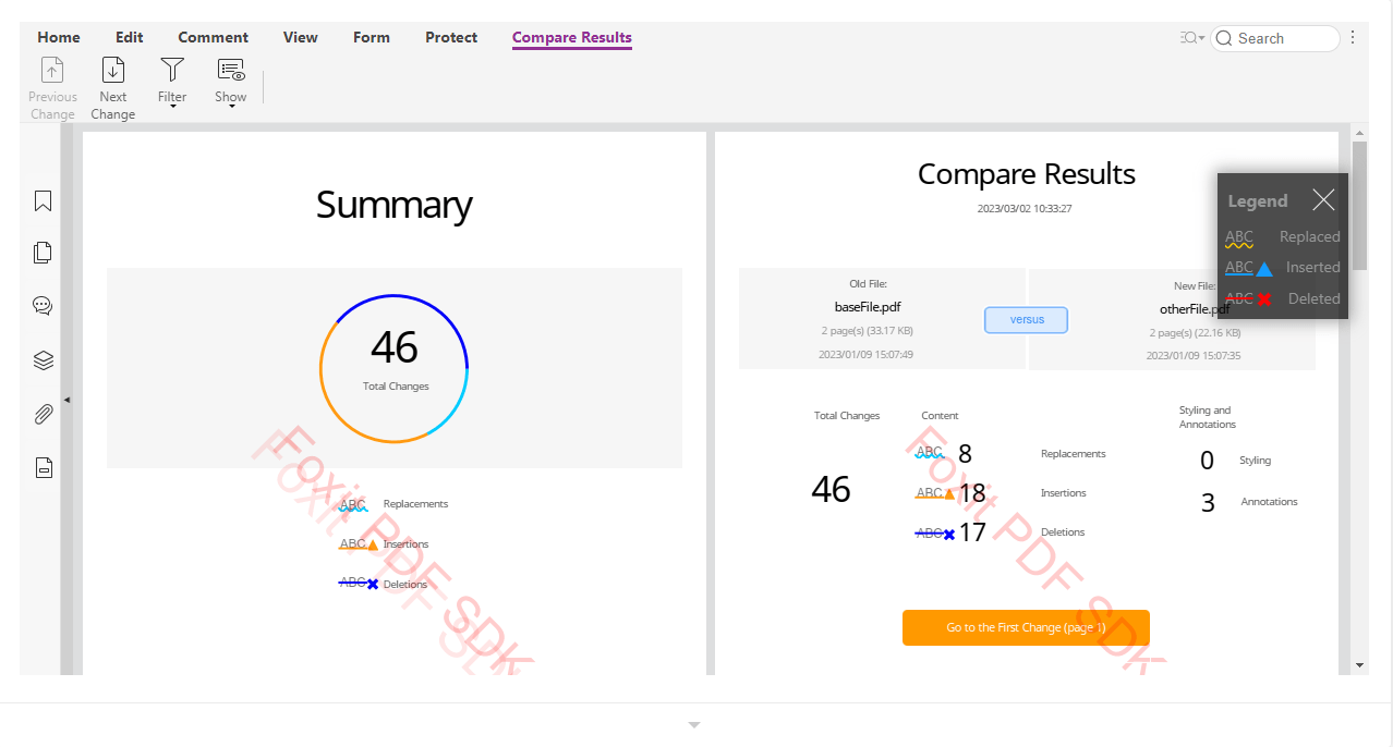
<script>
    const libPath = window.top.location.origin + '/lib';
    const pdfui = new UIExtension.PDFUI({
        viewerOptions: {
            libPath: libPath,
            jr: {
                fontPath: 'http://webpdf.foxitsoftware.com/webfonts',
                licenseSN: licenseSN,
                licenseKey: licenseKey
            }
        },
        renderTo: document.body,
        appearance: UIExtension.appearances.adaptive,
        addons: libPath + '/uix-addons/allInOne.js'
    });
    (async function() {
        const pdfViewer = await pdfui.getPDFViewer();
        const baseDoc = await pdfViewer.loadPDFDocByHttpRangeRequest({
            range: {
                url: '/assets/compare-base.pdf'
            }
        });
        const otherDoc = await pdfViewer.loadPDFDocByHttpRangeRequest({
            range: {
                url: '/assets/compare-other.pdf'
            }
        });
        const baseDocId = baseDoc.getId();
        const otherDocId = otherDoc.getId();

        const comparedDoc = await pdfViewer.compareDocuments(
            baseDocId,
            otherDocId,
            {
                baseFileName: 'baseFile.pdf',
                otherFileName: 'otherFile.pdf',
                resultFileName: pdfViewer.i18n.t('comparison:resultFileName') || 'The result of comparison.pdf'
            }
        );
        const comparedDocFile = await comparedDoc.getFile();
        pdfui.openPDFByFile(comparedDocFile);
    })()
</script>
The Parameters of compareDocuments method
Page range
You can specify the page range of the two documents to be compared through the following two parameters:
pdfViewer.compareDocuments(
    baseDocId,
    otherDocId,
    {
        // ...
        basePageRange: {
            from: 0,
            end: 2
        },
        otherPageRange: {
            from: 1,
            end: 3
        },
        options: {
            // ...
        }
    }
)
Both basePageRange and otherPageRange objects should include from and end properties which represent the starting and ending page indexes of the pages to be compared. In the above example code, the final pages to be compared are: baseDoc: [0, 1, 2], otherDoc: [1, 2, 3]. Please note that the number of pages specified in the basePageRange and otherPageRange should be same
options parameters
options are used to specify the objects that need to be compared and the comparison method. The parameters are explained as follows:
// Whether to compare tables, default is false, which means not to compare.
compareTable: false,
// Whether to detect page deletions and insertions, default is false, which means not to detect.
detectPage: false,
// The width of the outline border of the marker, and the unit is point.
lineThickness: {
    delete: 2,
    insert: 2,
    replace: 2
},
// This parameter is used to set the marker color for different types of differences. The format of marker color is 0xRRGGBB without transparent channel, and the transparency needs to be specified in opacity.
markingColor: {
    delete: 0xfa0505,
    insert: 0x149bff,
    replace: 0xffcc00
},
// This parameter is used to set the transparency of different types of differences.
opacity: {
    delete: 100,
    insert: 100,
    replace: 100
},
// Whether only to compare text differences. If the value is true, only compare the text differences, otherwise compare the annotations, page oobjects (include text), and so on.
textOnly: false
Following is an example with using the above parameters:
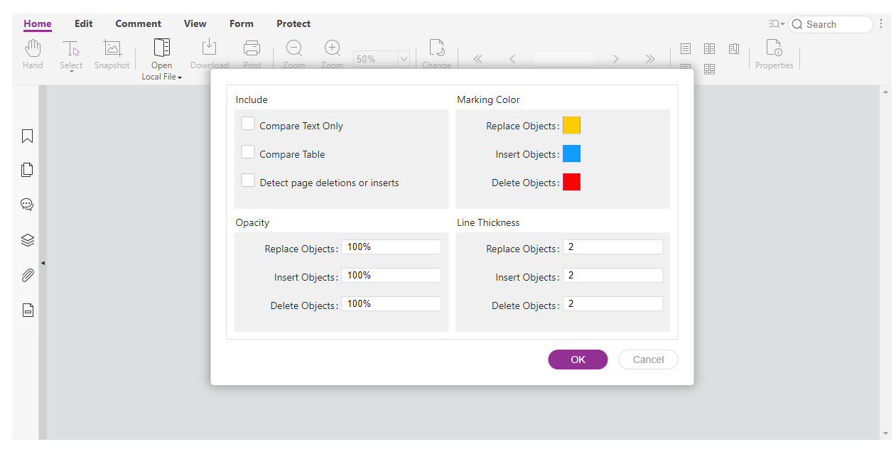
Click OK on the pop-up dialog.
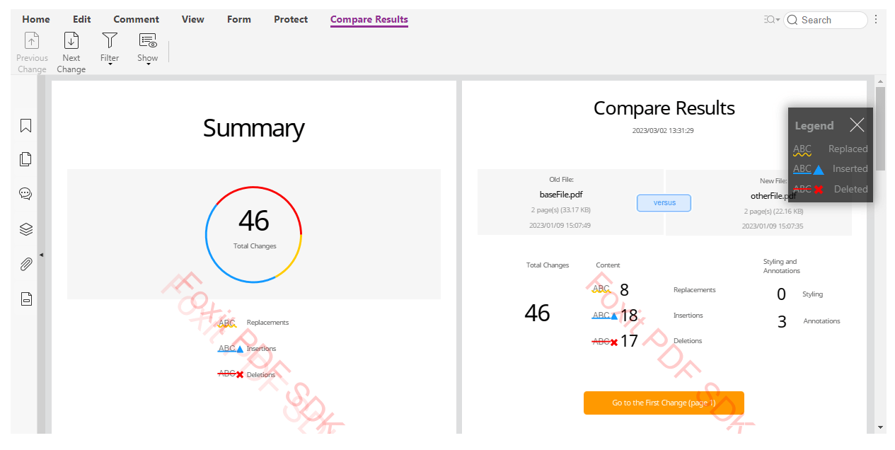
<script>
    const libPath = window.top.location.origin + '/lib';
    const pdfui = new UIExtension.PDFUI({
        viewerOptions: {
            libPath: libPath,
            jr: {
                fontPath: 'http://webpdf.foxitsoftware.com/webfonts',
                licenseSN: licenseSN,
                licenseKey: licenseKey
            }
        },
        renderTo: document.body,
        appearance: UIExtension.appearances.adaptive,
        addons: libPath + '/uix-addons/allInOne.js'
    });
    class ComparisonOptionsLayerComponent extends UIExtension.SeniorComponentFactory.createSuperClass({
        template: `
            <layer class="center fv__ui-comparison-options-dialog" @var.dialog="$component" style="width: 680px" append-to="body">
                <layer-view class="fv__ui-comparison-dialog-body">
                    <div class="fv__ui-layout-row">
                        <div class="fv__ui-layout-col-1">
                            <fieldset class="fv__ui-comparison-fieldset">
                                <legend>comparison:options-dialog.include</legend>
                                <div class="fv__ui-comparison-fieldset-content">
                                    <form-group label="comparison:options-dialog.compareTextOnly" direction="rtl">
                                        <checkbox  @model="dialog.currentOptions.textOnly" name="compareTextOnly"></checkbox>
                                    </form-group>
                                    <form-group label="comparison:options-dialog.compareTable" direction="rtl">
                                        <checkbox  @model="dialog.currentOptions.compareTable" name="compareTable"></checkbox>
                                    </form-group>
                                    <form-group label="comparison:options-dialog.detectPage" direction="rtl">
                                        <checkbox  @model="dialog.currentOptions.detectPage" name="detectPageDeletionsOrInserts"></checkbox>
                                    </form-group>
                                </div>
                            </fieldset>
                        </div>
                        <div class="fv__ui-layout-col-1">
                            <fieldset class="fv__ui-comparison-fieldset">
                                <legend>comparison:options-dialog.markingColor</legend>
                                <div class="fv__ui-comparison-fieldset-content">
                                    <form-group label="comparison:options-dialog.replaceObjects">
                                        <inline-color-picker name="fv--comparison-options-replace-marking-color" @model="dialog.currentOptions.markingColor.replace|comparison:color"></inline-color-picker>
                                    </form-group>
                                    <form-group label="comparison:options-dialog.insertObjects">
                                        <inline-color-picker name="fv--comparison-options-insert-marking-color" @model="dialog.currentOptions.markingColor.insert|comparison:color"></inline-color-picker>
                                    </form-group>
                                    <form-group label="comparison:options-dialog.deleteObjects">
                                        <inline-color-picker name="fv--comparison-options-delete-marking-color" @model="dialog.currentOptions.markingColor.delete|comparison:color"></inline-color-picker>
                                    </form-group>
                                </div>
                            </fieldset>
                        </div>
                    </div>
                    <div class="fv__ui-layout-row">
                        <div class="fv__ui-layout-col-1">
                            <fieldset class="fv__ui-comparison-fieldset">
                                <legend>comparison:options-dialog.opacity</legend>
                                <div class="fv__ui-comparison-fieldset-content fv__ui-comparison-options-checkbox-list">
                                    <form-group label="comparison:options-dialog.replaceObjects">
                                        <number type="number" min="0" max="100" step="1" suffix="%" @model="dialog.currentOptions.opacity.replace" name="fv--comparison-options-replace-opacity-replace"></number>
                                    </form-group>
                                    <form-group label="comparison:options-dialog.insertObjects">
                                        <number type="number" min="0" max="100" step="1" suffix="%" @model="dialog.currentOptions.opacity.insert" name="fv--comparison-options-replace-opacity-insert"></number>
                                    </form-group>
                                    <form-group label="comparison:options-dialog.deleteObjects">
                                        <number type="number" min="0" max="100" step="1" suffix="%" @model="dialog.currentOptions.opacity.delete" name="fv--comparison-options-replace-opacity-delete"></number>
                                    </form-group>
                                </div>
                            </fieldset>
                        </div>
                        <div class="fv__ui-layout-col-1">
                            <fieldset class="fv__ui-comparison-fieldset">
                                <legend>comparison:options-dialog.lineThickness</legend>
                                <div class="fv__ui-comparison-fieldset-content fv__ui-comparison-options-checkbox-list">
                                    <form-group label="comparison:options-dialog.replaceObjects">
                                        <number type="number" min="1" max="12" step="1" @model="dialog.currentOptions.lineThickness.replace"  name="fv--comparison-options-replace-lineThickness-replace"></number>
                                    </form-group>
                                    <form-group label="comparison:options-dialog.insertObjects">
                                        <number type="number" min="1" max="12" step="1" @model="dialog.currentOptions.lineThickness.insert"  name="fv--comparison-options-replace-lineThickness-insert"></number>
                                    </form-group>
                                    <form-group label="comparison:options-dialog.deleteObjects">
                                        <number type="number" min="1" max="12" step="1" @model="dialog.currentOptions.lineThickness.delete"  name="fv--comparison-options-replace-lineThickness-delete"></number>
                                    </form-group>
                                </div>
                            </fieldset>
                        </div>
                    </div>
                </layer-view>
                <div class="fv__ui-comparison-dialog-footer fv__ui-layout-row">
                    <div class="fv__ui-layout-col-1 fv__ui-comparison-footer-buttons">
                        <xbutton text="dialog.ok" class="fv__ui-dialog-button fv__ui-dialog-ok-button" name="fv__ui-dialog-ok-button" @on.click="dialog.ok()"></xbutton>
                        <xbutton text="dialog.cancel" class="fv__ui-dialog-button fv__ui-dialog-cancel-button" name="fv__ui-dialog-cancel-button" @on.click="dialog.cancel()" @cannotBeDisabled></xbutton>
                    </div>
                </div>
            </layer>
        `
    }) {
        static getName() {
            return 'comparison-options-layer'
        }
        currentOptions = this.getDefaultOptions();

        getDefaultOptions() {
            return {
                compareTable: false,
                detectPage: false,
                lineThickness: {
                    delete: 2,
                    insert: 2,
                    replace: 2
                },
                markingColor: {
                    delete: 0xfa0505,
                    insert: 0x149bff,
                    replace: 0xffcc00
                },
                opacity: {
                    delete: 100,
                    insert: 100,
                    replace: 100
                },
                textOnly: false
            };
        }
        onOk(callback) {
            this.onOkCallback = callback;
        }
        ok() {
            if(typeof this.onOkCallback == 'function') {
                this.onOkCallback(this.currentOptions);
            }
            this.hide();
            this.currentOptions = this.getDefaultOptions();
        }
        cancel() {
            this.hide();
            this.currentOptions = this.getDefaultOptions();
        }
    }

    UIExtension.modular.root().registerComponent(ComparisonOptionsLayerComponent);

    (async function() {
        const root = await pdfui.getRootComponent();
        root.append('<comparison-options-layer visible>');

        const pdfViewer = await pdfui.getPDFViewer();
        const baseDoc = await pdfViewer.loadPDFDocByHttpRangeRequest({
            range: {
                url: '/assets/compare-base.pdf'
            }
        });
        const otherDoc = await pdfViewer.loadPDFDocByHttpRangeRequest({
            range: {
                url: '/assets/compare-other.pdf'
            }
        });
        const baseDocId = baseDoc.getId();
        const otherDocId = otherDoc.getId();

        const optionsLayer = root.querySelector('@comparison-options-layer');
        optionsLayer.onOk(async options => {
            const comparedDoc = await pdfViewer.compareDocuments(
                baseDocId,
                otherDocId,
                {
                    baseFileName: 'baseFile.pdf',
                    otherFileName: 'otherFile.pdf',
                    resultFileName: pdfViewer.i18n.t('comparison:resultFileName') || 'The result of comparison.pdf',
                    options: options
                }
            );
            console.log(options);
            const comparedDocFile = await comparedDoc.getFile();
            pdfui.openPDFByFile(comparedDocFile);
        });
    })()
</script>
The progress of comparing documents
When the documents that need to be compared are large, it will take more time to generate the result document. At this time, the fourth parameter of the compareDocuments method can accept a callback function to get the processing progress information:
pdfViewer.compareDocuments(
    baseDocId,
    otherDocId,
    {
        ...
    },
    (currentRate) => {
        console.log(currentRate);
    }
)
The range of values for currentRate is from 0 to 100. You can use this value to update the progress bar on the UI.
An example with progress bar:

<script>
    const libPath = window.top.location.origin + '/lib';
    const pdfui = new UIExtension.PDFUI({
        viewerOptions: {
            libPath: libPath,
            jr: {
                fontPath: 'http://webpdf.foxitsoftware.com/webfonts',
                licenseSN: licenseSN,
                licenseKey: licenseKey
            }
        },
        renderTo: document.body,
        appearance: UIExtension.appearances.adaptive,
        addons: libPath + '/uix-addons/allInOne.js'
    });
    class ProgressBarComponent extends UIExtension.SeniorComponentFactory.createSuperClass({
        template: `<layer class="center" visible @var.self="$component">
            @{self.currentRate + '%'}
        </layer>`
    }) {
        static getName() {
            return 'progress-bar-layer'
        }
        currentRate = 0;
        setCurrentRate(rate) {
            this.currentRate = rate;
            this.digest();
            if(rate >= 100) {
                setTimeout(() => {
                    this.hide();
                }, 500);
            }
        }
    }

    UIExtension.modular.root().registerComponent(ProgressBarComponent);


    (async function() {
        const pdfViewer = await pdfui.getPDFViewer();
        const baseDoc = await pdfViewer.loadPDFDocByHttpRangeRequest({
            range: {
                url: '/assets/compare-base.pdf'
            }
        });
        const otherDoc = await pdfViewer.loadPDFDocByHttpRangeRequest({
            range: {
                url: '/assets/compare-other.pdf'
            }
        });
        const baseDocId = baseDoc.getId();
        const otherDocId = otherDoc.getId();

        const rootComponent = await pdfui.getRootComponent();
        rootComponent.append('<progress-bar-layer>');

        const comparedDoc = await pdfViewer.compareDocuments(
            baseDocId,
            otherDocId,
            {
                baseFileName: 'baseFile.pdf',
                otherFileName: 'otherFile.pdf',
                resultFileName: pdfViewer.i18n.t('comparison:resultFileName') || 'The result of comparison.pdf'
            },
            currentRate => {
                rootComponent.querySelector('@progress-bar-layer').setCurrentRate(currentRate);
            }
        );
        const comparedDocFile = await comparedDoc.getFile();
        pdfui.openPDFByFile(comparedDocFile);
    })()
</script>
{
    "iframeOptions": {
        "style": "height: 600px"
    }
}
Determine whether a document is a comparison result document
The dictionary information of the PDF file generated by the PDFViewer.compareDocuments interface can be used to determine whether a document is a comparison result document. In the SDK, it uses PDFDoc.isCompareDoc() method.
pdfViewer.eventEmitter.on(PDFViewCtrl.ViewerEvent.openFileSuccess, doc => {
    doc.isCompareDoc();
})
Below is a typical dictionary information for a comparison result document. the /PieceInfo at the end of the object (1 0) points to the (244 0) object, that is, points to the dictionary entry of /ComparePDF. So, you can determine whether a document is a comparison result document with this information.
1 0 obj
<</AcroForm 110 0 R/Pages 2 0 R/ViewerPreferences <<>>/OCProperties <</OCGs [62 0 R 63 0 R 64 0 R 65 0 R 66 0 R 67 0 R 68 0 R]/D <</Order [62 0 R 63 0 R 64 0 R 65 0 R 66 0 R 67 0 R 68 0 R]/ON [62 0 R 63 0 R 64 0 R]/OFF [65 0 R 66 0 R 67 0 R 68 0 R]>>>>/Names 367 0 R/PageLayout(TwoColumnLeft)/Type/Catalog/PieceInfo 244 0 R>>
endobj
...

244 0 obj
<</ComparePDF 235 0 R>>
endobj
...
235 0 obj
<</Private 236 0 R>>
endobj
236 0 obj
<</Differences 237 0 R>>
endobj
237 0 obj
<</Nums [1 238 0 R 2 239 0 R 3 240 0 R 4 241 0 R 5 242 0 R 6 243 0 R]>>
endobj
...
Customize Dynamic Stamps
Differences between dynamic stamps and standard stamps
| Type | Dependencies | Files that need to be prepared | Support to set |
| Dynamic stamps | The uix-addons/customer-dynamic-stamp is required. By default, this addon is included in AllInOne.js. If you are not using AllInOne.js, ensure that this addon is referenced in the PDFUI initialization. | image | Support to set background image, text, font, color and its position |
| Standard stamps | none | PDF and svg | image |
The process for creating a custom dynamic stamp
We provide a default dynamic stamp operation process in the Complete WebViewer (hereinafter referred to as UI). You can experience this feature by clicking Comment-> Create-> Create Dynamic Stamp. The logical flow of this implementation is as follows:
The UI provides a background image preprocessed by the frontend by default.
After the user inputs the required category, name and text of the dynamic stamp, the UI will transfer this data to the PDF Data layer.
According to the data received from the step #1 and step #2, the PDF Data layer draws preprocessed image and generates a text form field, updates the form field data in real time, exports the images, and sends them to the UI layer as an icon of the stamp list.
When the user selects the dynamic stamp icon created in step #3 from the stamp list and then clicks on the page to create stamp, the stamp data will be synchronized with the PDF data layer, which indicates that the dynamic stamp has been created successfully.
Create a custom dynamic stamp
Create a custom dynamic stamp through UI
Users can create a custom dynamic stamp directly by clicking comment-> Create-> Create Dynamic Stamp on the UI. Among them, the background image of the dynamic stamp can be passed in and managed by the user through the interfaces. The following code shows how to manage the background image of dynamic stamp by importing or deleting operations and so on.
// Get the dropdown component of custom dynamic stamp template
const templates = await pdfui.getComponentByName("stamp-templates");
// Import the dropdown button and its callback function through append method
templates.append("<dropdown-button name='test' url='xxx.png'>test</dropdown-button>", [{
    target: 'test',
    config: {
        // Set the callback function
        callback: async function () {
            // Get the dialog component of custom dynamic stamp
            const dialog = await pdfui.getComponentByName("fv--custom-dynamic-stamp-dialog")
            // Set the corresponding template information
            dialog.controller.selectTemplate({ name: 'test', url: "xxx.png" })
        }
    }
}])
Create a custom dynamic stamp through APIs
Add a custom dynamic stamp
var param = [{
     category:'category',
     name:'MyStamp',
     fileData:'http://stamp.png',
     field:{
        textType:PDFViewCtrl.PDF.constant.STAMP_TEXT_TYPE.CUSTOM_TEXT,
        value:'custom text',
        font:{
            name:'Helvetica',
            color:0,
        },
        rect:{
            left:0,
            right:30,
            top:30,
            bottom:0,
        }
     },
}]
// Add a custom dynamic stamp
pdfui.callAddonAPI( 'CustomDynamicStamp',  'setDynamicStamp',[param])
Remove a custom dynamic stamp
var param = [{
    category:'stamp',//The directory of the dynamic stamp
    names:[
        'MyStamp', //The name of the dynamic stamp
    ]
}]
// Remove a custom dynamic stamp
pdfui.callAddonAPI( 'CustomDynamicStamp',  'removeDynamicStamp',[param])
Get all custom dynamic stamps
// Get dynamic stamps
pdfui.callAddonAPI( 'CustomDynamicStamp',  'getDynamicStamp')
The Edit Modules in Foxit PDF SDK for Web
Before version 10.0, Foxit PDF SDK for Web provides three types of packages: Light package (excludes font resources), Standard package (includes font resources) and Full package (includes font resources and Document Comparison). Light/Standard package uses a same Edit module, and Full package uses an advanced Edit module. In order to distinguish these two Edit modules, the Edit module of the Light/Standard package will be named Std Edit, and the Edit module of the Full package will be named Adv Edit.
Starting from version 10.0, Foxit PDF SDK for Web only provides a full package.
The Full package uses Adv Edit by default, and it also includes the Std Edit module. Users can switch them based on their needs. The Adv Edit has more advantages in terms of interaction, but it needs license permissions, otherwise it will not be able to use.
The core features of Std Edit support editing based on PDF content object (text object, image object and shape object). Users can add PDF content objects and modify the font style (font, font size, and color) of the text objects.
The core features of Adv Edit not only support the editing based on PDF content, but also support text block editing. On the basis of the Std Edit, more features have been added.
Text block editing:
Font style, alignment, bullets, line/word spacing, character scale, and so on
Join and split
Search and Replace text
Shape object:
Preset path object
Create shading object
Edit the properties of the shape object
Following is a comparison of the two modules.
UI comparison
The ribbon under Edit Tab of Std Edit:
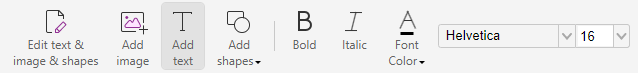
The ribbon under Edit Tab of Adv Edit:

The ribbon of the right panel of Adv Edit:
Adv Edit not only has all the features of the Std Edit, but also provides more other features. For example, text style/level/transformation, paragraph-related functions, and shape style, etc.
Feature comparison
| Features | Std Edit | Adv Edit |
| License Permission | Standard | Require a separate Adv Edit module license to be included in the SDK license |
| UI Components | 1. <edit-pageobjects:edit-all-objects-button>: Used to edit the currently supported page objects in PDF pages. 2. <add-image-ribbon-button>: Used to add image objects to PDF pages. 3. <edit-text-object:add-text-ribbon-button>: Used to add text objects to PDF pages. 4. <edit-pageobjects:path-objects-ribbon-dropdown>: Used to create different types of path objects, including Line Path, Rectangle Path, Circle Path, RoundRect Path. 5. <edit-text-object:text-bold-style-ribbon-button>: Used to switch the currently edited text object to bold style. It depends on the <edit-text-object:add-text-ribbon-button> component. 6. <edit-text-object:text-italic-style-ribbon-button>: Used to switch the currently edited text object to italic/normal style. It depends on the <edit-text-object:add-text-ribbon-button> component. 7. <edit-text-object:font-color-picker>: Used to set the text color of the currently edited text object. It depends on the <edit-text-object:add-text-ribbon-button> component. 8. <edit-text-object:font-style-dropdown>: Used to set the font style and size of the currently edited text object. It depends on the <edit-text-object:add-text-ribbon-button> component. | 1. <page-editor:edit-text>: Used to edit text objects in PDF pages. It depends on the <sidebar-right> component, and supports setting Font and Paragraph. 2. <page-editor:edit-object-ribbon-dropdown>: Used to edit different types of page objects, including Text, Image, Shape and Shading. It depends on the <sidebar-right> component. Text object supports setting Font, Paragraph, Split, Effect and Arrange. Image object supports setting Effect and Arrange. Shape object supports setting Shape Style, Effect and Arrange. Shading object supports setting Shading Style, Effect and Arrange. 3. <page-editor:join-split>: Used to merge or split text objects in PDF pages. 4. <find-replace:find-replace-button>: Used to find or replace text objects in PDF pages. 5. <page-editor:add-text-button>: Used to add text objects to PDF pages. It depends on the <sidebar-right> component, and supports setting Font and Paragraph. 6. <page-editor:add-image-button>: Used to add image objects to PDF pages. 7. <page-editor:add-shapes-ribbon-dropdown>: Used to add different types of shape objects in PDF pages, including Line/Rectangle/RoundRect/Ellipse/Polyline/Polygon/Polybezier/Curve Path, and Rectangle/RoundRect/Ellipse/Polyline/PolygonPolybezier/Curve Shading. |
| Undo/Redo Feature | Only AddText supports undo/redo functionality. Since it uses the browser’s undo/redo functionality, make sure the cursor is in the field when undoing or redoing. | The advanced editor leverages our built-in addon manager to manage undo/redo functionality. The responsible addon is UIExtension > addons > UndoRedoAddon. |
| Addon | path-objects text-object | Advanced_edit: Page_Editor find-replace PageEditorAddon |
| Class | PDF > GraphicsObject PDF > PathObject PDF > TextObject | N/A |
How to switch to the standard editor in the Full package
For the Full package, it uses advanced editor by default, if you don’t have a license for advanced editor and want to enable the standard editor, you can refer to the following two methods.
Method 1: modify the Edit module to be displayed through the fragments parameter when initializing PDFUI object
fragments: [
{
target: ‘adv-edit-tab-group-mode’,
action: UIExtension.UIConsts.FRAGMENT_ACTION.REPLACE,
template:`
<group name=”edit-tab-group-mode” retain-count=”3″>
<edit-pageobjects:edit-all-objects-button @async></edit-pageobjects:edit-all-objects-button>
<add-image-ribbon-button></add-image-ribbon-button>
<edit-text-object:add-text-ribbon-button @async></edit-text-object:add-text-ribbon-button>
<edit-pageobjects:path-objects-ribbon-dropdown @async></edit-pageobjects:path-objects-ribbon-dropdown>
</group>
`
},
{
target: ‘edit-tab-group-editor’,
action: UIExtension.UIConsts.FRAGMENT_ACTION.REPLACE,
template:`
<group name=”edit-tab-group-font” retain-count=”5″ @require-modules=”edit-text-object”>
<edit-text-object:text-bold-style-ribbon-button></edit-text-object:text-bold-style-ribbon-button>
<edit-text-object:text-italic-style-ribbon-button></edit-text-object:text-italic-style-ribbon-button>
<edit-text-object:font-color-picker></edit-text-object:font-color-picker>
<edit-text-object:font-style-dropdown></edit-text-object:font-style-dropdown>
</group>
`
}
]
For more information about fragments, please refer to https://webviewer-demo.foxitsoftware.com/docs/developer-guide/ui-extension/basics/fragments.html.
Method 2: switch the Edit module through the interface of the Component object
// Get the advEditTabGroupMode component that is the editing functionality of the Adv Edit.
var advEditTabGroupMode = await pdfui.getComponentByName(“adv-edit-tab-group-mode”);
// Remove the obtained advEditTabGroupMode component.
advEditTabGroupMode.remove();
// Get the advEditTabGroupEditor component that is the editing functionality of the Adv Edit.
var advEditTabGroupEditor = await pdfui.getComponentByName(“edit-tab-group-editor”);
// Remove the obtained advEditTabGroupEditor component.
advEditTabGroupEditor.remove();
// Get the first editTabGroupHand component under the Edit tab that contains the hand function.
var editTabGroupHand = await pdfui.getComponentByName(“edit-tab-group-hand”);
// Insert the target Edit module after the editTabGroupHand component.
editTabGroupHand.after(`
<group name=”edit-tab-group-font” retain-count=”5″> //group component
<edit-text-object:text-bold-style-ribbon-button></edit-text-object:text-bold-style-ribbon-button> //text-object Bold component
<edit-text-object:text-italic-style-ribbon-button></edit-text-object:text-italic-style-ribbon-button> //text-object Italic components
<edit-text-object:font-color-picker></edit-text-object:font-color-picker> //text object Color component
<edit-text-object:font-style-dropdown></edit-text-object:font-style-dropdown> //text object Font Name and Size components
</group>
`)
editTabGroupHand.after(`
<group name=”edit-tab-group-mode” retain-count=”3″> //group component
<edit-pageobjects:edit-all-objects-button @async></edit-pageobjects:edit-all-objects-button> //The component of editing graphic objects
<add-image-ribbon-button></add-image-ribbon-button>//The component of adding image graphic object
<edit-text-object:add-text-ribbon-button @async></edit-text-object:add-text-ribbon-button> //The component of adding text graphic object
<edit-pageobjects:path-objects-ribbon-dropdown @async></edit-pageobjects:path-objects-ribbon-dropdown> //The component of adding path graphic object
</group>
`)
AnnotationAuthorityManager
Before formally introducing how to use the AnnotationAuthorityManager utility class, let’s first understand the types of annotation permissions and how to set them.
Types of Annotation Permissions
There are three types of annotation permissions:
PDF annotation permissions: Restrictions on the operations of annotation within the PDF document itself. You can use the User_Permissions ( for global) or Annot_Flags (for a single annotation) to set it. The settings for PDF annotation permissions will be written into the document, thus changing the document.
View annotation permissions: Restrictions on the operations of annotation from the view layer. The settings for view annotation permissions only affect the application and are not written into the document, so that it will not change the document.
Interactive annotation permissions: The intersection of PDF annotation permissions and view annotation permissions is called interactive annotation permissions. After loading a PDF document, users will have restrictions on their actions towards annotations based on the interactive annotation permissions.
The method for setting annotation permissions
Foxit PDF SDK for Web provides four ways to set annotation permissions as follows:
Set view annotation permissions through the PDFViewer constructor. For example, [options.customs.getDocPermissions=(doc:PDFDoc)=>-1] and [options.customs.getAnnotPermissions=(annot:Annot)=>Promise.resolve()].
Set view annotation permissions dynamically in real-time using the AnnotationAuthorityManager utility class. See setAnnotPermissionCallback.
Set PDF annotation permissions globally through the PDFDoc::setPasswordAndPermission interface.
Set PDF annotation permissions for a single annotation through the Annot:setFlags interface.
The Usage of AnnotationAuthorityManager
You can update interactive annotation permissions by setting PDF annotation permissions or view annotation permissions. In some scenarios, you may not want to modify the original document and only want to control the user’s operation permissions on annotations at the application layer. In this case, you can use the AnnotationAuthorityManager utility class to set the view annotation permissions for annotations in real-time and then update the interactive annotation permissions.
Note: When the application layer updates the interactive annotation permissions, Foxit PDF SDK for Web internally takes the intersection of the view annotation permissions set by the application layer and the PDF annotation permissions to determine the final interactive permissions that users have on annotations.
Timing for updating interactive annotation permissions
The following example code demonstrates how users can passively or actively update the interactive annotation permissions.
Update the interactive annotation permissions passively
Before opening a document, users can set permissions first using setAnnotPermissionCallback , [options.customs.getDocPermissions=(doc:PDFDoc)=>-1] , and [options.customs.getAnnotPermissions=(annot:Annot)=>Promise.resolve()]. After the document is opened, the SDK will update the interactive annotation permissions automatically, and users do not need to set them again.
Note: Here, “passive update” means that the SDK will automatically update the interactive annotation permissions after the document is opened, without the need for the user to manually call an interface to update them.
// There are two ways to set the view annotation permissions before the document is opened:

    // The first method is to set the view annotation permissions based on the annotation information when constructing the PDFViewer object
    const pdfui = new PDFUI({
        viewerOptions: {
            customs:{
                // Set the view annotation permissions
                getAnnotPermissions:function(annot){
                    const ANNOTATION_PERMISSION = UIExtension.PDFViewCtrl.constants.ANNOTATION_PERMISSION
                    // Set to have all the view annotation permissions
                    return Promise.resolve([ANNOTATION_PERMISSION.fully]);
                }
            }
        }
    })

    // The second method is to set the view annotation permissions through the AnnotationAuthorityManager manager
    const pdfViewer = await pdfui.getPDFViewer();
    // Get the AnnotationAuthorityManager manager.
    const annotAuthMgr = pdfViewer.getAnnotAuthorityManager();
    // Set the view annotation permissions
    annotAuthMgr.setAnnotPermissionCallback(function(annot) {
        // Set to have no operation permissions
        return Promise.resolve([]);
    })

    // When opening a PDF document, the SDK will read the view annotation permissions that you set, and then update the interactive annotation permissions automatically.
    pdfui.openPDFByHttpRangeRequest('http:xxx');
Update the interactive annotation permissions actively
After the document is opened, users can dynamically set permissions and then actively update interactive annotation permissions using updateAll() or update() method.
// Open a document
    pdfui.openPDFByHttpRangeRequest('http:xxx');

    // Set the view annotation permissions through the AnnotationAuthorityManager manager
    const pdfViewer = await pdfui.getPDFViewer();
    // Get the AnnotationAuthorityManager manager
    const annotAuthMgr = pdfViewer.getAnnotAuthorityManager();
    // Set the view annotation permissions
    annotAuthMgr.setAnnotPermissionCallback(function(annot) {
        // Set to have no operation permissions for all annotations
        return Promise.resolve([]);
    })

    // Need to manually update the interactive permissions of all annotations, otherwise the view annotation permissions you set will not take effect immediately
 await annotAuthMgr.updateAll();
In actual projects, users can use PDFViewer.getCurrentPDFDoc to get the current document object and verify whether the current document is open. If the value is null, it means the document is not open.
Usage scenarios of view annotation permissions
In practical scenarios, different view annotation permissions may need to be set. Currently, there are mainly four types. The following example is based on a pre-created AnnotationAuthorityManager instance.
No permissions
// Set the view annotation permissions
    annotAuthMgr.setAnnotPermissionCallback(function(annot) {
        // Set to have no operation permissions for all annotations
        return Promise.resolve([]);
    })
Combined permissions
const ANNOTATION_PERMISSION = UIExtension.PDFViewCtrl.constants.ANNOTATION_PERMISSION
    // Set the view annotation permissions
    annotAuthMgr.setAnnotPermissionCallback(function(annot) {
        // Set the permission of all annotations to be able to modify properties and behaviors, and to be able to delete/move/rotate/scale
        return Promise.resolve([ANNOTATION_PERMISSION.adjustable,ANNOTATION_PERMISSION.deletable,ANNOTATION_PERMISSION.modifiable]);
    })
All permissions
const ANNOTATION_PERMISSION = UIExtension.PDFViewCtrl.constants.ANNOTATION_PERMISSION
    // Set the view annotation permissions
    annotAuthMgr.setAnnotPermissionCallback(function(annot) {
        // Set to have all the view annotation permissions
        return Promise.resolve([ANNOTATION_PERMISSION.fully]);
    })
Ignorable permissions
// Set the view annotation permissions
    annotAuthMgr.setAnnotPermissionCallback(function(annot) {
        // Set the permissions for all annotations to be ignorable
        return null;
    })
Usage scenarios of interactive annotation permissions
Example 1: Set the view annotation permissions which does not allow to delete specified annotations
const pdfViewer = await pdfui.getPDFViewer();
    // Get the AnnotationAuthorityManager manager
    const annotAuthMgr = pdfViewer.getAnnotAuthorityManager();
    // Get the annotationRender of a specified attachment type on a specified page
    const fileAnnotRender = pdfViewer.getAnnotRender(0,'name');
    // Get the annotation of a specified attachment type on a specified page
    const fileAnnot = fileAnnotRender.getAnnot();
    const ANNOTATION_PERMISSION = PDFViewCtrl.constants.ANNOTATION_PERMISSION
    // Set the view annotation permissions
    annotAuthMgr.setAnnotPermissionCallback(function(annot) {
        // Set a specific file annotation to have no permission to be deleted
        if(annot.getObjectNumber()=== fileAnnot.getObjectNumber()){
            return Promise.resolve(Object.keys(ANNOTATION_PERMISSION).filter(per=>per!==ANNOTATION_PERMISSION.deletable && per!==ANNOTATION_PERMISSION.fully));
        }
    })

    // Update the interactive annotation permissions for the specified annotation
    await annotAuthMgr.update(fileAnnot);
After executing the above code, users will not be able to delete the annotation with the specified name.

Example 2: Set the view annotation permissions to allow editing the callout content
const pdfViewer = await pdfui.getPDFViewer();
    // Get the AnnotationAuthorityManager manager
    const annotAuthMgr = pdfViewer.getAnnotAuthorityManager();
    const ANNOTATION_PERMISSION = PDFViewCtrl.constants.ANNOTATION_PERMISSION
    // Set the view annotation permissions
    annotAuthMgr.setAnnotPermissionCallback(function(annot) {
        // Set the callout-type annotation to have editing permission.
        if(annot.getIntent()=== 'FreeTextCallout'){
            return Promise.resolve([ANNOTATION_PERMISSION.editable]);
        }
    })

    // Update the interactive annotation permissions for all the annotations
    await annotAuthMgr.updateAll();
After executing the above code, users will be able to edit the FreeText objects with the type of callout.

Example 3: Validate PDF annotation permissions and view annotation permissions on a custom component
The following code will demonstrate how to validate annotation permission on a newly added custom component.
var pdfui = new PDFUI({
        // Customize a new component to delete annotations
        fragments: [{
            target: 'hand-tool',
            template: '<xbutton class="fv__ui-toolbar-show-text-button" name="cus-delete-button">button behind of hand-tool</xbutton>',
            action: UIExtension.UIConsts.FRAGMENT_ACTION.AFTER,
            config: [{
                target: 'cus-delete-button',
                callback: PDFViewCtrl.shared.createClass({
                    mounted: function() {
                        this.permissionHandler();
                    },
                    permissionHandler(){
                        const Events = UIExtension.UIEvents;
                        let permissionHandler = async ()=>{
                            const docRender = await pdfui.getPDFDocRender()
                            // Get PDF annotation permissions
                            const userPermission = docRender.getUserPermission().getValue();
                            const {AnnotForm} = UIExtension.PDFViewCtrl.Consts.PDFDocPermission;
                            this.hasAnnotForm = (userPermission & AnnotForm) === AnnotForm;
                            // Whether to disable this component
                            this.component[this.hasAnnotForm?'enable':'disable']();
                        }
                        this.addDestroyHook(
                            pdfui.addViewerEventListener(Events.openFileSuccess,permissionHandler)
                            pdfui.addViewerEventListener(Events.permissionChanged,permissionHandler)
                            pdfui.addViewerEventListener(Events.activeAnnotation,async annotRender=>{
                                // Get the active annotation
                                const annot = annotRender.getAnnot();
                                const pdfViewer = await pdfui.getPDFViewer();
                                // Get AnnotationAuthorityManager manager
                                const annotAuthMgr = pdfViewer.getAnnotAuthorityManager();
                                // Get the view annotation permissions of a specified annotation.
                                const annotPermission = await annotAuthMgr.getPermission(annot);
                                // Get the value which indicates whether the annotation can be deleted
                                const isDeleteAble = annotPermission.isDeletable();
                                // Whether to disable this component
                                this.component[isDeleteAble&&this.hasAnnotForm?'enable':'disable']();
                            })
                        );
                    }
                }, UIExtension.Controller)
            }]
        }]
    });
Restrictions on view annotation permissions
Currently, the restrictions on view annotation permissions are:
The Redaction Apply function does not support setting interactive annotation permissions.
AnnotationAuthorityManager does not support Form Widgets.
PDFViewer Multiple Instances
Concept Explanation
Multiple Instances: The ability to create and manage multiple independent PDFViewer instances within the same web page without using iframes or similar methods. Each instance can load, display, and manipulate separate PDF documents without interfering with each other.
PDFViewer: It is an important entry class in the Foxit PDF SDK for Web. It instantiates this class to render PDF documents using the Foxit PDF SDK for Web.
Limitations in Previous Versions
Prior to version 9.0.0, only one instance of PDFViewer was supported for creation and usage, which restricted developers from simultaneously loading and displaying multiple PDF documents (although this could be achieved through iframes, iframes also have many disadvantages and are no longer recommended). After upgrading and improving, starting from version 9.0.0, multiple instances are supported.
How to Implement PDFViewer Multiple Instances
To implement multiple PDFViewer instances, it is necessary to create multiple DOM instances beforehand. Each PDFViewer instance needs to be rendered within a specified DOM node. Here is a simplified code example:
var PDFViewer = PDFViewCtrl.PDFViewer;

function createPDFViewer(containerId) {
    var eContainer = document.getElementById(containerId);
    var pdfViewer = new PDFViewer({
        libPath: '../../../lib',
        jr: {
            licenseSN: licenseSN,
            licenseKey: licenseKey,
        },
        customs: {
            ScrollWrap: PDFViewCtrl.CustomScrollWrap
        }
    });

    var eSelectPDFFile = eContainer.querySelector('[name=select-pdf-file]');
    var eRenderTo = eContainer.querySelector('.pdf-viewer');

    pdfViewer.init(eRenderTo);
    return pdfViewer;
}
For the complete code example, please refer to the example in the Full package: examples/PDFViewCtrl/multiple-case.
Here is a runnable example. Click the run button to preview the effect:

<html>
<div class="foxit-web-pdf-app" id="pdf-app-0">
        <div class="pdf-viewer-container">
            <div class="pdf-viewer"></div>
        </div>
    </div>
    <div class="foxit-web-pdf-app" id="pdf-app-1">
        <div class="pdf-viewer-container">
            <div class="pdf-viewer"></div>
        </div>
    </div>
</html>
<script>
    const libPath = window.top.location.origin + '/lib';
    var PDFViewer = PDFViewCtrl.PDFViewer;
    function createPDFViewer(containerId) {
        var eContainer = document.getElementById(containerId);
        var pdfViewer = new PDFViewer({
            libPath: libPath,
            jr: {
                fontPath: 'http://webpdf.foxitsoftware.com/webfonts',
                licenseSN: licenseSN,
                licenseKey: licenseKey,
            },
            customs: {
                ScrollWrap: PDFViewCtrl.CustomScrollWrap
            }
        });

        var eSelectPDFFile = eContainer.querySelector('[name=select-pdf-file]');
        var eRenderTo = eContainer.querySelector('.pdf-viewer');

        pdfViewer.init(eRenderTo);
        return pdfViewer;
    }
    var viewer1 = createPDFViewer('pdf-app-0');
    var viewer2 = createPDFViewer('pdf-app-1');
    viewer1.openPDFByHttpRangeRequest({
        range: {
            url: getAssetPath("/assets/1-feature-example_default-setup.pdf"),
        },
    },
    { fileName: "1-feature-example_default-setup.pdf" });
    viewer2.openPDFByHttpRangeRequest({
        range: {
            url: getAssetPath("/assets/PDFViewer_Multiple_Instances.pdf"),
        },
    },
    { fileName: "PDFViewer_Multiple_Instances.pdf" });

    function getAssetPath(filePath) {
        var pathname = window.top.location.pathname;
        if(pathname.indexOf('/docs/developer-guide') === 0) {
            return ('/docs/developer-guide/' + filePath).replace('//', '/');
        }
        return filePath;
    }

    function getAssetPath(filePath) {
        var pathname = window.top.location.pathname;
        if(pathname.indexOf('/docs/developer-guide') === 0) {
            return ('/docs/developer-guide/' + filePath).replace('//', '/');
        }
        return filePath;
    }
</script>
<style>
    body {
        display: flex;
        overflow: hidden;
        flex-direction: row;
    }
    .foxit-web-pdf-app {
        display: flex;
        flex-direction: column;
        flex: 1;
        height: 100vh;
        min-width: 50vw;
        border-right: 1px solid #ddd;
        box-sizing: border-box;
        position: relative;
    }
    .pdf-viewer-container {
        flex: 1;
        overflow: scroll;
        min-width: 0;
    }
    .fv__viewer-single-view-mode .fv__pdf-view-mode-item {
        --facing-margin: 0;
    }
    .continuous-view-mode .fv__pdf-view-mode-item.fv__pdf-view-mode-item.fv__pdf-view-mode-item {
        --facing-margin: auto;
        margin-top: 8px;
    }
</style>
Application Scenarios for Multiple Instances
Simultaneously reviewing multiple case files in the legal field or comparing multiple related research papers in academic research. You can refer to the example /examples/PDFViewCtrl/overlay-comparison in the Full package.
Customize StorageDriver
This section will introduce how to customize a StorageDriver, along with related API information and example code.
Overview
StorageDriver is an interface used for storing and managing data. It is concerned with how data should be stored, deleted, and partitioned. By customizing a StorageDriver, you can implement operations such as reading, writing, and deleting data, and also listen for data changes.
API Reference
StorageContext Class
class StorageContext {
    public id: string;
    public feature: string;
}
The StorageContext class represents the storage context used to identify stored data and features.
PDFViewerStorageContext Class
class PDFViewerStorageContext extends StorageContext {
    public pdfViewer: PDFViewer;
}
The PDFViewerStorageContext class extends the StorageContext class and represents the storage context of a PDFViewer. It contains an instance of PDFViewer, which allows us to access information such as the current document and current page. By appropriately combining this information, data can be stored in partitioned manner.
PDFViewer Interface
interface PDFViewer {
    getInstanceId(): string;
}
Starting from version 9.1.0, the PDFViewer interface has added a method called getInstanceId(), which is used to retrieve the instance ID of a PDFViewer. When there are multiple instances of PDFViewer, it is important to ensure that their IDs are unique in order to partition the data storage for different PDFViewer instances.
PDFViewerConstructor Interface
interface PDFViewerConstructor {
    new(options: {
        instanceId: string,
        customs: {
            storageDriver: StorageDriver;
        }
    }): PDFViewer;
}
The PDFViewerConstructor interface describes the constructor information for creating a PDFViewer instance. Starting from version 9.1.0, this constructor adds an options object containing the properties instanceId and customs as parameters. The customs property includes a StorageDriver instance used for storing and managing data. By passing a custom StorageDriver instance via custom.storageDriver to PDFViewer, you can achieve custom storage functionality.
StorageDriver Interface
interface StorageDriver {
    public getAll(context: StorageContext): Promise<Record<string, any>>;
    public get<T>(context: StorageContext, key: string): Promise<T | null>;
    public set<T>(context: StorageContext, key: string, value: T): Promise<void>;
    public removeAll(context: StorageContext): Promise<void>;
    public remove(context: StorageContext, key: string): Promise<void>;
    public onChange<T>(callback: (event: StorageDriverChangeEvent<T>) => void): Function;
    public onRemove(callback: (event: StorageDriverRemoveEvent) => void): Function;
}
The StorageDriver is an interface that defines a set of methods for storing and managing data. You can customize StorageDriver by implementing these methods.
getAll(context: StorageContext): Promise<Record<string, any>>: Retrieves all data in the specified context.
get<T>(context: StorageContext, key: string): Promise<T | null>: Retrieves the data with the specified key in the specified context.
set<T>(context: StorageContext, key: string, value: T): Promise<void>: Sets the data with the specified key in the specified context.
removeAll(context: StorageContext): Promise<void>: Removes all data in the specified context.
remove(context: StorageContext, key: string): Promise<void>: Removes the data with the specified key in the specified context.
onChange<T>(callback: (event: StorageDriverChangeEvent<T>) => void): Function: Registers a callback function to listen for data change events.
onRemove(callback: (event: StorageDriverRemoveEvent) => void): Function: Registers a callback function to listen for data removal events.
StorageDriverChangeEvent Interface
interface StorageDriverChangeEvent<T> {
    public context: StorageContext;
    public key: string;
    public oldValue: T;
    public newValue: T;
}
The StorageDriverChangeEvent interface represents an event object for data changes. It contains information such as the context, key, old value, and new value. After a data change occurs, callback function can receive this object.
StorageDriverRemoveEvent Interface
interface StorageDriverRemoveEvent {
    public context: StorageContext;
    public key: string;
}
The StorageDriverRemoveEvent class represents an event for data removal. It contains information such as the context and key. After a data removal event occurs, callback function can receive this object.
Customize StorageDriver
To customize a StorageDriver, you need to create a subclass that implements the StorageDriver interface and implement its methods.
Following is an example of a custom StorageDriver based on sessionStorage implementation:
class MyStorageDriver extends StorageDriver {
    // Use a third-party library, https://www.npmjs.com/package/eventemitter3, to implement event distribution
    private readonly eventEmitter = new EventEmitter();
    // Generate a storage space name based on the context information, primarily for partitioning data
    private getSpace(context: StorageContext): string {
        const instanceId = context.id;
        return [instanceId, context.feature].join('.');
    }
    async getAll(context: StorageContext): Promise<Record<string, any>> {
        const space = this.getSpace(context);
        const keys = this.getSpaceKeys(context);
        return keys.reduce((result, completeKey) => {
            const key = completeKey.slice(space.length + 1);
            const rawData = sessionStorage.getItem(completeKey);
            result[key] = rawData ? JSON.parse(rawData) : null;
            return result;
        }, {});
    }
    async get<T>(context: StorageContext, key: string): Promise<T | null> {
        const storageKey = this.generateUniqueKey(context, key);
        const valueStr = sessionStorage.getItem(storageKey);
        if (valueStr) {
            return JSON.parse(valueStr) as T;
        } else {
            return null as T;
        }
    }
    async set<T>(context: StorageContext, key: string, value: T): Promise<void> {
        const storageKey = this.generateUniqueKey(context, key);
        const oldValueJSON = sessionStorage.getItem(storageKey);
        const oldValue = oldValueJSON ? JSON.parse(oldValueJSON) : undefined;
        const newValue = JSON.stringify(value);
        if (oldValueJSON === newValue) {
            return;
        }
        sessionStorage.setItem(storageKey, newValue);
        this.emitChangeEvent({
            context,
            key,
            oldValue,
            newValue: value
        });
    }
    async removeAll(context: StorageContext): Promise<void> {
        const keys = this.getSpaceKeys(context);
        keys.forEach(key => {
            const oldValue = sessionStorage.getItem(key);
            sessionStorage.removeItem(key);
            const newValue = sessionStorage.getItem(key);
            if (newValue !== oldValue) {
                this.emitRemoveEvent({
                    context,
                    key
                } as StorageDriverRemoveEvent);
            }
        });
    }
    async remove(context: StorageContext, key: string): Promise<void> {
        const storageKey = this.generateUniqueKey(context, key);
        const oldValue = sessionStorage.getItem(storageKey);
        sessionStorage.removeItem(storageKey);
        const newValue =

 sessionStorage.getItem(storageKey);
        if (newValue !== oldValue) {
            this.emitRemoveEvent({
                context,
                key
            });
        }
    }
    onChange<T>(callback: (event: StorageDriverChangeEvent<T>) => void): () => void {
        return this.addEventListener<T>('change', callback);
    }
    onRemove(callback: (event: StorageDriverRemoveEvent) => void): () => void {
        return this.addEventListener('remove', callback);
    }

    private addEventListener<T>(event: 'change' | 'remove', callback: (event: any) => void) {
        const listener = e => {
            callback(e);
        };
        this.eventEmitter.addListener(event, listener);
        return () => {
            this.eventEmitter.removeListener(event, listener);
        };
    }
    // Generate a unique index based on the namespace and key
    private generateUniqueKey(context: StorageContext, key: string) {
        const space = this.getSpace(context);
        return [space, key].join('.');
    }
    // Get all key-value pairs stored under the namespace
    private getSpaceKeys(context: StorageContext): string[] {
        const space = this.getSpace(context);
        const prefix = space + '.';
        return Array(sessionStorage.length)
        .fill(0)
        .map((_, index) => sessionStorage.key(index))
        .filter(it => !!it)
        .filter(it => it!.indexOf(prefix) === 0) as string[];
    }
    // Trigger a data change event when data changes
    private emitChangeEvent<T>(event: StorageDriverChangeEvent<T>) {
        this.eventEmitter.emit('change', event);
    }
    // Trigger a data removal event when data is deleted
    private emitRemoveEvent<T>(event: StorageDriverRemoveEvent) {
        this.eventEmitter.emit('remove', event);
    }
}
You can customize StorageDriver according to your specific needs. During the implementation process, you can use techniques such as asynchronous operations and database queries to achieve data storage and management.
Use Custom StorageDriver
To use a custom StorageDriver, you need to create a PDFViewer instance and pass the custom StorageDriver as a parameter to the constructor.
Following is an example of using a custom StorageDriver:
const storageDriver = new MyStorageDriver();

const pdfViewer = new PDFViewer({
    instanceId: 'pdf-viewer-1',
    customs: {
        storageDriver: storageDriver
    }
});
When creating a PDFViewer instance, pass the custom StorageDriver to the customs property. PDFViewer will use this StorageDriver instance to store and manage data.
ViewerUI
Viewer UI defines methods for creating and displaying user interface components, which can be called by PDFViewCtrl or UIExtension. With Viewer UI, we can customize various UI elementsm, such as context menus, alert dialogs, loading overlays, and more.
The interface declaration of Viewer UI can be found in the API Reference. Within the SDK, there are two sets of Viewer UI available: TinyViewerUI for PDFViewCtrl and XViewerUI for UIExtension.
In actual applications, we can choose either of the two built-in Viewer UI based on whether we are using PDFViewCtrl or UIExtension.
List of Methods defined in IViewer
createContextMenu(key, anchor, config): Creates a context menu component and registers a context event. This method can be overridden to customize the context menu. The parameters are explained below:
key: any type, represents the owner of the context menu instance, which can be the name of StateHandler or an instance of AnnotComponent.
anchor: HTMLElement, the HTML element used to respond to the context event.
config: object, configuration options.
config.selector: string, the CSS selector for the element that triggers this menu. This element should be the anchor or its child element.
config.items: array, contains the configuration of default menu items. Refer to JQuery contextmenu plugin documentation.
config.items[].nameI18nKey: string, i18n key for the menu item’s localized text.
Return Value: IContextMenu|undefined, the context menu component, including show/hide and destroy APIs. Returning undefined means the context menu for the specified target will not be shown.
alert(message): Displays an alert dialog with optional content and an OK button, and then returns a completed Promise after the dialog is closed.
message: string, the message for the alert dialog, using the i18next.js translation format.
Return Value: Promise<void>
confirm(message): Displays a modal dialog with an optional message and two buttons (OK and Cancel), and then returns a Promise. The Promise will be resolved if the user clicks OK, and it will be rejected if the user clicks Cancel.
message: string, the message for the confirmation dialog, using the i18next.js translation format.
Return Value: Promise<void>
prompt(defaultValue, message, title): Displays a dialog with optional messages, prompting the user to enter some text.
defaultValue: string, the default value to be displayed in the text input box.
message: string, the text to display to the user.
title: string, the title of the prompt dialog.
Return Value: Promise<string>, returns a Promise that resolves with the user’s input value when the dialog is closed.
promptPassword(defaultValue, message, title): Displays a dialog with optional messages, prompting the user to enter a password.
defaultValue: string, the default password to be displayed in the password input box.
message: string, the text to display to the user.
title: string, the title of the prompt dialog.
Return Value: Promise<string>, returns a Promise that resolves with the user’s input value when the dialog is closed.
loading(coverOn): Displays a loading overlay to indicate the loading state of a page or component.
coverOn: HTMLElement, the target element to cover.
Return Value: Function, a function that can be called to close the loading overlay.
createTextSelectionTooltip(pageRender): Creates a tooltip component that is displayed when the user selects text.
pageRender: PDFPageRender.
Return Value: IFloatingTooltip
Usage
Typically, we may only need to override certain methods in the Viewer UI, such as overriding the alert dialog. In that case, we can achieve this by inheriting the built-in Viewer UI of the SDK:
class CustomViewerUI extends UIExtension.XViewerUI {
    alert(message) {
        // Here we can display our custom alert dialog. Let's simply print the content to the console.
        console.log('alert:', message);
        return Promise.resolve();
    }
}

new PDFUI({
 viewerOptions: {
     viewerUI: new CustomViewerUI()
 }
})
To implement a custom Viewer UI at the PDFViewCtrl level, the process is similar:
class CustomViewerUI extends PDFViewCtrl.viewerui.TinyViewerUI {
    alert(message) {
        // Here we can display our custom alert dialog. Let's simply print the content to the console.
        console.log('alert:', message);
        return Promise.resolve();
    }
}
new PDFViewer({
    viewerUI: new CustomViewerUI()
})
For more examples, you can refer to the content in these two documents:
Page contextmenu customization
Progress Bar Component
Overview
Starting from version 9.1.0, Foxit PDF SDK for Web provides APIs to control and customize the progress bar.
API preview
The PDFUI constructor has added the parameter customs.progress, which can be used to customize the progress bar.
PDFViewer has added the registerProgressListener method, which can be used to register a progress bar listener.
PDFViewCtrl has exported the ProgressComponent class, which can be obtained through PDFViewCtrl.viewerui.ProgressComponent.
Affected scope
When one of the following actions is performed, the default progress bar will be displayed:
PDFDoc.sign
PDFDoc.addWatermark
Action: Run Form Recognition on the UI
PDFViewer.print
PDFViewer.printEx
PDFDoc.addPagingSealSignature
How to use
Using the customs.progress parameter in the PDFUI constructor
<body>
    <!-- ... -->
    <div id="pdf-ui"></div>
    <div id="progress-bar"></div>
    <!-- ... -->
</body>


var progressBar = document.getElementById('progress-bar');
var pdfui = new PDFUI({
    // ...
    customs: {
        progress: class Progress {
            updateProgress(progress, status) {
                progressBar.innerText = `${progress}%`;
            }
            show(coverOn) {
                progressBar.style.display = 'block';
                progressBar.innerText = '0%';
            }
            hide() {
                progressBar.style.display = 'none';
            }
        }
    },
    // ...
});


/* ... */
#progress-bar {
    display: none;
    position: absolute;
    inset: 0;
    text-align: center;
    line-height: 100vh;
    z-index: 9999;
    background: rgba(255, 255, 255, 0.6);
    font-size: 24px;
}
/* ... */
Using PDFViewer.registerProgressListener
<body>
    <!-- ... -->
    <div id="pdf-viewer"></div>
    <div id="progress-bar"></div>
    <!-- ... -->
</body>

var pdfViewer = new PDFViewer({
    // ...
});
pdfViewer.init('#pdf-viewer');
var progressBar = document.getElementById('progress-bar');
pdfViewer.registerProgressHandler(function (type,value,status) {
    if (status === PDFViewCtrl.constants.PROGRESS_STATUS.PROGRESSING) {
        progressBar.style.display = 'block';
        progressBar.innerHTML = value + '%';
    } else {
        progressBar.style.display = 'none';
    }
});

/* ... */
#progress-bar {
    display: none;
    position: absolute;
    inset: 0;
    text-align: center;
    line-height: 100vh;
    z-index: 9999;
    background: rgba(255, 255, 255, 0.6);
    font-size: 24px;
}
/* ... */
Using PDFViewCtrl.viewerui.ProgressComponent
Example1:
// Create an instance of ProgressComponent at an appropriate time
let progressComponent = new PDFViewCtrl.viewerui.ProgressComponent();
progressComponent.show(document.body);
progressComponent.updateProgress(20, PDFViewCtrl.constants.PROGRESS_STATUS.PROGRESSING);
// End with success
// progressComponent.updateProgress(null, PDFViewCtrl.constants.PROGRESS_STATUS.SUCCESS);
// End with failure
// progressComponent.updateProgress(null, PDFViewCtrl.constants.PROGRESS_STATUS.FAIL);
Example2:
// Create an instance of ProgressComponent at an appropriate time
let progressComponent = new PDFViewCtrl.viewerui.ProgressComponent();
progressComponent.show(document.body);
progressComponent.updateProgress({current: 1, total: 4}, PDFViewCtrl.constants.PROGRESS_STATUS.PROGRESSING);
// End with success
// progressComponent.updateProgress(null, PDFViewCtrl.constants.PROGRESS_STATUS.SUCCESS);
// End with failure
// progressComponent.updateProgress(null, PDFViewCtrl.constants.PROGRESS_STATUS.FAIL);
Collaboration
From version 8.5.2, the built-in collaboration solution has been replaced by the new web collaboration add-on which can help developers easily integrate real-time document collaboration into their web applications, please refer to the developer guide for more information.
Best Practice
Foxit PDF SDK for Web runs in a browser sandbox in a network environment. Choosing a correct website operation scheme and Foxit PDF SDK for Web configuration can make Foxit PDF SDK for Web run faster. The following section give references on website operation optimization and Foxit PDF SDK for Web configuration.
Website assets optimization
Gzip and Brotli compression
Compression is a way to shrink the assets size and reduce the downloading time. The following table shows the compressed size using gzip and brotli on UIExtension.css and UIExtension.full.js.
| File | Original size | Gzip | Brotli |
| UIExtension.css | 1.2M | 213kb | 156kb |
| UIExtension.full.js | 2.6M | 534kb | 443kb |
NOTE: Although the brotli compression algorithm provided by Google is superior to gzip in compression ratio. But brotli is not natively supported by all browsers, such as Microsoft’s IE. Decompression of brotli in IE requires the use of a JavaScript engine. This time-consuming process offsets the advantages of Brotli and consumes website loading performance.
Cache
Caching resource files can avoid downloading the same assets again and again. The /lib library in the SDK and the font files in /external are recommended for front-end caching. To learn more, check out Google and Mozilla for HTTP cache.
Foxit PDF SDK for Web configuration
Read only
If the following scenario is your current needs, it is recommended that you load the Foxit PDF SDK for Web read-only to improve rendering performance.
Applicable scenario:
complex PDF documents generated by CAD
page rendering speed is high preference
no page editing requirements
Code Example:
<script src="path/to/UIExtension.full.js"></script>


<script src="path/to/allInOne.js"></script>


<script>


    var pdfui = new UIExtension.PDFUI({


        ...


        viewerOptions:{


            customs: {


                getDocPermissions: function () {


                    return 0;// 0 means ReadOnly


                }


            }


        ...


    })


</script>
or
<script src="path/to/PDFViewCtrl.full.js"></script>


<script>


    var pdfviewer = new PDFViewCtrl.PDFViewer({


        ...


        customs: {


                getDocPermissions: function () {


                    return 0;// 0 means ReadOnly


                }


            }


        ...


    })


</script>
Brotli compression
The core of Foxit PDF SDK for Web is the wasm/asm module compiled by emscripten. The module size is 8M / 13M, and the loading time varies depending on the browser performance. These two modules are compressed using Brotli by default. But Brotli is not natively supported by all browsers, such as Microsoft’s IE, click here to see the browser support for Brotli. Decompressing brotli in IE needs to use the browser’s JavaScript engine. This process takes time, and may offset the advantages of Brotli and then result a performance penalty.
It is recommended that you select the most suitable configuration by enabling and disabling Brotli in your test environment.
Code Example:
<script src="path/to/UIExtension.full.js"></script>
<script src="path/to/allInOne.js"></script>
<script>
    var pdfui = new UIExtension.PDFUI({
        ...
        viewerOptions:{
            jr: {
                brotli:{
                    core:false,// the default value is true which means to enable brotli,false means no brotli compression
                }
            }
        ...
    })
</script>
or
<script src="path/to/PDFViewCtrl.full.js"></script>
<script>
    var pdfviewer = new PDFViewCtrl.PDFViewer({
        ...
        jr: {
            brotli:{
                core:false,// the default value is true which means to enable brotli,false means no brotli compression
            }
        }
        ...
    })
</script>
Preload webassembly artifacts
Starting from version 7.1.1, Foxit PDF SDK for Web provides a script file called “preload-jr-worker.js” to load webWorker scripts and wasm/asm in advance, this can greatly save document rendering time.
Code Example:
<body>


    <div id="pdf-ui"></div>


    <script>


        var licenseSN = "Your license SN";


        var licenseKey = "Your license Key";


    </script>


    <!-- Add the preload-jr-worker.js-->


    <script src="./lib/preload-jr-worker.js"></script>


    <script>


        var readyWorker = preloadJrWorker({


            workerPath: './lib/',


            enginePath: './lib/jr-engine/gsdk',


            fontPath: './external/brotli',


            licenseSN: licenseSN,


            licenseKey: licenseKey


        })


    </script>


    <script src="./lib/UIExtension.full.js"></script>


    <script>


        var pdfui = new UIExtension.PDFUI({


            viewerOptions: {


                libPath: './lib', // the library path of web sdk.


                jr: {


                    readyWorker: readyWorker,


                }


            },


            renderTo: '#pdf-ui', // the div (id="pdf-ui").


            appearance: UIExtension.appearances.adaptive,


            addons: [


                '```'


            ]


        });


        ...
Tiling size
Note: Starting from version 8.5, the Web SDK no longer uses the tileSize rendering mode. The following content is only applicable to the versions prior to 8.5.
Foxit PDF SDK for Web performs raster scan when rendering the page. If the currently rendered page layout is too large, the rendering speed of the page will be extremely slow. It is recommended that you enable tileSize rendering mode when opening this large page layout. Currently, the supported tileSize range is 500-3000px. In our internal comprehensive test, the rendering speed is optimal with the tileSize being set as 1200px. But it may vary with your document complex. You can set different tileSize such as 200, 3600, and etc. in your test environment according to the needs of the actual scenario to obtain the most suitable configuration scheme.
Applicable scenario:
Complex documents with large page layout
Code Example:
<script src="path/to/UIExtension.full.js"></script>
<script src="path/to/allInOne.js"></script>
<script>
    var pdfui = new UIExtension.PDFUI({
        ...
        viewerOptions:{
            tileSize:1200,
            ...
        }
        ...
    })
</script>
or
<script src="path/to/PDFViewCtrl.full.js"></script>
<script>
    var pdfviewer = new PDFViewCtrl.PDFViewer({
        ...
        tileSize:1200,
        ...
    })
</script>
Zoom
Foxit PDF SDK for Web opens PDF with fitWidth by default for desktop, and with actual scale by default for mobile. For mobile, if you display the pages in fitWidth mode, showing or hiding the left toolbar will cause the PDF pages to be re-rendered as the viewport size changes, which will affect the performance. To circumvent this problem, it is recommended to display the pages in actual scale.
Rendering mode
Starting in version 8.5, the option annotRenderingMode has been deprecated. By default, Foxit PDF SDK for Web uses the native mode (using WebAssembly as the rendering engine) to render annotations and form controls. The native render has been significantly optimized to ensure the rendering quality and speed, so the canvas rendering is no longer required.
Document loading
Synchronous loading
Synchronous loading is to first obtain the complete binary stream of the file for loading, which is a compromised way of memory and performance. For documents between 50M and 500M, this method is recommended.
Code Example:
<script src="path/to/UIExtension.full.js"></script>
<script src="path/to/allInOne.js"></script>
<script>
    var pdfui = new UIExtension.PDFUI({...})
    var blob = getBlob();
    pdfui.openPDFByFile(blob)
</script>
Asynchronous loading
Asynchronous loading does not require a complete file stream, only the required part is obtained during loading. When the file is too large (greater than 500MB) and cannot be put in memory at all, or when you only need to request part of the document at a time, it is recommended to load the document in this way to get a good performance experience.
Code Example:
<script src="path/to/UIExtension.full.js"></script>
<script>
    var pdfui = new UIExtension.PDFUI({...})
    pdfui.openPDFByHttpRangeRequest({
        range:{
            url:'../../../docs/FoxitPDFSDKforWeb_DemoGuide.pdf',
        }
    })
</script>
Loading document from memory arrayBuffer
Loading from arrayBuffer is to store the entire file stream to and load from in wasm/asm memory. For small local documents (less than 500MB), or when the entire document stream can be obtained in a short time, it is recommended to load in this way. This method has the advantages of high reading efficiency and fast loading speed. To enable this method, pass in the callback function getLoadingMode() at the time of constructing the PDFUI. When it returns 1, it means that it is loaded from memory arrayBuffer.
Code Example:
<script src="path/to/UIExtension.full.js"></script>
<script>
    var pdfui = new UIExtension.PDFUI({
        ...
        customs:{
            getLoadingMode:function(file){return 1}
        }
        ...
    })
</script>
If you have implemented your own file open control, you can use the following method to load:
var pdfui = new UIExtension.PDFUI({...})
...//event bind context
{
    var arrayBuffer=getArrayBuffer();
    pdfui.openPDFByFile(arrayBuffer);
}
...
I18n Entries Resources Management
Explanation
SDK: Foxit PDF SDK for Web.
Addon: The addon features in the uix-addons directory of Foxit PDF SDK for Web.
Entries: Defined in the JSON configuration file and placed in a directory named after the language code based on the language type.
Application layer: The upper layer architecture developed by the SDK interface.
Overview
This section provides some details about the management of i18n entries resources. It includes:
SDK entries resources file, namespace management
How to add a new language
How to rewrite some existing entries
Customize the entries of Addon
SDK I18n Entries Resource Management
The directory structure and the role of the file
In the SDK release package, internationalized entries are placed in the ‘lib/locales/’ directory and sorted by language code. Create the sub-directories based on the language code:
lib/locales
├── en-US
├── ja-JP
└── zh-CN
In the language code directory, there are ‘ui_.json’ and ‘viewer_.json’ files. If application layer is developed based on PDFViewCtrl library, it only relies on the ‘viewer_.json’ entry file; if application layer is developed based on UIExtension library, it relies on both the ‘ui_.json’ and ‘viewer_.json’ files.
The directory of the custom entry file
If the default entries of SDK cannot meet the needs of the application layer, so that you need to rewrite the entries, or add new languages. In this case, it is recommended that developers should create a new directory at the application layer to store the custom entries.
The structure of the created directory should be consistent with the entries directory structure of the SDK release package, and the name of the entries file must be ui_.json and viewer_.json, for example:
/custom/locales
├── en-US
│ ├── ui_.json
│ └── viewer_.json
├── ja-JP
│ ├── ui_.json
│ └── viewer_.json
└── zh-CN
├── ui_.json
└── viewer_.json
After determining the entry directory path, specify the entry path when constructing a PDFUI or PDFViewer instance:
Based on PDFViewCtrl:
new PDFViewer({
    i18nOptions: {
        absolutePath: '/custom/locales/'
    }
})
Based on UIExtension:
new PDFUI({
    i18n: {
        absolutePath: '/custom/locals'
    },
})
Verify the configuration in developer environment
Clear your browser caches to ensure the latest i18N resources will be loaded.
Refresh your browser, open the Network panel in DevTools, and check if the ui_.json or viewer_.json request url points your custom language path. If so, it means success.
Add new languages
Based on the above method of customizing the entry file directory, for adding new languages, you should only add the language code directory in the /custom/locales/ directory, and then write the entry file for the corresponding language according to the en-US entry.
Taking ko-KR for example, after adding new entry, the directory structure will look like:
/custom/locales
├── en-US
│ ├── ui_.json
│ └── viewer_.json
├── ja-JP
│ ├── ui_.json
│ └── viewer_.json
├── ko-KR
│ ├── ui_.json
│ └── viewer_.json
└── zh-CN
├── ui_.json
└── viewer_.json
After finishing adding new languages, you can specify the default language when initializing the library:
Based on PDFViewCtrl:
const pdfViewer = new PDFViewer({
    i18nOptions: {
        initOption: {
            lng: 'ko-KR'
        }
    }
})
Based on UIExtension:
const pdfui = new PDFUI({
    i18n: {
        lng: 'ko-KR'
    }
})
In addition, you can switch languages dynamically:
pdfViewer.changeLanguage('ko-KR');
pdfui.changeLanguage('ko-KR');
Rewrite some of the entries
If most of the SDK entries can meet the requirements of the application layer, and just need to do some minor modification, then you can use the functions addResources and addResourceBundle of i18next.js to overwrite the entries.
Based on PDFViewCtrl:
pdfViewer.i18n.addResource('en-US', 'viewer_', 'contextmenu.hand.zoomin', 'Custom Zoom in');
pdfViewer.i18n.addResources('en-US', 'viewer_', {
    'contextmenu.hand.zoomin': 'Custom Zoom in',
    'contextmenu.hand.zoomout': 'Custom Zoom out'
});
pdfViewer.i18n.addResourceBundle('en-US', 'viewer_', {
    contextmenu: {
        hand: {
            zoomin: 'Custom Zoom in',
            zoomout: 'Custom Zoom out'
        }
    }
}, true, true);
Based on UIExtension:
pdfui.waitForInitialization().then(() => {
    pdfui.i18n.addResource('en-US', 'ui_', 'contextmenu.tools.handTool', 'Custom Hand Tool');
    pdfui.i18n.addResources('en-US', 'ui_', {
        'contextmenu.tools.handTool': 'Custom Hand Tool',
        'contextmenu.tools.selectAnnotation': 'Custom Select Annotation Tool'
    });
    pdfui.i18n.addResourceBundle('en-US', 'ui_', {
        contextmenu: {
            tools: {
                handTool: 'Custom Hand Tool',
                selectAnnotation: 'Custom Select Annotation Tool'
            }
        }
    }, true, true);
    // make the above configuration work on the interface.
    pdfui.getRootComponent().then(root => {
        root.localize();
    });
})
Customize the entries of Addon
For Addon, please refer to this section Introduction to addons.
The following table lists all Addons and the corresponding entries namespaces:
| Addon | i18n namespace |
| edit-graphics | ega |
| export-form | export |
| file-property | file-property |
| form-designer | form-designer |
| h-continuous | h-continuous |
| h-facing | h-facing |
| h-single | h-single |
| import-form | import |
| recognition-form | recognition-form |
| text-object | edit-text |
| thumbnail | thumbnail |
When adding/overwriting the entries, you can use the namespaces in the above table to add/overwrite the entries of a specific addon, as follows:
pdfui.waitForInitialization().then(() => {
    pdfui.i18n.addResourceBundle('en-US', 'print', {
        dialog: {
            cancel: 'custom cancel'
        }
    }, true, true);
    pdfui.getRootComponent().then(root => {
        root.localize();
    });
})
For more details about the addon entries, you can refer to the uix-addons/{addon-name}/locales/en-US.json file in the SDK release package.
Font
Strategy and Usage of the New Font in Foxit PDF SDK for Web
Background
Foxit PDF SDK for Web enables users to use custom third-party fonts. However, when the underlying engine lacks font information, font matching rules may lead to incorrect font usage. To address this, Foxit PDF SDK for Web must furnish the font information list supported by the frontend to the underlying engine. This ensures that the engine can correctly match and utilize the corresponding fonts during font rendering.
How to configure a font information file
Foxit PDF SDK for Web provides a configuration parameter called fontInfoPath which allows users to customize the font information list based on their requirements. Users can refer to the example below for specific usage.
How to generate a font information list file
Foxit PDF SDK for Web provides a font information generation tool (located in the /server/gen-font-info folder of the package) to create a font information list file.
This file primarily includes the font information, such as family name, sub-family name, face index, postscript name, code page, and etc.
How to use
Foxit PDF SDK for Web provides some open-source fonts available in the /external folder of the package. Therefore, Foxit PDF SDK for Web will generate a font information file named “fileInfo.csv” based on these open-source fonts.
If users need to use custom fonts, they can generate a new font information file, such as “fileInfoNew.csv“. Alternatively, they can also append their custom font information to the existing “fileInfo.csv” file.
It is necessary to use PDFView.setJRFontMap in combination with this font strategy.
Example
const pdfui = new PDFUI({
    viewerOptions: {
        jr: {
            fontPath: '../external/brotli',
            fontInfoPath: '../external/brotli/fontInfo.csv',   // Set the path for the font information file.
            licenseSN,
            licenseKey,
            brotli:{
                core:false
            },
        },
    },
    customs: {
    },
    appearance,
    renderTo: '#pdf-ui',
    fragments: [],
    addons: []
});
// Add custom fonts
var fontMaps = [
    {
        nameMatches: [/Arial/i],
        glyphs: [
            {
                // bold: -1,
                flags: -1 ,
                url: 'http://<hostname>/unitTest/font/ARIAL.TTF'
            }
        ],
        charsets: [0]
    }
]
pdfui.getPDFViewer().then(function (viewer) {
    viewer.setJRFontMap(fontMaps)
})
Note
In the Hand mode, when directly copying rich text from a browser and pasting it into PDFViewer, Foxit PDF SDK for Web will add it as a Typewriter annotation. However, most of the fonts copied from browsers are often system fonts, such as “-apple-system”, “BlinkMacSystemFont”, “Segoe UI”, “Roboto”, “Oxygen”, “Ubuntu”, “Fira Sans”, “Droid Sans”, “Helvetica Neue”, “sans-serif”. It is recommended to specify a specific font based on the system platform when using this feature, so that the font engine of Foxit PDF SDK for Web can better recognize it. Otherwise, the font engine won’t know what font is being used at the application layer, potentially resulting in the inability to display the copied and pasted content correctly.
Therefore, when using this feature, Foxit PDF SDK for Web defaults to using the “Dengxian Light” font on Windows platform and the “PingFangSC” font on Mac platform. The application layer needs to follow the process of loading third-party fonts to incorporate the necessary fonts.
Generate a CSV file with font information
Usage
To execute the following command in the gen-font-info directory:
npm install
node index.js <input-path> [output-path] [output-override=true]
Explanation of the parameters
input-path: The path of font file. It supports the following formats:
Font file URL, which returns a font file with the content-type set to application/octet-stream.
Font list URL, which returns a font list with the content-type set to application/json, formatted as [“font-a-url”, “font-b-url”, …].
Local font file path, which supports both absolute path and relative path.
Local font folder path, which will traverse all font files in this folder including subfolders. It supports both absolute path and relative path.
output-path: Generated CSV file path, default is fontInfo.csv in the current directory.
output-override: Whether to overwrite the existing CSV file, default is true. If set to false, new font information will be appended to the existing CSV file.
Example
Example of font file URL
node index.js http://localhost:8080/fonts/Bradhitc_M.ttf ./fontInfo.csv
Example of font list URL
node index.js http://localhost:8080/fonts.json ./fontInfo.csv
Example of local font file path
# Relative path
node index.js ./fonts/arial.ttf ./fontInfo.csv
node index.js ./fonts ./fontInfo.csv
# Absolute path
# win
node index.js  D:\fonts\Bradhitc_M.ttf E:\fontInfo.csv
node index.js  D:\fonts E:\fontInfo.csv
# linux, mac
node index.js  /home/fonts/Bradhitc_M.ttf /home/fontInfo.csv
node index.js  /home/fonts /home/fontInfo.csv
Example of output-override
node index.js  /home/fonts /home/fontInfo.csv false
node index.js  /home/fonts false
Technique
Enter and Exit Browser Fullscreen Mode
Most browsers have implemented the fullscreen feature for web pages and provide keyboard shortcuts, usually F11 and Esc keys. In addition to keyboard shortcuts, W3C has also defined two APIs for fullscreen. With these APIs, we can control the fullscreen display of web pages using JavaScript.
Fullscreen API
In the W3C standard, the methods are as follows:
Enter fullscreen: Element.requestFullscreen
Exit fullscreen: Document.exitFullscreen
Element in current fullscreen mode: Document.fullscreenElement
However, the methods required to be used in some versions of browsers are different. Refer to the table below:
| Feature | webkit | Gecko(Firefox) | IE11 |
| Enter fullscreen | webkitRequestFullScreen | mozRequestFullScreen | msRequestFullScreen |
| Exit fullscreen | webkitExitFullscreen | mozCancelFullScreen | msExitFullscreen |
| Element in current fullscreen mode | webkitFullscreenElement or (webkitCurrentFullScreenElement, mobile safari) | mozFullScreenElement | msFullscreenElement |
Although W3C has defined the standard for the fullscreen API, it is not well supported in various browsers. Therefore, it is necessary to perform compatibility processing when using it.
Compatibility Encapsulation
Enter fullscreen
function requestFullscreen() {
    const html = document.documentElement;
    const rfs = html.requestFullscreen || html.mozRequestFullScreen || html.webkitRequestFullScreen || html.msRequestFullscreen;
    return rfs.call(html);
}
Exit fullscreen
function exitFullscreen() {
    const efs = document.exitFullscreen || document.mozCancelFullScreen || document.webkitExitFullscreen || document.msExitFullscreen;
    return efs.call(document);
}
Get the element in current fullscreen mode
function getFullscreenElement() {
    return document.fullscreenElement || document.webkitFullscreenElement || document.webkitCurrentFullScreenElement || document.mozFullScreenElement || document.msFullscreenElement;
}
Check if it is in fullscreen mode
Since the Document.fullscreen property has been deprecated, according to the MDN documentation, we can determine if it is in fullscreen mode by checking if Document.fullscreenElement is equal to null.
function isFullscreen() {
    return getFullscreenElement() !== null;
}
However, according to can I use, although fullscreenElement can be obtained with different prefixes, its compatibility is still not satisfactory. In scenarios with higher compatibility requirements, the Screen API can be used as an additional means to determine if it is in fullscreen mode.
function isFullscreen() {
    const fullscreenElement = getFullscreenElement();
    if (fullscreenElement === undefined) {
        return window.innerWidth === screen.availWidth && window.innerHeight === screen.availHeight;
    }
    return fullscreenElement !== null;
}
Event Listening
After entering and exiting fullscreen mode, the browser will trigger the fullscreenchange event. Related non-standard events include:
webkitfullscreenchange
mozfullscreenchange
MSFullscreenChange
According to the information provided on can I use, the compatibility of the fullscreenchange event is not very good. For improved compatibility across various browsers and devices, Foxit PDF SDK for Web offers the UIEvents.fullscreenchange event.
Here’s an example of how to listen for the fullscreenchange event using the addUIEventListener function provided by the PDFUI library:
pdfui.addUIEventListener(UIExtension.UIEvents.fullscreenchange, isFullscreen => {
    // do something here
})
Note that before using the UIEvents.fullscreenchange event, you need to make sure that the full-screen addon is loaded during the PDFUI initialization, or use AllInOne.js or AllInOne.mobile.js. For more details, please refer to the Addon Introduction section.
Alternatively, you can choose not to use the provided event and instead use the resize event to achieve the same result as fullscreenchange. The specific approach is as follows:
let _isFullscreen = isFullscreen(); // Refer to the "Checking if in fullscreen" section
window.addEventListener('resize', () => {
    const currentIsFullscreen = isFullscreen();
    if(currentIsFullscreen !== _isFullscreen) {
        // This code block is executed when the fullscreen mode changes, which is equivalent to fullscreenchange
    }
    _isFullscreen = currentIsFullscreen;
})
Both approaches allow you to perform certain actions when the fullscreen mode changes in the browser. Choose the one that suits your needs and browser compatibility requirements.
Upgrade Guide for Bookmark APIs
This guide is intended to help developers upgrade from an older version of the Bookmark APIs to the newest version. Starting from version 10.0.0, we have refactored the Bookmark APIs, which provides more powerful features and performance improvements. Next, we will further discuss which old Bookmark APIs are being deprecated and how to migrate to the new APIs.
Confirm the current version of the API in use
If your application was developed based on versions prior to 10.0.0, when upgrading to versions after 10.0.0, please note that you will need to search for relevant API calls in your code, or check if the old bookmark component has been used in your component templates. The names of the old APIs and components will be listed subsequently.
Deprecated APIs
The table below lists the deprecated bookmark APIs and alternative solutions.
| Old API | Description | Alternative API |
| PDFDoc.getRootBookmark | Get the root bookmark of the document, this method will load all bookmarks in the document at once | BookmarkDataService.getFirstLevelBookmarks |
| PDFDoc.createRootBookmark | Create the root bookmark of the document. The new version will automatically create the root bookmark, making it unnecessary to create via an interface | none |
| PDFBookmark.insertBookmark | Insert a new bookmark at the specified location | BookmarkUIService.addBookmark |
| PDFBookmark.setProperty | Set the properties of the bookmark | BookmarkDataService.renameBookmark, BookmarkDataService.setColor, BookmarkDataService.setFontStyle, BookmarkDataService.setDestination, BookmarkUIService.renameBookmark, BookmarkUIService.setColor, BookmarkUIService.setFontStyle, BookmarkUIService.setDestination |
| PDFBookmark.remove | Remove a specified bookmark | BookmarkDataService.deleteBookmark, BookmarkUIService.deleteBookmark |
| PDF.constant.DataEvents.bookmarkAdded | Triggered when bookmark has been added | BookmarkDataService.onBookmarkAdded |
| PDF.constant.DataEvents.bookmarkUpdated | Triggered when bookmark has been updated | BookmarkDataService.onBookmark PropertiesUpdated |
| PDF.constant.DataEvents.bookmarkRemoved | Triggered when bookmark has been removed | BookmarkDataService.onBookmarkRemoved |
Below are the deprecated bookmark UIExtension components and their alternatives:
| Old Component | Description | Alternative Component |
| <bookmark-sidebar-panel> | Sidebar bookmark panel component | <bookmark-v2:sidebar-panel> |
| <bookmark-contextmenu> | Bookmark contextmenu component | <bookmark-v2:bookmark-contextmenu> |
When these old components are replaced with new ones, the previously registered bookmark events will not be triggered. At this time, it is necessary to replace the registration method of these events. Examples will be provided later to illustrate.
If your application requires a custom bookmark UI, please refer to Customize bookmark.
Example
The following will provide examples to demonstrate how to use the new bookmark APIs to replace the old ones, as well as compare the differences between the two versions.
Example 1 – Listen to the event of adding a bookmark
This example demonstrates how to listen to the event of adding a bookmark, and modify the properties of the bookmark through the instance of BookmarkDataService.
<html>
    <div id="pdf-ui"></div>
</html>
<style>
html{
        overflow:hidden;
    }
    body {
        height: 100vh;
    }
    #pdf-ui {
        position: relative;
        top: 50px;
    }
</style>

<script>
const libPath = window.top.location.origin + '/lib';
const pdfui = new UIExtension.PDFUI({
    viewerOptions: {
        libPath: libPath,
        jr: {
            licenseSN: licenseSN,
            licenseKey: licenseKey
        }
    },
    renderTo: '#pdf-ui',
    appearance: UIExtension.appearances.adaptive,
    addons: []
});

pdfui.getBookmarkDataService().then(bookmarkDataService => {
    bookmarkDataService.onBookmarkAdded((event) => {
        bookmarkDataService.setColor(event.bookmarkId, '#FF0000');
        bookmarkDataService.setFontStyle(event.bookmarkId, {
            bold: true,
            italic: true
        });
    })
})
</script>
After running the above example and opening a document, then adding a new bookmark through the bookmark panel, you will find that the font color of the new bookmark is set to red, and the font style is set to bold and italic.
For versions 9.* and earlier, bookmark events are registered in the following way:
pdfui.addViewerEventListener(PDFViewCtrl.ViewerEvents.bookmarkAdded, bookmark => {
    // Here operates the bookmark object
})
Example 2 – Get the nodes of bookmark tree
In versions 9.* and earlier, bookmarks were loaded into memory all at once and inserted into the DOM tree, loading speed could be slow, even to the point of lag, when there were many bookmarks. After refactoring, bookmarks are loaded and rendered based on the number of bookmarks visible to the user, which speeds up the loading process. Furthermore, bookmarks are rendered through the TreeComponent component, reserving some space for user customization. The following example shows how to get the nodes of the bookmark tree and modify the node styles:
<html>
    <div id="pdf-ui"></div>
</html>
<style>
html{
        overflow:hidden;
    }
    body {
        height: 100vh;
    }
    #pdf-ui {
        position: relative;
        top: 50px;
    }
</style>

<script>
const libPath = window.top.location.origin + '/lib';
const pdfui = new UIExtension.PDFUI({
    viewerOptions: {
        libPath: libPath,
        jr: {
            licenseSN: licenseSN,
            licenseKey: licenseKey
        }
    },
    renderTo: '#pdf-ui',
    appearance: UIExtension.appearances.adaptive,
    addons: []
});

(async () => {
    const rootComponent = await pdfui.getRootComponent();
    const bookmarkTreeComponent = rootComponent.querySelector('@bookmark-v2:bookmark-tree');
    const treeComponent = bookmarkTreeComponent.getTree()
    treeComponent.on('create-tree-node', treeNode => {
        const titleElement = treeNode.element.querySelector('.fv__ui-tree-node-title');
        titleElement.style.cssText += 'font-family: system-ui, --apple-system, BlinkMacSystemFont;';
    })
})()

</script>
Unlike the old version, all DOM nodes of the old bookmarks can be obtained through querySelector once the bookmarks were loaded. However, the new version requires listening to the create-tree-node event to get these nodes.
Example 3 – Support for undo/redo
In version 10.0.0, a BookmarkUIService instance is provided, which is available only when the application layer is based on the implementation of UIExtension. It offers the same API as BookmarkDataService, but supports undo/redo operations.
<html>
    <div id="pdf-ui"></div>
</html>
<style>
html{
        overflow:hidden;
    }
    body {
        height: 100vh;
    }
    #pdf-ui {
        position: relative;
        top: 50px;
    }
</style>

<script>
const libPath = window.top.location.origin + '/lib';
const pdfui = new UIExtension.PDFUI({
    viewerOptions: {
        libPath: libPath,
        jr: {
            licenseSN: licenseSN,
            licenseKey: licenseKey
        }
    },
    renderTo: '#pdf-ui',
    appearance: UIExtension.appearances.adaptive,
    addons: [
        libPath + '/uix-addons/undo-redo'
    ]
});

(async () => {
    // Create a custom menu item component.
    class HighlightBookmarkContextMenuItem extends UIExtension.SeniorComponentFactory.createSuperClass({
        // Listen to the click event through the @on.click directive.
        template: `<contextmenu-item @on.click="$component.onClick()">Highlight it</contextmenu-item>`
    }) {
        static getName() {
            return 'highlight-bookmark-contextmenu-item';
        }
        async onClick() {
            const treeNode = this.parent.getCurrentTarget();
            const nodeData = treeNode.getData();
            const bookmarkData = nodeData.data;
            const bookmarkId = bookmarkData.id;
            const bookmarkUIService = pdfui.getBookmarkUIService();
            await bookmarkUIService.setColor(bookmarkId, '#FF0000', bookmarkData.color);
        }
    }
    const module = UIExtension.modular.module('custom', []);
    module.registerComponent(HighlightBookmarkContextMenuItem);
    const rootComponent = await pdfui.getRootComponent();
    // Get the bookmark contextmenu instance.
    const bookmarkContextMenu = rootComponent.querySelector('@bookmark-v2:bookmark-contextmenu');
    // Insert a custom menu item at the end of the bookmark contextmenu.
    bookmarkContextMenu.append('<custom:highlight-bookmark-contextmenu-item>');
})()

</script>
This example inserts a custom menu item at the end of the bookmark contextmenu. Clicking this item allows you to set the currently selected bookmark to red. Moreover, this action can be undone or redone using Ctrl+Z/Ctrl+Y. Please note, to enable the undo/redo feature, you need to include libPath + ‘/uix-addons/undo-redo’ in the addons configuration when initializing PDFUI, or you can simply configure addons: libPath + ‘/uix-addons/allInOne.js’ to load all addons.
Integration of ServiceWorker
Purpose
This section aims to provide developers a comprehensive guide for integrating and consolidating the built-in ServiceWorker functionality in the SDK at the application layer. It addresses the ServiceWorker conflict issues and common problems.
Although the browser allows multiple ServiceWorkers to be registered in the same domain, these ServiceWorkers must have different scopes. In this way, each ServiceWorker can independently control the resources under different scopes. However, MessageWorker.js occupies a scope (default is ‘/’), which will cause the application layer’s ServiceWorker to fail to register successfully in the same scope. Therefore, when the ServiceWorker at the application layer needs to share the same scope with the SDK’s built-in MessageWorker.js, they need to be merged into a single file.
This section will introduce how to merge and customize parameters related to ServiceWorker configuration.
Introduction to ServiceWorker
ServiceWorker is a script that runs in the background of a browser, which can be used to implement offline capabilities, push notifications, background synchronization, and other features. After the webpage is fully loaded, it operates in the background and can intercept network requests, cache resources, and provide other functions.
Key features of ServiceWorker:
Offline Capabilities: ServiceWorker can cache resources, allowing users to access websites even when the network is disconnected.
Push Notifications: ServiceWorker can receive push notifications from the server and display messages to the user.
Background Synchronization: ServiceWorker can perform tasks in the background, such as uploading data or updating data.
Network Interception: ServiceWorker can intercept network requests and process them as needed, such as caching data or modifying request headers.
Overview of MessageWorker.js
MessageWorker.js is a ServiceWorker script provided by the SDK to implement synchronous communication in the Web Worker layer. Since MessageWorker.js occupies an independent scope, when the application layer’s ServiceWorker needs to use the same scope, the two need to be merged into a single file.
Environment Setup
Before starting to integrate ServiceWorker, please ensure your development environment meets the following requirements:
Browser supporting ServiceWorker: Ensure your target browser supports ServiceWorker, such as Chrome, Firefox, and Edge. For more specific information, you can refer to Can I use .
@foxitsoftware/foxit-pdf-sdk-for-web-library: The version must be 10.0.0 or higher, and the lib directory should contain the MessageWorker.js file.
HTTPS support: Your website must be accessed via HTTPS to use ServiceWorker. However, there are exceptions for the development environment. localhost and 127.0.0.1 can use ServiceWorker without enabling HTTPS access.
Registration and Configuration of ServiceWorker
Starting from 10.0.0, a new messageSyncServiceWorker parameter has been added to the PDFViewer constructor arguments, used for specifying the registration method of the ServiceWorker.
There are two ways to use messageSyncServiceWorker:
Method 1: Specify url and options:
url is the registration path for the ServiceWorker;
options are the registration options for the ServiceWorker, you can refer to the specific description in MDN.
const viewer = new PDFViewer({
    messageSyncServiceWorker: {
        url: '/your-service-worker.js',
        options: { // Optional
            scope: '/foxit-lib/'
        }
    }
    // ... Other parameters
})
Method 2: Specify registration:
registration is the Promise<ServiceWorkerRegistration> object returned by the navigator.serviceWorker.register() method.
const viewer = new PDFViewer({
    messageSyncServiceWorker: {
        registration: navigator.serviceWorker.register('/your-service-worker.js', {
            scope: '/foxit-lib/'
        })
    }
    // ... Other parameters
})
Method 1 will be determined by the SDK internally as to when to register the ServiceWorker. If you need to manually control the registration of the ServiceWorker, you must use method 2.
In the SDK release package, we have provided a complete example (/examples/PDFViewCtrl/integrate-service-worker). You can directly refer to its implementation and run and view the effects according to the README.md document.
Service-Worker-Allowed Response Header
By default, the max scope allowed by a Service Worker is determined by its script location. Specifically, the scope of the Service Worker can only cover the directory where its script is located and its subdirectories. For example, if the Service Worker script is located at https://example.com/sub/worker.js, it can only control resources under https://example.com/sub/ and its subpaths by default. If you forcibly specify the scope parameter to a larger scope, it will lead to the failure of the Service Worker registration, and the error message will be: The path of the provided scope (‘/’) is not under the max scope allowed (‘/sub/’).
However, in some cases, you may want to expand the scope of the Service Worker so that it can control resources within a larger range. At this point, the Service-Worker-Allowed response header becomes particularly important. By configuring this response header, you can specify a broader path, allowing the Service Worker to be effective within a larger scope.
Configuring Service-Worker-Allowed Response Header
To use the Service-Worker-Allowed response header, you need to include the following field in the HTTP response header of the Service Worker script. Its value is the max scope path allowed:
Service-Worker-Allowed /;
Nginx Configuration Example
If you are using Nginx as your server, you can include the Service-Worker-Allowed response header by modifying the Nginx configuration file. Below is a configuration example:
server {
    location /sw.js {
        add_header Service-Worker-Allowed /;
    }
}
Webpack Dev Server Configuration Example
If you are using Webpack Dev Server for local development, you can include the Service-Worker-Allowed response header by configuring devServer. Below is a configuration example:
// webpack.config.js
module.exports = {
    //  Other configurations
    devServer: {
        headers: {
            'Service-Worker-Allowed': '/'
        }
    }
};
vue.config.js Configuration Example
If you are using Vue CLI, you can adjust the Webpack Dev Server by modifying vue.config.js. Below is a configuration example:
// vue.config.js
module.exports = {
    devServer: {
        headers: {
            'Service-Worker-Allowed': '/'
        }
    }
};
Special Request Address
Starting from 10.0.0, a new messageSyncServiceWorker parameter has been added to the PDFViewer constructor arguments, used for specifying the registration method of the ServiceWorker.
In the fetch event listened by the ServiceWorker in the application layer, if the request address matches __foxitwebsdk-syncmsg__, please ignore this request directly. This is also mentioned in our example code (examples/PDFViewCtrl/integrate-service-worker/src/service-worker.js).
Common Questions and Troubleshooting
Starting from 10.0.0, a new messageSyncServiceWorker parameter has been added to the PDFViewer constructor arguments, used for specifying the registration method of the ServiceWorker.
ServiceWorker Not Registered
Issue description: Unable to find the ServiceWorker registration results in the developer tools.
Possible reasons:
The path is set incorrectly, and the ServiceWorker js request returns 404 or other errors;
The browser does not support ServiceWorker;
The HTTPS protocol is not enabled. For security reasons, ServiceWorker can only be used under the HTTPS protocol. An exception to this is localhost and 127.0.0.1, which do not require HTTPS.
Solutions:
Check the ServiceWorker’s registration code and path configurations.
Check browser compatibility. For ServiceWorker compatibility, please refer to Can I use .
Enable HTTPS protocol.
ServiceWorker Registration Failed
Issue description: A prompt during registration indicates that the scope exceeds the max scope allowed. Example of error message:
register a ServiceWorker for scope ('http://localhost:9899/') with script ('http://localhost:9899/lib/MessageWorker.js?b=http://localhost:9899/__foxitwebsdk-syncmsg__'): The path of the provided scope ('/') is not under the max scope allowed ('/lib/'). Adjust the scope, move the Service Worker script, or use the Service-Worker-Allowed HTTP header to allow the scope.
w the scope.
Possible reasons: The registration path or scope of the Service Worker is not set correctly. It should be noted that the max scope allowed by the Service Worker depends on the location of the Service Worker script itself (refer to: MDN).
Solutions:
Understand the scope rules of ServiceWorker;
Check the registration code and scope settings of ServiceWorker;
Adjust the scope of ServiceWorker, that is, modify the scope parameter;
Adjust the Service-Worker-Allowed HTTP response header to allow a larger scope;
Check the path of ServiceWorker script and server configuration.
ServiceWorker Registration Indicates Unsupported MIME Type
Issue description: A prompt during registration indicates an unsupported MIME type (‘***/***’). Example of error message:
Failed to register a ServiceWorker for scope ('http://localhost:5173/assets/') with script ('http://localhost:5173/assets/service-worker.js'): The script has an unsupported MIME type ('text/html').
Possible reasons: The registration path of the ServiceWorker is incorrect or the target file does not exist.
Solutions:
Check the registration path of the ServiceWorker;
Check if the target file exists;
Check the server configuration.
Troubleshooting
Thumbnail Loading Error
This component is unavailable until “thumbnail” addon is loaded
With the release of version 7.3.0, the thumbnail component was modularized as an add-on. As thus, before migrating past versions to this version or higher, thumbnail components should be configured according to actual needs. Directly migrated versions without proper changes on thumbnail component will cause an error on your browser console during the initialization phase. To view the details of the error, open the browser DevTools and click run at the top right of the following demo. Note: the following demo doesn’t run on legacy browsers.

Solutions
Reference thumbnail addon
If you need Thumbnails, you should reference /uix-addons/thumbnail when initializing PDFUI. Below is the code example:
Delete the tag in the layout-template section
If you don’t need thumbnail, then you should delete <thumbnail-sidebar-panel> tag to avoid the error. Below is the code example:
Auto Zoom when typewriting on iPhone
The page will automatically zoom in when typewriting on iPhone
This is a feature for iPhones, if you want to prevent page from Auto Zoom when typewriting, you can add the following code:
//*.html
<meta name=”viewport” content=”width=device-width,initial-scale=1,minimum-scale=1,maximum-scale=1,user-scalable=no”>
//*.js
// Prevent page from Auto Zoom in Input text fields on iPhone.
window.onload = function () {
if(UIExtension.PDFViewCtrl.DeviceInfo.isIPHONE)return
var lastTouchEnd = 0;
document.addEventListener(‘touchend’, function (event) {
var now = (new Date()).getTime();
if (now – lastTouchEnd <= 300) {
event.preventDefault();
}
lastTouchEnd = now;
}, false);
};
Dynamically show/hide components
How to dynamically show/hide components
From version 8.5.2, three new APIs (keepState, revokeKeepState, isStateKept) are provided to help users show/hide components dynamically. keepState is a function specially provided to the application layer to manage the state of components, and is not be used by Web SDK internally. Currently, it is only valid for show/hide states. Users can first call show/hide function to control the visibility of the component, and then call keepState function to keep the current visibility state. The purpose of using keepState is to prevent SDK from modifying the visibility state at an uncertain time.
Example:
const redactApplyMenu = await pdfui.getComponentByName(‘fv–contextmenu-item-apply’);
redactApplyMenu.hide(); // First hide component.
redactApplyMenu.keepState(); // Keep the current hide state of the component, which prevents the component from being showed inside the SDK.
// Revoke the keep-state when necessary.
redactApplyMenu.revokeKeepState();
Support third-party text highlighting translation plugin
How to support third-party text highlighting translation plugin in Foxit PDF SDK for Web
You can use the select-text event to activate the text highlighting translation plugin of browser. Here we take Chrome Saladict plugin as an example to show you how to listen to the selection event and implement a pop-up dictionary or page translator.
Enable the Saladict plugin in the Chrome://extensions panel.

Add the select-text event listener in your code.
let div = document.createElement(‘div’);
div.style.cssText += `
opacity: 0;
position: absolute;
width: 0;
height: 0;
display: flex;
justify-content: center;
align-items: center;
`
document.body.append(div);
document.addEventListener(‘mousedown’, () => {
window.getSelection().removeAllRanges();
});
pdfui.addUIEventListener(PDFViewCtrl.Events.selectText, (data) => {
if (!data || !data.text || !data.e || !data.e.srcEvent) {
return;
}
const {text, e} = data;
const event = e.srcEvent;
div.style.cssText += `
left: ${event.clientX}px;
top: ${event.clientY}px;
`;
div.innerHTML = ”;
div.append(document.createTextNode(text));
const mousedown = new MouseEvent(‘mousedown’, {
bubbles: true,
clientX: event.clientX,
clientY: event.clientY,
relatedTarget: div
});
const pointerup = new PointerEvent(‘pointerup’, {
bubbles: true,
clientX: event.clientX,
clientY: event.clientY,
relatedTarget: div
});
const mouseup = new PointerEvent(‘mouseup’, {
bubbles: true,
clientX: event.clientX,
clientY: event.clientY,
relatedTarget: div
});
div.dispatchEvent(mousedown);
const selection = window.getSelection();
const range = document.createRange();
range.selectNode(div);
selection.addRange(range);
div.dispatchEvent(mouseup);
div.dispatchEvent(pointerup);
});
Choose Select Text Tool, drag and select a range of text on the page, and then the Saladict icon will appear on the selection.

CORS
Principle Analysis
What is CORS
CORS is a W3C standard mechanism based on HTTP headers, with the full name of “Cross-Origin Resource Sharing”. This mechanism uses additional HTTP response headers to inform the browser whether a page is allowed to access resources from servers with different origins, overcoming the limitation of AJAX which can only use the same origin, and enabling cross-origin access to resources.
For more information about CORS, please refer to the MDN document.
Same-Origin Policy
The Same-Origin Policy is an important security mechanism used to isolate potentially malicious files and reduce attacks. It limits how a page or script from one origin can interact with resources from another origin. For example, if a page uses AJAX to send a request to a URL from a different origin, the browser will detect that the request is from a different origin (i.e. cross-origin) and blocks the request, and then output the error message to the console.
So, what is the same-origin? In short, having the same protocol, IP/domain name, and port can be considered the same-origin. If any of these are different, it is not the same-origin. Some examples are given in the table below:
| URLs | Result | Reason |
| http://www.company.com/ https://www.company.com/ | Not the Same-Origin | The protocol is different |
| http://www.company.com/ http://www.company.net/ | Not the Same-Origin | The domain name is different |
| http://www.company.com/ http://blog.company.com/ | Not the Same-Origin | The domain name is different |
| http://www.company.com/ http://www.company.com:8080/ | Not the Same-Origin | The port is different (The default port for http:// is 80) |
| http://www.company.com/ http://www.company.com/blog.html | Same-Origin | Only the path is different |
| http://www.company.com/blog/index.html http://www.company.com/blog.html | Same-Origin | Only the path is different |
| http://192.168.0.1/ http://192.168.1.1 | Not the Same-Origin | The IP address is different |
Two kinds of CORS Requests
Browsers divide CORS requests into two categories: simple requests and non-simple requests.
A request is a simple request as long as it meets the following two conditions simultaneously:
The request method is one of the three methods: HEAD, GET, POST.
The header information of HTTP does not exceed the following fields:
Accept
Accept-Language
Content-Language
Last-Event-ID
Content-Type is one of the following: application/x-www-form-urlencoded, multipart/form-data, text/plain.
Browsers handle these two kinds of requests differently.
Simple Requests
For simple requests, the browser directly sends a CORS request and adds an Origin field in the request header.

The Origin field indicates which origin (protocol, domain, port) the request comes from. The server can set the Access-Control-Allow-Origin field based on this value to tell the browser whether to respond to this request.
Non-Simple Requests
Non-simple requests are different from simple requests. When the browser detects a non-simple request, it will automatically send an OPTIONS request first, which is called a preflight request. The purpose of the preflight request is to ask the server if cross-origin requests are allowed, which can avoid additional calculation logic.
After receiving the response from the preflight request, the browser will determine whether to continue sending the second request based on the related fields such as Access-Control-Allow-Origin and Access-Control-Allow-Methods in the response header.
Several Typical Cross-Origin Errors
The response header does not contain Access-Control-Allow-Origin:
Access to fetch at 'http://127.0.0.1:8967/1.pdf' from origin 'http://127.0.0.1:7001' has been blocked by CORS policy:
No 'Access-Control-Allow-Origin' header is present on the requested resource.
If an opaque response serves your needs, set the request's mode to 'no-cors' to fetch the resource with CORS disabled.
Access-Control-Allow-Origin format error:
Access to fetch at '<The target origin of AJAX request: for example: http://192.168.0.1:8080>' from origin 'http://127.0.0.1:7001' has been blocked by CORS policy:
The 'Access-Control-Allow-Origin' header contains the invalid value '192.168.0.1' for example.
Have the server send the header with a valid value, or, if an opaque response serves your needs,
set the request's mode to 'no-cors' to fetch the resource with CORS disabled.

Access-Control-Allow-Origin does not match:
Access to fetch at 'http://127.0.0.1:8967/1.pdf' from origin 'http://127.0.0.1:7001' has been blocked by CORS policy: Response to preflight request doesn't pass access control check: The 'Access-Control-Allow-Origin' header has a value '<Access-Control-Allow-Origin response header content, for example:http://127.0.0.1:9999>' that is not equal to the supplied origin. Have the server send the header with a valid value, or, if an opaque response serves your needs, set the request's mode to 'no-cors' to fetch the resource with CORS disabled.
Access-Control-Allow-Headers is not set:
Access to fetch at 'http://127.0.0.1:8967/1.pdf' from origin 'http://127.0.0.1:7001' has been blocked by CORS policy: Request header field range is not allowed by Access-Control-Allow-Headers in preflight response

CORS Solutions
There are two ways to solve CORS. One is to use a proxy server to avoid cross-origin issues, and the other is to configure CORS rules.
Using a proxy server
A proxy server is an intermediary server between the client and target server, which can be used to request third-party URL resources. Since the request is initiated by the proxy server, the browser does not have CORS problems. We can set up a proxy server ourselves or use a third-party proxy server. Here we introduce the methods of configuring a proxy server using nginx and node.js. These two methods implement the same function, which is to proxy requests for /prefix/* to the third-party server http://third_party.file.server, while removing the /prefix prefix from the original path. For example, the URL http://location:3000/prefix/path/to/some.pdf will be proxied to http://third_party.file.server/path/to/some.pdf.
Configure a proxy server with Nginx
Nginx is a high-performance web server that can be used as a proxy server. Following is the method of configuring a proxy server in Nginx.
Open the Nginx configuration file (usually located in /etc/nginx/nginx.conf, depending on the server environment), find the corresponding server block, and add the following code:
location ~* ^/prefix/(.*) {
    proxy_pass http://third_party.file.server/$1$is_args$args;
    proxy_redirect off;
}
In the above code, Nginx first constructs the correct file URL path when receiving a request that starts with /prefix in the path, and then proxies the request to the third-party file server.
Configure a proxy server with Node.js
Take Express, Koa, and NestJS as examples.
Express
Express can use the third-party middleware http-proxy-middleware to implement proxying, and with the routing functionality of Express, proxy requests starting with prefix to a third-party file server:
const express = require('express');
const { createProxyMiddleware } = require('http-proxy-middleware');
const app = express();

app.use('/prefix', createProxyMiddleware({
    target: 'http://third_party.file.server',
    changeOrigin: true,
    pathRewrite: {
        ['^/prefix']: ''
    }
}));
This code will replace the /prefix/ in the path when receiving requests starting with /prefix, and forward the request to the target URL. For more usage, please refer to https://www.npmjs.com/package/http-proxy-middleware.
Koa
Koa needs to use the third-party middleware koa-proxy to implement proxying:
const Koa = require('koa');
const proxy = require('koa-proxy');
const app = new Koa();

app.use(
    proxy('/prefix', {
        host: 'http://third_party.file.server',
        match: /^\/prefix\//,
        map: function(path) {
            return path.replace('/prefix', ''); // Replace the /prefix prefix in the path
        }
    })
)
For more usage, please refer to https://www.npmjs.com/package/koa-proxy.
NestJS
Similar to Express, NestJS can use the third-party middleware http-proxy-middleware to implement proxying:
import { NestFactory } from '@nestjs/core';
import { AppModule } from './app.module';
import { createProxyMiddleware } from 'http-proxy-middleware';

async function bootstrap() {
    const app = await NestFactory.create(AppModule);

    // Proxy endpoints
    app.use('/prefix', createProxyMiddleware({
        target: 'http://third_party.file.server',
        changeOrigin: true,
        pathRewrite: {
            [`^/prefix`]: '',
        }
    }));
    await app.listen(3000);
}
bootstrap();
This code has the same effect as the example of Express.
Configuring CORS
In Foxit PDF SDK for Web, PDFViewer.openPDFByHttpRangeRequest API often encounters cross-domain problems. In order to improve the speed of opening PDF documents and reduce file server bandwidth, this API will send a request with the Range request header to the file server when requesting PDF files. After receiving the response, it needs to calculate the total file size based on the Content-Range response header. Therefore, when configuring CORS, the following three items should be included at least.
Access-Control-Allow-Headers: Range;
Access-Control-Allow-Origin: *; // For security reasons, it is recommended to be the same as the value of the Referer header in the request.
Access-Control-Expose-Headers: Content-Range; // Only the response header keys added here can be obtained by JavaScript to get the values of the response headers.
Below are the configuration methods for several different scenarios.
Configure CORS with web servers
Configure CORS with Nginx
Add the following node to the nginx.conf file (usually located at /etc/nginx/nginx.conf):
server {
    listen 8967;
    server_name 127.0.0.1;
    charset utf8;
    location / {
        root "/path/to/files/directory/";
        if ($request_method = OPTIONS) {
            add_header 'Access-Control-Allow-Headers' 'Range';
            add_header 'Access-Control-Allow-Origin' '*';
            add_header 'Access-Control-Expose-Headers' 'Content-Range';
            return 204;
        }
        add_header 'Access-Control-Allow-Headers' 'Range';
        add_header 'Access-Control-Allow-Origin' '*';
        add_header 'Access-Control-Expose-Headers' 'Content-Range';
    }
}
The above configuration allows all sites to access resources across domains, which is an unsafe but convenient approach. In actual application scenarios, restrictions should be added, such as setting whether to allow cross-domain access based on the origin of the request. The approach is as follows:
Add the $cors variable and use $http_origin to determine if the origin is valid. The following code will allow all subdomains of foxit.com to access resources across domains:
map $http_origin $cors {
    '~*^https?://.*.foxit.com$' 'true';
}
Add the $allow_origin variable. If the value of $cors is ‘true’, it means that the request is a cross-domain request, and then response the value of Access-Control-Allow-Origin.
map $cors $allow_origin {
    'true' $http_origin;
}
Similarly, you can specify the Access-Control-Allow-Headers response header when making a cross-domain request.
map $cors $allow_headers {
    'true' 'Range';
}
Finally, integrate all the configurations.
map $http_origin $cors {
    '~*^https?://.+.foxit.com$' 'true';
}
map $cors $allow_origin {
    'true' $http_origin;
}
map $cors $allow_headers {
    'true' 'Range';
}
map $cors $allow_expose_headers {
    'true' 'Content-Range'
}
server {
    listen 8967;
    server_name 127.0.0.1;
    charset utf8;
    location / {
        root "/path/to/files/directory/";
        if ($request_method = OPTIONS) {
            add_header 'Access-Control-Allow-Headers' $allow_headers;
            add_header 'Access-Control-Allow-Origin' $allow_origin;
            add_header 'Access-Control-Expose-Headers' $allow_expose_headers;
            return 204;
        }
        add_header 'Access-Control-Allow-Headers' $allow_headers;
        add_header 'Access-Control-Allow-Origin' $allow_origin;
        add_header 'Access-Control-Expose-Headers' $allow_expose_headers;
    }
}
In order to ensure that the modifications are correct, we recommend running nginx -t to check if there are any errors in the modified configuration. If there are no errors, then run nginx -s reload to reload the Nginx service.
Configure CORS with Tomcat
Following is a simple example of CORS configuration. You can also refer to the official documentation of Tomcat: http://tomcat.apache.org/tomcat-7.0-doc/config/filter.html#CORS_Filter.
<filter>
    <filter-name>CorsFilter</filter-name>
    <filter-class>org.apache.catalina.filters.CorsFilter</filter-class>
</filter>
<init-param>
    <param-name>cors.allowed.origins</param-name>
    <param-value>https://*.foxit.org</param-value>
</init-param>
<init-param>
    <param-name>cors.allowed.headers</param-name>
    <param-value>Range</param-value>
</init-param>
<init-param>
    <param-name>cors.exposed.headers</param-name>
    <param-value>Content-Range</param-value>
</init-param>

<filter-mapping>
    <filter-name>CorsFilter</filter-name>
    <url-pattern>/*</url-pattern>
</filter-mapping>
Configure CORS with Apache
In Apache, we can enable CORS by adding the following rules to the <Directory>, <Location>, <Files> or <VirtualHost> section in the server configuration, which is usually located in httpd.conf or apache.conf:
Header set Access-Control-Allow-Origin '*';
Header set Access-Control-Allow-Headers 'Range';
Header set Access-Control-Expose-Headers 'Content-Range';
You can also add the following code to the .htaccess file:
<IfModule mod_headers.c>
    Header set Access-Control-Allow-Origin '*';
    Header set Access-Control-Allow-Headers 'Range';
    Header set Access-Control-Expose-Headers 'Content-Range';
</IfModule>
In order to ensure that the modifications are correct, we recommend running apachectl -t to check if there are any errors in the modified configuration. If there are no errors, then run sudo service apache2.conf or apachectl -k graceful to reload the Apache service.
Note: You can also use the add command instead of the set command, but using add may result in the header information being added multiple times. Therefore, the safest approach is to use set.
Configure CORS with IIS
The configuration methods for IIS6 and IIS7 versions are different. Please confirm the version you are currently using before configuring.
IIS6
Open IIS, select the site you need to configure, and right-click to open the property dialog box. Select the ‘HTTP Headers’ tab, and click the ‘Add’ button, and then add these response headers: Access-Control-Allow-Headers: ‘Range’, Access-Control-Allow-Origin: *, Access-Control-Expose-Headers: Content-Range.
IIS7
Please merge or add the following configuration to your site configuration file (i.e. web.config file. If you do not have this file, you can create a new one.):
<?xml version="1.0" encoding="utf-8"?>
<configuration>
<system.webServer>
<httpProtocol>
    <customHeaders>
    <add name="Access-Control-Allow-Origin" value="*" />
    <add name="Access-Control-Allow-Headers" value="Range" />
    <add name="Access-Control-Expose-Headers" value="Content-Range" />
    </customHeaders>
</httpProtocol>
</system.webServer>
</configuration>
Configure CORS with cloud storage resources
There are many cloud storage and CDN services in the market, and most of them have their corresponding configuration methods available in their official documentation. Here are just a few examples:
Alibaba Cloud: https://www.alibabacloud.com/help/en/object-storage-service/latest/configure-cors
Tencent Cloud: https://www.tencentcloud.com/document/product/436/13318
Google Cloud: https://cloud.google.com/storage/docs/using-cors
Azure Storage: https://learn.microsoft.com/en-us/rest/api/storageservices/cross-origin-resource-sharing–cors–support-for-the-azure-storage-services
AWS S3: https://docs.aws.amazon.com/AmazonS3/latest/userguide/cors.html
Configure CORS in server-side frameworks
Node.js related frameworks
Express: please refer to express cors middleware
Koa: please refer to @koa/cors
NestJS: please refer to CORS|NestJS
SpringBoot (java) framework:please refer to Enabling Cross Origin Requests for a RESTful Web Service
Django (python) framework:please refer to django-cors-headers
Laravel (php) framework:please refer to laravel-cors
Basics
Appearance
Appearance is a class that defines the appearance of the UI, it provides a template to specify the layout of the UI and fragments to modify the layout and control the logic of the components.
Following is the declaration of the Appearance class, its sub-classes should override these methods to define new appearance:
class Appearance {


    constructor(pdfui);


    // Layout template.


    public getLayoutTemplate: () => string;


    // Return fragment configuration.


    public getDefaultFragments: () => UIFragmentOptions[];


    // Triggered before inserting the component into the DOM tree.


    public beforeMounted: (root: Component) => void


    // Triggered after inserting the component into the DOM tree.


    public afterMounted: (root: Component) => void


    // Called to disable the component after closing PDF documents.


    protected disableAll: () => void;


    // Called to enable the component after closing PDF documents.


    protected enableAll: () => void;


}
Custom Appearance Example
<html>


    <template id="layout-template">


        <webpdf>


            <div name="toolbar" style="display: flex; flex-direction: row; padding: 6px;">


                <open-localfile-button></open-localfile-button>


                <download-file-button></download-file-button>


            </div>


            <div class="fv__ui-body">


                <viewer @touch-to-scroll></viewer>


            </div>


        </webpdf>


    </template>


</html>


<script>


    var CustomAppearance = UIExtension.appearances.Appearance.extend({


        getLayoutTemplate: function() {


            return document.getElementById('layout-template').innerHTML;


        },


        getDefaultFragments: function() {


            return [{


                target: 'toolbar',


                action: 'append',


                template: `<xbutton style="margin: 0 10px">appended via fragment configuration</xbutton>`


            }];


        },


        beforeMounted: function(root) {


            this.toolbarComponent = root.getComponentByName('toolbar')


        },


        disableAll: function() {


            this.toolbarComponent.disable();


        },


        enableAll: function() {


            this.toolbarComponent.enable();


        }


    });


    var libPath = window.top.location.origin + '/lib';


    var pdfui = new UIExtension.PDFUI({


            viewerOptions: {


                libPath: libPath,


                jr: {


                    licenseSN: licenseSN,


                    licenseKey: licenseKey


                }


            },


            renderTo: document.body,


            appearance: CustomAppearance,


            addons: []


    });


</script>

Device Adaptation
If the UI layout needs to be adaptive to the devices, you should determine the device type based on the characteristic value of your current device, and then pass the different appearance instance to PDFUI. Please refer to the following example:
The following code can be used to simulate the operation of different devices using the device mode of Chrome DevTool on the desktop Chrome browser.
<html>


</html>


<script>


    var mobileAppearance = UIExtension.appearances.MobileAppearance;


    var desktopAppearance = UIExtension.appearances.RibbonAppearance;


    var tabletAppearance = UIExtension.appearances.RibbonAppearance;


    var isDesktop = PDFViewCtrl.DeviceInfo.isDesktop;


    var isMobile = PDFViewCtrl.DeviceInfo.isMobile;


    var libPath = window.top.location.origin + '/lib';


    var pdfui = new UIExtension.PDFUI({


            viewerOptions: {


                libPath: libPath,


                jr: {


                    licenseSN: licenseSN,


                    licenseKey: licenseKey


                }


            },


            renderTo: document.body,


            // Provide different appearance depending on the device type.


            appearance: isDesktop? desktopAppearance : isMobile ? mobileAppearance : tabletAppearance,


            addons: []


    });


</script>

Built-in appearances
// desktop appearance


UIExtension.appearances.RibbonAppearance


// mobile appearance


UIExtension.appearances.MobileAppearance


// select ribbon or mobile appearance according to the device type(support both desktop and mobile)


UIExtension.appearances.AdaptiveAppearance
Modular
Modules are equivalent to a separate namespace, and UIExtension places all components, controllers and directives in different modules, which can avoid name conflicts. Currently, the modules are used in the following scenarios:
Root module: The basic components and directives are placed in the root module. Root module does not have module name, and does not need to add module name prefix when using it.
Business module:Business components and controller.
The module created by Addon.
Detailed information will be introduced in the related sections of Components.
Create a new module
const module = PDFUI.module('module-name', [


    // ...dependencies


]);
The module name cannot be repeated, otherwise it will report errors.
The second parameter is a dependent module that you can pass a name or module object. If it has no dependent module, you can pass an empty array.
Get module object
Get root module object
The root module is the foundation of all modules, and it contains the information of all built-in components and layouts.
const root = PDFUI.root();
Get a custom module object
As with the method of creating module, but it does not have the second parameter. It will report errors when the module name does not exist.
const module = PDFUI.module('module-name');
The methods of the module object
Register new component
// Register a custom component.


module.registerComponent(class ComponentClass extends UIExtension.Component{


    static getName() {


        return 'custom-component';


    }


});


// or


module.registerComponent(UIExtension.Component.extend('custom-component', {


}));


module.getComponentClass('custom-component');
Use the custom component in the template:
<module-name:custom-component></module-name:custom-component>
Register a pre-configured component
module.registerPreConfiguredComponent('pre-configured-btn', {


    template: '<xbutton name="pre-configured-btn"></xbutton>',


    config: [{


        target: 'pre-configured-btn',


        callback: function() {


            alert('button click')


        }


    }]


})
Use the component in the template:
<module-name:pre-configured-btn></module-name:pre-configured-btn>
Register Controller
module.registerController(class CustomController extends Controller {


    static getName() {


        return 'CustomController';


    }


    handle() {


        alert('')


    }


});
Or
module.controller('CustomController', {


    handle: function() {


        alert('')


    }


});
Use the controller in the template:
<module-name:custom-component @controller="module-name:CustomController"></module-name:custom-component>
Layout Template
Example
In Foxit PDF SDK for Web, templates are written with HTML that contains UIExtension specific elements, attributes and directives. UIExtension combines the layout template with information from the component, controller and directive to render UI in the browser. The following code snippet shows a template with UIExtension components and directives.
<webpdf>
    <div class="toolbar" style="display:flex;flex-direction:row;padding:6px">
        <print:print-ribbon-button></print:print-ribbon-button>
        <ribbon-button name="freetext-typewriter" @tooltip tooltip-title="toolbar.tooltip.typewriter.title" @controller="states:CreateTypewriterController" icon-class="fv__icon-toolbar-typewriter" >toolbar.create.typewriter</ribbon-button>
    </div>
    <div class="fv__ui-body">
        <viewer @touch-to-scroll></viewer>
    </div>
    <template name="template-container">
        <print:print-dialog></print:print-dialog>
    </template>
</webpdf>
Click run button to view the running result:

<html>
    <template id="layout-template-container">
        <webpdf>
            <div name="mytoolbar" class="toolbar" style="display:flex;flex-direction:row;padding:6px">
                <print:print-ribbon-button></print:print-ribbon-button>
                <ribbon-button name="freetext-typewriter" @tooltip tooltip-title="toolbar.tooltip.typewriter.title" @controller="states:CreateTypewriterController" icon-class="fv__icon-toolbar-typewriter" >toolbar.create.typewriter</ribbon-button>
            </div>
            <div class="fv__ui-body">
                <viewer @touch-to-scroll></viewer>
            </div>
            <template name="template-container">
                <print:print-dialog></print:print-dialog>
            </template>
        </webpdf>
    </template>
</html>
<script>
    var CustomAppearance = UIExtension.appearances.Appearance.extend({
        getLayoutTemplate: function() {
            return document.getElementById('layout-template-container').innerHTML;
        },
        beforeMounted: function(root) {
            this.toolbarComponent = root.getComponentByName('mytoolbar')
        },
        disableAll: function() {
            this.toolbarComponent.disable();
        },
        enableAll: function() {
            this.toolbarComponent.enable();
        }
    });
    var libPath = window.top.location.origin + '/lib';
    var pdfui = new UIExtension.PDFUI({
            viewerOptions: {
                libPath: libPath,
                jr: {
                    licenseSN: licenseSN,
                    licenseKey: licenseKey
                }
            },
            renderTo: document.body,
            appearance: CustomAppearance,
            addons: [
                libPath + '/uix-addons/print'
            ]
    });
</script>
Description of the format of layout template
<!-- Layout template must take <webpdf> as the root component. -->
<webpdf>
    <!-- Layout templates support all html tags and properties. -->
    <div class="toolbar" style="display:flex;flex-direction:row;padding:6px">
        <!-- The colon prefix is the name of the component module, and the component name and module name must be in lowercase. -->
        <print:print-ribbon-button></print:print-ribbon-button>

        <!-- The parameters that begin with @ are used to mark directives, the content that follow with @ is the name of directives. If the directive is registered in a non-root module, then the directive name should be written in the @module-name:directive-name format.   -->

        <ribbon-button name="freetext-typewriter" @tooltip tooltip-title="toolbar.tooltip.typewriter.title" @controller="states:CreateTypewriterController" icon-class="fv__icon-toolbar-typewriter" >toolbar.create.typewriter</ribbon-button>
    </div>
    <div class="fv__ui-body">
        <!-- Viewer is used to display the area of PDF, so there must be a viewer component in the layout template -->
        <viewer @touch-to-scroll></viewer>
    </div>
    <!-- Template is a re-written html template tag. It is typically used to hold the components that do not need to be displayed immediately, such as dialog boxes, context menus, floating boxes, and etc.. -->
    <template name="template-container">
        <print:print-dialog></print:print-dialog>
    </template>
</webpdf>
How to specify layout templates and implement device adaptation
Please refer to the section Appearance.
Dynamically insert layout templates
Please click run button to run the example:
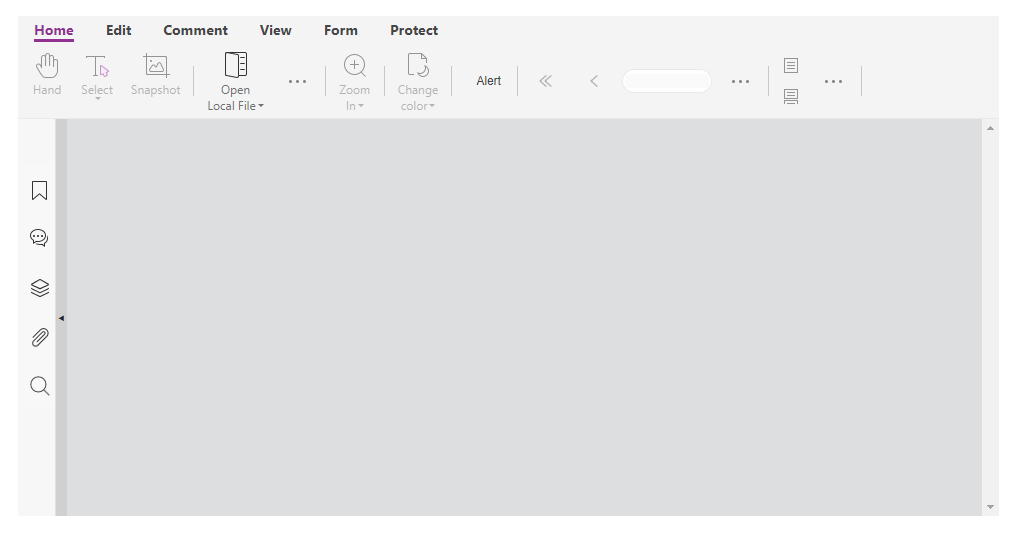
<script>
    var libPath = window.top.location.origin + '/lib';
    var pdfui = new UIExtension.PDFUI({
            viewerOptions: {
                libPath: libPath,
                jr: {
                    licenseSN: licenseSN,
                    licenseKey: licenseKey
                }
            },
            renderTo: document.body,
            addons: [
                libPath + '/uix-addons/print'
            ]
    });
    pdfui.getComponentByName('home-tab-group-change-color')
    .then(component => {
        // after this component, insert a new group component.
        component.after(`
            <group>
                <xbutton name="alert-btn" class="fv__ui-toolbar-show-text-button">Alert</xbutton>
            </group>
        `, [{
            target: 'alert-btn',
            config: {
                callback: function() {
                    alert('Hello world')
                }
            }
        }])
    })
</script>
The APIs that support inserting templates are as follows:
Component
#after(component|template, fragments)
#before(component|template, fragments)
ContainerComponent
#append(component|template, fragments)
#prepend(component|template, fragments)
#insert(component|template, index, fragments)
For more information about these APIs, please refer to the API Reference: Component and ContainerComponent.
Insert the layout template when initializing
Please refer to UI Fragments.
UI Fragments
Fragments are a set of UI snippets, which can be used to insert, delete, or modify the components in UI template. It is suitable to facilitate a small amount of UI customization based on built-in templates.
If you need a lot of custom layout and device adaptation, please refer to the methods described in Appearance and layout template.
simple example
The following code will use fragments configuration to remove the comment-tab component from the mobile and desktop/tablet layouts. Click run to run the example, and you can use the device mode of Chrome DevTool to simulate the running effect of mobile/tablet.

<script>
    var CustomAppearance= UIExtension.appearances.AdaptiveAppearance.extend({
        getDefaultFragments: function() {
            var isMobile = PDFViewCtrl.DeviceInfo.isMobile;
            if(isMobile) {
                // Fragment configuration for mobile devices.
                return [{
                    target: 'comment-tab',
                    action: 'remove'
                },{
                    target: 'comment-tab-li',
                    action: 'remove'
                }, {
                    target: 'comment-tab-body',
                    action: 'remove'
                }];
            } else {
                // Fragment configuration for desktop/tablet devices.
                return [{
                    target: 'comment-tab',
                    action: 'remove'
                }, {
                    target: 'fv--comment-tab-paddle',
                    action: 'remove'
                }, {
                    target: 'hand-tool',
                    config: {
                        callback: {
                            around: function(callback, args) {
                                try{
                                    console.info('before callback');
                                    var ret;
                                    if(callback instanceof UIExtension.Controller) {
                                        ret = callback.handle(...args);
                                    } else {
                                        ret = callback.apply(this, args);
                                    }
                                    console.info('after callback');
                                    return ret;
                                }catch(e) {
                                    console.error(e, 'an error occurred');
                                } finally {
                                    console.info('');
                                }
                            }
                        }
                    },
                }];
            }
        }
    });
    var libPath = window.top.location.origin + '/lib';

    var pdfui = new UIExtension.PDFUI({
            viewerOptions: {
                libPath: libPath,
                jr: {
                    licenseSN: licenseSN,
                    licenseKey: licenseKey
                }
            },
            renderTo: document.body,
            // Different appearances are available depending on the device type.
            appearance: CustomAppearance,
            addons: []
    });
</script>
The description of the Fragment configuration parameters
target: The name of the control, and each name is unique.
action: Indicates the action mode of the fragment snippets. The default action mode is UIExtension.UIConsts.FRAGMENT_ACTION.EXT. The specifics are as follows:
UIExtension.UIConsts.FRAGMENT_ACTION.EXT: Extend the target control.
UIExtension.UIConsts.FRAGMENT_ACTION.BEFORE: Insert a new control before the target control.
UIExtension.UIConsts.FRAGMENT_ACTION.AFTER: Insert a new control after the target control.
UIExtension.UIConsts.FRAGMENT_ACTION.APPEND: Insert a new control into the target control (the target control must be a container).
UIExtension.UIConsts.FRAGMENT_ACTION.FILL: Empty the child space of the target control and fill with a new control. Make sure that the target control must be a container.
UIExtension.UIConsts.FRAGMENT_ACTION.REPLACE: Replace the target control with a new control.
UIExtension.UIConsts.FRAGMENT_ACTION.REMOVE: Delete the target control.
template: The template of the control. The content is in XML format and action is BEFORE/AFTER/APPEND/FILL/REPLACE.
config: Control configuration object. It is invalid when action is REMOVE.
config.target: The name of the control in the above template. It is only required when action is BEFORE/AFTER/APPEND/FILL/REPLACE.
config.attrs: Set the html property of the control.
config.callback: The business logic implementation of the control. There are three ways to implement it:
function: The events of control will call this function, and override the built-in callbacks. The basic components that support function are (xbutton, dropdown-button, context-menu-item). If you want to add functionalities based on the built-in callbacks, you can use the second method.
controller class: Controller class can listen for components lifecycle and handle more component events:
{


    target: 'hand-tool',


    config: {


        callback: class extends UIExtension.Controller {


            mounted() {


                super.mounted();


                this.component.element.addEventListener('hover', e => {


                    console.info('mouse over', this.component)


                })


            }


            handle() {


                console.info('hand-tool clicked')


            }


        }


    }


}
decorator object: it contains a series of function hooks for blocking the execution of the controller handle method, including before, after, thrown, and around.
{


    target: 'hand-tool',


    config: {


        callback: {


            before: function() {


                // The function executed before calling the handle method of controller. It can receive all parameters of the handle method.


            },


            after: function(returnValue) {


               // The function executed after calling the handle method of controller. It can receive the return value and parameters of the handle function.


            },


            thrown: function(error) {


                // The function executed when the handle method of controller throws an exception. It can receive the exception object and parameters.


            },


            around: function(callback, args) {


                // It can receive the references and parameters of controller's handle method. Inside the around callback, you can execute code before/after running the handle function, or in the catch exception block. It also can decide whether to execute the handle method.


                try{


                    console.info('before callback');


                    var ret;


                    if(callback instanceof UIExtension.Controller) {


                        ret = callback.handle(...args);


                    } else {


                        ret = callback.apply(this, args);


                    }


                    console.info('after callback');


                    return ret;


                }catch(e) {


                    console.error(e, 'an error occurred');


                } finally {


                    console.info('');


                }


            }


        }


    }


}
Note
It is recommended that only use fragment for UI fine-tuning. If you want to substantially modify the built-in layout, please refer to the methods described in Appearance and layout template.
Component Selector
UIExtension provides a css-selector like syntax to make easier to search components. It’s usually used to configure the target property of fragments and component search.
Syntax
| selector name | example | description |
| name selector | ‘componentName’, ‘component_name’,’component-name’, ‘component-name1’, ‘1component’ | component name selectors can only include single-letter, number, underscore or minus character |
| type selector | ‘@div’,’@dropdown-menu’, ‘@print:print-dialog’ | component type means the tag name defined in layout template, a type selector should start with @ character and single-letter, number, underscore or minus. Sometime including the component module name separated with colon character. |
| star selector | ‘*’ | Selects all components |
| children selector | ‘selector1>selector2’ | Selects all components which match selector2 where the parent is selector1 |
| descendants | ‘selector1 selector2’ | Selects all selector2 components inside selector1 |
| attribute selector | [attr=value] | Selects all components with property or attribute name of attr whose value equals to value |
| attribute selector | [attr^=value] | Selects all components with property or attribute name of attr whose value begins with value |
| attribute selector | [attr$=value] | Selects all components with property or attribute name of attr whose value ends with value |
| attribute selector | [attr*=value] | Selects all components with property or attribute name of attr whose value contains with value |
| attribute selector | [attr!=value] | Selects all components with property or attribute name of attr whose value not equals to value |
| method selector | selector1::childAt(index) | Selects all components that are all the child at index of their parents selected by selector1 |
| method selector | selector1::parent() | Selects all components that are all the parent component of their children selected by selector1 |
| method selector | selector1::allAfter() | Selects all components of the same level that after the component set selected by selector1 |
| method selector | selector1::allBefore() | Selects all components of the same level that before the component set selected by selector1 |
| index-related selector | selector1::eq(index) | Selects the component by index value in components set selected by selector1 |
| index-related selector | selector1::last() | Selects the last one component of the components set selected by selector1 |
| index-related selector | selector1::first() | Selects the first one component of the components set selected by selector1, It’s equivalent to selector1:eq(0) |
Examples
<html>


</html>


<script>


    UIExtension.PDFUI.module('custom',[])


        .controller('customController', {


            handle: function() {


                const root = this.component.getRoot();


                const contextmenuItems = root.querySelectorAll('fv--page-contextmenu>@contextmenu-item');


                contextmenuItems.forEach(function(contextmenu) {


                    contextmenu.element.style.cssText += 'color: red';


                })


            }


        })


    var CustomRibbonAppearance = UIExtension.appearances.RibbonAppearance.extend({


        getDefaultFragments() {


            // remove the export comment dropdown menu!


            return [{


                target: 'home-tab-group-hand::childAt(0)',


                action: 'after',


                template: `<xbutton class="fv__ui-toolbar-show-text-button">Click me!</xbutton>`


            },{


                target: 'commentlist-export-comment::parent()',


                action: 'remove'


            }];


        }


    });


    var libPath = window.top.location.origin + '/lib';


    var pdfui = new UIExtension.PDFUI({


            viewerOptions: {


                libPath: libPath,


                jr: {


                    licenseSN: licenseSN,


                    licenseKey: licenseKey


                }


            },


            renderTo: document.body,


            appearance: CustomRibbonAppearance,


            addons: []


    });


</script>

I18n
Custom resources
Please refer to this page.
Usage
<text> component
<text> is a component used to display text. It supports i18n entries. On the DOM tree, it does not create a new HTML Element, but a text node and inserts it into the DOM tree. The font style needs to be enclosed outside Other tags are set through CSS.
<html>


    <template id="layout-template">


        <webpdf>


            <div>


                <span class="span-with-text-component">


                    <!-- The text "inline text" will be displayed -->


                    <text>inline text</text>


                </span>


                <span class="span-with-text-component">


                    <!-- The text "Home" will be displayed -->


                    <text>toolbar.tabs.home.title</text>


                </span>


            </div>


            <div class="fv__ui-body">


                <viewer></viewer>


            </div>


        </webpdf>


    </template>


</html>


<style>


    .span-with-text-component {


        color: red;


        font-size: 18px;


        font-style: bold;


    }


</style>


<script>


var CustomAppearance = UIExtension.appearances.Appearance.extend({


    getLayoutTemplate: function() {


        return document.getElementById('layout-template').innerHTML;


    },


    disableAll: function(){}


});


    var libPath = window.top.location.origin + '/lib';


    var pdfui = new UIExtension.PDFUI({


            viewerOptions: {


                libPath: libPath,


                jr: {


                    licenseSN: licenseSN,


                    licenseKey: licenseKey


                }


            },


            renderTo: document.body,


            appearance: CustomAppearance,


            addons: []


    });


</script>
data-i18n attribute
data-i18n attribute is another way to show texts in a HTML element, difference from <text> component, data-i18n will cover all children and replace to the text.
<html>


    <template id="layout-template">


        <webpdf>


            <div>


                <!-- The text "inline text" will be displayed -->


                <span class="span-with-text-component" data-i18n="inline text"> </span>


                <!-- The text "Home" will be displayed -->


                <span class="span-with-text-component" data-i18n="toolbar.tabs.home.title"> </span>


            </div>


            <div class="fv__ui-body">


                <viewer></viewer>


            </div>


        </webpdf>


    </template>


</html>


<style>


    .span-with-text-component {


        color: red;


        font-size: 18px;


        font-style: bold;


        padding: 0 1em;


    }


</style>


<script>


var CustomAppearance = UIExtension.appearances.Appearance.extend({


    getLayoutTemplate: function() {


        return document.getElementById('layout-template').innerHTML;


    },


    disableAll: function(){}


});


    var libPath = window.top.location.origin + '/lib';


    var pdfui = new UIExtension.PDFUI({


            viewerOptions: {


                libPath: libPath,


                jr: {


                    licenseSN: licenseSN,


                    licenseKey: licenseKey


                }


            },


            renderTo: document.body,


            appearance: CustomAppearance,


            addons: []


    });


</script>
components supporting

<html>
    <template id="layout-template">
        <webpdf>
            <div>
                <div>
                    <!-- tab component example -->
                    <gtab group="example-tab" body="tab-body-1">toolbar.tabs.home.title</gtab>
                    <gtab group="example-tab" body="tab-body-2">toolbar.tabs.edit.title</gtab>
                    <gtab group="example-tab" body="tab-body-3">toolbar.tabs.comment.title</gtab>
                </div>
                <div>
                    <div name="tab-body-1" class="button-group">
                        <!-- The text "OK" will be displayed -->
                        <xbutton>dialog.ok</xbutton>
                        <xbutton text="dialog.ok"></xbutton>
                        <file-selector>dialog.ok</file-selector>
                        <file-selector text="dialog.ok"></file-selector>
                        <dropdown text="dialog.ok"> </dropdown>
                    </div>
                    <div name="tab-body-2"></div>
                    <div name="tab-body-3"></div>
                </div>
            </div>
            <div class="fv__ui-body">
                <viewer></viewer>
            </div>
        </webpdf>
    </template>
</html>
<style>
    .span-with-text-component {
        color: red;
        font-size: 18px;
        font-style: bold;
        padding: 0 1em;
    }
    .button-group {
        display: flex;
    }
    .button-group .fv__ui-button-text {
        width: 3em;
        text-align: center;
    }
</style>
<script>
    var CustomAppearance = UIExtension.appearances.Appearance.extend({
        getLayoutTemplate: function() {
            return document.getElementById('layout-template').innerHTML;
        },
        disableAll: function() {
            //
        }
    });
    var libPath = window.top.location.origin + '/lib';
    var pdfui = new UIExtension.PDFUI({
            viewerOptions: {
                libPath: libPath,
                jr: {
                    licenseSN: licenseSN,
                    licenseKey: licenseKey
                }
            },
            renderTo: document.body,
            appearance: CustomAppearance,
            addons: []
    });
</script>
Switch current language via API

<html></html>


<style>


    .span-with-text-component {


        color: red;


        font-size: 18px;


        font-style: bold;


        padding: 0 1em;


    }


</style>


<script>


    UIExtension.PDFUI.module('custom', [])


        .controller('SwitchLanguageController', {


            mounted: function() {


                this.updateButtonText();


            },


            updateButtonText: function() {


                const pdfui = this.getPDFUI();


                switch(pdfui.currentLanguage || navigator.language) {


                    case 'en':


                    case 'en-US':


                        this.component.setText('Swith to Chinese');


                        break;


                    case 'zh':


                    case 'zh-CN':


                        this.component.setText('切换为英文');


                        break;


                }


            },


            handle: function() {


                const pdfui = this.getPDFUI();


                switch(pdfui.currentLanguage) {


                    case 'en':


                    case 'en-US':


                        pdfui.changeLanguage('zh-CN').then(() => {


                            this.updateButtonText();


                        });


                        break;


                    case 'zh':


                    case 'zh-CN':


                        pdfui.changeLanguage('en-US').then(() => {


                            this.updateButtonText();


                        });


                        break;


                }


            }


        });


    var CustomAppearance = UIExtension.appearances.AdaptiveAppearance.extend({


        getDefaultFragments: function() {


            return [{


                target: 'home-tab-group-hand',


                action: 'append',


                template: '<xbutton class="fv__ui-toolbar-show-text-button" @controller="custom:SwitchLanguageController"></xbutton>'


            }];


        }


    });


    var libPath = window.top.location.origin + '/lib';


    var pdfui = new UIExtension.PDFUI({


            viewerOptions: {


                libPath: libPath,


                jr: {


                    licenseSN: licenseSN,


                    licenseKey: licenseKey


                }


            },


            renderTo: document.body,


            appearance: CustomAppearance,


            addons: []


    });


</script>
Dark mode
The file “/lib/UIExtension.dark-variable.css” defines the style variables involved in the dark mode. To switch to the dark mode, you need to load both “/lib/UIExtension.css” and “/lib/UIExtension.dark-variable.css” files and then reference the style variables defined in “/lib/UIExtension.dark-variable.css” within “/lib/UIExtension.css” to achieve the desired effect. The specific steps are as follows:
Add /lib/UIExtension.css to the <head> tag of the HTML page:
<link rel="stylesheet" type="text/css" href="./lib/UIExtension.css">
Add /lib/UIExtension.dark-variable.css to the <head> tag of the HTML page:
<link id="dark-variable-css" rel="stylesheet" type="text/css" href="./lib/UIExtension.dark-variable.css">
Define a method for switching between style modes by changing the “rel” attribute value of the link tag to enable or disable the referenced styles in the browser.
function toggleDarkTheme () {
    let eCssLink = document.getElementById('dark-variable-css');
    let rel = eCssLink.getAttribute('rel');
    let STYLESHEET = 'stylesheet';
    eCssLink.setAttribute('rel', rel === STYLESHEET ? STYLESHEET + '-template' : STYLESHEET)
}
Note: There are many methods for switching between style modes. Simply referencing the style variables defined in the /lib/UIExtension.dark-variable.css file will enable dark mode. If not referenced, the original style mode will be maintained.
Create a Component
This section introduces how to create a custom component through the capabilities provided by UIExtension, and uses the implementation of a Counter functionality as an example to explain the usage of UIExtension components.
Basic Structure of a Component
A basic component typically consists of the following parts:
Layout template: This defines the structure and layout of the component’s view. The template syntax can be referred to the layout template.
Styles: The component’s styles can be added using the style attribute or the class attribute, similar to HTML. Styles added using the class attribute require a separate css file.
Scripts: This contains the logic of the component. UIExtension components need to implement a new component class through integration to handle the behavior and interaction of the component.
Module: If a component needs to be referenced by other components, it must be assigned a name and registered in a module. For more information about modularization, please refer to Modular.
Here is an example of a basic component structure:
/* my-component.css */
.my-counter {
    display: flex;
}

// my-component.js

const { SeniorComponentFactory } = UIExtension;
class MyComponent extends SeniorComponentFactory.createSuperClass({
    template: `
        <div class="my-counter" @var.my_counter="$component">
            <button class="my-btn" @on.click="my_counter.increment()">+</button>
            <div class="my-viewer">@{my_counter.count}</div>
            <button class="my-btn" @on.click="my_counter.decrement()">-</button>
        </div>
    `
}) {
    static getName() {}
    init() {
        super.init();
        this.count = 0;
    }
    increment() {
        this.count ++;
        this.digest(); // After data change, update must be triggered manually
    }
    decrement() {
        this.count --;
        this.digest(); // After data change, update must be triggered manually
    }
}
modular.module('custom', []).registerComponent(MyComponent);
Create a Simple Component
Based on the above description of the basic structure of a component, let’s now create a component that displays a clock. Click the run button below to start the example:

<style>
    .my-clock {
        font-size: 32px;
        border: 1px solid #ddd;
        padding: .3em;
    }
</style>
<html>
    <template id="layout-template-container">
        <webpdf>
            <custom:clock></custom:clock>
            <div class="fv__ui-body">
                <viewer @touch-to-scroll></viewer>
            </div>
        </webpdf>
    </template>
</html>
<script>
    const { PDFUI, SeniorComponentFactory, modular, appearances: { Appearance } } = UIExtension;
    class ClockComponent extends SeniorComponentFactory.createSuperClass({
        template: `
            <div class="my-clock" @var.clock="$component">
                @{clock.currentTime|timeformat('yyyy-MM-DD HH:mm:ss')}
            </div>
        `
    }) {
        static getName() {
            return 'clock'
        }
        init() {
            super.init();
            this.currentTime = new Date();
        }
        mounted() {
            super.mounted();
            const timerId = setInterval(() => {
                this.currentTime = new Date();
                this.digest();
            }, 1000);
            this.addDestroyHook(() => {
                // This step ensures that the timer is stopped once the component is destroyed.
                clearInterval(timerId);
            });
        }
    }
    modular.module('custom', []).registerComponent(ClockComponent);

    const CustomAppearance = Appearance.extend({
        getLayoutTemplate: function() {
            return document.getElementById('layout-template-container').innerHTML;
        }
    });
    const libPath = window.top.location.origin + '/lib';
    const pdfui = new PDFUI({
            viewerOptions: {
                libPath: libPath,
                jr: {
                    licenseSN: licenseSN,
                    licenseKey: licenseKey
                },
            },
            renderTo: document.body,
            appearance: CustomAppearance
        });
</script>
Running the example above, you will see a clock component that updates in real-time. This is just a simple component, but it demonstrates how to create and use a component, initialize and run a timer in the init and mounted lifecycle of the component, and how to reference component object properties in the component template. You can further extend and customize this example based on your needs.
Event Triggering and Binding in Components
Components can not only display data, but also interact with users. Parent components can also interact with child components by listening to their events. With UIExtension, we can implement event triggering and listening to achieve interactive functionality.
Event Triggering
To trigger an event in a component, we can use the trigger method. This method accepts an event name (required) and multiple data to be transmitted (optional). Here is an example:
class DidaComponent extends SeniorComponentFactory.createSuperClass({
    template: `
        <div></div>
    `
}) {
    static getName() {
        return 'dida'
    }
    mounted() {
        super.mounted();
        const execute = () => {
            if(this.isDestroyed) {
                return;
            }
            this.trigger('dida', performance.now());
            requestIdleCallback(execute);
        };
        requestIdleCallback(execute);
    }
}
modular.module('custom', []).registerComponent(DidaComponent);
In this example, the <dida></dida> component triggers a dida event and passes a timestamp whenever it is idle.
Event Listening
There are two ways to listen to the events in a component. One is to use the @on.event-name directive, and the other is to use the Component#on interface. The following example will continue to use the dida component mentioned above to demonstrate these two usages:
class DidaBoxComponent extends SeniorComponentFactory.createSuperClass({
    template: `<div @var.box="$component">
        <custom:dida name="dida" @on.dida="box.onDidaDirectiveEvent($args[0])"></custom:dida>
    </div>
    `
}) {
    static getName() {
        return 'dida-box';
    }
    onDidaDirectiveEvent(time) {
        console.log('Event listened through directive was triggered', time)
    }
    mounted() {
        super.mounted();
        this.getComponentByName('dida').on('dida', time => {
            console.log('Event listened through "on" interface was triggered', time)
        })
    }
}
Native DOM Event Listening
The @on directive can not only listen to custom events triggered by components, but also listen to native DOM events. For specific usage, please refer to the @on section.
Component Lifecycle
The lifecycle of a UIExtension component is relatively simple, with three commonly used methods: init, mounted, and destroy. As shown in the examples above, you can simply override these methods in the parent class. The init method is called when the component is constructed and is usually used to initialize some properties. The mounted method is called after the component is inserted into the DOM tree, where you can perform some DOM operations on itself or its child components. The destroy method requires adding tasks to be destroyed using addDestroyHook. These tasks are usually used to eliminate side effects, such as event deregistration and clearing timers. You can refer to the ClockComponent mentioned in the section Creating a Simple Component.
Component Communication
We know that child components can communicate with parent components by triggering events, while parent components can communicate with child components by calling their methods. But how can components communicate with each other if they are not parent-child? The UIExtension framework also supports simple injection functionality, which allows singleton objects to be injected and enables communication between any components. The implementation of injection is very simple. Here is an example of a counter functionality:
First, create a CounterService class. The role of CounterService is to keep track of a count property that can be shared by any component:
class CounterService {
    constructor() {
        this.count = 0;
    }
}
Next, create two components: one for modifying the count and one for displaying the count. Both of these components inject the CounterService:
class ModifyButtonComponent extends SeniorComponentFactory.createSuperClass({
    template: `<button @on.click="$component.onClick()"></button>`
}) {
    static getName() {
        return 'modify';
    }
    static inject() {
        return {
            service: CounterService
        };
    }
    createDOMElement() {
        return document.createElement('button');
    }
    init() {
        this.step = 0;
    }
    onClick() {
        this.service.count += this.step;
        this.digest();
    }
    setStep(step) {
        this.step = step;
    }
}
class ShowCountComponent extends SeniorComponentFactory.createSuperClass({
    template: `<span style="border: 1px solid #ddd;padding: .5em 1em; display: inline-block;">@{$component.service.count}</span>`
}) {
    static getName() {
        return 'show-count';
    }
    static inject() {
        return {
            service: CounterService
        };
    }
}
Let’s take a look at the final result:

<style>
    .my-clock {
        font-size: 32px;
        border: 1px solid #ddd;
        padding: .3em;
    }
</style>
<html>
    <template id="layout-template-container">
        <webpdf>
            <div style="display: flex;">
                <custom:modify @setter.step="1">Increment 1</custom:modify>
                <custom:show-count></custom:show-count>
                <custom:modify @setter.step="-2">Decrement 2</custom:modify>
            </div>
            <div class="fv__ui-body">
                <viewer @touch-to-scroll></viewer>
            </div>
        </webpdf>
    </template>
</html>
<script>
    const { PDFUI, SeniorComponentFactory, modular, appearances: { Appearance } } = UIExtension;
    class CounterService {
        constructor() {
            this.count = 0;
        }
    }
    class ModifyButtonComponent extends SeniorComponentFactory.createSuperClass({
        template: `<button @on.click="$component.onClick()"></button>`
    }) {
        static getName() {
            return 'modify';
        }
        static inject() {
            return {
                service: CounterService
            };
        }
        createDOMElement() {
            return document.createElement('button');
        }
        init() {
            this.step = 0;
        }
        onClick() {
            this.service.count += this.step;
            this.digest();
        }
        setStep(step) {
            this.step = step;
        }
    }
    class ShowCountComponent extends SeniorComponentFactory.createSuperClass({
        template: `<span style="border: 1px solid #ddd;padding: .5em 1em; display: inline-block;">@{$component.service.count}</span>`
    }) {
        static getName() {
            return 'show-count';
        }
        static inject() {
            return {
                service: CounterService
            };
        }
    }
    modular.module('custom', [])
        .registerComponent(ModifyButtonComponent)
        .registerComponent(ShowCountComponent)
        ;

    const CustomAppearance = Appearance.extend({
        getLayoutTemplate: function() {
            return document.getElementById('layout-template-container').innerHTML;
        },
        // To facilitate testing, you can override this method to prevent the control from being disabled when no document is open.
        disableAll() {}
    });
    const libPath = window.top.location.origin + '/lib';
    const pdfui = new PDFUI({
            viewerOptions: {
                libPath: libPath,
                jr: {
                    licenseSN: licenseSN,
                    licenseKey: licenseKey
                }
            },
            renderTo: document.body,
            appearance: CustomAppearance
    });
</script>
In the above example, the CounterService class is injected into both the ModifyButtonComponent and ShowCountComponent components. This allows the two components to access and modify the count property of the CounterService instance. The ModifyButtonComponent component increments the count when clicked, while the ShowCountComponent component displays the current count value.
By injecting the CounterService into the two components, they share the same service instance, enabling communication between them. Any changes made to the count property in one component will also be reflected in the other component.
Dependency injection is a powerful feature that enables components to communicate and share data without being tightly coupled. It promotes modularity and reusability in applications.
Components
Basic Components
XButton component
Xbutton is the UIExtension button component. It can be used to customize icon, define whether to show text, whether to disable/enable button, etc.
Code examples
Simple xbutton example:
<html>


    <template id="layout-template">


        <webpdf>


            <div>


                <xbutton>simple button(character data)</xbutton>


                <xbutton text="simple button(text property)"></xbutton>


            </div>


            <div class="fv__ui-body">


                <viewer></viewer>


            </div>


        </webpdf>


    </template>


</html>


<script>


var CustomAppearance = UIExtension.appearances.Appearance.extend({


    getLayoutTemplate: function() {


        return document.getElementById('layout-template').innerHTML;


    },


    disableAll: function(){}


});


    var libPath = window.top.location.origin + '/lib';


    var pdfui = new UIExtension.PDFUI({


            viewerOptions: {


                libPath: libPath,


                jr: {


                    licenseSN: licenseSN,


                    licenseKey: licenseKey


                }


            },


            renderTo: document.body,


            appearance: CustomAppearance,


            addons: []


    });


</script>
Force to show text in built-in toolbar component
<html>


    <template id="layout-template">


        <webpdf>


            <toolbar>


                <xbutton class="fv__ui-toolbar-show-text-button">Force to show text</xbutton>


                <xbutton icon-class="fv__icon-toolbar-hand">Text will be hidden</xbutton>


            </toolbar>


            <viewer></viewer>


        </webpdf>


    </template>


</html>


<script>


    var CustomAppearance = UIExtension.appearances.Appearance.extend({


        getLayoutTemplate: function() {


            return document.getElementById('layout-template').innerHTML;


        },


        disableAll: function(){}


    });


    var libPath = window.top.location.origin + '/lib';


    var pdfui = new UIExtension.PDFUI({


            viewerOptions: {


                libPath: libPath,


                jr: {


                    licenseSN: licenseSN,


                    licenseKey: licenseKey


                }


            },


            renderTo: document.body,


            appearance: CustomAppearance,


            addons: []


    });


</script>
Customize icon-class
<html>


    <template id="layout-template">


        <webpdf>


            <div>


                <xbutton icon-class="fv__icon-toolbar-hand">button with icon</xbutton>


                <xbutton icon-class="custom-icon-css-class">button with custom icon</xbutton>


            </div>


            <viewer></viewer>


        </webpdf>


    </template>


</html>


<script>


    var CustomAppearance = UIExtension.appearances.Appearance.extend({


        getLayoutTemplate: function() {


            return document.getElementById('layout-template').innerHTML;


        },


        disableAll: function(){}


    });


    var libPath = window.top.location.origin + '/lib';


    var pdfui = new UIExtension.PDFUI({


            viewerOptions: {


                libPath: libPath,


                jr: {


                    licenseSN: licenseSN,


                    licenseKey: licenseKey


                }


            },


            renderTo: document.body,


            appearance: CustomAppearance,


            addons: []


    });


</script>


<style>


    .custom-icon-css-class {


        background-repeat: no-repeat;


        background-position: center;


        background-image: url(data:image/png;charset=utf-8;base64,iVBORw0KGgoAAAANSUhEUgAAABgAAAAYCAYAAADgdz34AAAAGXRFWHRTb2Z0d2FyZQBBZG9iZSBJbWFnZVJlYWR5ccllPAAAA3ZpVFh0WE1MOmNvbS5hZG9iZS54bXAAAAAAADw/eHBhY2tldCBiZWdpbj0i77u/IiBpZD0iVzVNME1wQ2VoaUh6cmVTek5UY3prYzlkIj8+IDx4OnhtcG1ldGEgeG1sbnM6eD0iYWRvYmU6bnM6bWV0YS8iIHg6eG1wdGs9IkFkb2JlIFhNUCBDb3JlIDUuNi1jMTQyIDc5LjE2MDkyNCwgMjAxNy8wNy8xMy0wMTowNjozOSAgICAgICAgIj4gPHJkZjpSREYgeG1sbnM6cmRmPSJodHRwOi8vd3d3LnczLm9yZy8xOTk5LzAyLzIyLXJkZi1zeW50YXgtbnMjIj4gPHJkZjpEZXNjcmlwdGlvbiByZGY6YWJvdXQ9IiIgeG1sbnM6eG1wTU09Imh0dHA6Ly9ucy5hZG9iZS5jb20veGFwLzEuMC9tbS8iIHhtbG5zOnN0UmVmPSJodHRwOi8vbnMuYWRvYmUuY29tL3hhcC8xLjAvc1R5cGUvUmVzb3VyY2VSZWYjIiB4bWxuczp4bXA9Imh0dHA6Ly9ucy5hZG9iZS5jb20veGFwLzEuMC8iIHhtcE1NOk9yaWdpbmFsRG9jdW1lbnRJRD0ieG1wLmRpZDplMzAwMTU1Yi04ODI1LTIwNDItYTIwNy0yNmQwZTVhNmJhMTUiIHhtcE1NOkRvY3VtZW50SUQ9InhtcC5kaWQ6Qjk0NjgyREIyM0E4MTFFOTgxREFDQTNEMjBCNDM5NTgiIHhtcE1NOkluc3RhbmNlSUQ9InhtcC5paWQ6Qjk0NjgyREEyM0E4MTFFOTgxREFDQTNEMjBCNDM5NTgiIHhtcDpDcmVhdG9yVG9vbD0iQWRvYmUgUGhvdG9zaG9wIENDIDIwMTggKFdpbmRvd3MpIj4gPHhtcE1NOkRlcml2ZWRGcm9tIHN0UmVmOmluc3RhbmNlSUQ9InhtcC5paWQ6ZWIyZTI2YTItMTZlMy1hZTRmLTg1NTUtOTJmNmEyNGEyMDg1IiBzdFJlZjpkb2N1bWVudElEPSJ4bXAuZGlkOmUzMDAxNTViLTg4MjUtMjA0Mi1hMjA3LTI2ZDBlNWE2YmExNSIvPiA8L3JkZjpEZXNjcmlwdGlvbj4gPC9yZGY6UkRGPiA8L3g6eG1wbWV0YT4gPD94cGFja2V0IGVuZD0iciI/PjS81+AAAAHoSURBVHjavFa9SwJhGH8vWjRc+kLFpRIKUoMMKrcKobGprHBpa6m9RRz6AxqiqSmij6WtQaHRK7ioPIOmJjGxoiXOLfs913uCZ3f3StoDP54773me393z9SrVajXWSeliHZa2EWwe79W41mFIt5VDOp0m8hVgFZgBBoBX4Bo4Ac5SqdSXE7H0Ww0QfBjqPBQKRcPhMAsEAsztdjNN01ixWGSqqrJCoXALm2WQPBtfcLC+LTkS8OByPB4fjMVilm+Wy+VYNput4HKWSIwUGWKQNRDwtNwg+JRdcBOJgstpq3SZi5xASoSCk5Ad2ZOfaBclI5FI/Wbn4tCRhNsnRQmm/H5//eZD+3Qk8Hq9pCZECfqpW1oRl8tFqk+U4I1asRWpVquk3q2emwdNKZVKi8Fg8IddkhqmsrfHw3aXNhocyuUyqQd0YFNwdFYTwVE+n68T7K9tOX4B7HU/0RSdYkoVWZaF0kN2sL8nPyECPiyJTCZTcSKh57DT62xXZKtdNELLzNhFPp9P30VUUNSI9hC9OeXGAwwBKrDAl2FDDSSrA8e0TaPUwrxbFJ4SAg3BFTAKPALzQEWIwGaNm3/ycZIxMwkRtOPAeeFBn4Bx4LITJxqRzAF3gGY3aH8RmrjJfz/0pU7/bfkWYACxTcQvcW9G6AAAAABJRU5ErkJggg==);


    }


</style>
Disable button
<html>


    <template id="layout-template">


        <webpdf>


            <div>


                <xbutton disabled="true">disabled button</xbutton>


            </div>


            <viewer></viewer>


        </webpdf>


    </template>


</html>


<script>


    var CustomAppearance = UIExtension.appearances.Appearance.extend({


        getLayoutTemplate: function() {


            return document.getElementById('layout-template').innerHTML;


        },


        disableAll: function(){}


    });


    var libPath = window.top.location.origin + '/lib';


    var pdfui = new UIExtension.PDFUI({


            viewerOptions: {


                libPath: libPath,


                jr: {


                    licenseSN: licenseSN,


                    licenseKey: licenseKey


                }


            },


            renderTo: document.body,


            appearance: CustomAppearance,


            addons: []


    });


</script>
Click event handler

<html>


    <template id="layout-template">


        <webpdf>


            <div>


                <xbutton name="alert-btn">Click Me!</xbutton>


            </div>


            <viewer></viewer>


        </webpdf>


    </template>


</html>


<script>


    var CustomAppearance = UIExtension.appearances.Appearance.extend({


        getLayoutTemplate: function() {


            return document.getElementById('layout-template').innerHTML;


        },


        getDefaultFragments: function() {


            return [{


                target: 'alert-btn',


                config: {


                    callback: function() {


                        alert('click button!');


                    }


                }


            }];


        },


        disableAll: function(){}


    });


    var libPath = window.top.location.origin + '/lib';


    var pdfui = new UIExtension.PDFUI({


            viewerOptions: {


                libPath: libPath,


                jr: {


                    licenseSN: licenseSN,


                    licenseKey: licenseKey


                }


            },


            renderTo: document.body,


            appearance: CustomAppearance,


            addons: []


    });


</script>
Use controller to handle click event

<html>


    <template id="layout-template">


        <webpdf>


            <div>


                <xbutton name="alert-btn">Click Me!</xbutton>


            </div>


            <viewer></viewer>


        </webpdf>


    </template>


</html>


<script>


    var CustomAppearance = UIExtension.appearances.Appearance.extend({


        getLayoutTemplate: function() {


            return document.getElementById('layout-template').innerHTML;


        },


        getDefaultFragments: function() {


            return [{


                target: 'alert-btn',


                config: {


                    callback: UIExtension.controllers.Controller.extend({


                        handle: function() {


                            alert("Click button!");


                        }


                    })


                }


            }];


        },


        disableAll: function(){}


    });


    var libPath = window.top.location.origin + '/lib';


    var pdfui = new UIExtension.PDFUI({


            viewerOptions: {


                libPath: libPath,


                jr: {


                    licenseSN: licenseSN,


                    licenseKey: licenseKey


                }


            },


            renderTo: document.body,


            appearance: CustomAppearance,


            addons: []


    });


</script>
Use controller directive

<html>


    <template id="layout-template">


        <webpdf>


            <div>


                <xbutton name="alert-btn" @controller="custom-module:ClickButtonController">Click Me!</xbutton>


            </div>


            <viewer></viewer>


        </webpdf>


    </template>


</html>


<script>


    var module = UIExtension.PDFUI.module('custom-module', []);


    module.controller('ClickButtonController', {


        handle: function() {


            alert("Click button!");


        }


    });


    var CustomAppearance = UIExtension.appearances.Appearance.extend({


        getLayoutTemplate: function() {


            return document.getElementById('layout-template').innerHTML;


        },


        disableAll: function(){}


    });


    var libPath = window.top.location.origin + '/lib';


    var pdfui = new UIExtension.PDFUI({


            viewerOptions: {


                libPath: libPath,


                jr: {


                    licenseSN: licenseSN,


                    licenseKey: licenseKey


                }


            },


            renderTo: document.body,


            appearance: CustomAppearance,


            addons: []


    });


</script>
API
Xbutton object properties
| Properties | Description | Type |
| disabled | Button disabled status | boolean |
| isVisible | Button visibility status | boolean |
Methods
| Method | Description | Version |
| setText(text: String): void | Set button text. It supports I18n entry | 7.0 |
| setIconCls(cssClass: String): void | Set icon’s css-class of a button | 7.0 |
| disable(): void | Disable button. The disabled button will not respond to the click event | 7.0 |
| enable(): void | Enable button. The enabled button will respond to the click event | 7.0 |
| show(): void | Show the hidden button | 7.0 |
| hide(): void | Hide the button | 7.0 |
| destroy(): void | Destroy the button component | 7.0 |
Events
| Name | Description | Sample | Version |
| click | Click button to trigger | button.on(‘click’, () => {}) | 7.0 |
Ribbon button component
<ribbon-button> has similar functions to XButton, but comparing to XButton, ribbon Button has a top-down structure of ICONS and text, and can be used as a Dropdown toggler.
Code examples
Simple ribbon-button example:

<html>
    <template id="layout-template">
        <webpdf>
            <div>
                <ribbon-button text="simple ribbon button without icon"></ribbon-button>
            </div>
            <div class="fv__ui-body">
                <viewer></viewer>
            </div>
        </webpdf>
    </template>
</html>
<script>
var CustomAppearance = UIExtension.appearances.Appearance.extend({
    getLayoutTemplate: function() {
        return document.getElementById('layout-template').innerHTML;
    },
    disableAll: function(){}
});
    var libPath = window.top.location.origin + '/lib';
    var pdfui = new UIExtension.PDFUI({
            viewerOptions: {
                libPath: libPath,
                jr: {
                    licenseSN: licenseSN,
                    licenseKey: licenseKey
                }
            },
            renderTo: document.body,
            appearance: CustomAppearance,
            addons: []
    });
</script>
Customize icon
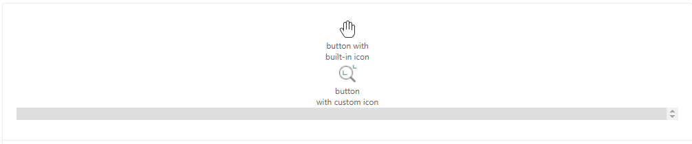
<html>
    <template id="layout-template">
        <webpdf>
            <div>
                <ribbon-button icon-class="fv__icon-toolbar-hand" text="button with built-in icon"></ribbon-button>
                <ribbon-button icon-class="custom-icon-css-class" text="button with custom icon"></ribbon-button>
            </div>
            <viewer></viewer>
        </webpdf>
    </template>
</html>
<script>
    var CustomAppearance = UIExtension.appearances.Appearance.extend({
        getLayoutTemplate: function() {
            return document.getElementById('layout-template').innerHTML;
        },
        disableAll: function(){}
    });
    var libPath = window.top.location.origin + '/lib';
    var pdfui = new UIExtension.PDFUI({
            viewerOptions: {
                libPath: libPath,
                jr: {
                    licenseSN: licenseSN,
                    licenseKey: licenseKey
                }
            },
            renderTo: document.body,
            appearance: CustomAppearance,
            addons: []
    });
</script>
<style>
    .custom-icon-css-class {
        background-repeat: no-repeat;
        background-position: center;
        background-image: url(data:image/png;charset=utf-8;base64,iVBORw0KGgoAAAANSUhEUgAAABgAAAAYCAYAAADgdz34AAAAGXRFWHRTb2Z0d2FyZQBBZG9iZSBJbWFnZVJlYWR5ccllPAAAA3ZpVFh0WE1MOmNvbS5hZG9iZS54bXAAAAAAADw/eHBhY2tldCBiZWdpbj0i77u/IiBpZD0iVzVNME1wQ2VoaUh6cmVTek5UY3prYzlkIj8+IDx4OnhtcG1ldGEgeG1sbnM6eD0iYWRvYmU6bnM6bWV0YS8iIHg6eG1wdGs9IkFkb2JlIFhNUCBDb3JlIDUuNi1jMTQyIDc5LjE2MDkyNCwgMjAxNy8wNy8xMy0wMTowNjozOSAgICAgICAgIj4gPHJkZjpSREYgeG1sbnM6cmRmPSJodHRwOi8vd3d3LnczLm9yZy8xOTk5LzAyLzIyLXJkZi1zeW50YXgtbnMjIj4gPHJkZjpEZXNjcmlwdGlvbiByZGY6YWJvdXQ9IiIgeG1sbnM6eG1wTU09Imh0dHA6Ly9ucy5hZG9iZS5jb20veGFwLzEuMC9tbS8iIHhtbG5zOnN0UmVmPSJodHRwOi8vbnMuYWRvYmUuY29tL3hhcC8xLjAvc1R5cGUvUmVzb3VyY2VSZWYjIiB4bWxuczp4bXA9Imh0dHA6Ly9ucy5hZG9iZS5jb20veGFwLzEuMC8iIHhtcE1NOk9yaWdpbmFsRG9jdW1lbnRJRD0ieG1wLmRpZDplMzAwMTU1Yi04ODI1LTIwNDItYTIwNy0yNmQwZTVhNmJhMTUiIHhtcE1NOkRvY3VtZW50SUQ9InhtcC5kaWQ6Qjk0NjgyREIyM0E4MTFFOTgxREFDQTNEMjBCNDM5NTgiIHhtcE1NOkluc3RhbmNlSUQ9InhtcC5paWQ6Qjk0NjgyREEyM0E4MTFFOTgxREFDQTNEMjBCNDM5NTgiIHhtcDpDcmVhdG9yVG9vbD0iQWRvYmUgUGhvdG9zaG9wIENDIDIwMTggKFdpbmRvd3MpIj4gPHhtcE1NOkRlcml2ZWRGcm9tIHN0UmVmOmluc3RhbmNlSUQ9InhtcC5paWQ6ZWIyZTI2YTItMTZlMy1hZTRmLTg1NTUtOTJmNmEyNGEyMDg1IiBzdFJlZjpkb2N1bWVudElEPSJ4bXAuZGlkOmUzMDAxNTViLTg4MjUtMjA0Mi1hMjA3LTI2ZDBlNWE2YmExNSIvPiA8L3JkZjpEZXNjcmlwdGlvbj4gPC9yZGY6UkRGPiA8L3g6eG1wbWV0YT4gPD94cGFja2V0IGVuZD0iciI/PjS81+AAAAHoSURBVHjavFa9SwJhGH8vWjRc+kLFpRIKUoMMKrcKobGprHBpa6m9RRz6AxqiqSmij6WtQaHRK7ioPIOmJjGxoiXOLfs913uCZ3f3StoDP54773me393z9SrVajXWSeliHZa2EWwe79W41mFIt5VDOp0m8hVgFZgBBoBX4Bo4Ac5SqdSXE7H0Ww0QfBjqPBQKRcPhMAsEAsztdjNN01ixWGSqqrJCoXALm2WQPBtfcLC+LTkS8OByPB4fjMVilm+Wy+VYNput4HKWSIwUGWKQNRDwtNwg+JRdcBOJgstpq3SZi5xASoSCk5Ad2ZOfaBclI5FI/Wbn4tCRhNsnRQmm/H5//eZD+3Qk8Hq9pCZECfqpW1oRl8tFqk+U4I1asRWpVquk3q2emwdNKZVKi8Fg8IddkhqmsrfHw3aXNhocyuUyqQd0YFNwdFYTwVE+n68T7K9tOX4B7HU/0RSdYkoVWZaF0kN2sL8nPyECPiyJTCZTcSKh57DT62xXZKtdNELLzNhFPp9P30VUUNSI9hC9OeXGAwwBKrDAl2FDDSSrA8e0TaPUwrxbFJ4SAg3BFTAKPALzQEWIwGaNm3/ycZIxMwkRtOPAeeFBn4Bx4LITJxqRzAF3gGY3aH8RmrjJfz/0pU7/bfkWYACxTcQvcW9G6AAAAABJRU5ErkJggg==);
    }
</style>
Disabled button

<html>
    <template id="layout-template">
        <webpdf>
            <div>
                <ribbon-button disabled="true" text="disabled button"></ribbon-button>
            </div>
            <viewer></viewer>
        </webpdf>
    </template>
</html>
<script>
    var CustomAppearance = UIExtension.appearances.Appearance.extend({
        getLayoutTemplate: function() {
            return document.getElementById('layout-template').innerHTML;
        },
        disableAll: function(){}
    });
    var libPath = window.top.location.origin + '/lib';
    var pdfui = new UIExtension.PDFUI({
            viewerOptions: {
                libPath: libPath,
                jr: {
                    licenseSN: licenseSN,
                    licenseKey: licenseKey
                }
            },
            renderTo: document.body,
            appearance: CustomAppearance,
            addons: []
    });
</script>
Click event handler

<html>
    <template id="layout-template">
        <webpdf>
            <div>
                <ribbon-button name="alert-btn" text="Click Me!"></ribbon-button>
            </div>
            <viewer></viewer>
        </webpdf>
    </template>
</html>
<script>
    var CustomAppearance = UIExtension.appearances.Appearance.extend({
        getLayoutTemplate: function() {
            return document.getElementById('layout-template').innerHTML;
        },
        getDefaultFragments: function() {
            return [{
                target: 'alert-btn',
                config: {
                    callback: function() {
                        alert('click button!');
                    }
                }
            }];
        },
        disableAll: function(){}
    });
    var libPath = window.top.location.origin + '/lib';
    var pdfui = new UIExtension.PDFUI({
            viewerOptions: {
                libPath: libPath,
                jr: {
                    licenseSN: licenseSN,
                    licenseKey: licenseKey
                }
            },
            renderTo: document.body,
            appearance: CustomAppearance,
            addons: []
    });
</script>
Use controller to handle click event

<html>
    <template id="layout-template">
        <webpdf>
            <div>
                <ribbon-button name="alert-btn" text="Click Me!"></ribbon-button>
            </div>
            <viewer></viewer>
        </webpdf>
    </template>
</html>
<script>
    var CustomAppearance = UIExtension.appearances.Appearance.extend({
        getLayoutTemplate: function() {
            return document.getElementById('layout-template').innerHTML;
        },
        getDefaultFragments: function() {
            return [{
                target: 'alert-btn',
                config: {
                    callback: UIExtension.controllers.Controller.extend({
                        handle: function() {
                            alert("Click button!");
                        }
                    })
                }
            }];
        },
        disableAll: function(){}
    });
    var libPath = window.top.location.origin + '/lib';
    var pdfui = new UIExtension.PDFUI({
            viewerOptions: {
                libPath: libPath,
                jr: {
                    licenseSN: licenseSN,
                    licenseKey: licenseKey
                }
            },
            renderTo: document.body,
            appearance: CustomAppearance,
            addons: []
    });
</script>
Use controller directive

<html>
    <template id="layout-template">
        <webpdf>
            <div>
                <ribbon-button name="alert-btn" text="Click Me!" @controller="custom-module:ClickButtonController"></ribbon-button>
            </div>
            <viewer></viewer>
        </webpdf>
    </template>
</html>
<script>
    var module = UIExtension.PDFUI.module('custom-module', []);
    module.controller('ClickButtonController', {
        handle: function() {
            alert("Click button!");
        }
    });

    var CustomAppearance = UIExtension.appearances.Appearance.extend({
        getLayoutTemplate: function() {
            return document.getElementById('layout-template').innerHTML;
        },
        disableAll: function(){}
    });

    var libPath = window.top.location.origin + '/lib';
    var pdfui = new UIExtension.PDFUI({
            viewerOptions: {
                libPath: libPath,
                jr: {
                    licenseSN: licenseSN,
                    licenseKey: licenseKey
                }
            },
            renderTo: document.body,
            appearance: CustomAppearance,
            addons: []
    });
</script>
Nested dropdown component

<html>
    <template id="layout-template">
        <webpdf>
            <div>
                <ribbon-button icon-class="fx-icon-ribbon_view_read-32" text="read-aloud:read-aloud.read.text" class="inline">
                    <dropdown
                        icon-class="fv__icon-read-aloud-read"
                        separate="false"
                    >
                        <xbutton icon-class="fx-icon-ribbon_view_read-16" text="read-aloud:read-aloud.read.text"></xbutton>
                        <xbutton icon-class="fx-icon-ribbon_view_read_rate-32" text="read-aloud:read-aloud.rate.text"></xbutton>
                        <xbutton icon-class="fx-icon-ribbon_view_read-32" text="read-aloud:read-aloud.volume.text"></xbutton>
                        <xbutton icon-class="fx-icon-ribbon_view_read_pause-16" text="read-aloud:read-aloud.pause.text"></xbutton>
                    </dropdown>
                </ribbon-button>
            </div>
            <viewer></viewer>
        </webpdf>
    </template>
</html>
<script>
    var CustomAppearance = UIExtension.appearances.Appearance.extend({
        getLayoutTemplate: function() {
            return document.getElementById('layout-template').innerHTML;
        },
        disableAll: function(){}
    });
    var libPath = window.top.location.origin + '/lib';
    var pdfui = new UIExtension.PDFUI({
            viewerOptions: {
                libPath: libPath,
                jr: {
                    licenseSN: licenseSN,
                    licenseKey: licenseKey
                }
            },
            renderTo: document.body,
            appearance: CustomAppearance,
            addons: [
                '/lib/uix-addons/read-aloud'
            ]
    });
</script>
API
Ribbon button properties
| Properties | Description | Type |
| disabled | Button disabled status | boolean |
| isVisible | Button visibility status | boolean |
Methods
| Method | Description | Version |
| setText(text: String): void | Set button text. It supports I18n entry | 8.2.0 |
| setIconCls(cssClass: String): void | Set icon’s css-class of a button | 8.2.0 |
| disable(): void | Disable button. The disabled button will not respond to the click event | 8.2.0 |
| enable(): void | Enable button. The enabled button will respond to the click event | 8.2.0 |
| show(): void | Show the hidden button | 8.2.0 |
| hide(): void | Hide the button | 8.2.0 |
| destroy(): void | Destroy the button component | 8.2.0 |
Events
| Name | Description | Sample | Version |
| click | Click button to trigger | rbutton.on(‘click’, () => {}) | 8.2.0 |
File selector
The usage of File selector is almost same as button. It inherits from the XbuttonComponent and supports the accept property and the change event.
Code example
<html>


    <template id="layout-template">


        <webpdf>


            <div class="file-selector-container">


                <!-- accepts all type of files -->


                <file-selector accept="*.*">Select all type of file</file-selector>


                <!-- accepts PDF files -->


                <file-selector accept=".pdf">Select PDF</file-selector>


                <!-- accepts image files -->


                <file-selector accept=".png;.jpg;.bmp" @controller="custom:SelectSingleFileController">Select Image</file-selector>


                <!-- select multiple files -->


                <file-selector @controller="custom:SelectMultipleFileController" accept="image/*" multiple>Select multiple files</file-selector>


                <!-- use in dropdown -->


                <dropdown style="width: auto" text="dropdown with file selector" separate="false">


                    <file-selector accept=".xfdf;.fdf" text="import FDF/XFDF" icon-class="fv__icon-sidebar-import-comment"></file-selector>


                </dropdown>


            </div>


            <div class="fv__ui-body">


                <viewer></viewer>


            </div>


        </webpdf>


    </template>


</html>


<style>


    .file-selector-container {


        display: flex;


        flex-wrap: wrap;


    }


    .file-selector-container > .fv__ui-fileselector {


        flex: 1 1 auto;


    }


</style>


<script>


    UIExtension.PDFUI.module('custom', [])


        .controller('SelectSingleFileController', {


            handle: function(file) {


                alert('Selected file: ' + file.name);


            }


        })


        .controller('SelectMultipleFileController', {


            handle: function(files) {


                alert('Selected files: \r\n' + files.map(it => it.name));


            }


        })


    var CustomAppearance = UIExtension.appearances.Appearance.extend({


        getLayoutTemplate: function() {


            return document.getElementById('layout-template').innerHTML;


        },


        disableAll: function(){}


    });


    var libPath = window.top.location.origin + '/lib';


    var pdfui = new UIExtension.PDFUI({


            viewerOptions: {


                libPath: libPath,


                jr: {


                    licenseSN: licenseSN,


                    licenseKey: licenseKey


                }


            },


            renderTo: document.body,


            appearance: CustomAppearance,


            addons: []


    });


</script>
API
You may check button for more details.
Events
| Name | Description | Example | Version |
| change | Triggered when the button is clicked. If the file selector turns on multiple selection, file is an array, otherwise it is a single file instance | fileSelector.on(‘change’, (file) => { if(Array.isArray(file)) {} else {} }) | 7.4 |
Dropdown component
Code examples
Basic example
<html>


    <template id="layout-template">


        <webpdf>


            <div>


                <dropdown icon-class="fv__icon-toolbar-shape" text="Dropdown">


                    <xbutton icon-class="fv__icon-toolbar-square">Square</xbutton>


                    <xbutton icon-class="fv__icon-toolbar-circle">Circle</xbutton>


                    <li class="fv__ui-dropdown-separator"></li>


                    <file-selector>Select a file</file-selector>


                    <li class="my-dropdown-list-item">


                    </li>


                </dropdown>


            </div>


            <div class="fv__ui-body">


                <viewer></viewer>


            </div>


        </webpdf>


    </template>


</html>


<style>


    .my-dropdown-list-item {


        padding: 10px 0;


        text-align: center;


    }


    .fv__ui-dropdown {


        width: auto;


    }


</style>


<script>


    var CustomAppearance = UIExtension.appearances.Appearance.extend({


        getLayoutTemplate: function() {


            return document.getElementById('layout-template').innerHTML;


        },


        disableAll: function(){}


    });


    var libPath = window.top.location.origin + '/lib';


    var pdfui = new UIExtension.PDFUI({


            viewerOptions: {


                libPath: libPath,


                jr: {


                    licenseSN: licenseSN,


                    licenseKey: licenseKey


                }


            },


            renderTo: document.body,


            appearance: CustomAppearance,


            addons: []


    });


</script>
Separation
A dropdown button can be divided into left and right parts. The left part consists of icons and text, and the right part is a drop-down arrow. When the separate parameter is set to false, you can click any one of the two parts to display the drop-down list. When the separate parameter is set to true, you can only click the right part (drop-down arrow) to display the drop-down list.
In the following demo, you will see two dropdown buttons as shown below:
Try to click the ‘Separated Dropdown’ button, you will notice the dropdown list can display only when the arrow is clicked. This is because the dropdown button has been separated, and only clicking-on-arrow can trigger the dropdown list. But you can make the dropdown list display by clicking any area on the Un-separated Dropdown button.
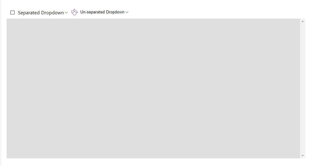
<html>
    <template id="layout-template">
        <webpdf>
            <div>
                <!-- By default, the value of dropdown's 'separate' option is true -->
                <!-- Set selected="0" means when you click on the dropdown button, it will trigger the event for  the first item in the dropdown list -->
                <dropdown name="separate-dropdown" icon-class="fv__icon-toolbar-square" text="Separated Dropdown" selected="0">
                    <xbutton name="separate-dropdown-square-btn" icon-class="fv__icon-toolbar-square">Square</xbutton>
                    <xbutton icon-class="fv__icon-toolbar-circle">Circle</xbutton>
                    <file-selector>Select a file</file-selector>
                    <li class="my-dropdown-list-item">
                        html <li> tag
                    </li>
                </dropdown>
                <dropdown name="non-separate-dropdown" icon-class="fv__icon-toolbar-shape" text="Un-separated Dropdown" separate="false">
                    <xbutton icon-class="fv__icon-toolbar-square">Square</xbutton>
                    <xbutton icon-class="fv__icon-toolbar-circle">Circle</xbutton>
                </dropdown>
            </div>
            <div class="fv__ui-body">
                <viewer></viewer>
            </div>
        </webpdf>
    </template>
</html>
<style>
    .my-dropdown-list-item {
        padding: 10px 0;
        text-align: center;
    }
    .fv__ui-dropdown {
        width: auto;
    }
</style>
<script>
    var CustomAppearance = UIExtension.appearances.Appearance.extend({
        getLayoutTemplate: function() {
            return document.getElementById('layout-template').innerHTML;
        },
        getDefaultFragments: function() {
            return [{
                target: 'separate-dropdown-square-btn',
                config: [{
                    callback: function() {
                        alert('Click on separate Dropdown');
                    }
                }]
            }];
        },
        disableAll: function(){}
    });
    var libPath = window.top.location.origin + '/lib';
    var pdfui = new UIExtension.PDFUI({
            viewerOptions: {
                libPath: libPath,
                jr: {
                    licenseSN: licenseSN,
                    licenseKey: licenseKey
                }
            },
            renderTo: document.body,
            appearance: CustomAppearance,
            addons: []
    });
</script>
Use as select component
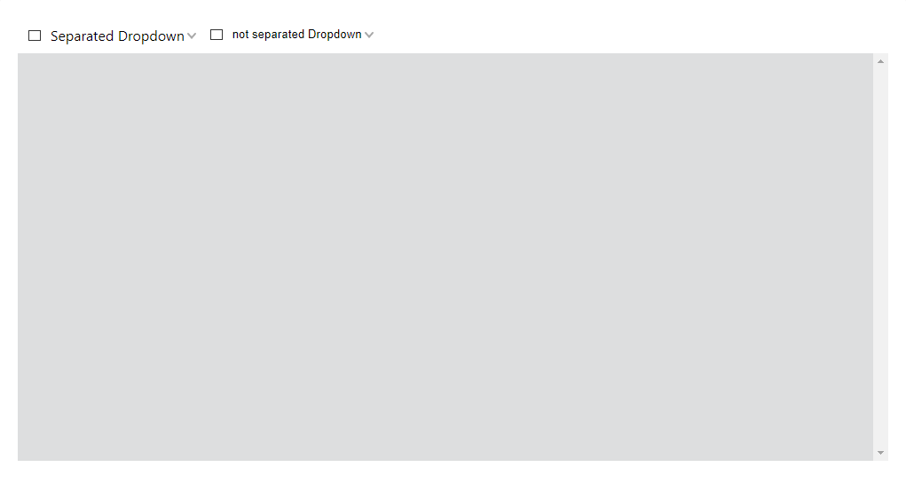
<html>
    <template id="layout-template">
        <webpdf>
            <div>
                <!-- Specify selected="0" that is the initial value -->
                <dropdown name="separate-dropdown" icon-class="fv__icon-toolbar-square" text="Separated Dropdown" selected="0">
                    <xbutton name="separate-dropdown-square-btn" icon-class="fv__icon-toolbar-square">Square</xbutton>
                    <xbutton icon-class="fv__icon-toolbar-circle">Circle</xbutton>
                </dropdown>
                <dropdown name="not-separate-dropdown" icon-class="fv__icon-toolbar-shape" text="not separated Dropdown" separate="false" selected="0">
                    <xbutton icon-class="fv__icon-toolbar-square">Square</xbutton>
                    <xbutton icon-class="fv__icon-toolbar-circle">Circle</xbutton>
                </dropdown>
            </div>
            <div class="fv__ui-body">
                <viewer></viewer>
            </div>
        </webpdf>
    </template>
</html>
<style>
    .my-dropdown-list-item {
        padding: 10px 0;
        text-align: center;
    }
    .fv__ui-dropdown {
        width: auto;
    }
</style>
<script>
    var CustomAppearance = UIExtension.appearances.Appearance.extend({
        getLayoutTemplate: function() {
            return document.getElementById('layout-template').innerHTML;
        },
        getDefaultFragments: function() {
            return [{
                target: 'separate-dropdown @xbutton,not-separate-dropdown @xbutton',
                config: [{
                    callback: function() {
                        this.component.parent.select(this.component);
                    }
                }]
            }];
        },
        disableAll: function(){}
    });
    var libPath = window.top.location.origin + '/lib';
    var pdfui = new UIExtension.PDFUI({
            viewerOptions: {
                libPath: libPath,
                jr: {
                    licenseSN: licenseSN,
                    licenseKey: licenseKey
                }
            },
            renderTo: document.body,
            appearance: CustomAppearance,
            addons: []
    });
</script>
Editable
<html>


    <template id="layout-template">


        <webpdf>


            <div>


                <dropdown name="font-editable-dropdown" editable>


                    <xbutton>Helvetica</xbutton>


                    <xbutton>Courier</xbutton>


                    <xbutton>Times-Bold</xbutton>


                    <xbutton>宋体</xbutton>


                </dropdown>


                <dropdown name="zoom-editable-dropdown" editable @controller="custom:ZoomPageController">


                    <xbutton @controller="custom:ScaleRatioController" scale="0.5">50%</xbutton>


                    <xbutton @controller="custom:ScaleRatioController" scale="0.75">75%</xbutton>


                    <xbutton @controller="custom:ScaleRatioController" scale="1">100%</xbutton>


                </dropdown>


            </div>


            <div class="fv__ui-body">


                <viewer></viewer>


            </div>


        </webpdf>


    </template>


</html>


<style>


    .fv__ui-dropdown {


        width: 80px;


    }


</style>


<script>


    UIExtension.PDFUI.module('custom', [])


    .controller('ScaleRatioController', {


        handle: function() {


            const scaleRatio = parseFloat(this.component.element.getAttribute('scale'));


            debugger;


            this.component.parent.setEditValue(scaleRatio);


        }


    })


    .controller('ZoomPageController', {


        mounted: function() {


            const component = this.component;


            const firstChild = component.childAt(0);


            const scaleRatio = parseFloat(firstChild.element.getAttribute('scale'))


            component.setEditValue(scaleRatio);


            component.on('change', function(newValue, oldValue) {


                if(isNaN(parseFloat(newValue))) {


                    alert('Illegal scale value: ' + newValue);


                    component.setEditValue(oldValue);


                    return;


                }


                alert('scale value changed to: ' + newValue)


            })


        }


    });


    var CustomAppearance = UIExtension.appearances.Appearance.extend({


        getLayoutTemplate: function() {


            return document.getElementById('layout-template').innerHTML;


        },


        getDefaultFragments() {


            return [{


                target: 'zoom-editable-dropdown',


                config: {


                    editOptions: {


                        type: 'number',


                        min: 0,


                        max: 10,


                        step: 0.01


                    }


                }


            }];


        },


        disableAll: function(){}


    });


    var libPath = window.top.location.origin + '/lib';


    var pdfui = new UIExtension.PDFUI({


            viewerOptions: {


                libPath: libPath,


                jr: {


                    licenseSN: licenseSN,


                    licenseKey: licenseKey


                }


            },


            renderTo: document.body,


            appearance: CustomAppearance,


            addons: []


    });


</script>
Position the dropdown list
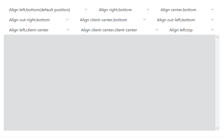
<html>


    <template id="layout-template">


        <webpdf>


            <div class="flex-with-gap">


                <dropdown text="Align left,bottom(default position)" align="left" valign="bottom">


                    <li>left bottom</li>


                </dropdown>


                <dropdown text="Align right,bottom" align="right" valign="bottom">


                    <li>right bottom</li>


                </dropdown>


                <dropdown text="Align center,bottom" align="center" valign="bottom">


                    <li>center bottom</li>


                </dropdown>


            </div>


            <div class="flex-with-gap">


                <dropdown text="Align out-right,bottom" align="out-right" valign="bottom">


                    <li>out-right bottom</li>


                </dropdown>


                <dropdown text="Align client-center,bottom" align="client-center" valign="bottom">


                    <li>client-center bottom</li>


                </dropdown>


                <dropdown text="Align out-left,bottom" align="out-left" valign="bottom">


                    <li>out-left bottom</li>


                </dropdown>


            </div>


            <div class="flex-with-gap">


                <dropdown text="Align left,client-center" align="left" valign="client-center">


                    <li>left client-center</li>


                </dropdown>


                <dropdown text="Align client-center,client-center" align="client-center" valign="client-center">


                    <li>client-center</li>


                </dropdown>


                <dropdown text="Align left,top" align="left" valign="top">


                    <li>left top</li>


                </dropdown>


            </div>


            <div class="fv__ui-body">


                <viewer></viewer>


            </div>


        </webpdf>


    </template>


</html>


<style>


    .fv__ui-dropdown {


        width: auto;


    }


    .flex-with-gap {


        display: flex;


        flex-direction: row;


        justify-content: center;


    }


    .flex-with-gap>.fv__ui-dropdown {


        margin: 0 20px;


        flex: 1 1 auto;


    }


</style>


<script>


    var CustomAppearance = UIExtension.appearances.Appearance.extend({


        getLayoutTemplate: function() {


            return document.getElementById('layout-template').innerHTML;


        },


        disableAll: function(){}


    });


    var libPath = window.top.location.origin + '/lib';


    var pdfui = new UIExtension.PDFUI({


            viewerOptions: {


                libPath: libPath,


                jr: {


                    licenseSN: licenseSN,


                    licenseKey: licenseKey


                }


            },


            renderTo: document.body,


            appearance: CustomAppearance,


            addons: []


    });


</script>
Dynamic dropdown list
<html>


    <template id="layout-template">


        <webpdf>


            <div>


                <dropdown separate="false" @controller="custom:DropdownItemListController as ctrl" text="Dynamic dropdown list">


                    <li style="padding-left: 1em;">Click button to create more</li>


                    <li @foreach="item in ctrl.items track by id">


                        <text @sync.text="item.text"></text>


                    </li>


                    <xbutton icon-class="fv__icon-toolbar-add-sign" @controller="custom:AddItemController">Add dropdown item</xbutton>


                </dropdown>


            </div>


            <div class="fv__ui-body">


                <viewer></viewer>


            </div>


        </webpdf>


    </template>


</html>


<style>


    .fv__ui-dropdown {


        width: auto;


    }


</style>


<script>


    UIExtension.PDFUI.module('custom', [])


        .controller('DropdownItemListController', {


            init: function() {


                this.items = [{


                    id: Date.now().toString(16),


                    text: new Date().toLocaleString()


                }];


            },


            addItem: function(data) {


                this.items = this.items.concat(data);


                this.digest();


            }


        })


        .controller('AddItemController', {


            handle: function() {


                const itemListCtrl = this.data.ctrl;


                itemListCtrl.addItem({


                    id: Date.now().toString(16),


                    text: new Date().toLocaleString()


                });


            }


        })


    var CustomAppearance = UIExtension.appearances.Appearance.extend({


        getLayoutTemplate() {


            return document.getElementById('layout-template').innerHTML;


        },


        disableAll(){}


    });


    var libPath = window.top.location.origin + '/lib';


    var pdfui = new UIExtension.PDFUI({


            viewerOptions: {


                libPath: libPath,


                jr: {


                    licenseSN: licenseSN,


                    licenseKey: licenseKey


                }


            },


            renderTo: document.body,


            appearance: CustomAppearance,


            addons: []


    });


</script>
API
Dropdown component template
Template example:
<dropdown text="" icon-class="" editable align="left" valign="bottom" separate="true" selected="0"></dropdown>
The template properties:
| Property | Description | Type | Default Value | Version |
| text | Set text for dropdown button | string | ‘ ‘ | 7.0 |
| icon-class | Set the icon’s css class | string | ‘ ‘ | 7.0 |
| editable | If editable | boolean | false | 7.0 |
| align | Horizontal alignment | ‘left’|’right’|’out-right’|’out-left’|’center’|’client-center’ | ‘left’ | 7.0 |
| valign | Vertical alignment | ‘top’|’bottom’|’center’|’client-center’ | ‘bottom’ | 7.0 |
| separate | If the dropdown button is separated | boolean | true | 7.0 |
Configure dropdown properties using fragment
Besides the editOptions, the others are same as the template properties.
{


    target: 'dropdown-name',


    config: {


        editOptions: {


            type: 'text',


            min: 0,


            max: 0,


            step: 0,


            vallue: ''


        }


    }


}
| Property | Description | Type | Default Value | Version |
| editOptions.type | Set edit mode for dropdown. It supports both the text and ‘number’ edit mode | string | ‘text’ | 7.0 |
| editOptions.min | The minimum value for the edit box. It is valid only when the edit mode is ‘number’ | number | 7.0 | |
| editOptions.max | The maximum value for the edit box. It is valid only when the edit mode is ‘number’ | number | 7.0 | |
| editOptions.step | The step for the edit box. It is valid only when the edit mode is ‘number’ | number | 7.0 | |
| editOptions.value | The initial value of the edit box | string|number | 7.0 |
Dropdown object properties
| Property | Description | Type |
| disabled | Button disabled status | boolean |
| isVisible | Button visible status | boolean |
| isActive | Check if the dropdown list is active | boolean |
Methods
| Method | Description | Version |
| setEditValue(text: String|number): void | Set the input value. This won’t trigger the change event | 7.0 |
| disable(): void | Disable dropdown. | 7.0 |
| enable(): void | Enable the disabled dropdown | 7.0 |
| show(): void | Show the hidden dropdown | 7.0 |
| hide(): void | Hide the dropdown | 7.0 |
| active(): void | Open the dropdown | 7.0 |
| deactive(): void | Close the dropdown | 7.0 |
| destroy(): void | Destroy the component | 7.0 |
Events
| Name | Description | Example | Version |
| active | Triggered upon the dropdown expands | dropdown.on(‘active’, () => {}) | 7.0 |
| deactive | Triggered upon the dropdown hides | dropdown.on(‘deactive’, () => {}) | 7.0 |
| change | Triggered upon the mouse enters and focus loses | dropdown.on(‘change’, (newValue,oldValue) => {}) | 7.0 |
Tab component
Code examples
Basic tab example
<html>
    <template id="layout-template">
        <webpdf>
            <div>
                <div>
                    <div class="tabs">
                        <gtab group="top-toolbar-tab" body="home-tab" active>home</gtab>
                        <gtab group="top-toolbar-tab" body="comment-tab">comment</gtab>
                        <gtab group="top-toolbar-tab" body="edit-tab">edit</gtab>
                    </div>
                    <div class="tab-bodies">
                        <div name="home-tab">
                            Home tab
                        </div>
                        <div name="comment-tab">
                            Comment tab
                        </div>
                        <div name="edit-tab">
                            Edit tab
                        </div>
                    </div>
                </div>
            </div>
            <div class="fv__ui-body">
                <viewer></viewer>
            </div>
        </webpdf>
    </template>
</html>
<script>
    var CustomAppearance = UIExtension.appearances.Appearance.extend({
        getLayoutTemplate: function() {
            return document.getElementById('layout-template').innerHTML;
        },
        disableAll: function(){}
    });
    var libPath = window.top.location.origin + '/lib';
    var pdfui = new UIExtension.PDFUI({
            viewerOptions: {
                libPath: libPath,
                jr: {
                    licenseSN: licenseSN,
                    licenseKey: licenseKey
                }
            },
            renderTo: document.body,
            appearance: CustomAppearance,
            addons: []
    });
</script>
Nested tab
<html>
    <template id="layout-template">
        <webpdf>
            <div>
                <div>
                    <div class="tabs">
                        <gtab group="top-toolbar-tab" body="tab1" active>Tab One</gtab>
                        <gtab group="top-toolbar-tab" body="tab2">Tab Two</gtab>
                        <gtab group="top-toolbar-tab" body="tab3">Tab Three</gtab>
                    </div>
                    <div class="tab-bodies">
                        <div name="tab1">
                            <div class="tabs">
                                <gtab group="nested-tab1" body="nested-tab1-1" active>Nested Tab One</gtab>
                                <gtab group="nested-tab1" body="nested-tab1-2">Nested Tab Two</gtab>
                            </div>
                            <div name="nested-tab1-1">Nested Tab 1-1</div>
                            <div name="nested-tab1-2">Nested Tab 1-2</div>
                        </div>
                        <div name="tab2">
                            Tab Two
                        </div>
                        <div name="tab3">
                            <div class="tabs">
                                <gtab group="nested-tab3" body="nested-tab3-1">Nested Tab3 One</gtab>
                                <gtab group="nested-tab3" body="nested-tab3-2" active>Nested Tab3 Two</gtab>
                                <gtab group="nested-tab3" body="nested-tab3-3">Nested Tab3 Two</gtab>
                            </div>
                            <div name="nested-tab3-1">Nested Tab 3-1</div>
                            <div name="nested-tab3-2">Nested Tab 3-2</div>
                            <div name="nested-tab3-3">Nested Tab 3-3</div>
                        </div>
                    </div>
                </div>
            </div>
            <div class="fv__ui-body">
                <viewer></viewer>
            </div>
        </webpdf>
    </template>
</html>
<script>
    var CustomAppearance = UIExtension.appearances.Appearance.extend({
        getLayoutTemplate: function() {
            return document.getElementById('layout-template').innerHTML;
        },
        disableAll: function(){}
    });
    var libPath = window.top.location.origin + '/lib';
    var pdfui = new UIExtension.PDFUI({
            viewerOptions: {
                libPath: libPath,
                jr: {
                    licenseSN: licenseSN,
                    licenseKey: licenseKey
                }
            },
            renderTo: document.body,
            appearance: CustomAppearance,
            addons: []
    });
</script>
Leading icon
<html>
    <template id="layout-template">
        <webpdf>
            <div>
                <div>
                    <div class="tabs">
                        <gtab group="top-toolbar-tab" body="comment-tab" active icon-class="fv__icon-sidebar-comment-list">Comment</gtab>
                        <gtab group="top-toolbar-tab" body="help-tab" active icon-class="fv__icon-dialog-level-question">Help</gtab>
                        <gtab group="top-toolbar-tab" body="settings-tab" icon-class="fv__icon-comment-item-menu-settings">Settings</gtab>
                    </div>
                    <div class="tab-bodies">
                        <div name="comment-tab">
                            Comment tab
                        </div>
                        <div name="help-tab">
                            Help tab
                        </div>
                        <div name="settings-tab">
                            Settings tab
                        </div>
                    </div>
                </div>
            </div>
            <div class="fv__ui-body">
                <viewer></viewer>
            </div>
        </webpdf>
    </template>
</html>
<script>
    var CustomAppearance = UIExtension.appearances.Appearance.extend({
        getLayoutTemplate: function() {
            return document.getElementById('layout-template').innerHTML;
        },
        disableAll: function(){}
    });
    var libPath = window.top.location.origin + '/lib';
    var pdfui = new UIExtension.PDFUI({
            viewerOptions: {
                libPath: libPath,
                jr: {
                    licenseSN: licenseSN,
                    licenseKey: licenseKey
                }
            },
            renderTo: document.body,
            appearance: CustomAppearance,
            addons: []
    });
</script>
Top icon
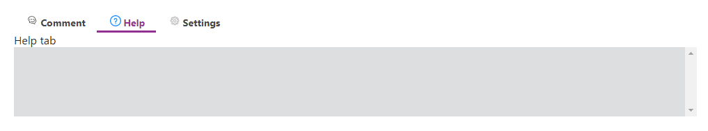
<html>
    <template id="layout-template">
        <webpdf>
            <div>
                <div>
                    <div class="tabs">
                        <gtab class="stacked" group="top-toolbar-tab" body="comment-tab" active icon-class="fv__icon-sidebar-comment-list">Comment</gtab>
                        <gtab class="stacked" group="top-toolbar-tab" body="help-tab" active icon-class="fv__icon-dialog-level-question">Help</gtab>
                        <gtab class="stacked" group="top-toolbar-tab" body="settings-tab" icon-class="fv__icon-comment-item-menu-settings">Settings</gtab>
                    </div>
                    <div class="tab-bodies">
                        <div name="comment-tab">
                            Comment tab
                        </div>
                        <div name="help-tab">
                            Help tab
                        </div>
                        <div name="settings-tab">
                            Settings tab
                        </div>
                    </div>
                </div>
            </div>
            <div class="fv__ui-body">
                <viewer></viewer>
            </div>
        </webpdf>
    </template>
</html>
<script>
    var CustomAppearance = UIExtension.appearances.Appearance.extend({
        getLayoutTemplate: function() {
            return document.getElementById('layout-template').innerHTML;
        },
        disableAll: function(){}
    });
    var libPath = window.top.location.origin + '/lib';
    var pdfui = new UIExtension.PDFUI({
            viewerOptions: {
                libPath: libPath,
                jr: {
                    licenseSN: licenseSN,
                    licenseKey: licenseKey
                }
            },
            renderTo: document.body,
            appearance: CustomAppearance,
            addons: []
    });
</script>
Closable tabs
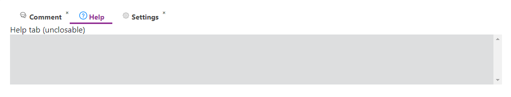
<html>
    <template id="layout-template">
        <webpdf>
            <div>
                <div>
                    <div class="tabs">
                        <!-- Comment tab will be destroy after closed -->
                        <gtab class="stacked" group="top-toolbar-tab" body="comment-tab" icon-class="fv__icon-sidebar-comment-list" closable destroy-on-close>Comment</gtab>
                        <gtab class="stacked" group="top-toolbar-tab" body="help-tab" active icon-class="fv__icon-dialog-level-question">Help</gtab>
                        <gtab @controller="custom:SettingsTabController" name="settings-tab-ctrl" class="stacked" group="top-toolbar-tab" body="settings-tab" icon-class="fv__icon-comment-item-menu-settings" closable>Settings</gtab>
                        <xbutton visible="false" name="open-settings-tab-btn" class="open-settings-tab-btn" @controller="custom:ReopenTabController" icon-class="fv__icon-toolbar-add-sign" @tooltip tooltip-title="Reopen settings tab"></xbutton>
                    </div>
                    <div class="tab-bodies">
                        <div name="comment-tab">
                            Comment tab(closable,and will be destroyed after closing)
                        </div>
                        <div name="help-tab">
                            Help tab (unclosable)
                        </div>
                        <div name="settings-tab">
                            Settings tab (closable)
                        </div>
                    </div>
                </div>
            </div>
            <div class="fv__ui-body">
                <viewer></viewer>
            </div>
        </webpdf>
    </template>
</html>
<style>
    .tabs {
        display: flex;
        align-items: center;
    }
    .open-settings-tab-btn {
        display: inline-flex;
        width: 32px;
        height: 32px;
    }
</style>
<script>
    UIExtension.PDFUI.module('custom',[])
    .controller('ReopenTabController', {
        handle: function() {
            this.getComponentByName('settings-tab-ctrl').open();
        }
    })
    .controller('SettingsTabController', {
        mounted: function() {
            this.component.on('close', () => {
                this.getComponentByName('open-settings-tab-btn').show();
            });
            this.component.on('open', () => {
                this.getComponentByName('open-settings-tab-btn').hide();
            });
        }
    });
    var CustomAppearance = UIExtension.appearances.Appearance.extend({
        getLayoutTemplate: function() {
            return document.getElementById('layout-template').innerHTML;
        },
        disableAll: function(){}
    });
    var libPath = window.top.location.origin + '/lib';
    var pdfui = new UIExtension.PDFUI({
            viewerOptions: {
                libPath: libPath,
                jr: {
                    licenseSN: licenseSN,
                    licenseKey: licenseKey
                }
            },
            renderTo: document.body,
            appearance: CustomAppearance,
            addons: []
    });
</script>
Tabs with dropdown
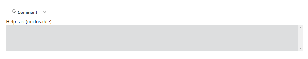
<html>
    <template id="layout-template">
        <webpdf>
            <div>
                <div>
                    <div class="tabs">
                        <gtab group="top-toolbar-tab" body="comment-tab" icon-class="fv__icon-sidebar-comment-list">Comment</gtab>
                        <dropdown>
                            <li>
                                <gtab group="top-toolbar-tab" body="help-tab" active icon-class="fv__icon-dialog-level-question">Help</gtab>
                            </li>
                            <li>
                                <gtab name="settings-tab-ctrl"  group="top-toolbar-tab" body="settings-tab" icon-class="fv__icon-comment-item-menu-settings">Settings</gtab>
                            </li>
                        </dropdown>
                    </div>
                    <div class="tab-bodies">
                        <div name="comment-tab">
                            Comment tab(closable and will be destroy after closed)
                        </div>
                        <div name="help-tab">
                            Help tab (unclosable)
                        </div>
                        <div name="settings-tab">
                            Settings tab (closable)
                        </div>
                    </div>
                </div>
            </div>
            <div class="fv__ui-body">
                <viewer></viewer>
            </div>
        </webpdf>
    </template>
</html>
<style>
    .tabs {
        display: flex;
        align-items: center;
    }
</style>
<script>
    var CustomAppearance = UIExtension.appearances.Appearance.extend({
        getLayoutTemplate: function() {
            return document.getElementById('layout-template').innerHTML;
        },
        disableAll: function(){}
    });
    var libPath = window.top.location.origin + '/lib';
    var pdfui = new UIExtension.PDFUI({
            viewerOptions: {
                libPath: libPath,
                jr: {
                    licenseSN: licenseSN,
                    licenseKey: licenseKey
                }
            },
            renderTo: document.body,
            appearance: CustomAppearance,
            addons: []
    });
</script>
Insert a tab using fragment-configuration

<html>
</html>
<style>
    .tabs {
        display: flex;
        align-items: center;
    }
</style>
<script>
    var FRAGMENT_ACTION = UIExtension.UIConsts.FRAGMENT_ACTION;
    var CustomAppearance = UIExtension.appearances.RibbonAppearance.extend({
        getDefaultFragments: function() {
            return [{
                target: 'toolbar-tabs',
                action: FRAGMENT_ACTION.APPEND,
                template: '<gtab name="new-tab" group="toolbar-tab" body="new-tab-body">Tab inserted via fragment-configuration</gtab>'
            }, {
                target: 'toolbar-tab-bodies',
                action: FRAGMENT_ACTION.APPEND,
                template: '<div name="new-tab-body" style="line-height:1"><text>New tab body</text></div>'
            }];
        }
    });
    var libPath = window.top.location.origin + '/lib';
    var pdfui = new UIExtension.PDFUI({
            viewerOptions: {
                libPath: libPath,
                jr: {
                    licenseSN: licenseSN,
                    licenseKey: licenseKey
                }
            },
            renderTo: document.body,
            appearance: CustomAppearance,
            addons: []
    });
</script>
Dynamically insert a tab using JavaScript
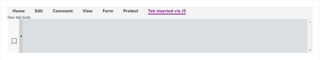
<html>
</html>
<style>
    .tabs {
        display: flex;
        align-items: center;
    }
</style>
<script>
    var libPath = window.top.location.origin + '/lib';
    var pdfui = new UIExtension.PDFUI({
            viewerOptions: {
                libPath: libPath,
                jr: {
                    licenseSN: licenseSN,
                    licenseKey: licenseKey
                }
            },
            renderTo: document.body,
            appearance: UIExtension.appearances.RibbonAppearance,
            addons: []
    });
    pdfui.getRootComponent().then(root => {
        // the component name can be found in 'examples/UIExtension/layout-templates/built-in-pc-layout-template.tpl'
        var tabs = root.getComponentByName('toolbar-tabs');
        var tabBodies = root.getComponentByName('toolbar-tab-bodies');
        // insert a div named in 'new-tab-body'
        tabBodies.append('<div name="new-tab-body" style="line-height:1"><text>New tab body</text></div>');
        // insert a tab into 'toolbar-tabs' and specifies the tab body name as 'new-tab-body'
        tabs.append('<gtab name="new-tab" body="new-tab-body" group="toolbar-tab">Tab inserted via JS</gtab>');
        // activate new tab
        var newTab = tabs.getComponentByName('new-tab');
        newTab.active();
    })
</script>
API
Tab component template
Template example:
<div class="tabs">


    <gtab group="mytabs" body="tab1" class="stacked" icon-class="fv__icon-comment-item-menu-settings" active>Tab Text 1</gtab>


    <gtab group="mytabs" body="tab2" class="stacked" closable destroy-on-close>Tab Text 2<gtab>


</div>


<div class="tab-bodies">


    <div name="tab1">Tab One</div>


    <div name="tab2">Tab Two</div>


</div>
The tab component template properties:
| Property | Description | Type | Default Value | Version |
| group | Only one tab can be activated in a group, similar to the radio name | string | — | 7.4.0 |
| body | Tab body’s name | string | — | 7.4.0 |
| closable | Define if the tab is closable | boolean | false | 7.4.0 |
| destroy-on-close | Whether to destroy tab after the tab is closed. Once the tab is destroyed, the body component will be destructed also. | |||
| Boolean | false | 7.4.0 | ||
| class=”stacked” | Define the tab’s ‘icon and text’ to be displayed in two lines, otherwise in one line. | — | — | 7.4.0 |
Tab object properties
| Property | Description | Type |
| disabled | Disabled status | boolean |
| isVisible | Visibility status | boolean |
| isActive | Activity status | boolean |
| isClosed | Closes | boolean |
Methods
| Method | Description | Version |
| disable(): void | Disable a tab | 7.0.0 |
| enable(): void | Make a disabled tab enabled | 7.0.0 |
| show(): void | Make a hidden tab shown | 7.0.0 |
| hide(): void | Hide a tab | 7.0.0 |
| active(): void | Activate a tab | 7.0.0 |
| deactive(): void | Make a tab inactive | 7.0.0 |
| destroy(): void | Destroy a tab | 7.0.0 |
| close(): void | Close a tab. The closed tab will be hidden, and the adjacent tab will be activated | 7.4.0 |
| open(): void | Make a closed tab shown | 7.4.0 |
Events
| Name | Description | Sample | Version |
| active | Triggered when a tab is activated | gtab.on(‘active’, () => {}) | 7.0.0 |
| deactive | Triggered when a tab is deactivated | gtab.on(‘deactive’, () => {}) | 7.0.0 |
| close | Triggered when a tab is closed | gtab.on(‘close’, () => {}) | 7.4.0 |
| open | Triggered when a tab is opened | gtab.on(‘open’, () => {}) | 7.4.0 |
Sidebar Component
Code examples
Basic example
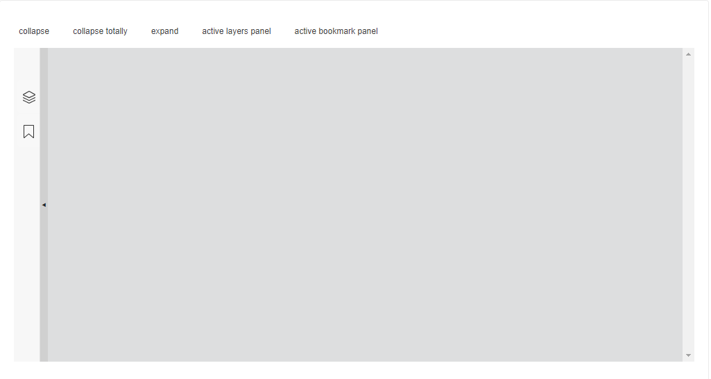
<html>


    <template id="layout-template">


        <webpdf>


            <div class="btn-container">


                <xbutton @controller="custom:SidebarActionController" action="collapse">collapse</xbutton>


                <xbutton @controller="custom:SidebarActionController" action="collpase.totally">collapse totally</xbutton>


                <xbutton @controller="custom:SidebarActionController" action="expand">expand</xbutton>


                <xbutton @controller="custom:SidebarActionController" action="active.layers">active layers panel</xbutton>


                <xbutton @controller="custom:SidebarActionController" action="active.bookmark">active bookmark panel</xbutton>


            </div>


            <div class="fv__ui-body">


                <sidebar name="my-sidebar">


                    <sidebar-panel name="sidebar-layers" icon-class="fv__icon-sidebar-page-manager" title="Layers"></sidebar-panel>


                    <sidebar-panel name="sidebar-bookmark" active icon-class="fv__icon-sidebar-bookmark" title="Bookmark"></sidebar-panel>


                </sidebar>


                <viewer></viewer>


            </div>


        </webpdf>


    </template>


</html>


<style>


    .btn-container {


        display: flex;


        padding: 10px 0;


    }


    .btn-container>.fv__ui-button + .fv__ui-button {


        margin-left: 20px;


    }


</style>


<script>


    UIExtension.PDFUI.module('custom', [])


    .controller('SidebarActionController', {


        handle: function() {


            var action = this.component.getAttribute('action');


            var sidebar = this.getComponentByName('my-sidebar');


            switch(action) {


                case 'collapse':


                    sidebar.collapse();


                    break;


                case 'collpase.totally':


                    sidebar.collapseTotally();


                    break;


                case 'expand':


                    sidebar.expand();


                    break;


                case 'active.layers':


                    sidebar.getComponentByName('sidebar-layers').active();


                    break;


                case 'active.bookmark':


                    sidebar.getComponentByName('sidebar-bookmark').active();


                    break;


            }


        }


    })


    var CustomAppearance = UIExtension.appearances.Appearance.extend({


        getLayoutTemplate: function() {


            return document.getElementById('layout-template').innerHTML;


        },


        disableAll: function(){}


    });


    var libPath = window.top.location.origin + '/lib';


    var pdfui = new UIExtension.PDFUI({


            viewerOptions: {


                libPath: libPath,


                jr: {


                    licenseSN: licenseSN,


                    licenseKey: licenseKey


                }


            },


            renderTo: document.body,


            appearance: CustomAppearance,


            addons: []


    });


</script>
Sidebar width

<html>


    <template id="layout-template">


        <webpdf>


            <p> Use a fixed pixel value as the initial width <p>


            <div>


                <sidebar width="500" open>


                    <sidebar-panel icon-class="fv__icon-sidebar-page-manager" title="Layers"></sidebar-panel>


                    <sidebar-panel active icon-class="fv__icon-sidebar-bookmark" title="Bookmark"></sidebar-panel>


                </sidebar>


            </div>


            <p> Use the scale value of window.innerWidth as the initial width </p>


            <div>


                <sidebar width="0.5" open>


                    <sidebar-panel icon-class="fv__icon-sidebar-page-manager" title="Layers"></sidebar-panel>


                    <sidebar-panel active icon-class="fv__icon-sidebar-bookmark" title="Bookmark"></sidebar-panel>


                </sidebar>


            </div>


            <div class="hide">


                <viewer></viewer>


            </div>


        </webpdf>


    </template>


</html>


<script>


    var CustomAppearance = UIExtension.appearances.Appearance.extend({


        getLayoutTemplate: function() {


            return document.getElementById('layout-template').innerHTML;


        },


        disableAll: function(){}


    });


    var libPath = window.top.location.origin + '/lib';


    var pdfui = new UIExtension.PDFUI({


            viewerOptions: {


                libPath: libPath,


                jr: {


                    licenseSN: licenseSN,


                    licenseKey: licenseKey


                }


            },


            renderTo: document.body,


            appearance: CustomAppearance,


            addons: []


    });


</script>
Expand and collapse sidebar

<html>
<template id="layout-template">
<webpdf>
<p>Expand sidebar by default</p>
<div>
<sidebar open>
<sidebar-panel icon-class="fv__icon-sidebar-page-manager" title="Layers"></sidebar-panel>
<sidebar-panel active icon-class="fv__icon-sidebar-bookmark" title="Bookmark"></sidebar-panel>
</sidebar>
</div>
<p>Collapse sidebar by default/p>
<div>
<sidebar>
<sidebar-panel icon-class="fv__icon-sidebar-page-manager" title="Layers"></sidebar-panel>
<sidebar-panel active icon-class="fv__icon-sidebar-bookmark" title="Bookmark"></sidebar-panel>
</sidebar>
</div>
<div class="hide">
<viewer></viewer>
</div>
</webpdf>
</template>
</html>
<script>
var CustomAppearance = UIExtension.appearances.Appearance.extend({
getLayoutTemplate: function() {
return document.getElementById('layout-template').innerHTML;
},
disableAll: function(){}
});
var libPath = window.top.location.origin + '/lib';
var pdfui = new UIExtension.PDFUI({
viewerOptions: {
libPath: libPath,
jr: {
licenseSN: licenseSN,
licenseKey: licenseKey
}
},
renderTo: document.body,
appearance: CustomAppearance,
addons: []
});
</script>
Sidebar buttons’ tooltip
Hover your mouse over a button to show the tooltip.

<html>
<template id="layout-template">
<webpdf>
<div>
<sidebar open>
<sidebar-panel @tooltip tooltip-title="Layers sidebar panel" tooltip-placement="right" icon-class="fv__icon-sidebar-page-manager" title="Layers"></sidebar-panel>
<sidebar-panel @tooltip tooltip-title="Bookmark sidebar panel" tooltip-placement="right" active icon-class="fv__icon-sidebar-bookmark" title="Bookmark"></sidebar-panel>
</sidebar>
</div>
<div class="hide">
<viewer></viewer>
</div>
</webpdf>
</template>
</html>
<script>
var CustomAppearance = UIExtension.appearances.Appearance.extend({
getLayoutTemplate: function() {
return document.getElementById('layout-template').innerHTML;
},
disableAll: function(){}
});
var libPath = window.top.location.origin + '/lib';
var pdfui = new UIExtension.PDFUI({
viewerOptions: {
libPath: libPath,
jr: {
licenseSN: licenseSN,
licenseKey: licenseKey
}
},
renderTo: document.body,
appearance: CustomAppearance,
addons: []
});
</script>
Dynamically insert a sidebar panel using JavaScript

<html>
<template id="layout-template">
<webpdf>
<div>
<xbutton @controller="custom:InsertSidebarController">Add sidebar panel</xbutton>
</div>
<div>
<sidebar open name="sidebar-component-name">
<sidebar-panel @tooltip tooltip-title="Layers sidebar panel" tooltip-placement="right" icon-class="fv__icon-sidebar-page-manager" title="Layers"></sidebar-panel>
<sidebar-panel @tooltip tooltip-title="Bookmark sidebar panel" tooltip-placement="right" active icon-class="fv__icon-sidebar-bookmark" title="Bookmark"></sidebar-panel>
</sidebar>
</div>
<div class="hide">
<viewer></viewer>
</div>
</webpdf>
</template>
</html>
<script>
UIExtension.PDFUI.module('custom', [])
.controller('InsertSidebarController', {
mounted: function() {
this.count = 0;
},
handle: function() {
if(this.count >= 3) {
return;
}
this.count++;
this.getPDFUI().getComponentByName('sidebar-component-name')
.then(sidebar => {
sidebar.append(
'<sidebar-panel icon-class="fv__icon-sidebar-bookmark" title="Dynamic sidebar panel"></sidebar-panel>'
);
})
}
});
var CustomAppearance = UIExtension.appearances.Appearance.extend({
getLayoutTemplate: function() {
return document.getElementById('layout-template').innerHTML;
},
disableAll: function(){}
});
var libPath = window.top.location.origin + '/lib';
var pdfui = new UIExtension.PDFUI({
viewerOptions: {
libPath: libPath,
jr: {
licenseSN: licenseSN,
licenseKey: licenseKey
}
},
renderTo: document.body,
appearance: CustomAppearance,
addons: []
});
</script>
API
Sidebar component template
Template example:
<!-- The width value smaller than 1 means that is a scale value of window.innerWidth -->
<sidebar open width="500">
<sidebar-panel icon-class="fv__icon-sidebar-page-manager" title="Layers"></sidebar-panel>
<sidebar-panel active icon-class="fv__icon-sidebar-bookmark" title="Bookmark"></sidebar-panel>
</sidebar>
The sidebar component template properties:
| Property | Decription | Type | Default Value | Version |
| open | Expand Status | boolean | false | 7.0.0 |
| width | The width of the expanded Sidebar will be used as pixel value if it is greater than or equal to 1, and will be calculated by multiplying window.innerwidth if it is less than 1 | number | 310px | 7.0.0 |
The sidebar-panel properties:
| Property | Description | Type | Default value | Version |
| title | The string show at the top of expanded sidebar-panel | string | ‘ ‘ | 7.0.0 |
| active | If the sidebar-panel is active | boolean | false | 7.0.0 |
Sidebar object properties
The sidebar object properties:
| Properties | Description | Type |
| disabled | If the sidebar is disabled | boolean |
| isVisible | If the sidebar is visible | boolean |
| status | Three status: ‘SidebarComponent.STATUS_COLLAPSED’, ‘SidebarComponent.STATUS_COLLAPSED_TOTALLY’, ‘SidebarComponent.STATUS_EXPANDED’ | string |
The sidebar-panel object properties:
| Properties | Description | Type |
| disabled | If the sidebar-panel is disabled | boolean |
| isVisible | If the sidebar-panel is visible | boolean |
| isActive | If the sidebar-panel is active | boolean |
Methods
The sidebar methods:
| Method | Description | Version |
| isCollapsed(): boolean | Return true if the status is not equal to sidebarcomponent.status_expanded | 7.0.0 |
| expand(width: number): void | Expand sidebar | 7.0.0 |
| collapse(): void | Hide the sidebar-panel with the sidebar buttons visible | 7.0.0 |
| collapseTotally(): void | Hide the sidebar with the sidebar buttons invisible | 7.0.0 |
The sidebar-panel methods:
| Method | Description | Version |
| disable(): void | Disable sidebar-panel. Once disabled, it cannot be activated | 7.0 |
| enable(): void | Enable sidebar-panel | 7.0 |
| show(): void | Show the hidden sidebar-panel | 7.0 |
| hide(): void | Hide the sidebar-panel | 7.0 |
| destroy(): void | Destroy the sidebar-panel | 7.0 |
Events
The Sidebar events:
| Event Name | Description | Sample | Version |
| COMPONENT_EVENTS.EXPAND | Triggered when the sidebar is expanded | sidebar.on(COMPONENT_EVENTS.EXPAND, () => void) | 7.0.0 |
| COMPONENT_EVENTS.COLLAPSE | Triggered when the sidebar is collapsed | sidebar.on(COMPONENT_EVENTS.COLLAPSE, () => void) | 7.0.0 |
The Sidebar-panel events:
| Event Name | Description | Sample | Version |
| active | Triggered when the sidebar-panel is activated | sidebarPanel.on(‘active’, () => {}) | 7.0.0 |
| deactive | Triggered when the sidebar-panel is deactivated | sidebarPanel.on(‘deactive’, () => {}) | 7.0.0 |
| shown | Triggered when the sidebar-panel is shown | sidebarPanel.on(‘shown’, () => {}) | 7.0.0 |
| hidden | Triggered when the sidebar-panel is hidden | sidebarPanel.on(‘hidden’, () => {}) | 7.0.0 |
Paddle component
In a case of the toolbar length which goes beyond the screen width, some tools are hidden. Users have to scroll to show the hidden contents. The Paddle component serves in other way to display buttons at the ends of toolbar so that users can click to show the hidden tools instead of using scrollbar.
The arrow is the paddle button:

Code examples
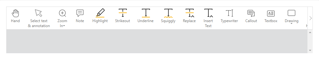
<html>
<template id="layout-template">
<webpdf>
<toolbar>
<paddle>
<div class="flex-div">
<hand-button></hand-button>
<selection-button></selection-button>
<zoom-dropdown></zoom-dropdown>
<create-note-button></create-note-button>
<create-text-highlight-button></create-text-highlight-button>
<create-strikeout-button></create-strikeout-button>
<create-underline-button></create-underline-button>
<create-squiggly-button></create-squiggly-button>
<create-replace-button></create-replace-button>
<create-caret-button></create-caret-button>
<create-typewriter-button></create-typewriter-button>
<create-callout-button></create-callout-button>
<create-textbox-button></create-textbox-button>
<create-drawings-dropdown></create-drawings-dropdown>
<create-area-highlight-button></create-area-highlight-button>
<create-pencil-button></create-pencil-button>
<eraser-button></eraser-button>
<stamp-dropdown></stamp-dropdown>
<create-measure-dropdown></create-measure-dropdown>
<create-attachment-button></create-attachment-button>
<create-image-button></create-image-button>
<create-link-button></create-link-button>
</div>
</paddle>
</toolbar>
<div class="fv__ui-body">
<viewer></viewer>
</div>
</webpdf>
</template>
</html>
<style>
.flex-div {
display: flex;
}
.fv__ui-toolbar {
border: 1px solid #ddd;
}
</style>
<script>
var CustomAppearance = UIExtension.appearances.Appearance.extend({
getLayoutTemplate: function() {
return document.getElementById('layout-template').innerHTML;
},
disableAll: function(){}
});
var libPath = window.top.location.origin + '/lib';
var pdfui = new UIExtension.PDFUI({
viewerOptions: {
libPath: libPath,
jr: {
licenseSN: licenseSN,
licenseKey: licenseKey
}
},
renderTo: document.body,
appearance: CustomAppearance,
addons: []
});
</script>
If you apply the same layout template for desktop and tablet, but only use drag functions on tablet instead of paddle, you can use exclude-devices to implement it:

<html>
<template id="layout-template">
<webpdf>
<toolbar>
<!-- exclude all tablet devices -->
<paddle exclude-devices="tablet">
<div class="flex-div">
<hand-button></hand-button>
<selection-button></selection-button>
<zoom-dropdown></zoom-dropdown>
<create-note-button></create-note-button>
<create-text-highlight-button></create-text-highlight-button>
<create-strikeout-button></create-strikeout-button>
<create-underline-button></create-underline-button>
<create-squiggly-button></create-squiggly-button>
<create-replace-button></create-replace-button>
<create-caret-button></create-caret-button>
<create-typewriter-button></create-typewriter-button>
<create-callout-button></create-callout-button>
<create-textbox-button></create-textbox-button>
<create-drawings-dropdown></create-drawings-dropdown>
<create-area-highlight-button></create-area-highlight-button>
<create-pencil-button></create-pencil-button>
<eraser-button></eraser-button>
<stamp-dropdown></stamp-dropdown>
<create-measure-dropdown></create-measure-dropdown>
<create-attachment-button></create-attachment-button>
<create-image-button></create-image-button>
<create-link-button></create-link-button>
</div>
</paddle>
</toolbar>
<div class="fv__ui-body">
<viewer></viewer>
</div>
</webpdf>
</template>
</html>
<style>
.flex-div {
display: flex;
}
.fv__ui-toolbar {
border: 1px solid #ddd;
}
/* use native scrollbar in tablet device */
.fv__ui-tablet .fv__ui-toolbar {
overflow-y: auto;
}
</style>
<script>
var CustomAppearance = UIExtension.appearances.Appearance.extend({
getLayoutTemplate: function() {
return document.getElementById('layout-template').innerHTML;
},
disableAll: function(){}
});
var libPath = window.top.location.origin + '/lib';
var pdfui = new UIExtension.PDFUI({
viewerOptions: {
libPath: libPath,
jr: {
licenseSN: licenseSN,
licenseKey: licenseKey
}
},
renderTo: document.body,
appearance: CustomAppearance,
addons: []
});
</script>
The device values that can be used include the following:
mac, ios, iphone, ipad, ipod, android, webos, kindle, tablet, mobile, desktop, xiaomi, huawei, touch.
By default, continuously clicking the paddle buttons at the ends of the toolbar moves the tool to the beginning or end. However, when the toolbar length is twice the screen width, the middle tools will never be displayed. To avoid this problem, you can set step in the paddle component.
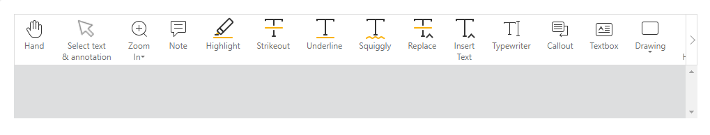
<html>
<template id="layout-template">
<webpdf>
<toolbar>
<paddle step="200">
<div class="flex-div">
<hand-button></hand-button>
<selection-button></selection-button>
<zoom-dropdown></zoom-dropdown>
<create-note-button></create-note-button>
<create-text-highlight-button></create-text-highlight-button>
<create-strikeout-button></create-strikeout-button>
<create-underline-button></create-underline-button>
<create-squiggly-button></create-squiggly-button>
<create-replace-button></create-replace-button>
<create-caret-button></create-caret-button>
<create-typewriter-button></create-typewriter-button>
<create-callout-button></create-callout-button>
<create-textbox-button></create-textbox-button>
<create-drawings-dropdown></create-drawings-dropdown>
<create-area-highlight-button></create-area-highlight-button>
<create-pencil-button></create-pencil-button>
<eraser-button></eraser-button>
<stamp-dropdown></stamp-dropdown>
<create-measure-dropdown></create-measure-dropdown>
<create-attachment-button></create-attachment-button>
<create-image-button></create-image-button>
<create-link-button></create-link-button>
</div>
</paddle>
</toolbar>
<div class="fv__ui-body">
<viewer></viewer>
</div>
</webpdf>
</template>
</html>
<style>
.flex-div {
display: flex;
}
.fv__ui-toolbar {
border: 1px solid #ddd;
}
</style>
<script>
var CustomAppearance = UIExtension.appearances.Appearance.extend({
getLayoutTemplate: function() {
return document.getElementById('layout-template').innerHTML;
},
disableAll: function(){}
});
var libPath = window.top.location.origin + '/lib';
var pdfui = new UIExtension.PDFUI({
viewerOptions: {
libPath: libPath,
jr: {
licenseSN: licenseSN,
licenseKey: licenseKey
}
},
renderTo: document.body,
appearance: CustomAppearance,
addons: []
});
</script>
Group component
The Group component is commonly used on the Toolbar to separate the components with a vertical line. Each group represents a category, and can be set to shrink when running in a small screen.
Group shrank and hid tools under the dots:
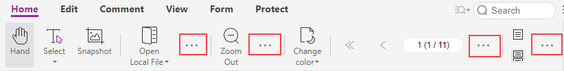
Code example
Getting started

<html>
<template id="layout-template">
<webpdf>
<toolbar>
<group-list>
<group name="home-tab-group-hand">
<hand-button></hand-button>
<selection-button>Selection</selection-button>
<snapshot-button></snapshot-button>
</group>
<group name="home-tab-group-io">
<open-file-dropdown></open-file-dropdown>
<download-file-button></download-file-button>
</group>
</group-list>
</toolbar>
<div class="fv__ui-body">
<viewer></viewer>
</div>
</webpdf>
</template>
</html>
<style>
</style>
<script>
var CustomAppearance = UIExtension.appearances.Appearance.extend({
getLayoutTemplate: function() {
return document.getElementById('layout-template').innerHTML;
},
disableAll: function(){}
});
var libPath = window.top.location.origin + '/lib';
var pdfui = new UIExtension.PDFUI({
viewerOptions: {
libPath: libPath,
jr: {
licenseSN: licenseSN,
licenseKey: licenseKey
}
},
renderTo: document.body,
appearance: CustomAppearance,
addons: []
});
</script>
Designate the shrink-size
In the following example, the group-list defines shrink-size as 762 pixels, which means all child group with no shrink-size marker will contract when the width of the root component <webpdf> is smaller than 762 pixels. The child group with shrink-size=”600″ marker will shorten when the root component’s width is less than 600 pixels.
<html>
<template id="layout-template">
<webpdf>
<toolbar>
<group-list shrink-size="762">
<group name="home-tab-group-hand">
<hand-button></hand-button>
<selection-button>Selection</selection-button>
<snapshot-button></snapshot-button>
</group>
<group name="home-tab-group-io" shrink-size="600">
<open-file-dropdown></open-file-dropdown>
<download-file-button></download-file-button>
</group>
</group-list>
</toolbar>
<div class="fv__ui-body">
<viewer></viewer>
</div>
</webpdf>
</template>
</html>
<style>
</style>
<script>
var CustomAppearance = UIExtension.appearances.Appearance.extend({
getLayoutTemplate: function() {
return document.getElementById('layout-template').innerHTML;
},
disableAll: function(){}
});
var libPath = window.top.location.origin + '/lib';
var pdfui = new UIExtension.PDFUI({
viewerOptions: {
libPath: libPath,
jr: {
licenseSN: licenseSN,
licenseKey: licenseKey
}
},
renderTo: document.body,
appearance: CustomAppearance,
addons: []
});
</script>
Designate the retained components after shrinkage
<html>
<template id="layout-template">
<webpdf>
<toolbar>
<group-list shrink-size="762">
<!-- retain two components after shrinking -->
Specify
<group name="home-tab-group-hand" retain-count="2">
<hand-button></hand-button>
<selection-button>Selection</selection-button>
<snapshot-button></snapshot-button>
</group>
<!-- If the retain-count value is equal to the components count, no shrinkag will occur -->
<group name="home-tab-group-io" retain-count="2">
<open-file-dropdown></open-file-dropdown>
<download-file-button></download-file-button>
</group>
</group-list>
</toolbar>
<div class="fv__ui-body">
<viewer></viewer>
</div>
</webpdf>
</template>
</html>
<style>
</style>
<script>
var CustomAppearance = UIExtension.appearances.Appearance.extend({
getLayoutTemplate: function() {
return document.getElementById('layout-template').innerHTML;
},
disableAll: function(){}
});
var libPath = window.top.location.origin + '/lib';
var pdfui = new UIExtension.PDFUI({
viewerOptions: {
libPath: libPath,
jr: {
licenseSN: licenseSN,
licenseKey: licenseKey
}
},
renderTo: document.body,
appearance: CustomAppearance,
addons: []
});
</script>
Designate the shrink-title
The More Options in the image below is the shrink title:

<html>
<template id="layout-template">
<webpdf>
<toolbar>
<group-list shrink-size="762">
<group name="home-tab-group-hand" retain-count="2" shrink-title="options">
<hand-button></hand-button>
<selection-button>Selection</selection-button>
<snapshot-button></snapshot-button>
</group>
<group name="home-tab-group-io" shrink-title="options">
<open-file-dropdown></open-file-dropdown>
<download-file-button></download-file-button>
</group>
</group-list>
</toolbar>
<div class="fv__ui-body">
<viewer></viewer>
</div>
</webpdf>
</template>
</html>
<style>
</style>
<script>
var CustomAppearance = UIExtension.appearances.Appearance.extend({
getLayoutTemplate: function() {
return document.getElementById('layout-template').innerHTML;
},
disableAll: function(){}
});
var libPath = window.top.location.origin + '/lib';
var pdfui = new UIExtension.PDFUI({
viewerOptions: {
libPath: libPath,
jr: {
licenseSN: licenseSN,
licenseKey: licenseKey
}
},
renderTo: document.body,
appearance: CustomAppearance,
addons: []
});
</script>
API
Group component template
Template example:
<group-list shrink-size="762">
<group retain-count="2" shrink-title="options"></group>
<group retain-count="1" shrink-title="options"></group>
</group-list>
The group-list template properties:
| Property | Description | Type | Default Value | Version |
| shrink-size | Specify a pixel width. Triggered when the <webpdf> width is less than the specified width | number | 1024 | 7.0.0 |
The group template properties:
| Property | Description | Type | Default Value | Version |
| retain-count | Define the retained components after shrinkage | number | 1 | 7.0.0 |
| shrink-title | Define the title which shows on the top of the drop-down list after shrinkage | string | ‘ ‘ | 7.0.0 |
| shrink-size | Specify a pixel width value. Triggered when the <webpdf> width is less than this value. Once specified, this group will ignore the value defined in the parent group-list | number | the same value in the parent component group-list | 7.0.0 |
Methods
The <group> component methods:
| Method | Description | Version |
| setRetainCount(count: number): void | Set the retained count after shrinkage | 7.0.0 |
| setShrinkTitle(title: string): void | Set the title which shows on the top of the drop-down list after shrinkage | 7.0.0 |
Events
The <group> component events:
| Name | Description | Example | Version |
| shrink | Triggered on shrink or expand | group.on(‘shink’, (isShrinked) => void) | 7.4.0 |
The <group-list> component events:
| Name | Description | Example | Version |
| shrink | Triggered on shrink or expand | groupList.on(‘shink’, (groupComponent, isShrinked) => void) | 7.4.0 |
Layer component
Layer is a floating box component, which is typically used to implement dialogs, tooltips, context menus, and some other components that need to float on other elements.
Code examples
Getting started
<html>
<template id="layout-template">
<webpdf>
<div class="flex-container">
<xbutton action="show-layer" @controller="custom:ShowHideLayerController">Click to show layer</xbutton>
<xbutton action="hide-layer" @controller="custom:ShowHideLayerController">Click to hide layer</xbutton>
</div>
<div class="fv__ui-body">
<viewer></viewer>
</div>
<template>
<layer name="my-layer" class="center">
<text>Hello! I'm a layer component!</text>
</layer>
</template>
</webpdf>
</template>
</html>
<style>
.flex-container {
display: flex;
justify-content: space-between;
}
</style>
<script>
UIExtension.PDFUI.module('custom', [])
.controller('ShowHideLayerController', {
handle: function() {
const layer = this.getComponentByName('my-layer');
const action = this.component.getAttribute('action');
switch(action) {
case 'show-layer':
layer.show();
break;
case 'hide-layer':
layer.hide();
break;
}
}
});
var CustomAppearance = UIExtension.appearances.Appearance.extend({
getLayoutTemplate: function() {
return document.getElementById('layout-template').innerHTML;
},
disableAll: function(){}
});
var libPath = window.top.location.origin + '/lib';
var pdfui = new UIExtension.PDFUI({
viewerOptions: {
libPath: libPath,
jr: {
licenseSN: licenseSN,
licenseKey: licenseKey
}
},
renderTo: document.body,
appearance: CustomAppearance,
addons: []
});
</script>
Create a layer with header
<html>
<template id="layout-template">
<webpdf>
<div class="flex-container">
<xbutton target-layer="my-layer" @controller="custom:ShowLayerController">Click to show layer</xbutton>
<xbutton target-layer="my-layer-2" @controller="custom:ShowLayerController">Click to show layer with custom header</xbutton>
</div>
<div class="fv__ui-body">
<viewer></viewer>
</div>
<template>
<layer name="my-layer" class="center my-layer">
<layer-header title="Layer Title" icon-class="fv__icon-toolbar-print"></layer-header>
</layer>
<layer name="my-layer-2" class="center my-layer">
<div class="my-custom-layer-header">
<i class="fv__icon-toolbar-print"></i>
<h2>Custom layer header</h2>
</div>
</layer>
</template>
</webpdf>
</template>
</html>
<style>
.my-layer {
width: 400px;
height: 300px;
}
.my-custom-layer-header {
display: flex;
align-items: center;
}
.my-custom-layer-header i{
display: inline-block;
width: 32px;
height: 32px;
}
.my-custom-layer-header h2 {
flex: 1;
margin: 0 0 0 1em;
}
.flex-container {
display: flex;
justify-content: space-between;
}
</style>
<script>
UIExtension.PDFUI.module('custom', [])
.controller('ShowLayerController', {
handle: function() {
const layerName = this.component.getAttribute('target-layer')
const layer = this.getComponentByName(layerName);
layer.show();
}
});
var CustomAppearance = UIExtension.appearances.Appearance.extend({
getLayoutTemplate: function() {
return document.getElementById('layout-template').innerHTML;
},
disableAll: function(){}
});
var libPath = window.top.location.origin + '/lib';
var pdfui = new UIExtension.PDFUI({
viewerOptions: {
libPath: libPath,
jr: {
licenseSN: licenseSN,
licenseKey: licenseKey
}
},
renderTo: document.body,
appearance: CustomAppearance,
addons: []
});
</script>
Create a draggable layer

<html>
<template id="layout-template">
<webpdf>
<div class="fv__ui-body">
<viewer></viewer>
</div>
<template>
<layer name="my-layer1" class="center my-layer" visible>
<layer-header @draggable="{type:'parent'}" title="Click header area to drag" icon-class="fv__icon-toolbar-print"></layer-header>
</layer>
<layer name="my-layer2" class="center my-layer" @draggable visible>
<layer-header title="Click anywhere on the box to drag" icon-class="fv__icon-toolbar-print"></layer-header>
</layer>
</template>
</webpdf>
</template>
</html>
<style>
.my-layer {
width: 400px;
height: 300px;
}
.flex-container {
display: flex;
justify-content: space-between;
}
</style>
<script>
var CustomAppearance = UIExtension.appearances.Appearance.extend({
getLayoutTemplate: function() {
return document.getElementById('layout-template').innerHTML;
},
disableAll: function(){}
});
var libPath = window.top.location.origin + '/lib';
var pdfui = new UIExtension.PDFUI({
viewerOptions: {
libPath: libPath,
jr: {
licenseSN: licenseSN,
licenseKey: licenseKey
}
},
renderTo: document.body,
appearance: CustomAppearance,
addons: []
});
</script>
Create a modal layer
<html>
<template id="layout-template">
<webpdf>
<div class="flex-container">
<xbutton @controller="custom:ShowLayer1Controller">Click to show modal layer 1</xbutton>
<xbutton @controller="custom:ShowLayer2Controller">Click to show modal layer 2</xbutton>
</div>
<div class="fv__ui-body">
<viewer></viewer>
</div>
<template>
<layer name="my-layer-1" class="center my-layer" modal backdrop>
<layer-header title="Modal layer with backdrop" icon-class="fv__icon-toolbar-print"></layer-header>
</layer>
<layer name="my-layer-2" class="center my-layer" modal>
<layer-header title="Modal layer without backdrop" icon-class="fv__icon-toolbar-print"></layer-header>
</layer>
</template>
</webpdf>
</template>
</html>
<style>
.my-layer {
width: 400px;
height: 300px;
}
.flex-container {
display: flex;
justify-content: space-between;
}
</style>
<script>
UIExtension.PDFUI.module('custom', [])
.controller('ShowLayer1Controller', {
handle: function() {
const layer = this.getComponentByName('my-layer-1');
layer.show();
}
})
.controller('ShowLayer2Controller', {
handle: function() {
const layer = this.getComponentByName('my-layer-2');
layer.show();
}
});
var CustomAppearance = UIExtension.appearances.Appearance.extend({
getLayoutTemplate: function() {
return document.getElementById('layout-template').innerHTML;
},
disableAll: function(){}
});
var libPath = window.top.location.origin + '/lib';
var pdfui = new UIExtension.PDFUI({
viewerOptions: {
libPath: libPath,
jr: {
licenseSN: licenseSN,
licenseKey: licenseKey
}
},
renderTo: document.body,
appearance: CustomAppearance,
addons: []
});
</script>
Specify a parent node for the layer component
By default, the layer DOM nodes are appended to the end of the root component when the layer is displayed. This may cause the layer DOM hierarchy to display incorrectly in some cases. To avoid this problem, you can specify where to insert the layer DOM when calling show(). Here is the code example:
<html>
<template id="layout-template">
<webpdf>
<div class="flex-container">
<xbutton action="show-layer" @controller="custom:ShowHideLayerController">Click to show layer</xbutton>
<xbutton action="hide-layer" @controller="custom:ShowHideLayerController">Click to hide layer</xbutton>
</div>
<div class="fv__ui-body">
<viewer></viewer>
</div>
<template>
<layer name="my-layer" class="center">
<text>Hello! I'm a layer component!</text>
</layer>
</template>
</webpdf>
</template>
</html>
<style>
.flex-container {
display: flex;
justify-content: space-between;
}
</style>
<script>
UIExtension.PDFUI.module('custom', [])
.controller('ShowHideLayerController', {
handle: function() {
const layer = this.getComponentByName('my-layer');
const action = this.component.getAttribute('action');
switch(action) {
case 'show-layer':
layer.show(document.body); // The layer will be appended to `document.body` when it is displayed.
break;
case 'hide-layer':
layer.hide();
break;
}
}
});
var CustomAppearance = UIExtension.appearances.Appearance.extend({
getLayoutTemplate: function() {
return document.getElementById('layout-template').innerHTML;
},
disableAll: function(){}
});
var libPath = window.top.location.origin + '/lib';
var pdfui = new UIExtension.PDFUI({
viewerOptions: {
libPath: libPath,
jr: {
licenseSN: licenseSN,
licenseKey: licenseKey
}
},
renderTo: document.body,
appearance: CustomAppearance,
addons: []
});
</script>
API
Layer component template
Template example:
<layer class="center" visible modal backdrop>
<layer-header title="" icon-class="fv__icon-toolbar-print"></layer-header>
</layer>
The <layer> component template properties:
| Property | Description | Type | Default value | Version |
| visible | Whether make the layer visible | boolean | false | 7.0.0 |
| modal | Whether it is a modal box | boolean | false | 7.0.0 |
| backdrop | Whether the modal box uses a black translucent background | boolean | false | 7.0.0 |
| class=”center” | Center layer | — | — | 7.0.0 |
| class=”centerv” | Vertically center layer | — | — | 7.0.0 |
| class=”centerh” | Horizontally center layer | — | — | 7.0.0 |
| class=”left” | Show the layer on the left | — | — | 7.0.0 |
| class=”right” | Show the layer on the right | — | — | 7.0.0 |
| class=”top” | Show the layer on the top | — | — | 7.0.0 |
| class=”bottom” | Show the layer on the bottom | — | — | 7.0.0 |
The <layer-header> component template properties:
| Property | Description | Type | Default value | Version |
| title | Title contents | string | ” | 7.0.0 |
| icon-class | Title icon | string | ” | 7.0.0 |
Methods
| Method | Description | Version |
| show(appendTo: HTMLElement): void | Append the layer components to a specified DOM node, and show. | 7.0.0 |
| open(appendTo: HTMLElement): void | Function same as show() | 7.0.0 |
| hide(): void | Hide layer | 7.0.0 |
| close(): void | Hide and destroy layer | 7.0.0 |
Events
| Name | Description | Sample | Version |
| shown | Triggered after the layer displays | layer.on(‘shown’, () => void) | 7.0.0 |
| hidden | Triggered after the layer is hidden | layer.on(‘hidden’, () => void) | 7.0.0 |
| closed | Triggered after the layer is hidden and destroyed | layer.on(‘closed’, () => void) | 7.0.0 |
Number component
The number component is used for number inputs. Its features include the input number range, the step gradient, the display effects, etc.
Code example
<html>
<template id="layout-template">
<webpdf>
<div class="flex-container">
<number @tooltip tooltip-placement="right" tooltip-title="Any non numeric characters will be rejected" min="0"></number>
<number @tooltip tooltip-title="min=0,max=100,step=0.1" min="0" max="100" step="0.1"></number>
<number @tooltip tooltip-title="use prefix and suffix" min="0" max="100" step="0.1" prefix="about " suffix="%"></number>
</div>
<div class="fv__ui-body">
<viewer></viewer>
</div>
</webpdf>
</template>
</html>
<style>
.flex-container {
display: flex;
}
</style>
<script>
var CustomAppearance = UIExtension.appearances.Appearance.extend({
getLayoutTemplate: function() {
return document.getElementById('layout-template').innerHTML;
},
disableAll: function(){}
});
var libPath = window.top.location.origin + '/lib';
var pdfui = new UIExtension.PDFUI({
viewerOptions: {
libPath: libPath,
jr: {
licenseSN: licenseSN,
licenseKey: licenseKey
}
},
renderTo: document.body,
appearance: CustomAppearance,
addons: []
});
</script>
API
Number component template
<number min="0" max="100" step="0.1" prefix="about " suffix="%"></number>
Methods
| Method | Description | Version |
| setValue(value: number) | Set the value. If the value is not in the specified range and step, it will be automatically formatted. Calling this method won’t trigger the change event. | 7.1.0 |
| getValue(): number | Get the current value | 7.1.0 |
Events
| Name | Description | Sample | Version |
| change | Triggered when the user enters a number and blurs focus | number.on(‘change’, (newValue, oldValue) => void) | 7.1.0 |
Contextmenu component
Code examples
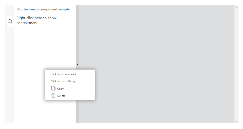
<html>
<template id="layout-template">
<webpdf>
<div class="fv__ui-body">
<sidebar open>
<sidebar-panel icon-class="fv__icon-sidebar-comment-list" @controller="custom:CustomController" title="Contextmenu component sample">
<text>Right click here to show contextmenu</text>
</sidebar-panel>
</sidebar>
<viewer></viewer>
</div>
<template>
<contextmenu name="fv--custom-contextmenu">
<contextmenu-item @controller="custom:AlertDialogController">Click to show a alert</contextmenu-item>
<contextmenu-item>Click to do nothing</contextmenu-item>
<contextmenu-separator></contextmenu-separator>
<contextmenu-item icon-class="fv__icon-comment-item-menu-copy">Copy</contextmenu-item>
<contextmenu-item icon-class="fv__icon-comment-item-menu-delete">Delete</contextmenu-item>
</contextmenu>
</template>
</webpdf>
</template>
</html>
<script>
UIExtension.PDFUI.module('custom', [])
.controller('AlertDialogController', {
handle: function() {
this.getPDFUI().alert('Hello World');
}
})
.controller('CustomController', {
mounted: function() {
this.component.active();
var element = this.component.getContainerElement();
var contextmenu = this.getComponentByName('fv--custom-contextmenu');
var rect = element.getBoundingClientRect();
contextmenu.showAt(rect.left + rect.width/2, rect.top + rect.height / 2);
element.addEventListener('contextmenu', function(e) {
contextmenu.showAt(e.clientX, e.clientY);
e.preventDefault();
});
}
});
var CustomAppearance = UIExtension.appearances.Appearance.extend({
getLayoutTemplate: function() {
return document.getElementById('layout-template').innerHTML;
},
disableAll: function(){}
});
var libPath = window.top.location.origin + '/lib';
var pdfui = new UIExtension.PDFUI({
viewerOptions: {
libPath: libPath,
jr: {
licenseSN: licenseSN,
licenseKey: licenseKey
}
},
renderTo: document.body,
appearance: CustomAppearance,
addons: []
});
</script>
API
Contextmenu component template
Template example:
<contextmenu name="fv--custom-contextmenu">
<contextmenu-item >Click to show a alert</contextmenu-item>
<contextmenu-item>Click to do nothing</contextmenu-item>
<contextmenu-separator></contextmenu-separator>
<contextmenu-item icon-class="fv__icon-comment-item-menu-copy">Copy</contextmenu-item>
<contextmenu-item icon-class="fv__icon-comment-item-menu-delete">Delete</contextmenu-item>
</contextmenu>
Methods
Contextmenu methods
| Method | Description | Version |
| showAt(x: number, y: number):void | Shows on the specified coordinates, where the x and y axes are relative to the browser viewport. | 7.2.0 |
For more information, you may check layer component.
Contextmenun item method:
For details, you may check button component.
Events
Contextmenu events are same as layer component.
Viewer component
The <viewer> component is used to render PDF. It is required in the layout template. Below is a basic layout template example:
<webpdf>
<viewer></viewer>
</webpdf>
Runnable example:

<html>
<div id="pdf-ui"></div>
<template id="layout-template">
<webpdf>
<viewer></viewer>
</webpdf>
</template>
</html>
<style>
html{
overflow:hidden;
}
body {
height: 4180px;
}
#pdf-ui {
position: relative;
top: 50px;
}
</style>
<script>
var CustomAppearance = UIExtension.appearances.Appearance.extend({
getLayoutTemplate: function() {
return document.getElementById('layout-template').innerHTML;
},
disableAll: function(){}
});
var libPath = window.top.location.origin + '/lib';
var pdfui = new UIExtension.PDFUI({
viewerOptions: {
libPath: libPath,
jr: {
licenseSN: licenseSN,
licenseKey: licenseKey
}
},
renderTo: '#pdf-ui',
appearance: CustomAppearance,
addons: []
});
var origin = window.top.location.origin;
var url = origin + window.top.location.href.slice(origin.length).replace(/((\/.*)?\/docs\/).*/, '$1FoxitPDFSDKforWeb_DemoGuide.pdf');
pdfui.openPDFByHttpRangeRequest({
range: {
url: url,
}
}, { fileName: 'FoxitPDFSDKforWeb_DemoGuide.pdf' })
window.addEventListener(UIExtension.PDFViewCtrl.DeviceInfo.isDesktop ? 'resize' : 'orientationchange', function(e) {
pdfui.redraw().catch(function(err) {console.log(err)});
});
</script>
By default, the PDFUI container has no size limit. In order to display the scroller, you should set the height for PDFUI based on your real viewer size.

<html>
<div id="pdf-ui"></div>
<template id="layout-template">
<webpdf>
<viewer></viewer>
</webpdf>
</template>
</html>
<style>
html{
overflow:hidden;
}
body {
height: 4180px;
}
/* PDFUI container style */
#pdf-ui {
position: relative;
top: 50px;
height: 500px;
}
</style>
<script>
var CustomAppearance = UIExtension.appearances.Appearance.extend({
getLayoutTemplate: function() {
return document.getElementById('layout-template').innerHTML;
},
disableAll: function(){}
});
var libPath = window.top.location.origin + '/lib';
var pdfui = new UIExtension.PDFUI({
viewerOptions: {
libPath: libPath,
jr: {
licenseSN: licenseSN,
licenseKey: licenseKey
}
},
renderTo: '#pdf-ui',
appearance: CustomAppearance,
addons: []
});
var origin = window.top.location.origin;
var url = origin + window.top.location.href.slice(origin.length).replace(/((\/.*)?\/docs\/).*/, '$1FoxitPDFSDKforWeb_DemoGuide.pdf');
pdfui.openPDFByHttpRangeRequest({
range: {
url: url,
}
}, { fileName: 'FoxitPDFSDKforWeb_DemoGuide.pdf' })
window.addEventListener(UIExtension.PDFViewCtrl.DeviceInfo.isDesktop ? 'resize' : 'orientationchange', function(e) {
pdfui.redraw().catch(function(err) {console.log(err)});
});
</script>
To achieve drag, zoom and scroll on a rendered PDF page, you should reference directives in your <viewer> component.
Usage snippet:
<viewer @zoom-on-pinch @zoom-on-doubletap @zoom-on-wheel @touch-to-scroll></viewer>
Directives:
| Directive | Function |
| @zoom-on-pinch | Pinch to zoom |
| @zoom-on-doubletap | Double click to zoom |
| @zoom-on-wheel | Ctrl + mouse wheel to zoom |
| @touch-to-scroll | Drag to scroll |
Form-group component
The <form-group> component is used to add certain controls with a specific structure to a form. It is the easy way to organize the layout of input components and labels, and to provide the help text.
Note: The <form-group> currently is used only for the “fv–comparison-select-pdf-file-dialog”.
Code Examples
Label Text
The label text of the form component is used to provide a description of an innput component.
Label Text Layout
The label text for the form-group component provides three types of form layouts, ltr, rtl and ttb:
The ltr and rtl are horizontal layouts, and the label text and the input component display on the same line.
The ltr in layout is that the label text appears on the left side of the input component.
The rtl in layout is that the label text appears to the right of the input component.
The ttb is a vertical layout, means Top-To-Bottom, where the label text appears above the input component.
The following example demonstrates the effect of these three layouts:
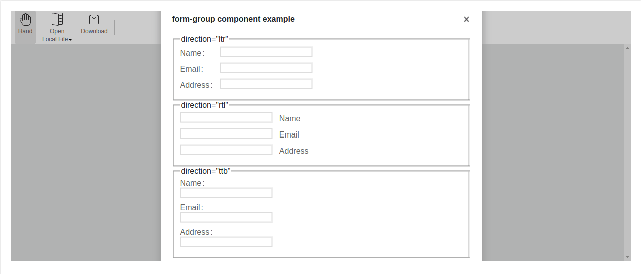
<html>
<template id=”layout-template”>
<webpdf>
<toolbar>
<group-list>
<group name=”home-tab-group-hand”>
<hand-ribbon-button></hand-ribbon-button>
<open-file-ribbon-dropdown></open-file-ribbon-dropdown>
<download-file-ribbon-button></download-file-ribbon-button>
</group>
</group-list>
</toolbar>
<div class=”fv__ui-body”>
<viewer></viewer>
</div>
<template name=”template-container”>
<layer class=”center” visible=”true” backdrop style=”width: 640px”>
<layer-header title=”form-group component example” @draggable=”{type: ‘parent’}”></layer-header>
<layer-view>
<fieldset>
<legend>direction=”ltr”</legend>
<form-group label=”Name”>
<input>
</form-group>
<form-group label=”Email”>
<input type=”email”>
</form-group>
<form-group label=”Address”>
<input type=”address”>
</form-group>
</fieldset>
<fieldset>
<legend>direction=”rtl”</legend>
<form-group label=”Name” direction=”rtl”>
<input>
</form-group>
<form-group label=”Email” direction=”rtl”>
<input type=”email”>
</form-group>
<form-group label=”Address” direction=”rtl”>
<input type=”address”>
</form-group>
</fieldset>
<fieldset>
<legend>direction=”ttb”</legend>
<form-group label=”Name” direction=”ttb”>
<input>
</form-group>
<form-group label=”Email” direction=”ttb”>
<input type=”email”>
</form-group>
<form-group label=”Address” direction=”ttb”>
<input type=”address”>
</form-group>
</fieldset>
</layer-view>
</layer>
</template>
</webpdf>
</template>
</html>
<style>
.fv__ui-form-group-label {
width: 5em;
}
.fv__ui-form-group {
margin-bottom: 10px;
color: #666;
}
input {
border: 1px solid #ddd;
margin-right: 1em;
}
</style>
<script>
var CustomAppearance = UIExtension.appearances.Appearance.extend({
getLayoutTemplate: function() {
return document.getElementById(‘layout-template’).innerHTML;
},
disableAll: function(){}
});
var libPath = window.top.location.origin + ‘/lib’;
var pdfui = new UIExtension.PDFUI({
viewerOptions: {
libPath: libPath,
jr: {
licenseSN: licenseSN,
licenseKey: licenseKey
}
},
renderTo: document.body,
appearance: CustomAppearance,
addons: []
});
</script>
Label Delimiter
In the example above, the label delimiter : takes place automatically when the direction is set to ltr and ttb. If the delimiter sign is not required, you can include delimiter inside the <legend> tag but leave its value blank to hide it:
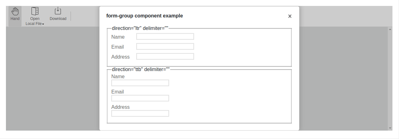
<html>
<template id=”layout-template”>
<webpdf>
<toolbar>
<group-list>
<group name=”home-tab-group-hand”>
<hand-ribbon-button></hand-ribbon-button>
<open-file-ribbon-dropdown></open-file-ribbon-dropdown>
<download-file-ribbon-button></download-file-ribbon-button>
</group>
</group-list>
</toolbar>
<div class=”fv__ui-body”>
<viewer></viewer>
</div>
<template name=”template-container”>
<layer class=”center” visible=”true” backdrop style=”width: 640px”>
<layer-header title=”form-group component example” @draggable=”{type: ‘parent’}”></layer-header>
<layer-view>
<fieldset>
<legend>direction=”ltr” delimiter=””</legend>
<form-group label=”Name” delimiter=””>
<input>
</form-group>
<form-group label=”Email” delimiter=””>
<input type=”email”>
</form-group>
<form-group label=”Address” delimiter=””>
<input type=”address”>
</form-group>
</fieldset>
<fieldset>
<legend>direction=”ttb” delimiter=””</legend>
<form-group label=”Name” direction=”ttb” delimiter=””>
<input>
</form-group>
<form-group label=”Email” direction=”ttb” delimiter=””>
<input type=”email”>
</form-group>
<form-group label=”Address” direction=”ttb” delimiter=””>
<input type=”address”>
</form-group>
</fieldset>
</layer-view>
</layer>
</template>
</webpdf>
</template>
</html>
<style>
.fv__ui-form-group-label {
width: 5em;
}
.fv__ui-form-group {
margin-bottom: 10px;
color: #666;
}
input {
border: 1px solid #ddd;
margin-right: 1em;
}
</style>
<script>
var CustomAppearance = UIExtension.appearances.Appearance.extend({
getLayoutTemplate: function() {
return document.getElementById(‘layout-template’).innerHTML;
},
disableAll: function(){}
});
var libPath = window.top.location.origin + ‘/lib’;
var pdfui = new UIExtension.PDFUI({
viewerOptions: {
libPath: libPath,
jr: {
licenseSN: licenseSN,
licenseKey: licenseKey
}
},
renderTo: document.body,
appearance: CustomAppearance,
addons: []
});
</script>
Help Text
The help text is optional and is primarily used to display component descriptive information, and the content can be set through the description property, which supports i18n.
The following example shows the help text styles in the different layouts:
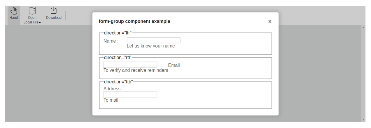
<html>
<template id=”layout-template”>
<webpdf>
<toolbar>
<group-list>
<group name=”home-tab-group-hand”>
<hand-ribbon-button></hand-ribbon-button>
<open-file-ribbon-dropdown></open-file-ribbon-dropdown>
<download-file-ribbon-button></download-file-ribbon-button>
</group>
</group-list>
</toolbar>
<div class=”fv__ui-body”>
<viewer></viewer>
</div>
<template name=”template-container”>
<layer class=”center” visible=”true” backdrop style=”width: 640px”>
<layer-header title=”form-group component example” @draggable=”{type: ‘parent’}”></layer-header>
<layer-view>
<fieldset>
<legend>direction=”ltr”</legend>
<form-group label=”Name” description=”Let us know your name”>
<input>
</form-group>
</fieldset>
<fieldset>
<legend>direction=”rtl”</legend>
<form-group label=”Email” direction=”rtl” description=”To verify and receive reminders”>
<input type=”email”>
</form-group>
</fieldset>
<fieldset>
<legend>direction=”ttb”</legend>
<form-group label=”Address” direction=”ttb” description=”To mail”>
<input type=”address”>
</form-group>
</fieldset>
</layer-view>
</layer>
</template>
</webpdf>
</template>
</html>
<style>
.fv__ui-form-group-label {
width: 5em;
}
.fv__ui-form-group {
margin-bottom: 10px;
color: #666;
}
input {
border: 1px solid #ddd;
margin-right: 1em;
}
</style>
<script>
var CustomAppearance = UIExtension.appearances.Appearance.extend({
getLayoutTemplate: function() {
return document.getElementById(‘layout-template’).innerHTML;
},
disableAll: function(){}
});
var libPath = window.top.location.origin + ‘/lib’;
var pdfui = new UIExtension.PDFUI({
viewerOptions: {
libPath: libPath,
jr: {
licenseSN: licenseSN,
licenseKey: licenseKey
}
},
renderTo: document.body,
appearance: CustomAppearance,
addons: []
});
</script>
Set Parameters Dynamically
The parameters of the form-group component can be dynamically modified via the template or js, see the following example:
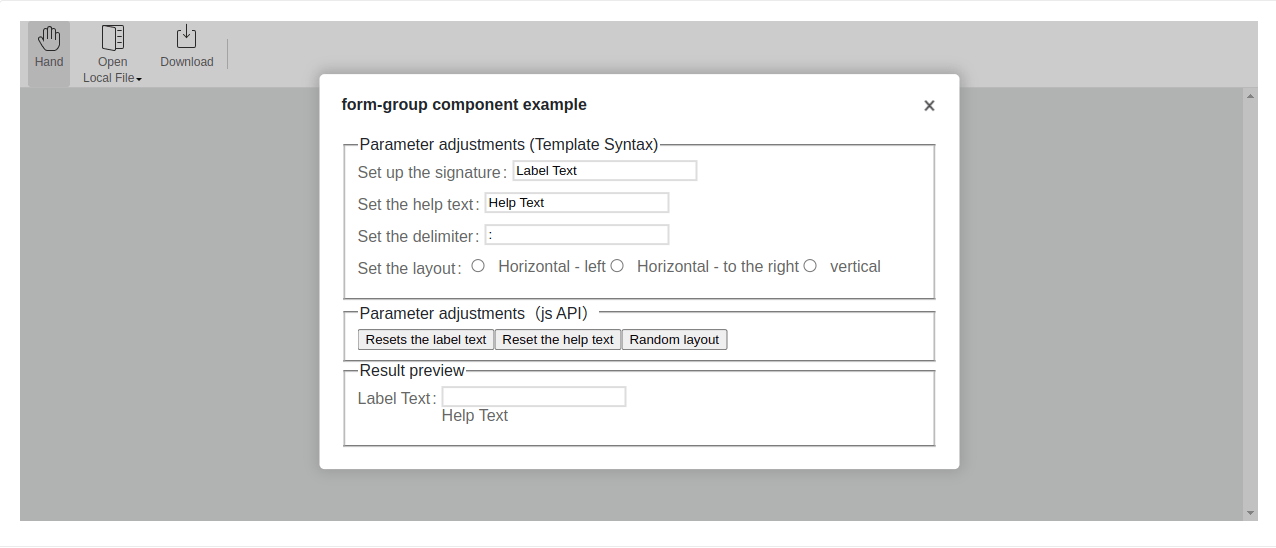
<html>
<template id=”example-dialog-template”>
<layer class=”center” backdrop style=”width: 640px” @var.comp=”$component”>
<layer-header title=”form-group component example” @draggable=”{type: ‘parent’}”></layer-header>
<layer-view>
<fieldset>
<legend>Parameter adjustments (Template Syntax)</legend>
<form-group label=”Set up the signature”>
<input @model=”comp.label”>
</form-group>
<form-group label=”Set the help text”>
<input @model=”comp.description”>
</form-group>
<form-group label=”Set the delimiter”>
<input @model=”comp.delimiter”>
</form-group>
<form-group label=”Set the layout” tag=”div”>
<radio name=”form-group-direction” @model=”comp.direction” value=”ltr” text=”Horizontal – left”></radio>
<radio name=”form-group-direction” @model=”comp.direction” value=”rtl” text=”Horizontal – to the right”></radio>
<radio name=”form-group-direction” @model=”comp.direction” value=”ttb” text=”vertical”></radio>
</form-group>
</fieldset>
<fieldset>
<legend>Parameter adjustments(js API)</legend>
<button @on.click=”comp.resetLabel()”>Resets the label text</button>
<button @on.click=”comp.resetDescription()”>Reset the help text</button>
<button @on.click=”comp.resetDirection()”>Random layout</button>
</fieldset>
<fieldset>
<legend>Result preview</legend>
<form-group
@setter.label=”comp.label”
@setter.description=”comp.description”
@setter.delimiter=”comp.delimiter”
@setter.direction=”comp.direction”
@init=”comp.formGroupComponent = $component”
>
<input>
</form-group>
</fieldset>
</layer-view>
</layer>
</template>
<template id=”layout-template”>
<webpdf>
<toolbar>
<group-list>
<group name=”home-tab-group-hand”>
<hand-ribbon-button></hand-ribbon-button>
<open-file-ribbon-dropdown></open-file-ribbon-dropdown>
<download-file-ribbon-button></download-file-ribbon-button>
</group>
</group-list>
</toolbar>
<div class=”fv__ui-body”>
<viewer></viewer>
</div>
<template name=”template-container”>
<exp:example-dialog visible=”true”></exp:example-dialog>
</template>
</webpdf>
</template>
</html>
<style>
.fv__ui-form-group {
margin-bottom: 10px;
color: #666;
}
input {
border: 1px solid #ddd;
margin-right: 1em;
}
</style>
<script>
class ExampleDialog extends UIExtension.SeniorComponentFactory.createSuperClass({
template: document.getElementById(‘example-dialog-template’).innerHTML
}) {
static getName() {
return ‘example-dialog’
}
init() {
super.init();
this.delimiter = ‘:’;
this.description = ‘Help Text’;
this.label = ‘Label Text’;
this.direction = ‘ltr’;
}
resetLabel() {
this.formGroupComponent.setLabel(
this.label = new Date().toUTCString()
);
this.digest();
}
resetDescription() {
this.formGroupComponent.setDescription(
this.description = ‘Help Text:’ + new Date().toUTCString()
);
this.digest();
}
resetDirection() {
this.formGroupComponent.setDirection(
this.direction = [‘ltr’, ‘rtl’, ‘ttb’][Math.floor(Math.random() * 3)]
);
this.digest();
}
}
UIExtension.modular.module(‘exp’, []).registerComponent(ExampleDialog);
var CustomAppearance = UIExtension.appearances.Appearance.extend({
getLayoutTemplate: function() {
return document.getElementById(‘layout-template’).innerHTML;
},
disableAll: function(){}
});
var libPath = window.top.location.origin + ‘/lib’;
var pdfui = new UIExtension.PDFUI({
viewerOptions: {
libPath: libPath,
jr: {
licenseSN: licenseSN,
licenseKey: licenseKey
}
},
renderTo: document.body,
appearance: CustomAppearance,
addons: []
});
</script>
API
form-group Component Templates:
<form-group delimiter=”:” direction=”ltr” label=”” description=””>
<input>
</form-group>
Descriptions for each property of the form-group :
| Attribute | Description | Type | The default value | Version |
| delimiter | The delimiter after the label text, invalid when direction is rtl | string | ‘:’ | 8.5.0 |
| direction | The way to lay out the label text and input components. | ‘ltr’ | ‘rtl’ | ‘ttb’ | ‘ltr’ | 8.5.0 |
| label | Label text | string | ” | 8.5.0 |
| description | The help text under the input component | string | ” | 8.5.0 |
Methods
form-group componets’ methods
| Method | Description | Version |
| setDelimiter(delimiter: string) | Modify the delimiter | 8.5.0 |
| setDirection(direction: ‘ltr’ | ‘rtl’ | ‘ttb’) | Modify the layout way | 8.5.0 |
| setLabel(label: string) | Modify the label text | 8.5.0 |
| setDescription(description: string) | Modify the help text | 8.5.0 |
Events
The form-group component does not define events.
Inline-color-picker components
The inline-color-picker component displays a rectangular box on the UI, from where a user clicks to bring up a color picker palette and select colors.
Note: inline-color-picker currently is only used for the “fv–comparison-select-pdf-file-dialog”.
Code examples
The following example shows the basic usage of the inline-color-picker component:
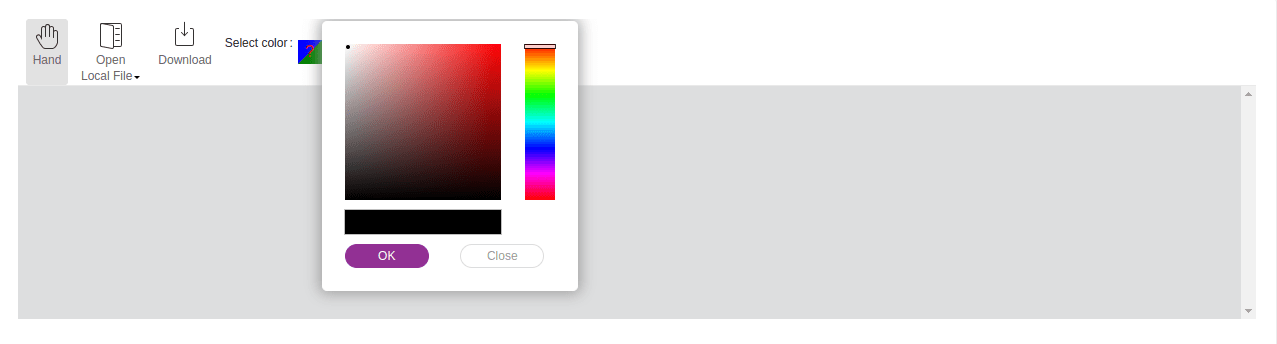
<html>
<template id=”layout-template”>
<webpdf>
<toolbar>
<group-list shrink-size=”0″>
<group name=”home-tab-group-hand”>
<hand-ribbon-button></hand-ribbon-button>
<open-file-ribbon-dropdown></open-file-ribbon-dropdown>
<download-file-ribbon-button></download-file-ribbon-button>
<form-group label=”Select color”>
<inline-color-picker></inline-color-picker>
</form-group>
</group>
</group-list>
</toolbar>
<div class=”fv__ui-body”>
<viewer></viewer>
</div>
</webpdf>
</template>
</html>
<style>
</style>
<script>
var CustomAppearance = UIExtension.appearances.Appearance.extend({
getLayoutTemplate: function() {
return document.getElementById(‘layout-template’).innerHTML;
},
disableAll: function(){}
});
var libPath = window.top.location.origin + ‘/lib’;
var pdfui = new UIExtension.PDFUI({
viewerOptions: {
libPath: libPath,
jr: {
licenseSN: licenseSN,
licenseKey: licenseKey
}
},
renderTo: document.body,
appearance: CustomAppearance,
addons: []
});
</script>
Set the current color displayed on the rectangle by using API:
<html>
<template id=”layout-template”>
<webpdf>
<toolbar>
<group-list shrink-size=”0″>
<group name=”home-tab-group-hand” @var.grp=”$component”>
<hand-ribbon-button></hand-ribbon-button>
<open-file-ribbon-dropdown></open-file-ribbon-dropdown>
<download-file-ribbon-button></download-file-ribbon-button>
<form-group label=”Select color”>
<inline-color-picker @init=”grp.colorPicker=$component”></inline-color-picker>
</form-group>
<ribbon-button @on.click=”grp.colorPicker.setValue(Math.floor(Math.random() * 0xFFFFFF))” text=”Set a random color”></ribbon-button>
</group>
</group-list>
</toolbar>
<div class=”fv__ui-body”>
<viewer></viewer>
</div>
</webpdf>
</template>
</html>
<style>
</style>
<script>
var CustomAppearance = UIExtension.appearances.Appearance.extend({
getLayoutTemplate: function() {
return document.getElementById(‘layout-template’).innerHTML;
},
disableAll: function(){}
});
var libPath = window.top.location.origin + ‘/lib’;
var pdfui = new UIExtension.PDFUI({
viewerOptions: {
libPath: libPath,
jr: {
licenseSN: licenseSN,
licenseKey: licenseKey
}
},
renderTo: document.body,
appearance: CustomAppearance,
addons: []
});
</script>
API
inline-color-picker component templates
<inline-color-picker></inline-color-picker>
Methods
| Method | Description | Version |
| setValue(color: number | Color) | Sets the current color value | 8.5.0 |
| getValue(): Color | Gets the current color value | 8.5.0 |
Events
| Name | Description | Example | Version |
| change | Triggered when the user selects a color | inlineColorPicker.on(‘change’, (color) => {}) | 8.5.0 |
Tree Component
The Tree Component is a powerful UI component that integrates functionalities such as selection, dragging, editing, and lazy loading. This section will introduce how to create a tree component and the usage of its key interfaces and events through examples.
The article will involve some APIs and event names of the Tree Component. For related information, please refer to the API Reference as below:
TreeComponent, TreeNodeComponent , TreeNodeData
Getting Started
Create a Tree Component
As the code snippet below shows, you can create a Tree Component by using the <tree> tag in the template. The Tree Component supports three attributes:
draggable: Indicates whether the dragging feature is enabled. It is disabled by default. Once enabled, tree nodes can be dragged onto other tree nodes, triggering the dragend event.
editable: Indicates whether the editing feature is enabled. It is disabled by default. Once enabled, the text on the tree nodes can be edited by double-clicking, and the confirm-edit event is triggered upon hitting enter to confirm the update.
lazy-mode: Represents the mode for lazy loading child nodes. The default is “none”, which indicates that delayed loading is not enabled. When set to “passive”, child nodes are only created and rendered when they are within the visible area, which can improve performance when there are a large number of child nodes.
<tree
draggable="true"
editable="true"
lazy-mode="passive"
></tree>
Display Data in the Tree Component
The previous example code simply creates a tree component and does not display any content, as no data is provided. There are two ways to display data in the tree component:
Use the @setter.data=”expression” directive in the component template to specify the data binding relationship. The result returned by the expression will be used for the tree component’s data display.
Update the data of the tree component through the [TreeComponent.setData] API.
Please note that these two methods cannot be used simultaneously to avoid unexpected results due to synchronization order issues.
Below are two examples of tree components demonstrated separately by directive and setData, please click run to execute:
Display data using the @setter.data directive:
<html>
<div id="pdf-ui"></div>
<template id="layout-template">
<webpdf class="custom-webpdf-container">
<my-tree class="my-tree-container"></my-tree>
<viewer style="flex: 1"></viewer>
</webpdf>
</template>
</html>
<style>
html{
overflow:hidden;
}
body {
height: 100vh;
}
#pdf-ui {
position: relative;
top: 50px;
}
.custom-webpdf-container {
display: flex;
flex-direction: row;
}
.my-tree-container {
width: 200px;
border-right: 1px solid #ddd;
overflow-y: scroll;
}
</style>
<script>
class MyTreeComponent extends UIExtension.SeniorComponentFactory.createSuperClass({
template: `<div @var.my_tree="$component">
<tree
@setter.data="my_tree.treeData"
></tree>
<xbutton @on.click="my_tree.handleClick()">Show More</xbutton>
</div>`
}) {
static getName() {
return 'my-tree'
}
treeData = [{
title: 'First',
id: '1'
}]
handleClick() {
this.treeData = [{
title: 'First',
id: '1'
}, {
title: 'Second',
id: '2'
}, {
title: 'Third',
id: '3',
isLeaf: false,
children: [{
title: 'Fourth',
id: '4'
}]
}];
this.digest();
}
}
UIExtension.modular.root().registerComponent(MyTreeComponent);
const CustomAppearance = UIExtension.appearances.Appearance.extend({
getLayoutTemplate: function() {
return document.getElementById('layout-template').innerHTML;
},
disableAll: function(){}
});
const libPath = window.top.location.origin + '/lib';
const pdfui = new UIExtension.PDFUI({
viewerOptions: {
libPath: libPath,
jr: {
licenseSN: licenseSN,
licenseKey: licenseKey
}
},
renderTo: '#pdf-ui',
appearance: CustomAppearance,
addons: []
});
</script>
Display data using the setData API
<html>
<div id="pdf-ui"></div>
<template id="layout-template">
<webpdf class="custom-webpdf-container">
<my-tree class="my-tree-container"></my-tree>
<viewer style="flex: 1"></viewer>
</webpdf>
</template>
</html>
<style>
html{
overflow:hidden;
}
body {
height: 100vh;
}
#pdf-ui {
position: relative;
top: 50px;
}
.custom-webpdf-container {
display: flex;
flex-direction: row;
}
.my-tree-container {
width: 200px;
border-right: 1px solid #ddd;
overflow-y: scroll;
}
</style>
<script>
class MyTreeComponent extends UIExtension.SeniorComponentFactory.createSuperClass({
template: `<div @var.my_tree="$component">
<tree></tree>
<xbutton @on.click="my_tree.handleClick()">Show Tree Data</xbutton>
</div>`
}) {
static getName() {
return 'my-tree'
}
handleClick() {
const tree = this.childAt(0);
tree.setData([{
title: 'First',
id: '1'
}, {
title: 'Second',
id: '2'
}, {
title: 'Third',
id: '3',
isLeaf: false,
children: [{
title: 'Fourth',
id: '4'
}]
}])
}
}
UIExtension.modular.root().registerComponent(MyTreeComponent);
const CustomAppearance = UIExtension.appearances.Appearance.extend({
getLayoutTemplate: function() {
return document.getElementById('layout-template').innerHTML;
},
disableAll: function(){}
});
const libPath = window.top.location.origin + '/lib';
const pdfui = new UIExtension.PDFUI({
viewerOptions: {
libPath: libPath,
jr: {
licenseSN: licenseSN,
licenseKey: licenseKey
}
},
renderTo: '#pdf-ui',
appearance: CustomAppearance,
addons: []
});
</script>
Create an editable tree
To create an editable tree, you need to set the editable attribute to true on the <tree> tag. This will allow the node name to be edited by double-clicking on the tree node text.
For example:
<tree editable="true"></tree>
After enabling the editing feature, when the tree node text is double-clicked, it will trigger an edit event. You can make the node data editable by updating it in the event listener function.
Once the editing is complete, you can listen to the confirm-edit event to get the text edited by the user.
Example:
<html>
<div id="pdf-ui"></div>
<template id="layout-template">
<webpdf class="custom-webpdf-container">
<my-tree class="my-tree-container"></my-tree>
<viewer style="flex: 1"></viewer>
</webpdf>
</template>
</html>
<style>
html{
overflow:hidden;
}
body {
height: 100vh;
}
#pdf-ui {
position: relative;
top: 50px;
}
.custom-webpdf-container {
display: flex;
flex-direction: row;
}
.my-tree-container {
width: 200px;
border-right: 1px solid #ddd;
overflow-y: scroll;
}
</style>
<script>
class MyTreeComponent extends UIExtension.SeniorComponentFactory.createSuperClass({
template: `<div @var.my_tree="$component">
<tree
editable="true"
@setter.data="my_tree.treeData"
@on.confirm-edit="my_tree.onConfirmEdit($args[0])"
></tree>
</div>`
}) {
static getName() {
return 'my-tree'
}
treeData = [{
title: 'First',
id: '1'
}, {
title: 'Second',
id: '2'
}, {
title: 'Third',
id: '3',
isLeaf: false,
children: [{
title: 'Fourth',
id: '4'
}]
}]
onConfirmEdit(event) {
console.log(event.oldTitle, event.newTitle, event.nodeId);
}
}
UIExtension.modular.root().registerComponent(MyTreeComponent);
const CustomAppearance = UIExtension.appearances.Appearance.extend({
getLayoutTemplate: function() {
return document.getElementById('layout-template').innerHTML;
},
disableAll: function(){}
});
const libPath = window.top.location.origin + '/lib';
const pdfui = new UIExtension.PDFUI({
viewerOptions: {
libPath: libPath,
jr: {
licenseSN: licenseSN,
licenseKey: licenseKey
}
},
renderTo: '#pdf-ui',
appearance: CustomAppearance,
addons: []
});
</script>
If you want to set a specific node to be uneditable, you can individually specify its data parameter editable as false in treeData.
Example:
<html>
<div id="pdf-ui"></div>
<template id="layout-template">
<webpdf class="custom-webpdf-container">
<my-tree class="my-tree-container"></my-tree>
<viewer style="flex: 1"></viewer>
</webpdf>
</template>
</html>
<style>
html{
overflow:hidden;
}
body {
height: 100vh;
}
#pdf-ui {
position: relative;
top: 50px;
}
.custom-webpdf-container {
display: flex;
flex-direction: row;
}
.my-tree-container {
width: 200px;
border-right: 1px solid #ddd;
overflow-y: scroll;
}
</style>
<script>
class MyTreeComponent extends UIExtension.SeniorComponentFactory.createSuperClass({
template: `<div @var.my_tree="$component">
<tree
editable="true"
@setter.data="my_tree.treeData"
></tree>
</div>`
}) {
static getName() {
return 'my-tree'
}
treeData = [{
title: 'First',
id: '1'
}, {
title: 'Not editable',
id: '2',
editable: false
}, {
title: 'Third',
id: '3',
isLeaf: false,
children: [{
title: 'Fourth',
id: '4'
}]
}]
}
UIExtension.modular.root().registerComponent(MyTreeComponent);
const CustomAppearance = UIExtension.appearances.Appearance.extend({
getLayoutTemplate: function() {
return document.getElementById('layout-template').innerHTML;
},
disableAll: function(){}
});
const libPath = window.top.location.origin + '/lib';
const pdfui = new UIExtension.PDFUI({
viewerOptions: {
libPath: libPath,
jr: {
licenseSN: licenseSN,
licenseKey: licenseKey
}
},
renderTo: '#pdf-ui',
appearance: CustomAppearance,
addons: []
});
</script>
Please note that if you set the editable parameter of the tree component to false, you will not be able to individually specify whether a node is editable.
Create a draggable tree
To make the tree component draggable, you need to enable the draggable attribute on the <tree> component:
<tree draggable="true"></tree>
In this way, you can drag tree nodes into other nodes. When the dragging ends, a dragend event will be triggered. Through the event parameters, you can obtain the data of the dragged node, the ID of the target node, and the relationship between nodes after dragging. Typically, at this point, the application needs to update the backend data based on this information.
Example:
<html>
<div id="pdf-ui"></div>
<template id="layout-template">
<webpdf class="custom-webpdf-container">
<my-tree class="my-tree-container"></my-tree>
<viewer style="flex: 1"></viewer>
</webpdf>
</template>
</html>
<style>
html{
overflow:hidden;
}
body {
height: 100vh;
}
#pdf-ui {
position: relative;
top: 50px;
}
.custom-webpdf-container {
display: flex;
flex-direction: row;
}
.my-tree-container {
width: 200px;
border-right: 1px solid #ddd;
overflow-y: scroll;
}
</style>
<script>
class MyTreeComponent extends UIExtension.SeniorComponentFactory.createSuperClass({
template: `<div @var.my_tree="$component">
<tree
draggable="true"
@setter.data="my_tree.treeData"
@on.dragend="my_tree.handleDragendEvent($args[0])"
></tree>
</div>`
}) {
static getName() {
return 'my-tree'
}
treeData = [{
title: 'First',
id: '1'
}, {
title: 'Second',
id: '2'
}, {
title: 'Third',
id: '3',
isLeaf: false,
children: [{
title: 'Fourth',
id: '4'
}]
}]
handleDragendEvent(event) {
console.log('On dragend event:', event)
}
}
UIExtension.modular.root().registerComponent(MyTreeComponent);
const CustomAppearance = UIExtension.appearances.Appearance.extend({
getLayoutTemplate: function() {
return document.getElementById('layout-template').innerHTML;
},
disableAll: function(){}
});
const libPath = window.top.location.origin + '/lib';
const pdfui = new UIExtension.PDFUI({
viewerOptions: {
libPath: libPath,
jr: {
licenseSN: licenseSN,
licenseKey: licenseKey
}
},
renderTo: '#pdf-ui',
appearance: CustomAppearance,
addons: []
});
</script>
If you want to set a specific node to be non-draggable, you can individually specify its data parameter draggable as false in treeData.
Example:
<html>
<div id="pdf-ui"></div>
<template id="layout-template">
<webpdf class="custom-webpdf-container">
<my-tree class="my-tree-container"></my-tree>
<viewer style="flex: 1"></viewer>
</webpdf>
</template>
</html>
<style>
html{
overflow:hidden;
}
body {
height: 100vh;
}
#pdf-ui {
position: relative;
top: 50px;
}
.custom-webpdf-container {
display: flex;
flex-direction: row;
}
.my-tree-container {
width: 200px;
border-right: 1px solid #ddd;
overflow-y: scroll;
}
</style>
<script>
class MyTreeComponent extends UIExtension.SeniorComponentFactory.createSuperClass({
template: `<div @var.my_tree="$component">
<tree
draggable="true"
@setter.data="my_tree.treeData"
@on.dragend="my_tree.handleDragendEvent($args[0])"
></tree>
</div>`
}) {
static getName() {
return 'my-tree'
}
treeData = [{
title: 'First',
id: '1'
}, {
title: 'Not draggable',
id: '2',
draggable: false
}, {
title: 'Third',
id: '3',
isLeaf: false,
children: [{
title: 'Fourth',
id: '4'
}]
}]
handleDragendEvent(event) {
console.log('On dragend event:', event)
}
}
UIExtension.modular.root().registerComponent(MyTreeComponent);
const CustomAppearance = UIExtension.appearances.Appearance.extend({
getLayoutTemplate: function() {
return document.getElementById('layout-template').innerHTML;
},
disableAll: function(){}
});
const libPath = window.top.location.origin + '/lib';
const pdfui = new UIExtension.PDFUI({
viewerOptions: {
libPath: libPath,
jr: {
licenseSN: licenseSN,
licenseKey: licenseKey
}
},
renderTo: '#pdf-ui',
appearance: CustomAppearance,
addons: []
});
</script>
Please note that if the draggable of the tree component is specified as false, you will not be able to individually specify whether a node is draggable.
Selectable tree node
To make the tree nodes selectable, you need to enable the selectable attribute on the <tree> component:
<tree selectable="true"></tree>
In this way, when a user clicks on a tree node, the fv__ui-tree-node-selected CSS class will be added to the node. The default appearance will not change, but your application can customize the appearance after selection. At the same time, the select event will be triggered.
<html>
<div id="pdf-ui"></div>
<template id="layout-template">
<webpdf class="custom-webpdf-container">
<my-tree class="my-tree-container"></my-tree>
<viewer style="flex: 1"></viewer>
</webpdf>
</template>
</html>
<style>
html{
overflow:hidden;
}
body {
height: 100vh;
}
#pdf-ui {
position: relative;
top: 50px;
}
.custom-webpdf-container {
display: flex;
flex-direction: row;
}
.my-tree-container {
width: 200px;
border-right: 1px solid #ddd;
overflow-y: scroll;
}
.fv__ui-tree-node-selected>.fv__ui-tree-node-wrapper {
color: red;
}
</style>
<script>
class MyTreeComponent extends UIExtension.SeniorComponentFactory.createSuperClass({
template: `<div @var.my_tree="$component">
<tree
selectable="true"
@setter.data="my_tree.treeData"
@on.select="my_tree.handleSelectEvent($args[0])"
></tree>
</div>`
}) {
static getName() {
return 'my-tree'
}
treeData = [{
title: 'First',
id: '1'
}, {
title: 'Second',
id: '2',
}, {
title: 'Third',
id: '3',
isLeaf: false,
children: [{
title: 'Fourth',
id: '4'
}]
}]
handleSelectEvent(nodeId) {
console.log('On select event:', nodeId)
}
}
UIExtension.modular.root().registerComponent(MyTreeComponent);
const CustomAppearance = UIExtension.appearances.Appearance.extend({
getLayoutTemplate: function() {
return document.getElementById('layout-template').innerHTML;
},
disableAll: function(){}
});
const libPath = window.top.location.origin + '/lib';
const pdfui = new UIExtension.PDFUI({
viewerOptions: {
libPath: libPath,
jr: {
licenseSN: licenseSN,
licenseKey: licenseKey
}
},
renderTo: '#pdf-ui',
appearance: CustomAppearance,
addons: []
});
</script>
If you want to specify a node as unselectable, you can individually set its data parameter selectable to false in treeData.
Example:
<html>
<div id="pdf-ui"></div>
<template id="layout-template">
<webpdf class="custom-webpdf-container">
<my-tree class="my-tree-container"></my-tree>
<viewer style="flex: 1"></viewer>
</webpdf>
</template>
</html>
<style>
html{
overflow:hidden;
}
body {
height: 100vh;
}
#pdf-ui {
position: relative;
top: 50px;
}
.custom-webpdf-container {
display: flex;
flex-direction: row;
}
.my-tree-container {
width: 200px;
border-right: 1px solid #ddd;
overflow-y: scroll;
}
.fv__ui-tree-node-selected>.fv__ui-tree-node-wrapper {
color: red;
}
</style>
<script>
class MyTreeComponent extends UIExtension.SeniorComponentFactory.createSuperClass({
template: `<div @var.my_tree="$component">
<tree
selectable="true"
@setter.data="my_tree.treeData"
@on.select="my_tree.handleSelectEvent($args[0])"
></tree>
</div>`
}) {
static getName() {
return 'my-tree'
}
treeData = [{
title: 'First',
id: '1'
}, {
title: 'Not selectable',
id: '2',
selectable: false
}, {
title: 'Third',
id: '3',
isLeaf: false,
children: [{
title: 'Fourth',
id: '4'
}]
}]
handleSelectEvent(nodeId) {
console.log('On select event:', nodeId)
}
}
UIExtension.modular.root().registerComponent(MyTreeComponent);
const CustomAppearance = UIExtension.appearances.Appearance.extend({
getLayoutTemplate: function() {
return document.getElementById('layout-template').innerHTML;
},
disableAll: function(){}
});
const libPath = window.top.location.origin + '/lib';
const pdfui = new UIExtension.PDFUI({
viewerOptions: {
libPath: libPath,
jr: {
licenseSN: licenseSN,
licenseKey: licenseKey
}
},
renderTo: '#pdf-ui',
appearance: CustomAppearance,
addons: []
});
</script>
Please note that if the selectable of the tree component is specified as false, you will not be able to individually specify whether a node is selectable.
The states of the tree node
Tree nodes have the following states:
disabled: Whether it is disabled or not, default is false. A disabled tree node cannot be edited, selected, or dragged.
activated: Whether the subtree is expanded or not, default is false. If the node is a leaf node, setting this value will have no effect.
selected: Whether it is selected or not, default is false. If the node is unselectable, setting this value will have no effect.
editing: Whether editing is enabled or not, default is false. If the node is uneditable, setting this value will have no effect.
Example:
<html>
<div id="pdf-ui"></div>
<template id="layout-template">
<webpdf class="custom-webpdf-container">
<my-tree class="my-tree-container"></my-tree>
<viewer style="flex: 1"></viewer>
</webpdf>
</template>
</html>
<style>
html{
overflow:hidden;
}
body {
height: 100vh;
}
#pdf-ui {
position: relative;
top: 50px;
}
.custom-webpdf-container {
display: flex;
flex-direction: row;
}
.my-tree-container {
width: 200px;
border-right: 1px solid #ddd;
overflow-y: scroll;
}
.fv__ui-tree-node-selected>.fv__ui-tree-node-wrapper {
color: red;
}
</style>
<script>
class MyTreeComponent extends UIExtension.SeniorComponentFactory.createSuperClass({
template: `<div @var.my_tree="$component">
<tree
selectable="true"
draggable="true"
editable="true"
@setter.data="my_tree.treeData"
></tree>
</div>`
}) {
static getName() {
return 'my-tree'
}
treeData = [{
title: 'Selected',
id: '1',
selected: true
}, {
title: 'Editting',
id: '2',
editting: true
}, {
title: 'Expanded',
id: '3',
isLeaf: false,
activated: true,
children: [{
title: 'Sub node',
id: '4'
}]
}, {
title: 'Disabled',
id: '5',
disabled: true,
}]
}
UIExtension.modular.root().registerComponent(MyTreeComponent);
const CustomAppearance = UIExtension.appearances.Appearance.extend({
getLayoutTemplate: function() {
return document.getElementById('layout-template').innerHTML;
},
disableAll: function(){}
});
const libPath = window.top.location.origin + '/lib';
const pdfui = new UIExtension.PDFUI({
viewerOptions: {
libPath: libPath,
jr: {
licenseSN: licenseSN,
licenseKey: licenseKey
}
},
renderTo: '#pdf-ui',
appearance: CustomAppearance,
addons: []
});
</script>
Lazy Mode
Lazy mode does not refer to data delay, but rendering delay. Considering that there may be a large number of tree nodes, inserting too many DOM nodes into the browser at once can cause display stuttering. To address this, the tree component provides a lazy mode lazy-mode=”passive”, which can display tree nodes as needed.
Example of using Lazy Mode:
<html>
<div id="pdf-ui"></div>
<template id="layout-template">
<webpdf class="custom-webpdf-container">
<my-tree class="my-tree-container"></my-tree>
<viewer style="flex: 1"></viewer>
</webpdf>
</template>
</html>
<style>
html{
overflow:hidden;
}
body {
height: 100vh;
}
#pdf-ui {
position: relative;
top: 50px;
}
.custom-webpdf-container {
display: flex;
flex-direction: row;
}
.my-tree-container {
width: 200px;
border-right: 1px solid #ddd;
overflow-y: scroll;
}
.fv__ui-tree-node-selected>.fv__ui-tree-node-wrapper {
color: red;
}
</style>
<script>
class MyTreeComponent extends UIExtension.SeniorComponentFactory.createSuperClass({
template: `<div @var.my_tree="$component">
<tree
selectable="true"
draggable="true"
editable="true"
lazy-mode="passive"
@setter.data="my_tree.treeData"
></tree>
</div>`
}) {
static getName() {
return 'my-tree'
}
treeData = [{
title: 'More than 10000+ Children',
id: '1',
isLeaf: false,
children: Array(10000).fill(0).map((_,i) => {
return {
title: '' + (Date.now()+i).toString(26),
id: Date.now() + i
};
})
}];
}
UIExtension.modular.root().registerComponent(MyTreeComponent);
const CustomAppearance = UIExtension.appearances.Appearance.extend({
getLayoutTemplate: function() {
return document.getElementById('layout-template').innerHTML;
},
disableAll: function(){}
});
const libPath = window.top.location.origin + '/lib';
const pdfui = new UIExtension.PDFUI({
viewerOptions: {
libPath: libPath,
jr: {
licenseSN: licenseSN,
licenseKey: licenseKey
}
},
renderTo: '#pdf-ui',
appearance: CustomAppearance,
addons: []
});
</script>
Example without using Lazy Mode:
<html>
<div id="pdf-ui"></div>
<template id="layout-template">
<webpdf class="custom-webpdf-container">
<my-tree class="my-tree-container"></my-tree>
<viewer style="flex: 1"></viewer>
</webpdf>
</template>
</html>
<style>
html{
overflow:hidden;
}
body {
height: 100vh;
}
#pdf-ui {
position: relative;
top: 50px;
}
.custom-webpdf-container {
display: flex;
flex-direction: row;
}
.my-tree-container {
width: 200px;
border-right: 1px solid #ddd;
overflow-y: scroll;
}
.fv__ui-tree-node-selected>.fv__ui-tree-node-wrapper {
color: red;
}
</style>
<script>
class MyTreeComponent extends UIExtension.SeniorComponentFactory.createSuperClass({
template: `<div @var.my_tree="$component">
<tree
selectable="true"
draggable="true"
editable="true"
lazy-mode="none"
@setter.data="my_tree.treeData"
></tree>
</div>`
}) {
static getName() {
return 'my-tree'
}
treeData = [{
title: 'More than 10000+ Children',
id: '1',
isLeaf: false,
children: Array(10000).fill(0).map((_,i) => {
return {
title: '' + (Date.now()+i).toString(26),
id: Date.now() + i
};
})
}];
}
UIExtension.modular.root().registerComponent(MyTreeComponent);
const CustomAppearance = UIExtension.appearances.Appearance.extend({
getLayoutTemplate: function() {
return document.getElementById('layout-template').innerHTML;
},
disableAll: function(){}
});
const libPath = window.top.location.origin + '/lib';
const pdfui = new UIExtension.PDFUI({
viewerOptions: {
libPath: libPath,
jr: {
licenseSN: licenseSN,
licenseKey: licenseKey
}
},
renderTo: '#pdf-ui',
appearance: CustomAppearance,
addons: []
});
</script>
When running the above two examples and clicking to expand a subtree with over 10,000 nodes, it can be observed that without the use of lazy mode, the browser exhibits noticeable stuttering at the outset.
Business Components
Pre-configured component
Pre-configured components are set in advance with text, icons, event handling and other information and assigning an alias, and then use alias in layout template directory. It is useful to simplify the template and reuse component in different appearance templates.
Custom pre-configured component
registerPreConfiguredComponent API
PDFUI.module('custom', [])
.registerPreConfiguredComponent('alias-button', {
template: '<xbutton name="pre-configured-button"></xbutton>',
config: [{
target: 'pre-configured-button',
text: 'Pre-configured button'
}]
})
Runnable example:

<html>
<template id="layout-template">
<webpdf>
<div>
<custom:alias-button></custom:alias-button>
</div>
<div class="fv__ui-body">
<viewer></viewer>
</div>
</webpdf>
</template>
</html>
<script>
UIExtension.PDFUI.module('custom', [])
.registerPreConfiguredComponent('alias-button', {
template: '<xbutton name="pre-configured-button">Pre-configured button</xbutton>',
config: [{
target: 'pre-configured-button',
callback: function() {
alert('click pre-configured button')
}
}]
});
var CustomAppearance = UIExtension.appearances.Appearance.extend({
getLayoutTemplate: function() {
return document.getElementById('layout-template').innerHTML;
},
disableAll: function(){}
});
var libPath = window.top.location.origin + '/lib';
var pdfui = new UIExtension.PDFUI({
viewerOptions: {
libPath: libPath,
jr: {
licenseSN: licenseSN,
licenseKey: licenseKey
}
},
renderTo: document.body,
appearance: CustomAppearance,
addons: []
});
</script>
Built-in pre-configured components
<hand-button>
From version 8.2.0, <hand-ribbon-button> is used by default.
Switch the state-handler to STATE_HANDLER_HAND
Component usage:
<hand-button></hand-button>
Equivalent to:
<xbutton @tooltip tooltip-title="toolbar.tooltip.hand.title" name="hand-tool" icon-class="fv__icon-toolbar-hand" @controller="states:HandController"></xbutton>
<hand-ribbon-button>
Added in version 8.2.0.
Switch the state-handler to STATE_HANDLER_HAND.
Component usage:
<hand-ribbon-button></hand-ribbon-button>
Equivalent to:
<ribbon-button text="toolbar.tooltip.hand.title" @tooltip tooltip-title="toolbar.tooltip.hand.title" name="hand-tool" icon-class="fv__icon-toolbar-hand" @controller="states:HandController"></ribbon-button>
<selection-dropdown>
From version 8.2.0, <selection-ribbon-dropdown> is used by default.
A dropdown with select-text-image button and select-annotation button.
component usage:
<selection-dropdown></selection-dropdown>
Equivalent to:
<dropdown @tooltip @controller="selection:SelectionDropdownController" name="selection-dropdown" class="fv__ui-dropdown-hide-text">
<select-text-image-button></select-text-image-button>
<select-annotation-button></select-annotation-button>
</dropdown>
<selection-ribbon-dropdown>
Added in version 8.2.0.
A dropdown with select-text-image button and select-annotation button.
component usage:
<selection-dropdown icon-class="fx-icon-ribbon_home_selecttextandimage-32"></selection-dropdown>
Equivalent to:
<ribbon-button
@tooltip
@controller="selection:SelectionDropdownController"
name="selection-dropdown"
@var.self="$component"
has-select="true"
>
<selection-dropdown></selection-dropdown>
</ribbon-button>
<select-text-image-button>
Switch the state-handler to STATE_HANDLER_SELECT_TEXT_IMAGE
component usage:
<select-text-image-button></select-text-image-button>
Equivalent to:
<xbutton @controller="states:SelectTextImageController" name="select-text-image" icon-class="fv__icon-toolbar-select-text-image">toolbar.buttons.selectTextImage</xbutton>
<select-annotation-button>
Switch the state-handler to STATE_HANDLER_SELECT_ANNOTATION
component usage:
<select-annotation-button></select-annotation-button>
Equivalent to:
<xbutton @controller="states:SelectAnnotationController" name="select-annotation" icon-class="fv__icon-toolbar-select-annotation">toolbar.buttons.selectAnnotation</xbutton>
<snapshot-button>
From version 8.2.0, <snapshot-ribbon-button> is used by default.
Switch the state-handler to STATE_HANDLER_SNAPSHOT_TOOL
component usage:
<snapshot-button></snapshot-button>
Equivalent to:
<xbutton @controller="states:SnapshotToolController" @tooltip tooltip-title="toolbar.buttons.snapshot" name="snapshot-button" icon-class="fv__icon-toolbar-snapshot">toolbar.buttons.snapshot</xbutton>
<snapshot-ribbon-button>
Added in version 8.2.0.
Switch the state-handler to STATE_HANDLER_SNAPSHOT_TOOL
component usage:
<snapshot-ribbon-button></snapshot-ribbon-button>
Equivalent to:
<ribbon-button
text="toolbar.buttons.snapshot"
@controller="states:SnapshotToolController"
@tooltip
tooltip-title="toolbar.buttons.snapshot"
name="snapshot-button"
icon-class="fv__icon-toolbar-snapshot"
>toolbar.buttons.snapshot</ribbon-button>
<change-color-dropdown>
From 8.2.0, <change-color-ribbon-dropdown> is used by default.
A dropdown with colors to change background color of PDF viewer.
component usage:
<change-color-dropdown></change-color-dropdown>
Equivalent to:
<dropdown
name="change-color-dropdown"
@controller="change-color:ChangeColorController as ctrl"
@tooltip tooltip-title="toolbar.tooltip.changeColor.title"
icon-class="fv__icon-toolbar-change-color"
popup-class="fv__ui-change-color-dropdown-popup"
class="fv__ui-change-color-dropdown"
separate="false"
@init="ctrl.dropdown = $component"
changeIconCls="false"
>
<xbutton
@foreach="color in colors track by background"
@class="'fv__ui-change-color-dropdown-color-round ' + color.type || ''"
@sync.attr.style="color.type === 'moon' ? '' : ('background-color:' + color.background)"
tabindex='0'
@on.click="ctrl.changeColor(color, $index)"
></xbutton>
</dropdown>
<change-color-ribbon-dropdown>
Added in 8.2.0.
A dropdown with colors to change background color of PDF viewer.
component usage:
<change-color-ribbon-dropdown></change-color-ribbon-dropdown>
Equivalent to:
<ribbon-button name="change-color-dropdown" @controller="change-color:ChangeColorController as ctrl" @tooltip tooltip-title="toolbar.tooltip.changeColor.title" text="toolbar.tooltip.changeColor.title" icon-class="fv__icon-toolbar-change-color" @var.self="$component" not-immediately="true" >
<dropdown
popup-class="fv__ui-change-color-dropdown-popup" class="fv__ui-change-color-dropdown" separate="false"
@init="ctrl.dropdown = $component"
>
<xbutton
@foreach="color in colors track by background"
@class="'fv__ui-change-color-dropdown-color-round ' + color.type || ''"
@sync.attr.style="color.type === 'moon' ? '' : ('background-color:' + color.background)"
tabindex='0'
@on.click="ctrl.changeColor(color, $index)"
></xbutton>
</dropdown>
</ribbon-button>
<open-file-dropdown>
From version 8.2.0, <open-file-ribbon-dropdown> is used by default.
A dropdown with open-local-file button and open-url-file button.
Component usage:
<open-file-dropdown></open-file-dropdown>
Equivalent to:
<dropdown @controller="OpenFileDropdownController" name="open-file-button-list" class="fv__ui-dropdown-hide-text" @cannotBeDisabled>
<file-selector
@controller="file:OpenLocalFileController"
icon-class="fv__icon-toolbar-open"
name="open-local-file"
accept=".pdf,.gif,.jpeg,.jpg,.png,.bmp"
@cannotBeDisabled
>toolbar.buttons.openfile</file-selector>
<xbutton
@controller="file:OpenRemoteFileController"
icon-class="fv__icon-toolbar-open-url"
name="open-from-url"
@cannotBeDisabled
>toolbar.buttons.openFromUrl</xbutton>
</dropdown>
<open-file-ribbon-dropdown>
Added in 8.2.0.
A dropdown with open-local-file button and open-url-file button.
Component usage:
<open-file-ribbon-dropdown></open-file-ribbon-dropdown>
Equivalent to:
<ribbon-button name="open-file-button-list" @cannotBeDisabled @var.self="$component">
<dropdown
@controller="OpenFileDropdownController"
name="open-file-button-list"
class="fv__ui-dropdown-hide-text"
@cannotBeDisabled
>
<file-selector
@controller="file:OpenLocalFileController"
icon-class="fv__icon-toolbar-open"
name="open-local-file"
accept=".pdf,.gif,.jpeg,.jpg,.png,.bmp"
@cannotBeDisabled
>toolbar.buttons.openfile</file-selector>
<xbutton
@controller="file:OpenRemoteFileController"
icon-class="fv__icon-toolbar-open-url"
name="open-from-url"
@cannotBeDisabled
>toolbar.buttons.openFromUrl</xbutton>
</dropdown>
</ribbon-button>
<download-file-button>
From version 8.2.0, <download-file-ribbon-button> is used by default.
A button that clicks to download current opening PDF file.
Component usage:
<download-file-button></download-file-button>
Equivalent to:
<xbutton @tooltip tooltip-title="toolbar.buttons.download" name="download-file-button" icon-class="fv__icon-toolbar-download" @controller="file:DownloadFileController">toolbar.buttons.download</xbutton>
<download-file-ribbon-button>
Added in 8.2.0.
A button that clicks to download current opening PDF file.
Component usage:
<download-file-ribbon-button></download-file-ribbon-button>
Equivalent to:
<ribbon-button
@tooltip
text="toolbar.buttons.download"
tooltip-title="toolbar.buttons.download"
name="download-file-button"
icon-class="fv__icon-toolbar-download"
@controller="file:DownloadFileController"
>toolbar.buttons.download</ribbon-button>
<print:print-button> and <print:print-dialog>
The function of <print:print-button> is to click to display the <print:print-dialog>
These components are defined in print addon, before using it, you should add the print addon into addons:[]. For more details about addons, please refer to Introduction to addons.
Component usage
At first, define the <print:print-button> (From version 8.2.0, <print:print-ribbon-button> is used by default) inside the toolbar or anywhere you need:
<print:print-button></print:print-button>
Its Equivalent to
<xbutton @tooltip tooltip-title="print:button-tooltip.title" name="print-button" icon-class="fv__icon-toolbar-print" @controller="print:ShowPrintDialogController">print:button-tooltip.title</xbutton>
At the second, define <print:print-dialog> inside a <template> tag:
<print:print-dialog></print:print-dialog>
This component is essential, because if this component is not defined, the user will not be able to see the print configuration dialog.
<print:print-ribbon-button>
Added in 8.2.0.
Click to display the <print:print-dialog>.
Component usage:
<print:print-ribbon-button></print:print-ribbon-button>
Equivalent to:
<ribbon-button
text="print:button-tooltip.title"
@tooltip
tooltip-title="print:button-tooltip.title"
name="print-button"
icon-class="fv__icon-toolbar-print"
@controller="print:ShowPrintDialogController"
>print:button-tooltip.title</ribbon-button>
<goto-prev-page-button> and <goto-next-page-button>
These buttons are used to jump pages to previous or next.
Component usage
<goto-prev-page-button></goto-prev-page-button> <goto-next-page-button></goto-next-page-button>
Equivalent to:
<xbutton @tooltip tooltip-title="toolbar.tooltip.previousPage.title" icon-class="fv__icon-toolbar-prev-page" name="goto-prev-page" @controller="gotoview:GotoPrevPageController"></xbutton> <xbutton @tooltip tooltip-title="toolbar.tooltip.nextPage.title" icon-class="fv__icon-toolbar-next-page" name="goto-next-page" @controller="gotoview:GotoNextPageController"></xbutton>
<goto-page-input>
It is a component with input and text that displays the current page number and the total number of pages. It also allows you to enter page numbers and then press enter to jump to the page.
Component usage
<goto-page-input></goto-page-input>
Equivalent to:
<div class="fv__ui-toolbar-gotopage">
<number @controller="gotoview:GotoPageController" min="1" @bind.attr.max="pageNumber" @bind.value="currentPageIndex" name="gotopage-input" @on.change="onchange" @on.keydown="onkeydown"></number>
<span class="fv__ui-toolbar-gotopage-sep">/</span>
<text @controller="gotoview:TotalPageTextController" @sync.text="pageNumber" name="gotopage-total">0</text>
</div>
<zoom-out-button> and <zoom-in-button>
These two buttons are used to zoom in/out of the page.
Component usage
<zoom-out-button></zoom-out-button> <zoom-in-button></zoom-in-button>
Equivalent to:
<xbutton @tooltip tooltip-title="toolbar.buttons.zoomout" @controller="zoom:ZoomInAndOutController" action="zoomout" name="zoom-out" icon-class="fv__icon-toolbar-zoom-out">toolbar.buttons.zoomout</xbutton> <xbutton @tooltip tooltip-title="toolbar.buttons.zoomin" @controller="zoom:ZoomInAndOutController" action="zoomin" name="zoom-in" icon-class="fv__icon-toolbar-zoom-in">toolbar.buttons.zoomin</xbutton>
<editable-zoom-dropdown>
This dropdown is used to zoom in/out on the page to specify the scale value.
Component usage
<editable-zoom-dropdown></editable-zoom-dropdown>
Its equivalent to
template:
<dropdown name="editable-zoom-dropdown" @controller="zoom:EditableZoomDropdownController" class="fv__ui-editable_zoom_dropdown" editable="true">
<dropdown-button icon-class="fv__icon-toolbar-fit-page" action="fitHeight" @controller="zoom:EditableZoomActionController" name="editable-zoom-dropdown-fitpage">toolbar.buttons.fitHeight</dropdown-button>
<dropdown-button icon-class="fv__icon-toolbar-fit-width" action="fitWidth" @controller="zoom:EditableZoomActionController" name="editable-zoom-dropdown-fitwidth">toolbar.buttons.fitWidth</dropdown-button>
<li class="fv__ui-dropdown-separator"></li>
<dropdown-button @foreach="scale in $pdfui.customScalingValues" @sync.text="scale * 100 + '%'" @controller="zoom:EditableZoomToScaleValueController"></dropdown-button>
</dropdown>,
config:
{
target: 'editable-zoom-dropdown',
editOptions: {
type: 'number',
min: 25,
max: 600,
step: 1,
value: 50,
template: '${value}%'
}
}
<zoom-dropdown>
From version 8.2.0, <zoom-ribbon-dropdown> is used by default.
This dropdown is used to zoom in/out on the pages like <editable-zoom-dropdown>, but it is un-editable.
Component usage
<zoom-dropdown></zoom-dropdown>
Equivalent to:
<dropdown name="dropdown-zoom" icon-class="fv__icon-toolbar-zoom-in" class="fv__ui-dropdown-hide-text" selected="0">
<dropdown-button name="dropdown-zoom-in" action="zoomin" @controller="zoom:DropdownZoomInAndOutController" icon-class="fv__icon-toolbar-zoom-in">toolbar.buttons.zoomin</dropdown-button>
<dropdown-button name="dropdown-zoom-out" action="zoomout" @controller="zoom:DropdownZoomInAndOutController" icon-class="fv__icon-toolbar-zoom-out">toolbar.buttons.zoomout</dropdown-button>
<dropdown-button name="dropdown-zoom-fitpage" action="fitHeight" @controller="zoom:ZoomActionController" icon-class="fv__icon-toolbar-fit-page">toolbar.buttons.fitHeight</dropdown-button>
<dropdown-button name="dropdown-zoom-fitwidth" action="fitWidth" @controller="zoom:ZoomActionController" icon-class="fv__icon-toolbar-fit-width">toolbar.buttons.fitWidth</dropdown-button>
<li class="fv__ui-dropdown-separator"></li>
<dropdown-button @foreach="scale in $pdfui.customScalingValues" @sync.text="scale * 100 + '%'" @controller="zoom:ZoomToScaleValueController"></dropdown-button>
</dropdown>
<zoom-ribbon-dropdown>
Added in 8.2.0.
This dropdown is used to zoom in/out on the pages.
Component usage
<zoom-ribbon-dropdown></zoom-ribbon-dropdown>
Equivalent to:
<ribbon-button name="dropdown-zoom" @var.self="$component" @tooltip > <dropdown @aria:label.caret="aria:labels.setzoom" icon-class="fv__icon-toolbar-zoom-in" class="fv__ui-dropdown-hide-text" selected="0" @on.selected="self.select($args[0])"> <dropdown-button name="dropdown-zoom-in" action="zoomin" @controller="zoom:DropdownZoomInAndOutController" icon-class="fv__icon-toolbar-zoom-in" ribbon-icon="fx-icon-ribbon_home_zoomin-32" tooltip-title="toolbar.buttons.zoomin" tabindex="0">toolbar.buttons.zoomin</dropdown-button> <dropdown-button name="dropdown-zoom-out" action="zoomout" @controller="zoom:DropdownZoomInAndOutController" icon-class="fv__icon-toolbar-zoom-out" ribbon-icon="fx-icon-ribbon_home_zoomout-32" tooltip-title="toolbar.buttons.zoomout" tabindex="0">toolbar.buttons.zoomout</dropdown-button> <dropdown-button name="dropdown-zoom-fitpage" action="fitHeight" @controller="zoom:ZoomActionController" icon-class="fv__icon-toolbar-fit-page" ribbon-icon="fx-icon-ribbon_home_fitpage-32" tooltip-title="toolbar.buttons.fitHeight" tabindex="0">toolbar.buttons.fitHeight</dropdown-button> <dropdown-button name="dropdown-zoom-fitwidth" action="fitWidth" @controller="zoom:ZoomActionController" icon-class="fv__icon-toolbar-fit-width" ribbon-icon="fx-icon-ribbon_home_fitwidth-32" tooltip-title="toolbar.buttons.fitWidth" tabindex="0">toolbar.buttons.fitWidth</dropdown-button> <dropdown-button name="dropdown-zoom-fitvisible" action="fitVisible" @controller="zoom:ZoomActionController" icon-class="fv__icon-toolbar-fit-visible" ribbon-icon="fx-icon-ribbon_home_visible-32" tooltip-title="toolbar.buttons.fitVisible" tabindex="0">toolbar.buttons.fitVisible</dropdown-button> <li class="fv__ui-dropdown-separator"></li> <dropdown-button @foreach="scale in $pdfui.customScalingValues" @sync.text="scale * 100 + '%'" @controller="zoom:ZoomToScaleValueController" tabindex="0"></dropdown-button> </dropdown> </ribbon-button>
Page view mode buttons
Page view mode contains a series of buttons which are used to switch page view.
Component usage
<single-page-button></single-page-button> <continuous-page-button></continuous-page-button> <facing-page-button></facing-page-button> <continuous-facing-page-button></continuous-facing-page-button> <h-continuous:h-continuous-button></h-continuous:h-continuous-button>
Equivalent to
<xbutton @tooltip tooltip-title="toolbar.tools.single-page" @controller="pagemode:SinglePageModeController" name="single-page" icon-class="fv__icon-toolbar-single-page">toolbar.tools.single-page</xbutton> <xbutton @tooltip tooltip-title="toolbar.tools.continuous-page" @controller="pagemode:ContinuousPageModeController" name="continuous-page" icon-class="fv__icon-toolbar-continuous-page">toolbar.tools.continuous-page</xbutton> <xbutton @tooltip tooltip="toolbar.tools.facing" @controller="pagemode:FacingPageModeController" name="facing-page" icon-class="fv__icon-toolbar-double-page">toolbar.tools.facing</xbutton> <xbutton @tooltip tooltip="toolbar.tools.continuous-facing" @controller="pagemode:ContinuousFacingPageModeController" name="continuous-facing-page" icon-class="fv__icon-toolbar-facing-continuous-page">toolbar.tools.continuous-facing</xbutton> <xbutton @tooltip tooltip-title="h-continuous:buttons.title" @controller="h-continuous:HContinuousViewModeController" name="h-continuous-button" icon-class="fv__icon-toolbar-h-continuous-page">h-continuous:buttons.title</xbutton>
<h-continuous:h-continuous-button> is defined in h-continuous addon, before using it, you should add the ‘h-continuous’ addon into addons list. For more details about addon, please refer to Introduction to addons.
From version 8.2.0, the default page view mode buttons are changed to use these components:
<single-page-ribbon-button></single-page-ribbon-button> <continuous-page-ribbon-button></continuous-page-ribbon-button> <facing-page-ribbon-button></facing-page-ribbon-button> <continuous-facing-page-ribbon-button></continuous-facing-page-ribbon-button> <h-continuous:h-continuous-ribbon-button></h-continuous:h-continuous-ribbon-button>
They are equivalent to
<ribbon-button small="true" @tooltip tooltip-title="toolbar.tools.single-page" @controller="pagemode:SinglePageModeController" name="single-page" icon-class="fv__icon-toolbar-single-page">toolbar.tools.single-page</ribbon-button> <ribbon-button small="true" @tooltip tooltip-title="toolbar.tools.continuous-page" @controller="pagemode:ContinuousPageModeController" name="continuous-page" icon-class="fv__icon-toolbar-continuous-page">toolbar.tools.continuous-page</ribbon-button> <ribbon-button small="true" @tooltip tooltip-title="toolbar.tools.facing" @controller="pagemode:FacingPageModeController" name="facing-page" icon-class="fv__icon-toolbar-double-page">toolbar.tools.facing</ribbon-button> <ribbon-button small="true" @tooltip tooltip-title="toolbar.tools.continuous-facing" @controller="pagemode:ContinuousFacingPageModeController" name="continuous-facing-page" icon-class="fv__icon-toolbar-facing-continuous-page">toolbar.tools.continuous-facing</ribbon-button> <ribbon-button small="true" @tooltip tooltip-title="h-continuous:buttons.title" @controller="h-continuous:HContinuousViewModeController" name="h-continuous-button" icon-class="fv__icon-toolbar-h-continuous-page">h-continuous:buttons.title</ribbon-button>
<loupe-tool-button> and <loupe-tool-dialog>
A button which is used to switch state-handler to loupe tool when being clicked.
Component usage
<loupe-tool-button></loupe-tool-button>
<template>
<loupe-tool-dialog></loupe-tool-dialog>
</template>
Equivalent to
<xbutton name="loupe-button" icon-class="fv__icon-toolbar-loupe" class="fv__ui-toolbar-show-text-button" @tooltip tooltip-title="toolbar.tooltip.loupe.title" @controller="loupe:LoupeController">toolbar.tools.loupe</xbutton>
<template>
<layer name="loupe-tool-dialog" class="fv__ui-loupe-tool-dialog" @resizable>
<layer-header class="fv__ui-loupe-tool-header" title="loupe.title" @draggable="{type: 'parent'}"></layer-header>
<layer-view class="fv__ui-loupe-body">
</layer-view>
<layer-toolbar class="loupe-tool-bottom-bar" visible="false">
<dropdown name="loupe-tool-zoom-dropdown" @controller="loupe:LoupeToolScaleListController" editable="true">
<dropdown-button @foreach="scaleItem in scaleList track by value" @controller="loupe:LoupeToolScaleController" @bind.text="scaleItem.text"></dropdown-button>
</dropdown>
<slider name="loupe-tool-zoom-slider" min="50" max="600" step="1"></slider>
<checkbox name="loupe-tool-lock">loupe.lockButton</checkbox>
</layer-toolbar>
</layer>
</template>
From version 8.2.0, the internal implementation of <loupe-button> has been adjusted to <ribbon-button>:
<ribbon-button
name="loupe-button"
icon-class="fv__icon-toolbar-loupe"
class="fv__ui-toolbar-show-text-button"
@tooltip tooltip-title="toolbar.tooltip.loupe.title"
@controller="loupe:LoupeController"
>toolbar.tools.loupe</ribbon-button>
Note: The <loupe-tool-button> and <loupe-tool-dialog> should be defined in layout-template at the same time.
<marquee-tool-button>
A button which is used to switch the current state-handler to the marquee tool.
Component usage
<marquee-tool-button></marquee-tool-button>
Equivalent to
<xbutton name="marquee-button" icon-class="fv__icon-toolbar-marquee" class="fv__ui-toolbar-show-text-button" @tooltip tooltip-title="toolbar.tooltip.marquee.title" @controller="marquee:MarqueeToolController">toolbar.buttons.marquee</xbutton>
From version 8.2.0, the internal implementation of <marquee-tool-button> has been adjusted to <ribbon-button>:
<ribbon-button
name="marquee-button"
icon-class="fv__icon-toolbar-marquee"
@tooltip
tooltip-title="toolbar.tooltip.marquee.title"
@controller="marquee:MarqueeToolController"
>toolbar.buttons.marquee</ribbon-button>
<fpmodule:contextmenu-item-file-property>, <fpmodule:file-property-button> and <fpmodule:file-property-dialog>
<fpmodule:contextmenu-item-file-property> and <fpmodule:file-property-button> are used to display <fpmodule:file-property-dialog> when being clicked. All of these components are defined in the file-property addon. Before using it, you should add the file-property addon into addons:[]. For more details about addons, please refer to Introduction to addons.
Component usage <fpmodule:file-property-dialog>
<fpmodule:file-property-button></fpmodule:file-property-button>
<template>
<fpmodule:file-property-dialog></fpmodule:file-property-dialog>
</template>
<fpmodule:contextmenu-item-file-property> must be used inside of <contextmenu>.
Buttons to create annotations
The following components are built-in pre-configured components with their initial template which are used to switch current state-handler to state-handlers for annotation creation.
<create-drawings-dropdown>
From version 8.2.0, <create-drawings-ribbon-button> is used by default.
<dropdown @controller="drawings:DrawingsDropdownController" name="create-shape-dropdown" class="fv__ui-dropdown-hide-text">
<create-square-button></create-square-button>
<create-circle-button></create-circle-button>
<create-line-button></create-line-button>
<create-arrow-button></create-arrow-button>
<create-polygon-button></create-polygon-button>
<create-polyline-button></create-polyline-button>
<create-cloud-button></create-cloud-button>
</dropdown>
<create-drawings-ribbon-button>
<ribbon-button @controller="drawings:DrawingsDropdownController" name="create-shape-dropdown" @var.self="$component" not-immediately="true">
<dropdown @aria:label.caret="aria:labels.toolbar.shape" @on.selected="self.select($args[0])" class="fv__ui-dropdown-hide-text" selected="0">
<create-square-button ribbon-text="toolbar.buttons.drawing" tabindex="0"></create-square-button>
<create-circle-button ribbon-text="toolbar.buttons.drawing" tabindex="0"></create-circle-button>
<create-polygon-button ribbon-text="toolbar.buttons.drawing" tabindex="0"></create-polygon-button>
<create-cloud-button ribbon-text="toolbar.buttons.drawing" tabindex="0"></create-cloud-button>
<create-arrow-button ribbon-text="toolbar.buttons.drawing" tabindex="0"></create-arrow-button>
<create-line-button ribbon-text="toolbar.buttons.drawing" tabindex="0"></create-line-button>
<create-polyline-button ribbon-text="toolbar.buttons.drawing" tabindex="0"></create-polyline-button>
</dropdown>
</ribbon-button>
<create-note-button>
<xbutton name="create-text" @tooltip tooltip-title="toolbar.tooltip.note.title" @controller="states:CreateTextController" icon-class="fv__icon-toolbar-note">toolbar.create.note</xbutton>
<create-note-ribbon-button>
<ribbon-button name="create-text" @tooltip tooltip-title="toolbar.tooltip.note.title" text="toolbar.tooltip.note.title" @controller="states:CreateTextController" icon-class="fv__icon-toolbar-note">toolbar.create.note</ribbon-button>
<create-text-highlight-button>
<xbutton name="create-highlight" @tooltip tooltip-title="toolbar.tooltip.highlight.title" @controller="states:CreateHighlightController" icon-class="fv__icon-toolbar-text-highlight">toolbar.create.highlight</xbutton>
<create-text-highlight-ribbon-button>
<ribbon-button name="create-highlight" @tooltip tooltip-title="toolbar.tooltip.highlight.title" text="toolbar.tooltip.highlight.title" @controller="states:CreateHighlightController" icon-class="fv__icon-toolbar-text-highlight">toolbar.create.highlight</ribbon-button>
<create-strikeout-button>
<xbutton name="create-strikeout" @tooltip tooltip="toolbar.tooltip.strikeout.title" @controller="states:CreateStrikeoutController" icon-class="fv__icon-toolbar-strikeout">toolbar.create.strikeout</xbutton>
<create-strikeout-ribbon-button>
<ribbon-button name="create-strikeout" @tooltip tooltip-title="toolbar.tooltip.strikeout.title" text="toolbar.tooltip.strikeout.title" @controller="states:CreateStrikeoutController" icon-class="fv__icon-toolbar-strikeout">toolbar.create.strikeout</ribbon-button>
<create-underline-button>
<xbutton name="create-underline" @tooltip tooltip-title="toolbar.tooltip.underline.title" @controller="states:CreateUnderlineController" icon-class="fv__icon-toolbar-underline">toolbar.create.underline</xbutton>
<create-underline-ribbon-button>
<ribbon-button name="create-underline" @tooltip tooltip-title="toolbar.tooltip.underline.title" text="toolbar.tooltip.underline.title" @controller="states:CreateUnderlineController" icon-class="fv__icon-toolbar-underline">toolbar.create.underline</ribbon-button>
<create-squiggly-button>
<xbutton name="create-squiggly" @tooltip tooltip="toolbar.tooltip.squiggly.title" @controller="states:CreateSquigglyController" icon-class="fv__icon-toolbar-squiggly">toolbar.create.squiggly</xbutton>
<create-squiggly-ribbon-button>
<ribbon-button name="create-squiggly" @tooltip tooltip-title="toolbar.tooltip.squiggly.title" text="toolbar.tooltip.squiggly.title" @controller="states:CreateSquigglyController" icon-class="fv__icon-toolbar-squiggly">toolbar.create.squiggly</ribbon-button>
<create-replace-button>
<xbutton name="create-replace" @tooltip tooltip="toolbar.tooltip.replace.title" @controller="states:CreateReplaceController" icon-class="fv__icon-toolbar-replace">toolbar.create.replace</xbutton>
<create-replace-ribbon-button>
<ribbon-button name="create-replace" @tooltip tooltip-title="toolbar.tooltip.replace.title" text="toolbar.tooltip.replace.title" @controller="states:CreateReplaceController" icon-class="fv__icon-toolbar-replace">toolbar.create.replace</ribbon-button>
<create-caret-button>
<xbutton name="create-caret" @tooltip tooltip-title="toolbar.tooltip.caret.title" @controller="states:CreateCaretController" icon-class="fv__icon-toolbar-insert">toolbar.create.caret</xbutton>
<create-caret-ribbon-button>
<ribbon-button name="create-caret" @tooltip tooltip-title="toolbar.tooltip.caret.title" text="toolbar.tooltip.caret.title" @controller="states:CreateCaretController" icon-class="fv__icon-toolbar-insert">toolbar.create.caret</ribbon-button>
<create-typewriter-button>
<xbutton name="freetext-typewriter" @tooltip tooltip-title="toolbar.tooltip.typewriter.title" @controller="states:CreateTypewriterController" icon-class="fv__icon-toolbar-typewriter" >toolbar.create.typewriter</xbutton>
<create-typewriter-ribbon-button>
<ribbon-button name="freetext-typewriter" @tooltip tooltip-title="toolbar.tooltip.typewriter.title" @controller="states:CreateTypewriterController" icon-class="fv__icon-toolbar-typewriter" >toolbar.create.typewriter</ribbon-button>
<create-callout-button>
<xbutton name="freetext-callout" @tooltip tooltip-title="toolbar.tooltip.callout.title" @controller="states:CreateCalloutController" icon-class="fv__icon-toolbar-callout" >toolbar.create.callout</xbutton>
<create-callout-ribbon-button>
<ribbon-button name="freetext-callout" @tooltip tooltip-title="toolbar.tooltip.callout.title" @controller="states:CreateCalloutController" icon-class="fv__icon-toolbar-callout" >toolbar.create.callout</ribbon-button>
<create-textbox-button>
<xbutton name="freetext-textbox" @tooltip tooltip-title="toolbar.tooltip.textbox.title" @controller="states:CreateTextboxController" icon-class="fv__icon-toolbar-textbox" >toolbar.create.textbox</xbutton>
<create-textbox-ribbon-button>
<ribbon-button name="freetext-textbox" @tooltip tooltip-title="toolbar.tooltip.textbox.title" @controller="states:CreateTextboxController" icon-class="fv__icon-toolbar-textbox" >toolbar.create.textbox</ribbon-button>
<create-area-highlight-button>
<xbutton name="create-area-highlight" @tooltip tooltip="toolbar.tooltip.areaHighlight.title" @controller="states:CreateAreaHighlightController" icon-class="fv__icon-toolbar-area-highlight">toolbar.create.areahighlight</xbutton>
<create-area-highlight-ribbon-button>
<ribbon-button name="create-area-highlight" @tooltip tooltip-title="toolbar.tooltip.areaHighlight.title" text="toolbar.tooltip.areaHighlight.title" @controller="states:CreateAreaHighlightController" icon-class="fv__icon-toolbar-area-highlight">toolbar.create.areahighlight</ribbon-button>
<create-pencil-button>
<xbutton name="pencil-tool" @tooltip tooltip-title="toolbar.tooltip.pencil.title" @controller="states:CreatePencilController" icon-class="fv__icon-toolbar-pencil">toolbar.buttons.pencil</xbutton>
<create-pencil-ribbon-button>
<ribbon-button name="pencil-tool" @tooltip tooltip-title="toolbar.tooltip.pencil.title" @controller="states:CreatePencilController" icon-class="fv__icon-toolbar-pencil">toolbar.buttons.pencil</ribbon-button>
<eraser-button>
<xbutton name="eraser-tool" @tooltip tooltip-title="toolbar.tooltip.eraser.title" @controller="states:EraserController" icon-class="fv__icon-toolbar-eraser">toolbar.buttons.eraser</xbutton>
<eraser-ribbon-button>
<ribbon-button name="eraser-tool" @tooltip tooltip-title="toolbar.tooltip.eraser.title" @controller="states:EraserController" icon-class="fv__icon-toolbar-eraser">toolbar.buttons.eraser</ribbon-button>
<stamp-dropdown>
It’s a dropdown component exhibits all stamp icons and a button for creating custom stamp. From version 8.2.0, <stamp-ribbon-dropdown> is used by default.
<!-- internal implementation -->
<stamp-ribbon-dropdown>
Added in 8.2.0, Its equivalent to <stamp-dropdown>.
<create-measurement-dropdown>
<dropdown name="create-measurement-button-list" class="fv__ui-dropdown-hide-text" @cannotBeDisabled selected="0">
<xbutton @tooltip tooltip-title="toolbar.buttons.tooltip.distance" name="create-distance-btn" icon-class="fv__icon-toolbar-distance" @controller="distance:CreateDistanceController">toolbar.buttons.distance</xbutton>
<xbutton @hide-on-sr @tooltip tooltip-title="toolbar.buttons.tooltip.perimeter" name="create-perimeter-btn" icon-class="fv__icon-toolbar-perimeter" @controller="distance:CreatePerimeterController">toolbar.buttons.perimeter</xbutton>
<xbutton @hide-on-sr @tooltip tooltip-title="toolbar.buttons.tooltip.area" name="create-area-btn" icon-class="fv__icon-toolbar-area" @controller="distance:CreateAreaController">toolbar.buttons.area</xbutton>
<xbutton @hide-on-sr @tooltip tooltip-title="toolbar.buttons.tooltip.circleArea" name="create-circle-area-btn" icon-class="fv__icon-toolbar-areacircle" @controller="distance:CreateCircleAreaController">toolbar.buttons.area</xbutton>
</dropdown>
<create-measure-ribbon-dropdown>
<ribbon-button @controller="selection:SelectionDropdownController" icon-class="fv__icon-toolbar-measurement" name="create-measurement-button-list" @var.self="$component">
<dropdown class="fv__ui-dropdown-hide-text" @cannotBeDisabled selected="0" @on.selected="self.select($args[0])">
<xbutton ribbon-text="toolbar.buttons.measure" @tooltip tooltip-title="toolbar.buttons.tooltip.distance" name="create-distance-btn" ribbon-icon="fx-icon-ribbon_comment_measure_distance-32" icon-class="fx-icon-sm fv__icon-toolbar-distance" @controller="distance:CreateDistanceController">toolbar.buttons.distance</xbutton>
<xbutton ribbon-text="toolbar.buttons.measure" @hide-on-sr @tooltip tooltip-title="toolbar.buttons.tooltip.perimeter" name="create-perimeter-btn" ribbon-icon="fx-icon-ribbon_comment_measure_perimeter-32" icon-class="fx-icon-sm fv__icon-toolbar-perimeter" @controller="distance:CreatePerimeterController">toolbar.buttons.perimeter</xbutton>
<xbutton ribbon-text="toolbar.buttons.measure" @hide-on-sr @tooltip tooltip-title="toolbar.buttons.tooltip.area" name="create-area-btn" ribbon-icon="fx-icon-ribbon_comment_measure_area-32" icon-class="fx-icon-sm fv__icon-toolbar-area" @controller="distance:CreateAreaController">toolbar.buttons.area</xbutton>
<xbutton ribbon-text="toolbar.buttons.measure" @hide-on-sr @tooltip tooltip-title="toolbar.buttons.tooltip.circleArea" name="create-circle-area-btn" ribbon-icon="fx-icon-ribbon_areacircle-32" icon-class="fx-icon-sm fv__icon-toolbar-areacircle" @controller="distance:CreateCircleAreaController">toolbar.buttons.area</xbutton>
</dropdown>
</ribbon-button>
<create-attachment-button>
<xbutton name="create-fileattachment" @tooltip tooltip-title="toolbar.tooltip.fileattachment.title" @controller="states:CreateFileAttachmentController" icon-class="fv__icon-toolbar-attachment">toolbar.create.fileattachment</xbutton>
<create-attachment-ribbon-button>
<ribbon-button name="create-fileattachment" @tooltip tooltip-title="toolbar.tooltip.fileattachment.title" text="toolbar.buttons.fileattachment" @controller="states:CreateFileAttachmentController" icon-class="fv__icon-toolbar-file-attachment">toolbar.create.fileattachment</ribbon-button>
<create-image-button>
<xbutton name="create-image" @tooltip tooltip-title="toolbar.tooltip.image.title" @controller="states:CreateImageController" icon-class="fv__icon-toolbar-image">toolbar.create.image</xbutton>
<create-image-ribbon-button>
<ribbon-button name="create-image" @tooltip tooltip-title="toolbar.tooltip.imageAnnot.title" @controller="states:CreateImageController" icon-class="fv__icon-toolbar-image">toolbar.create.image</ribbon-button>
<create-link-button>
<xbutton name="create-link" @tooltip tooltip-title="toolbar.tooltip.link.title" @controller="states:CreateLinkController" icon-class="fv__icon-toolbar-link" >toolbar.create.link</xbutton>
<create-link-ribbon-button>
<ribbon-button name="create-link" @tooltip tooltip-title="toolbar.tooltip.link.title" @controller="states:CreateLinkController" icon-class="fv__icon-toolbar-links" >toolbar.create.link</ribbon-button>
<multi-media:multi-media-button>
This component is defined in the multi-media addon. Before using it, you should add the multi-media addon into addons:[], For more details about addons, please refer to Introduction to addons.
From version 8.2.0, <multi-media-ribbon-button> is used by default.
<multi-media:multi-media-ribbon-button>
Added in version 8.2.0, and its function is equivalent to <multi-media:multi-media-button>.
Graphics object components
Components defined in edit-graphics addon
<edit-graphics:contextmenu-item-properties>:
A <contextmenu-item> component that is used to show graphic object’s properties dialog.
<edit-graphics:contextmenu-item-delete>:
A <contextmenu-item> component that is used to delete a graphic object.
<edit-graphics:image-contextmenu>:
A <contextmenu> component with properties & delete items is used for image graphics object.
<edit-graphics:contextmenu-item-set-to-back>:
A <contextmenu-item> component that is used to send a graphic object to back. Added in version 8.2.0.
<edit-graphics:contextmenu-item-set-to-front>:
A <contextmenu-item> compoennt that is used to bring a graphic object to front. Added in version 8.2.0.
Components defined in path-object addon
<edit-pageobjects:path-contextmenu>:
A <contextmenu> with properties & delete items is used for path graphic object.
<edit-pageobjects:edit-all-objects-button>:
A button which is used to switch current state-handler to ‘edit-all’ state-handler to modify currently supported graphic objects in PDF page.
<edit-pageobjects:path-objects-dropdown>:
A dropdown component which is used to create different types of path objects.
Components defined in text-object addon
<edit-text-object:add-text-button>:
A button component which is used to switch state-handler into add-text.
<edit-text-object:text-bold-style-button>:
A button to toggle the current editing text object to bold/thin style.
<edit-text-object:text-italic-style-button>:
A button to toggle the current editing text object to italic/normal style.
<edit-text-object:text-underline-button>:
A button to toggle the underline of current editing text object.
<edit-text-object:font-color-picker>:
A color-picker component which is used to set text color of current editing text object.
<edit-text-object:font-style-dropdown>:
A dropdown component which is used to set font style & size of the current editing text object.
PDF form components
<import-form-module:import-form-button>
A button which is used to select a form file to import form data. This component is defined in import-form addon. From version 8.2.0, <import-form-module:import-form-ribbon-button> is used by default.
<import-form-module:import-form-ribbon-button>
Added in version 8.2.0. The function of this component is equivalent to <import-form-module:import-form-button>.
<export-form-module:export-form-dropdown>
A button which is used to export form data as a xml file. This component is defined in export-form addon.
<create-text-field-button>
It has been removed from version 8.2.0.
<create-signature-field-button>
It has been removed from version 8.2.0.
<recognition-form:recognition-form-ribbon-button>
A button which is used to run form field recognition.
<form-designer:create-text-ribbon>
A button added in version 8.2.0 which is used to switch the current state-handler to CreateTextStateHandler to create text form widget. The function is equivalent to <create-text-field-button>.
<form-designer:create-sign-ribbon>
A button which is used to switch the current state-handler to CreateSignStateHandler to create signature form widget.
<form-designer:create-push-button-ribbon>
A button which is used to switch the current state-handler to CreatePushButtonStateHandler to create push-button form widget.
<form-designer:create-check-box-ribbon>
A button which is used to switch the current state-handler to CreateCheckBoxStateHandler to create checkbox form widget.
<form-designer:create-radio-button-ribbon>
A button which is used to switch the current state-handler to CreateRadioButtonStateHandler to create radio form widget.
<form-designer:create-combo-box-ribbon>
A button which is used to switch the current state-handler to CreateComboBoxStateHandler to create combobox form widget.
<form-designer:create-list-box-ribbon>
A button which is used to switch the current state-handler to CreateListBoxStateHandler to create listbox form widget.
<form-designer:create-image-ribbon>
A button which is used to switch the current state-handler to CreateImageStateHandler to create image form widget.
<form-designer:create-date-ribbon>
A button which is used to switch the current state-handler to CreateDateStateHandler to create date form widget.
<page-template:page-template-ribbon-button>
Added in version 8.2.0. It’s used to show a dialog to create PDF page template. This component is defined in page-template addon.
<ribbon-button text="page-template:button-tooltip.title" @tooltip name="page-template-button" icon-class="fv__icon-toolbar-page-template" @controller="page-template:ShowPageTemplateDialogController">page-template:button-tooltip.title</ribbon-button>
<xfa-form-module:xfa-form-button>
Added in version 8.2.0. It’s used to edit static XFA form. This component is defined in xfa-form addon.
<ribbon-button text="xfa:tips.xfa" @tooltip name="xfa-form-button" icon-class="fv__icon-toolbar-xfa-form"></ribbon-button>
<form-designer:showco>
Added in version 8.2.0. It’s used to show the ‘Calculation Order’ dialog.
<ribbon-button name="fv--showCO-btn" icon-class="fv__icon-toolbar-form-CO" @tooltip tooltip-title="form-designer:tips.showCO" @controller="form-designer:showCODialogController">form-designer:tips.showCO</ribbon-button>
<form-designer:add-tooltip>
Added in version 8.2.0. It’s used to add tooltip.
<ribbon-button @tooltip name="fv--add-tooltip-btn" @controller="form-designer:AddTooltipController" tooltip-title="form-designer:tips.AddTooltip" icon-class="fv__icon-toolbar-add-tooltip">form-designer:tips.AddTooltip</ribbon-button>
<form-designer:reset-form>
Added in version 8.2.0. It’s used to reset all form fields to their default values.
<ribbon-button @tooltip name="fv--reset-field-btn" @controller="form-designer:ResetFormController" tooltip-title="form-designer:tips.ResetForm" icon-class="fv__icon-toolbar-reset-field">form-designer:tips.ResetForm</ribbon-button>
<ink-sign-dropdown> and <create-ink-sign-dialog>
These components are used to display all ink-signatures and create custom ink-signatures. They should be defined in the layout-template at the same time.
<ink-sign-dropdown></ink-sign-dropdown> <template> <create-ink-sign-dialog></create-ink-sign-dialog> </template>
From version 8.2.0, <ink-sign-ribbon-dropdown> is used by default.
<ink-sign-ribbon-dropdown>
Added in version 8.2.0. The function of this component is equivalent to <ink-sign-dropdown>.
<password-protect:password-protect-button>
This button is used to display the password protection dialog to encrypt current PDF document.
Usage
<password-protect:password-protect-button></password-protect:password-protect-button>
<password-protect:remove-protect-button>
This button is used to remove security of the current PDF document.
Usage
<password-protect:remove-protect-button></password-protect:remove-protect-button>
Redaction components
<redaction:create-redactions-dropdown>
A button to switch current state-handler to ‘create-redaction-state’.
<redaction:create-redactions-ribbon-dropdown>
Added in version 8.2.0, the function of this component is equivalent to <redaction:create-redactions-dropdown>.
<redaction:apply-redactions-button>
A button to apply all redactions in PDF document.
<redaction:apply-redactions-ribbon-button>
Added in version 8.2.0, the function of this component is equivalent to <redaction:apply-redactions-button>.
<redaction:redaction-search-button>
A button to toggle search sidebar panel.
<redaction:redaction-search-ribbon-button>
Added in version 8.2.0, the function of this component is equivalent to <redaction:redaction-search-button>.
sidebar components
<bookmark-sidebar-panel>
<commentlist-sidebar-panel>
<thumbnail-sidebar-panel>
<layer-sidebar-panel>
<search-sidebar-panel>
<attachment-sidebar-panel>
<distance:ruler-container> and <distance:measurement-popup>
These two components show ruler and measurement information when creating distance annotation. The <viewer> component should be wrapped in <distance:ruler-container> with <slot> and <distance:measurement-popup> should be wrapped in a <template> tag.
<distance:ruler-container name="pdf-viewer-container-with-ruler">
<slot>
<viewer></viewer>
</slot>
</distance:ruler-container>
<template>
<distance:measurement-popup></distance:measurement-popup>
</template>
Context menu components
<page-contextmenu>
<contextmenu name="fv--page-contextmenu" @controller="collaboration-mode:PageContextmenuController">
<full-screen:contextmenu-item-fullscreen></full-screen:contextmenu-item-fullscreen>
<contextmenu-separator @require-modules="full-screen" @hide-on-device="ios"></contextmenu-separator>
<contextmenu-item-select-text-image></contextmenu-item-select-text-image>
<contextmenu-item-select-annotation></contextmenu-item-select-annotation>
<contextmenu-item-hand-tool></contextmenu-item-hand-tool>
<contextmenu-item-marquee-zoom></contextmenu-item-marquee-zoom>
<contextmenu-separator></contextmenu-separator>
<contextmenu-item-zoom-actual-size></contextmenu-item-zoom-actual-size>
<contextmenu-item-zoom-fitpage></contextmenu-item-zoom-fitpage>
<contextmenu-item-zoom-fitwidth></contextmenu-item-zoom-fitwidth>
<contextmenu-item-zoom-fitvisible></contextmenu-item-zoom-fitvisible>
<contextmenu-separator></contextmenu-separator>
<contextmenu-item-rotate-right></contextmenu-item-rotate-right>
<contextmenu-item-rotate-left></contextmenu-item-rotate-left>
<contextmenu-separator></contextmenu-separator>
<print:contextmenu-item-print></print:contextmenu-item-print>
<contextmenu-separator @require-modules="fpmodule"></contextmenu-separator>
<fpmodule:contextmenu-item-file-property></fpmodule:contextmenu-item-file-property>
</contextmenu>
<default-annot-contextmenu>
If the contextmenu for the annotation cannot be found, and that annotation is not a markup, this will be used by default.
<contextmenu name="fv--default-annot-contextmenu">
<contextmenu-item-reply></contextmenu-item-reply>
<contextmenu-separator></contextmenu-separator>
<contextmenu-item-delete-annot></contextmenu-item-delete-annot>
<contextmenu-separator></contextmenu-separator>
<contextmenu-item-properties></contextmenu-item-properties>
</contextmenu>
<markup-contextmenu>
If the contextmenu for the annotation cannot be found, and that annotation is a markup, this will be used by default.
Original template:
<contextmenu name="fv--markup-contextmenu">
<contextmenu-item-reply></contextmenu-item-reply>
<contextmenu-separator></contextmenu-separator>
<contextmenu-item-cut></contextmenu-item-cut>
<contextmenu-item-copy></contextmenu-item-copy>
<contextmenu-item-paste></contextmenu-item-paste>
<contextmenu-separator></contextmenu-separator>
<contextmenu-item-delete-annot></contextmenu-item-delete-annot>
<contextmenu-separator></contextmenu-separator>
<contextmenu-item-properties></contextmenu-item-properties>
<contextmenu-separator></contextmenu-separator>
<form-designer:alignment-menu></form-designer:alignment-menu>
<contextmenu-separator></contextmenu-separator>
<contextmenu-item-flip></contextmenu-item-flip>
<contextmenu-separator @require-modules="group-annot"></contextmenu-separator>
<contextmenu-item-group></contextmenu-item-group>
<contextmenu-separator></contextmenu-separator>
<contextmenu-item-default-prop></contextmenu-item-default-prop>
</contextmenu>
Using
<markup-contextmenu name="fv--line-contextmenu"></markup-contextmenu> <markup-contextmenu name="fv--linearrow-contextmenu"></markup-contextmenu> <markup-contextmenu name="fv--linedimension-contextmenu"></markup-contextmenu> <markup-contextmenu name="fv--polylinedimention-contextmenu"></markup-contextmenu> <markup-contextmenu name="fv--polygondimension-contextmenu"></markup-contextmenu> <markup-contextmenu name="fv--circle-contextmenu"></markup-contextmenu> <markup-contextmenu name="fv--square-contextmenu"></markup-contextmenu> <markup-contextmenu name="fv--polyline-contextmenu"></markup-contextmenu> <markup-contextmenu name="fv--polygon-contextmenu"></markup-contextmenu> <markup-contextmenu name="fv--polygoncloud-contextmenu"></markup-contextmenu> <markup-contextmenu name="fv--ink-contextmenu"></markup-contextmenu> <markup-contextmenu name="fv--stamp-contextmenu"></markup-contextmenu> <markup-contextmenu name="fv--text-contextmenu"></markup-contextmenu>
<caret-contextmenu>
Original template:
<contextmenu name="fv--caret-contextmenu">
<contextmenu-item-reply></contextmenu-item-reply>
<contextmenu-separator></contextmenu-separator>
<contextmenu-item-delete-annot></contextmenu-item-delete-annot>
<contextmenu-separator></contextmenu-separator>
<contextmenu-item-properties></contextmenu-item-properties>
<contextmenu-separator></contextmenu-separator>
<contextmenu-item-group></contextmenu-item-group>
<contextmenu-separator></contextmenu-separator>
<contextmenu-item-default-prop></contextmenu-item-default-prop>
</contextmenu>
Usage:
<caret-contextmenu name="fv--areahighlight-contextmenu"></caret-contextmenu> <caret-contextmenu name="fv--replace-contextmenu"></caret-contextmenu> <caret-contextmenu name="fv--caret-contextmenu"></caret-contextmenu>
<textmarkup-contextmenu>
Original template:
<contextmenu name="fv--textmarkup-contextmenu">
<contextmenu-item-reply></contextmenu-item-reply>
<contextmenu-separator></contextmenu-separator>
<contextmenu-item-copy-text></contextmenu-item-copy-text>
<contextmenu-item-delete-annot></contextmenu-item-delete-annot>
<contextmenu-separator></contextmenu-separator>
<contextmenu-item-properties></contextmenu-item-properties>
<contextmenu-separator></contextmenu-separator>
<contextmenu-item-default-prop></contextmenu-item-default-prop>
<contextmenu-separator></contextmenu-separator>
<contextmenu-item-group></contextmenu-item-group>
</contextmenu>
Usage:
<textmarkup-contextmenu name="fv--highlight-contextmenu"></textmarkup-contextmenu> <textmarkup-contextmenu name="fv--strikeout-contextmenu"></textmarkup-contextmenu> <textmarkup-contextmenu name="fv--underline-contextmenu"></textmarkup-contextmenu> <textmarkup-contextmenu name="fv--squiggly-contextmenu"></textmarkup-contextmenu>
<freetext-contextmenu>
Original template:
<contextmenu name="fv--freetext-contextmenu">
<contextmenu-item-cut></contextmenu-item-cut>
<contextmenu-item-delete-annot></contextmenu-item-delete-annot>
<contextmenu-separator></contextmenu-separator>
<contextmenu-item-properties></contextmenu-item-properties>
<contextmenu-separator></contextmenu-separator>
<form-designer:alignment-menu></form-designer:alignment-menu>
<contextmenu-separator @require-modules="group-annot"></contextmenu-separator>
<contextmenu-item-group></contextmenu-item-group>
<contextmenu-separator></contextmenu-separator>
<contextmenu-item-default-prop></contextmenu-item-default-prop>
</contextmenu>
Usage:
<freetext-contextmenu name="fv--typewriter-contextmenu"></freetext-contextmenu> <freetext-contextmenu name="fv--callout-contextmenu"></freetext-contextmenu> <freetext-contextmenu name="fv--textbox-contextmenu"></freetext-contextmenu>
<action-annot-contextmenu>
Original template:
<contextmenu name="fv--action-annot-contextmenu">
<contextmenu-item-delete-annot></contextmenu-item-delete-annot>
<contextmenu-separator></contextmenu-separator>
<contextmenu-item-properties></contextmenu-item-properties>
<contextmenu-separator></contextmenu-separator>
<form-designer:alignment-menu></form-designer:alignment-menu>
</contextmenu>
Usage:
<action-annot-contextmenu name="fv--image-contextmenu"></action-annot-contextmenu> <action-annot-contextmenu name="fv--link-contextmenu"></action-annot-contextmenu>
<fileattachment-contextmenu>
Original template:
<contextmenu name="fv--fileattachment-contextmenu">
<contextmenu-item-reply></contextmenu-item-reply>
<contextmenu-separator></contextmenu-separator>
<contextmenu-item-delete-annot></contextmenu-item-delete-annot>
<contextmenu-separator></contextmenu-separator>
<contextmenu-item-properties></contextmenu-item-properties>
<contextmenu-separator></contextmenu-separator>
<form-designer:alignment-menu></form-designer:alignment-menu>
<contextmenu-separator @require-modules="group-annot"></contextmenu-separator>
<contextmenu-item-group></contextmenu-item-group> <contextmenu-separator></contextmenu-separator>
<contextmenu-item-default-prop></contextmenu-item-default-prop>
</contextmenu>
<media-contextmenu>
Original template:
<contextmenu name="fv--media-contextmenu">
<contextmenu-item-media-download></contextmenu-item-media-download>
<contextmenu-separator></contextmenu-separator>
<contextmenu-item-delete-annot></contextmenu-item-delete-annot>
<contextmenu-separator></contextmenu-separator>
<contextmenu-item-properties></contextmenu-item-properties>
<contextmenu-separator></contextmenu-separator>
<contextmenu-item-media-play></contextmenu-item-media-play>
<contextmenu-separator></contextmenu-separator>
<form-designer:alignment-menu></form-designer:alignment-menu>
</contextmenu>
<sound-contextmenu>
Original template:
<contextmenu name="fv--sound-contextmenu">
<contextmenu-item-media-download></contextmenu-item-media-download>
<contextmenu-separator></contextmenu-separator>
<contextmenu-item-delete-annot></contextmenu-item-delete-annot>
<contextmenu-separator></contextmenu-separator>
<contextmenu-item-media-play></contextmenu-item-media-play>
</contextmenu>
<redact-contextmenu>
Original template:
<contextmenu name="fv--redact-contextmenu">
<contextmenu-item-reply></contextmenu-item-reply>
<contextmenu-separator functional-module="redaction" @license-validation=""></contextmenu-separator>
<contextmenu-item-delete-annot functional-module="redaction" @license-validation=""></contextmenu-item-delete-annot>
<contextmenu-separator functional-module="redaction" @license-validation=""></contextmenu-separator>
<contextmenu-item-apply functional-module="redaction" @license-validation=""></contextmenu-item-apply>
<contextmenu-item-apply-all functional-module="redaction" @license-validation=""></contextmenu-item-apply-all>
<contextmenu-item-place functional-module="redaction" @license-validation=""></contextmenu-item-place>
<contextmenu-separator functional-module="redaction" @license-validation=""></contextmenu-separator>
<contextmenu-item-properties functional-module="redaction" @license-validation=""></contextmenu-item-properties>
<contextmenu-separator functional-module="redaction" @license-validation=""></contextmenu-separator>
<form-designer:alignment-menu></form-designer:alignment-menu>
<contextmenu-separator></contextmenu-separator>
<contextmenu-item-default-prop></contextmenu-item-default-prop>
<span class="fv-redact-codesets" name="codesets" @controller="annot-opr:SetPropsDefault as spdcl">
<contextmenu-separator></contextmenu-separator>
</span>
</contextmenu>
<edit-graphics:image-contextmenu>
Original template:
<contextmenu name="fv--image-graphics-object-contextmenu" @edit-graphics:check-activates="">
<edit-graphics:contextmenu-item-set-to-front name="fv--contextmenu-item-image-graphics-object-set-to-front"></edit-graphics:contextmenu-item-set-to-front>
<edit-graphics:contextmenu-item-set-to-back name="fv--contextmenu-item-image-graphics-object-set-to-back"></edit-graphics:contextmenu-item-set-to-back>
<edit-graphics:contextmenu-separator></edit-graphics:contextmenu-separator>
<edit-graphics:contextmenu-item-delete name="fv--contextmenu-item-image-graphics-object-delete"></edit-graphics:contextmenu-item-delete>
<edit-graphics:contextmenu-separator></edit-graphics:contextmenu-separator>
<edit-graphics:contextmenu-item-properties name="fv--contextmenu-item-image-graphics-object-properties"></edit-graphics:contextmenu-item-properties>
</contextmenu>
<edit-pageobjects:path-contextmenu>
Original template:
<contextmenu name="fv--path-graphics-object-contextmenu" @edit-graphics:check-activates="">
<edit-graphics:contextmenu-item-set-to-front name="fv--contextmenu-item-image-graphics-object-set-to-front"></edit-graphics:contextmenu-item-set-to-front>
<edit-graphics:contextmenu-item-set-to-back name="fv--contextmenu-item-image-graphics-object-set-to-back"></edit-graphics:contextmenu-item-set-to-back>
<edit-graphics:contextmenu-separator></edit-graphics:contextmenu-separator>
<edit-graphics:contextmenu-item-delete name="fv--contextmenu-item-path-graphics-object-delete"></edit-graphics:contextmenu-item-delete>
<edit-graphics:contextmenu-separator></edit-graphics:contextmenu-separator>
<edit-graphics:contextmenu-item-properties name="fv--contextmenu-item-path-graphics-object-properties"></edit-graphics:contextmenu-item-properties>
</contextmenu>
<text-field-contextmenu>
Original template:
<contextmenu name='fv--text-field-contextmenu'>
<contextmenu-item name="fv--contextmenu-item-form-sign" @controller="annot-opr:SignController">certifySign.sign</contextmenu-item>
<contextmenu-item-form-properties></contextmenu-item-form-properties>
<contextmenu-separator></contextmenu-separator>
<contextmenu-item-delete-annot></contextmenu-item-delete-annot>
</contextmenu>
Note: The name of the contextmenu is used internally to obtain the menu components and cannot be changed!
From version 8.2.0, this component has been removed and contextmenu-form-designer is used instead.
contextmenu-form-designer
<contextmenu name="contextmenu-form-designer">
<contextmenu-item
@controller="form-designer:Copy"
>contextmenu.annot.copyAnnot</contextmenu-item>
<contextmenu-separator></contextmenu-separator>
<contextmenu-item
name="deleteTarget"
@controller="form-designer:Delete"
>contextmenu.annot.delete</contextmenu-item>
<contextmenu-separator></contextmenu-separator>
<contextmenu-item
name="propertiesMenu"
@controller="form-designer:ShowPropertiesController"
>contextmenu.annot.properties</contextmenu-item>
<contextmenu-separator></contextmenu-separator>
<contextmenu-item
@controller="form-designer:MultipleCopy"
>form-designer:contextMenu.multipleCopy</contextmenu-item>
<contextmenu-item
name="copyToPage"
@controller="form-designer:CopyToPage"
>form-designer:contextMenu.copyToPage</contextmenu-item>
<contextmenu-item
name="setTabOrdern"
@controller="form-designer:SetTabOrder"
>form-designer:contextMenu.setTabOrder</contextmenu-item>
<contextmenu-separator></contextmenu-separator>
<form-designer:alignment-menu></form-designer:alignment-menu>
</contextmenu>
<text-sel:text-selection-tooltip>
A floating component that appears when you select text in a PDF page.
<annottext>
A floating component that appears when mouse over an annotation.
Directives
@controller
The @controller directive attaches a controller class to the component. The controller class must be registered in a module.
Usage
Syntax
<component-name @controller="module-name:ControllerName">
Example
This example demonstrates the directive syntax.
<html>
<template id="layout-template">
<webpdf>
<div>
<xbutton @controller="custom:MyController">Click me</xbutton>
</div>
<div class="fv__ui-body">
<viewer></viewer>
</div>
</webpdf>
</template>
</html>
<script>
UIExtension.PDFUI.module('custom', [])
.controller('MyController', {
handle: function() {
alert('Button click!');
}
});
var CustomAppearance = UIExtension.appearances.Appearance.extend({
getLayoutTemplate: function() {
return document.getElementById('layout-template').innerHTML;
},
disableAll: function(){}
});
var libPath = window.top.location.origin + '/lib';
var pdfui = new UIExtension.PDFUI({
viewerOptions: {
libPath: libPath,
jr: {
licenseSN: licenseSN,
licenseKey: licenseKey
}
},
renderTo: document.body,
appearance: CustomAppearance,
addons: []
});
</script>
@tooltip
This is a simple text pop-up tip which is shown on mouse enter and hidden on mouse leave. This tooltip doesn’t support complex text and operations.
Example
Show tooltip on mouse enter
<html>
<template id="layout-template">
<webpdf>
<div>
<xbutton @tooltip tooltip-title="Tooltip title">show tooltip on mouse enter</xbutton>
</div>
<div class="fv__ui-body">
<viewer></viewer>
</div>
</webpdf>
</template>
</html>
<script>
var CustomAppearance = UIExtension.appearances.Appearance.extend({
getLayoutTemplate: function() {
return document.getElementById('layout-template').innerHTML;
},
disableAll: function(){}
});
var libPath = window.top.location.origin + '/lib';
var pdfui = new UIExtension.PDFUI({
viewerOptions: {
libPath: libPath,
jr: {
licenseSN: licenseSN,
licenseKey: licenseKey
}
},
renderTo: document.body,
appearance: CustomAppearance,
addons: []
});
</script>
Tooltip placement

<html>
<template id="layout-template">
<webpdf>
<div class="vertical">
<xbutton @tooltip tooltip-title="pop text" tooltip-placement="top">Top</xbutton>
<div class="left-right">
<xbutton @tooltip tooltip-title="pop text" tooltip-placement="left">Left</xbutton>
<xbutton @tooltip tooltip-title="pop text" tooltip-placement="right">Right</xbutton>
</div>
<xbutton @tooltip tooltip-title="pop text" tooltip-placement="bottom">Bottom</xbutton>
</div>
<div class="fv__ui-body">
<viewer></viewer>
</div>
</webpdf>
</template>
</html>
<style>
.vertical {
display: flex;
flex-direction: column;
align-items: center;
width: 200px;
margin: 50px auto;
}
.vertical .fv__ui-button {
width: 60px;
justify-content: center;
}
.left-right {
display: flex;
flex-direction: row;
justify-content: space-between;
width: 100%;
}
.fv__ui-body {
display: none;
}
</style>
<script>
var CustomAppearance = UIExtension.appearances.Appearance.extend({
getLayoutTemplate: function() {
return document.getElementById('layout-template').innerHTML;
},
disableAll: function(){}
});
var libPath = window.top.location.origin + '/lib';
var pdfui = new UIExtension.PDFUI({
viewerOptions: {
libPath: libPath,
jr: {
licenseSN: licenseSN,
licenseKey: licenseKey
}
},
renderTo: document.body,
appearance: CustomAppearance,
addons: []
});
</script>
Fragment configuration

<html>
<template id="layout-template">
<webpdf>
<div class="vertical">
<xbutton name="top-button" @tooltip tooltip-title="pop text" tooltip-placement="top">Top</xbutton>
<div class="left-right">
<xbutton name="left-button" @tooltip tooltip-title="pop text" tooltip-placement="left">Left</xbutton>
<xbutton name="right-button" @tooltip tooltip-title="pop text" tooltip-placement="right">Right</xbutton>
</div>
<xbutton name="bottom-button" @tooltip tooltip-title="pop text" tooltip-placement="bottom">Bottom</xbutton>
</div>
<div class="fv__ui-body">
<viewer></viewer>
</div>
</webpdf>
</template>
</html>
<style>
.vertical {
display: flex;
flex-direction: column;
align-items: center;
width: 200px;
margin: 50px auto;
}
.vertical .fv__ui-button {
width: 60px;
justify-content: center;
}
.left-right {
display: flex;
flex-direction: row;
justify-content: space-between;
width: 100%;
}
.fv__ui-body {
display: none;
}
</style>
<script>
var CustomAppearance = UIExtension.appearances.Appearance.extend({
getLayoutTemplate: function() {
return document.getElementById('layout-template').innerHTML;
},
getDefaultFragments: function() {
return [{
target: 'left-button',
config: {
tooltip: {
title: 'fragment config'
}
}
}]
},
disableAll: function(){}
});
var libPath = window.top.location.origin + '/lib';
var pdfui = new UIExtension.PDFUI({
viewerOptions: {
libPath: libPath,
jr: {
licenseSN: licenseSN,
licenseKey: licenseKey
}
},
renderTo: document.body,
appearance: CustomAppearance,
addons: []
});
</script>
Tooltip on sidebar

<html>
<template id="layout-template">
<webpdf>
<div class="fv__ui-body">
<sidebar>
<!-- tooltip-anchor: specify an element to display tip -->
<sidebar-panel
@tooltip
tooltip-title="Tooltip text"
tooltip-placement="right"
tooltip-anchor=".fv__ui-sidebar-nav-ctrl"
icon-class="fv__icon-sidebar-comment-list"
></sidebar-panel>
</sidebar>
<viewer></viewer>
</div>
</webpdf>
</template>
</html>
<script>
var CustomAppearance = UIExtension.appearances.Appearance.extend({
getLayoutTemplate: function() {
return document.getElementById('layout-template').innerHTML;
},
disableAll: function(){}
});
var libPath = window.top.location.origin + '/lib';
var pdfui = new UIExtension.PDFUI({
viewerOptions: {
libPath: libPath,
jr: {
licenseSN: licenseSN,
licenseKey: licenseKey
}
},
renderTo: document.body,
appearance: CustomAppearance,
addons: []
});
</script>
@draggable
The @draggable directive implements a common drag-and-drop function which is commonly used in dialog components.
Example
Draggable dialog

<html>
<template id="layout-template">
<webpdf>
<div class="fv__ui-body">
<viewer></viewer>
</div>
<template>
<layer name="my-layer2" class="center my-layer" @draggable visible>
<layer-header title="Click anywhere on the box to drag" icon-class="fv__icon-toolbar-print"></layer-header>
</layer>
</template>
</webpdf>
</template>
</html>
<style>
.my-layer {
width: 400px;
height: 300px;
}
.flex-container {
display: flex;
justify-content: space-between;
}
</style>
<script>
var CustomAppearance = UIExtension.appearances.Appearance.extend({
getLayoutTemplate: function() {
return document.getElementById('layout-template').innerHTML;
},
disableAll: function(){}
});
var libPath = window.top.location.origin + '/lib';
var pdfui = new UIExtension.PDFUI({
viewerOptions: {
libPath: libPath,
jr: {
licenseSN: licenseSN,
licenseKey: licenseKey
}
},
renderTo: document.body,
appearance: CustomAppearance,
addons: []
});
</script>
Draggable dialog header
<html>
<template id="layout-template">
<webpdf>
<div class="fv__ui-body">
<viewer></viewer>
</div>
<template>
<layer name="my-layer1" class="center my-layer" visible>
<layer-header @draggable="{type:'parent'}" title="Click header area to drag" icon-class="fv__icon-toolbar-print"></layer-header>
</layer>
</template>
</webpdf>
</template>
</html>
<style>
.my-layer {
width: 400px;
height: 300px;
}
.flex-container {
display: flex;
justify-content: space-between;
}
</style>
<script>
var CustomAppearance = UIExtension.appearances.Appearance.extend({
getLayoutTemplate: function() {
return document.getElementById('layout-template').innerHTML;
},
disableAll: function(){}
});
var libPath = window.top.location.origin + '/lib';
var pdfui = new UIExtension.PDFUI({
viewerOptions: {
libPath: libPath,
jr: {
licenseSN: licenseSN,
licenseKey: licenseKey
}
},
renderTo: document.body,
appearance: CustomAppearance,
addons: []
});
</script>
Non-draggable area
Sometimes, a draggable dialog box may contain components that have their own drag function (e.g., slider). At this point, if the drag function does not stop dragging events from propagating to the outer layer, the overall interaction will be affected. To solve this problem, you can mark the component with @stop-drag to prevent the inner component drag function. Here is the code example:

<html>
<template id="layout-template">
<webpdf>
<div class="fv__ui-body">
<viewer></viewer>
</div>
<template>
<layer name="my-layer1" class="center my-layer" @draggable visible>
<layer-header title="Drag everywhere" icon-class="fv__icon-toolbar-print"></layer-header>
<div>
<label>
without @stop-drag:
<input type="range" min="0" max="100" step="0.1">
</label>
<label>
marked with @stop-drag:
<input @stop-drag type="range" min="0" max="100" step="0.1">
</label>
</div>
</layer>
</template>
</webpdf>
</template>
</html>
<style>
.my-layer {
width: 400px;
height: 300px;
}
.flex-container {
display: flex;
justify-content: space-between;
}
</style>
<script>
var CustomAppearance = UIExtension.appearances.Appearance.extend({
getLayoutTemplate: function() {
return document.getElementById('layout-template').innerHTML;
},
disableAll: function(){}
});
var libPath = window.top.location.origin + '/lib';
var pdfui = new UIExtension.PDFUI({
viewerOptions: {
libPath: libPath,
jr: {
licenseSN: licenseSN,
licenseKey: licenseKey
}
},
renderTo: document.body,
appearance: CustomAppearance,
addons: []
});
</script>
@device
The @device directive is used to specify a list of device types and to restrict components to run only on the marked (specified) devices. If the currently running device type doesn’t match with any of the marked devices, the component with the device markers won’t be resolved and calling getComponentByName() or querySelector will fail to retrieve the components
Device Type
| Name | Description |
| mobile | mobile devices |
| tablet | tablet devices |
| desktop | desktop |
| touch | touchable screen devices |
| android | android devices |
| iphone | iphones |
| ios | devices with IOS OS |
| ipad | ipad |
Example
<html>
<template id="layout-template">
<webpdf>
<div>
<xbutton name="desktop-button" @device="desktop">Works on desktop only</xbutton>
<xbutton name="mobile-tablet-button" @device="mobile,tablet">Works on mobile and tablet</xbutton>
</div>
<div class="fv__ui-body">
<viewer></viewer>
</div>
</webpdf>
</template>
</html>
<script>
var CustomAppearance = UIExtension.appearances.Appearance.extend({
getLayoutTemplate: function() {
return document.getElementById('layout-template').innerHTML;
},
disableAll: function(){},
afterMounted: function(rootComponent) {
// In addition to the desktop, other devices will return null
var desktopButton = rootComponent.getComponentByName('desktop-button');
// in addition to mobile and tablet device, other devices will return null;
var mobileTabletButton = rootComponent.getComponentByName('mobile-tablet-button');
console.info(desktopButton, mobileTabletButton);
}
});
var libPath = window.top.location.origin + '/lib';
var pdfui = new UIExtension.PDFUI({
viewerOptions: {
libPath: libPath,
jr: {
licenseSN: licenseSN,
licenseKey: licenseKey
}
},
renderTo: document.body,
appearance: CustomAppearance,
addons: []
});
</script>
@device.invert example
<html>
<template id="layout-template">
<webpdf>
<div>
<xbutton name="desktop-button" @device.invert="desktop">Doesn't work on desktop</xbutton>
<xbutton name="mobile-tablet-button" @device.invert="mobile,tablet">Doesn't work on mobile and tablet</xbutton>
</div>
<div class="fv__ui-body">
<viewer></viewer>
</div>
</webpdf>
</template>
</html>
<script>
var CustomAppearance = UIExtension.appearances.Appearance.extend({
getLayoutTemplate: function() {
return document.getElementById('layout-template').innerHTML;
},
disableAll: function(){},
afterMounted: function(rootComponent) {
// In desktop, this will return null
var desktopButton = rootComponent.getComponentByName('desktop-button');
// in mobile and tablet device will return null
var mobileTabletButton = rootComponent.getComponentByName('mobile-tablet-button');
console.info(desktopButton, mobileTabletButton);
}
});
var libPath = window.top.location.origin + '/lib';
var pdfui = new UIExtension.PDFUI({
viewerOptions: {
libPath: libPath,
jr: {
licenseSN: licenseSN,
licenseKey: licenseKey
}
},
renderTo: document.body,
appearance: CustomAppearance,
addons: []
});
</script>
@require-modules
The @require-modules directive is used to determine if a module exists, and if it does not, the component marked with this directive won’t be resolved.
Code example
When you run the following example, you won’t see any buttons because the file-Property addon isn’t loaded.

<html>
<template id="layout-template">
<webpdf>
<group-list>
<!-- 'fpmodule' is a module defined in the 'file-property' addon which is not declared in the `addons:[]`, this group component will not be rendered -->
<group name="file-property" @require-modules="fpmodule">
<fpmodule:file-property-button></fpmodule:file-property-button>
</group>
</group-list>
<div class="fv__ui-body">
<viewer></viewer>
</div>
<template>
<fpmodule:file-property-dialog></fpmodule:file-property-dialog>
</template>
</webpdf>
</template>
</html>
<script>
var CustomAppearance = UIExtension.appearances.Appearance.extend({
getLayoutTemplate: function() {
return document.getElementById('layout-template').innerHTML;
}
});
var libPath = window.top.location.origin + '/lib';
var pdfui = new UIExtension.PDFUI({
viewerOptions: {
libPath: libPath,
jr: {
licenseSN: licenseSN,
licenseKey: licenseKey
}
},
renderTo: document.body,
appearance: CustomAppearance,
addons: [] // No addon is loaded
});
var origin = window.top.location.origin;
var url = origin + window.top.location.href.slice(origin.length).replace(/((\/.*)?\/docs\/).*/, '$1FoxitPDFSDKforWeb_DemoGuide.pdf');
pdfui.openPDFByHttpRangeRequest({
range: {
url: url,
}
}, { fileName: 'FoxitPDFSDKforWeb_DemoGuide.pdf' })
window.addEventListener(UIExtension.PDFViewCtrl.DeviceInfo.isDesktop ? 'resize' : 'orientationchange', function(e) {
pdfui.redraw().catch(function(err) {console.log(err)});
});
</script>
When you run the following example, you will see the File Property because the file-Property addon is loaded.

<html>
<template id="layout-template">
<webpdf>
<group-list>
<group name="file-property" @require-modules="fpmodule">
<fpmodule:file-property-button></fpmodule:file-property-button>
</group>
</group-list>
<div class="fv__ui-body">
<viewer></viewer>
</div>
<template>
<fpmodule:file-property-dialog></fpmodule:file-property-dialog>
</template>
</webpdf>
</template>
</html>
<script>
var CustomAppearance = UIExtension.appearances.Appearance.extend({
getLayoutTemplate: function() {
return document.getElementById('layout-template').innerHTML;
}
});
var libPath = window.top.location.origin + '/lib';
var pdfui = new UIExtension.PDFUI({
viewerOptions: {
libPath: libPath,
jr: {
licenseSN: licenseSN,
licenseKey: licenseKey
}
},
renderTo: document.body,
appearance: CustomAppearance,
addons: [
libPath + '/uix-addons/file-property'
] // the `file-property` addon will be loaded
});
var origin = window.top.location.origin;
var url = origin + window.top.location.href.slice(origin.length).replace(/((\/.*)?\/docs\/).*/, '$1FoxitPDFSDKforWeb_DemoGuide.pdf');
pdfui.openPDFByHttpRangeRequest({
range: {
url: url,
}
}, { fileName: 'FoxitPDFSDKforWeb_DemoGuide.pdf' })
window.addEventListener(UIExtension.PDFViewCtrl.DeviceInfo.isDesktop ? 'resize' : 'orientationchange', function(e) {
pdfui.redraw().catch(function(err) {console.log(err)});
});
</script>
@on
The @on directive is typically used to listen to events triggered on a component, including custom events within the component and native DOM events, and can accept an expression to be executed after the event is triggered.
Usage
Syntax for listening to custom events:
<component @on.custom-event-name="expression"></component>
Syntax for listening to native DOM events:
<component @on.native.click="expression"></component>
Example
The following example demonstrates the usage of the custom events and native DOM events through two buttons. Please click the run button to start the example:

<html>
<template id="layout-template">
<webpdf>
<div>
<custom:listener></custom:listener>
</div>
<div class="fv__ui-body">
<viewer></viewer>
</div>
</webpdf>
</template>
</html>
<script>
const { SeniorComponentFactory, modular } = UIExtension;
class EventEmitterComponent extends SeniorComponentFactory.createSuperClass({
template: `
<button></button>
`
}) {
static getName() {
return 'emitter'
}
mounted() {
super.mounted();
this.trigger('foo')
}
}
class EventListenerComponent extends SeniorComponentFactory.createSuperClass({
template: `
<div @var.self="$component">
<custom:emitter @on.foo="self.onFoo()" @on.native.click="self.onNativeClick()" @cannotBeDisabled >Mouse click</custom:emitter>
</div>
`
}) {
static getName() {
return 'listener'
}
onFoo() {
alert('on foo'); // The emitter component will immediately trigger the foo event after mounted.
}
onNativeClick() {
alert('on native click event'); // Clicking on the emitter component will trigger the click event.
}
}
modular.module('custom', [])
.registerComponent(EventEmitterComponent)
.registerComponent(EventListenerComponent)
;
var CustomAppearance = UIExtension.appearances.Appearance.extend({
getLayoutTemplate: function() {
return document.getElementById('layout-template').innerHTML;
}
});
var libPath = window.top.location.origin + '/lib';
var pdfui = new UIExtension.PDFUI({
viewerOptions: {
libPath: libPath,
jr: {
licenseSN: licenseSN,
licenseKey: licenseKey
}
},
renderTo: document.body,
appearance: CustomAppearance,
addons: []
});
</script>
@retractable and @retractable-body
Introduction
@retractable and @retractable-body are two custom directives that need to be used together to implement the retractable (floating) and fixed functionalities of the tab panel. These two directives can help you create tabs with retractable and fixed functionalities in your application, thus providing a better user experience.
Usage
Basic usage
To create tabs with retractable and fixed functionalities, please use the @retractable and @retractable-body directives in combination. Below is a basic usage example:
<gtab name="home-tab" group="tabs" body="home-tab-body" @retractable></gtab> <gtab name="edit-tab" group="tabs" body="edit-tab-body" @retractable></gtab> <div name="home-tab-body" @retractable-body style="position: relative"></div> <div name="edit-tab-body" @retractable-body style="position: relative"></div>
After using the @retractable and @retractable-body directives, the tab panel will have retractable and fixed functionalities, allowing users to click on tabs or buttons to expand or collapse the page content.
Enable the @retractable functionality
Since the default layout template does not integrate with this directive, users need to take further action to enable the related functionality. Currently, users may encounter the following scenarios:
User uses the default built-in layout
User uses a custom layout
Below, we will explain the usage for these two scenarios.
How to enable the functionality when using the default built-in layout
You can enable the functionality using Fragment Configuration:
var CustomAppearance= UIExtension.appearances.AdaptiveAppearance.extend({
getDefaultFragments: function() {
return [{
target: '@gtab', // Select all <gtab> components
config: {
attrs: {
'@retractable': ''
}
}
}, {
target: 'toolbar-tab-bodies', // Select the container of the tab panel
config: {
attrs: {
'@retractable-body': ''
}
}
}];
}
})
new PDFUI({
// ...more options
appearance: CustomAppearance
})
How to enable the functionality when using a custom layout
In a custom layout, you just need to add the @retractable directive to the <gtab> component. The @retractable-body directive can be added to each tab panel or to the container of the tab panels, as long as all your tab panels are placed under the same container component. However, the first method is more cumbersome, and we do not recommend it. Below, we provide an example of using the @retractable-body directive in a container component:
var CustomAppearance= UIExtension.appearances.AdaptiveAppearance.extend({
getLayoutTemplate: function(){
return `
<webpdf @aria:circular-focus>
<toolbar name="toolbar" class="fv__ui-toolbar-scrollable" @aria:role="navigation" @aria:label="aria:labels.toolbar.nav-title">
<div class="fv__ui-tab-nav" name="toolbar-tabs" @alt.menu=">::activated()" @aria:toolbar.tablist>
<gtab @retractable name="home-tab" group="toolbar-tab" body="fv--home-tab-paddle" text="toolbar.tabs.home.title" @aria:toolbar.tab active @portfolio.deactive></gtab>
<gtab @retractable name="comment-tab" group="toolbar-tab" body="fv--comment-tab-paddle" text="toolbar.tabs.comment.title" @aria:toolbar.tab @portfolio.unsupport></gtab>
</div>
<div class="fv__ui-toolbar-tab-bodies" name="toolbar-tab-bodies" @retractable-body>
<paddle exclude-devices="tablet" name="fv--home-tab-paddle" @portfolio.unsupport @aria:toolbar>
<group-list name="home-toolbar-group-list">
<group name="home-tab-group-hand" retain-count="3">
<hand-ribbon-button></hand-ribbon-button>
<selection-ribbon-dropdown></selection-ribbon-dropdown>
<snapshot-ribbon-button @hide-on-sr></snapshot-ribbon-button>
</group>
<group name="home-tab-group-io" retain-count="1" shrink-title="toolbar.more.document.title">
<open-file-ribbon-dropdown></open-file-ribbon-dropdown>
<download-file-ribbon-button></download-file-ribbon-button>
<print:print-ribbon-button></print:print-ribbon-button>
</group>
<!-- ... more components -->
</group-list>
</paddle>
<paddle exclude-devices="tablet" name="fv--comment-tab-paddle" @portfolio.unsupport @aria:toolbar visible="false" @lazy.idle>
<group-list name="comment-toolbar-group-list">
<group name="comment-tab-group-hand" retain-count="3">
<hand-ribbon-button></hand-ribbon-button>
<selection-ribbon-dropdown></selection-ribbon-dropdown>
<zoom-ribbon-dropdown></zoom-ribbon-dropdown>
</group>
<group name="comment-tab-group-note" retain-count="3">
<create-note-ribbon-button></create-note-ribbon-button>
<create-attachment-ribbon-button></create-attachment-ribbon-button>
</group>
<!-- ... more components -->
</group-list>
</paddle>
</div>
</toolbar>
<!-- ... more components -->
</webpdf>
`;
}
})
new PDFUI({
// ...more options
appearance: CustomAppearance
})
Example
Here is a complete example that demonstrates how to create a simple application with retractable tabs using the @retractable and @retractable-body directives. Please click the run button to execute.

<style>
.my-layer {
width: 400px;
height: 300px;
}
.flex-container {
display: flex;
justify-content: space-between;
}
</style>
<script>
var CustomAppearance = UIExtension.appearances.AdaptiveAppearance.extend({
getDefaultFragments: function() {
debugger;
return [{
target: '@gtab', // Select all <gtab> components
config: {
attrs: {
'@retractable': ''
}
}
}, {
target: 'toolbar-tab-bodies', // Select the container of the tab panel
config: {
attrs: {
'@retractable-body': ''
}
}
}];
}
});
var libPath = window.top.location.origin + '/lib';
var pdfui = new UIExtension.PDFUI({
viewerOptions: {
libPath: libPath,
jr: {
licenseSN: licenseSN,
licenseKey: licenseKey
}
},
renderTo: document.body,
appearance: CustomAppearance,
addons: []
});
</script>
Note
The @retractable directive adds a button component inside the tab panel, which is displayed at the bottom right corner of the tab panel. This is accomplished using absolute positioning (position: absolute). Thus, you need to make sure that the position CSS property value of the tab panel cannot be set to static.
The purpose of the @retractable-body directive is to add the fv__ui-retractable-floating-bar to the component’s className when the user collapses the tab panel. This class includes default styles such as position: absolute;left:0;right:0, which are intended to make the panel width equal to that of the parent node and not take up the container’s height. In practical application scenarios, the panel may not display correctly due to issues such as the parent node not having a set width and positioning. Users should adjust these style values based on their specific application requirements.
Addons
Introduction to addons
In the /lib/uix-addons directory, Foxit PDF SDK for Web provides a set of rich addons that can be freely combined. The following structure lists the currently supported addons. Each addon can be loaded individually or in combination as needed.
uix-addons
├── aria —– Make components support ARIA standards
├── comparison —– Provides the function of comparing PDF documents
├── edit-graphics —– Edit page objects
├── export-form —– Export form
├── file-property —– Used to display PDF file
├── form-designer —– Provides form editing function
├── form-to-sheet —– Provides functionality for form-to-sheet conversion
├── full-screen —– Full screen
├── h-continuous —– Horizontal continuous page mode
├── h-facing —– Horizontal facing mode for the cover
├── h-single —– Horizontal single page mode
├── import-form —– Import form
├── javascript-form —– Add, modify and test JavaScript within the document
├── manage-comments —– Provides a series of functions to control the list of comments
├── multi-media —– Provides the function of adding audio and video annotations
├── page-template —– Provides the function of editing page templates
├── password-protect —– Password protection
├── path-objects —– Edit path objects
├── preview —– Supports output preview feature
├── print —– Print PDF pages function
├── range-input —– Provides range-input component.
├── read-aloud —– Read aloud UI components
├── recognition-form —– Form field recognition
├── redaction —– Redaction
├── rotate-pages —– Rotate pages
├── search —– Text search function
├── text-object —– Edit text objects
├── thumbnail —– Provides the function of thumbnail sidebar
├── undo-redo —– Undo and redo
├── xfa-form —– Provides the function of editing static XFA form
├── allInOne.js —– Collection of all add-ons
└── allInOne.mobile.js —– Collection of all add-ons that support mobile
Dependency Hierarchy
In order to avoid repeating registration and execution of the same functions in different addons, the functions will be extracted into separate addons, and then passively loaded as dependencies.
edit-graphics
├── path-objects
└── text-object
When the application loads path-objects or text-object, edit-graphics will also be loaded and only loaded once.
Load Addons
Load addons individually
You can load all available addons or a few specific addons individually.
Code Example:
<script src="path/to/UIExtension.full.js"></script>
<script>
var pdfui = new UIExtension.PDFUI({...
addons:[
"path/to/customized-addon/addon.info.json",
"path/to/lib/multi-media/addon.info.json",
...
],
...
})
</script>
The file /examples/UIExtension/complete_webViewer/index.html also provides an example to show how to load all addons individually.
Load addons in combination
In the network environment, downloading too many addons would increase the HTTP requests. To minimize the number of HTTP requests, you may prefer loading all addons in a single file. We provide two script files allInOne.js (for PC) and allInOne.mobile.js (for mobile) which are a combination of all addons. Besides, you can use our merge addons tools to tailor addons.
The addon’s structure
The entry file — addon.info.json
The addon.info.json is the addon entry file, which includes the addon’s library name, i18n sources and css files.
Example:
{
"library": "ExampleUIXAddon",
"i18n": {
"ns": "example",
"sources": {
"en-US": "./locales/en-US.json",
"zh-CN": "./locales/zh-CN.json"
}
},
"css": [
"./index.css"
]
}
The “i18n” sources
This item is used to configure localization. “ns” specifies namespace. “sources” specifies files.
After configuration, you can use [i18n-namespace]:[i18n-key] to implement localization.
In the case below, i18n namespace is “example”, “i18n-key” could be “toolbar.title”, “dialog.title” or “buttons.addText” (Refer to zh-CN.json for details).
<h6>example:dialog.title</h6>
will be translated to
<h6>Dialog title</h6>
And
<h6>对话框标题 Dialog title</h6>
The “css” field
This item specifies style sheets (“index.css” is the output of style-loader). Currently only CSS is supported.
allInOne.js and allInOne.mobile.js
The allInOne.js is a script file that contains all currently supported addons for PC, and the allInOne.mobile.js is for mobile. They are provided for your convenience to load addons in a combination way. The difference between them is that form-designer and text-object addons are not available in mobile.
Load allInOne.js and allInOne.mobile.js
<script src="path/to/UIExtension.full.js"></script>
<script src="path/to/allInOne.js"></script>
<script src="path/to/allInOne.mobile.js"></script>
<script>
var pdfui = new UIExtension.PDFUI({...
addons:UIXAddons, // UIXAddons is the library name in allInOne.js
...
})
</script>
Loading custom addInOne.js and allInOne.mobile.js
The default allInOne.js (for PC) and allInOne.mobile.js (for mobile) combine all currently supported addons into a single script. You can detach the unwanted addon by UIXAddons(UIExtension).filter and then load them to web viewer.
For example:
<script src="path/to/UIExtension.full.js"></script>
<script src="path/to/allInOne.js"></script>
<script>
UIXAddons = UIXAddons(UIExtension).filter(addon=>addon.getName()!= 'editTextObject')
var pdfui = new UIExtension.PDFUI({...
addons:UIXAddons,
...
})
</script>
Merge addons
If you want to merge addons by yourself or rebuild allInOne.js or allInOne.mobile.js to merge your selected addons, you can use our merge addon tools addon loader and gulp plugin. Check out the links below for details.
addon-loader for webpack
addon merge tool for gulp
You can also refer to /examples/UIExtension/use-merged-addon for usage.
Develop custom addons
The /examples/UIExtension/scaffoldDemo/ is a scaffold project that contains an open source addon example. You may refer to the /examples/UIExtension/scaffoldDemo/readme.md file in that directory to start developing your own addons.
How to use the controllers in addons
API overview
The controllers in the Foxit PDF SDK for Web can be found in the API Reference documentation under the “Modules > UIExtension > controllers” section. Specifically, the controllers defined in addons are grouped together under the “Modules > UIExtension > controllers > UIXAddon” section.
The API Reference documentation can be found at the following address: https://webviewer-demo.foxit.com/docs/api_reference/html/group__controllers.html
The usage of controllers
Using controllers in templates
Let’s take page-editor:AddTextController as an example to illustrate how to use a controller in a template.
Using controllers during initialization
new PDFUI({
fragments: [{
// The target element to be manipulated
target: 'add-text',
// The type of operation, here is replacement
action: UIExtension.UIConsts.FRAGMENT_ACTION.REPLACE,
// Template,here the "@require-modules" directive is used to handle lazy loading
template: `<ribbon-button @controller="page-editor:AddTextController" @require-modules="page-editor"></ribbon-button>`,
}]
});
or
new PDFUI({
fragments: [{
// The target element to be manipulated
target: 'add-text',
// The type of operation, here is replacement
action: UIExtension.UIConsts.FRAGMENT_ACTION.REPLACE,
// Template,here the "@async" directive is used to handle lazy loading
templage: `<ribbon-button @controller="page-editor:AddTextController" @async></ribbon-button>`,
}]
});
Using controllers after initialization
// After initialization, use the "Component.after" method to add elements after the component
var someComponent = await pdfui.getComponentByName('some-component-name');
someComponent.after(`<ribbon-button @controller="page-editor:AddTextController"></ribbon-button>`);
Using controllers in configuration
Let’s take AddImageController as an example to illustrate how to use a controller in a configuration-based manner.
new PDFUI({
fragments: [{
// The target element to be manipulated
target: 'image-tool',
config: {
// Specify the controller
callback: UIExtension.controllers.AddImageController
}
}]
});
Limitations on the use of controllers in addons
Controllers in addons cannot be used in a configuration-based manner and can only be used via templates. This is because addons are loaded asynchronously, and when configuring, the controllers in addons have not yet been loaded. Therefore, they can only be used via templates, which are loaded after the addons have been loaded.
Controllers in addons cannot be accessed through UIExtension.controllers.SomeController, because addons are loaded asynchronously. Therefore, it is not possible to expose the controllers in addons under UIExtension.controllers.
Undo/Redo
Introduction
Foxit PDF SDK for Web provides an addon called “undo-redo”, which adds undo and redo functionality to PDF documents. Users can use the combination keys Ctrl+Z and Ctrl+Y to undo and redo the following actions:
Add comments
Delete comments
Modify comments
And more
Additionally, the addon also provides APIs to allow developers to implement undo and redo functionality in their custom applications.
Load the addon
Please refer to the methods in the Addons Introduction section. Once the addon is loaded, the undo-redo functionality will be automatically activated. Users can use Ctrl+Z and Ctrl+Y (or Cmd+Z and Cmd+Y on Mac) to undo and redo the previous actions.
APIs
In addition to providing shortcut keys, the undo-redo addon also offers a series of APIs to help developers implement custom features. Before calling the API, we first need to obtain the object instance of the undo-redo addon:
async function obtainAddonInstanceExample() {
const undoRedoAddon = await pdfui.getAddonInstance("UndoRedoAddon");
if (undoRedoAddon) {
// Here you can begin to use the methods of undoRedoAddon object.
} else {
console.error("UndoRedo Addon instance not found.");
}
}
For a detailed description of APIs in UndoRedoAddon class, please refer to the API Reference.
After getting the UndoRedoAddon instance, let’s start using it.
Undo an operation
The undoRedoAddon.undo() method is used for undoing an operation, allowing the reversal of the user’s last action. Please refer to the example:
async function undoExample() {
const undoRedoAddon = await pdfui.getAddonInstance("UndoRedoAddon");
if (undoRedoAddon) {
undoRedoAddon.undo();
} else {
console.error("UndoRedo Addon instance not found.");
}
}
Redo an operation
The undoRedoAddon.redo() method is used for redoing an operation, allowing the reapplication of the most recent user action that was undone. Please refer to the example:
async function redoExample() {
const undoRedoAddon = await pdfui.getAddonInstance("UndoRedoAddon");
if (undoRedoAddon) {
undoRedoAddon.redo();
} else {
console.error("UndoRedo Addon instance not found.");
}
}
Undo all operations
The undoRedoAddon.undoAll() method is used for undoing all operations, allowing the reversal of all user actions and restoring the document to its original state. Please refer to the example:
async function undoAllExample() {
const undoRedoAddon = await pdfui.getAddonInstance("UndoRedoAddon");
if (undoRedoAddon) {
undoRedoAddon.undoAll();
} else {
console.error("UndoRedo Addon instance not found.");
}
}
Although all operations have been undone, they can still be redone step by step.
Record operations
The UndoRedoAddon also provides an invoke method, through which a callback function can be passed. This function accepts a PDFDoc object, which is a wrapped object. The difference between this wrapped PDFDoc and an unwrapped one is that it can record operations, and these recorded operations can be undone and redone.
Here is a simple example, where we record the operations of creating and modifying annotations within the callback function. After these operations have been recorded, we can also undo and redo them using the undo/redo APIs:
function wait() {
// The purpose of this function is to pause for a certain amount of time after each step is executed, making it easier to observe the results.
return new Promise((resolve) => setTimeout(resolve, 2000));
}
async function invokeExample() {
const undoRedoAddon = await pdfui.getAddonInstance("UndoRedoAddon");
if (undoRedoAddon) {
await undoRedoAddon.invoke(async (pdfDoc) => {
const pdfPage = await pdfDoc.getPageByIndex(0);
const [square, popup] = await pdfPage.addAnnot({
type: "square",
rect: {
left: 0,
right: 100,
bottom: 500,
top: 550,
},
color: 0xff0000, // Initialize the border color to red.
});
await wait();
// Set the border color to purple after creation is completed.
await square.setBorderColor(0xff00ff);
});
await wait();
// After undoing, the color reverts back to red.
await undoRedoAddon.undo();
await wait();
// After redoing, the color changes to purple.
await undoRedoAddon.redo();
await wait();
// Undo all, the square annotation will be deleted.
await undoRedoAddon.undoAll();
} else {
console.error("UndoRedo Addon instance not found.");
}
}
List of APIs supporting Undo/Redo
The following lists the APIs that Foxit PDF SDK for Web currently supports for undo and redo operations.
Supported object retrieval APIs
Here is a series of APIs that, when called within the UIXAddon.invoke callback function, return a wrapped object. Developers can use the methods on this wrapped object to record operations:
PDFDoc.getPageByIndex(index): Get a page in the document by its index.
PDFDoc.getPageById(id): Get a page using its unique identifier.
PDFDoc.getAnnots(): Get all annotations in the document.
PDFPage.getAnnots(): Get all annotations on a page.
PDFPage.getAnnotsByObjectNumArray(objectNums): Get annotations on a page using an array of object numbers.
PDFPage.getAnnotsByIdArray(annotIds): Get annotations on a page using an array of annotation identifiers.
PDFPage.getMarkupAnnots(): Get markup annotations on a page.
PDFPage.getAnnotTree(): Get the tree structure of annotations on a page.
Example:
async function getAnnotsExample() {
const undoRedoAddon = await pdfui.getAddonInstance("UndoRedoAddon");
if (undoRedoAddon) {
await undoRedoAddon.invoke(async (pdfDoc) => {
const pdfPage = await pdfDoc.getPageByIndex(0);
const [square] = await pdfPage.getAnnotsByObjectNumArray([12002]);
square.setBorderColor(0xFF0000);
});
await undoRedoAddon.undo();
} else {
console.error("UndoRedo Addon instance not found.");
}
}
Supported operation APIs
After these APIs are called, their operations will be automatically recorded, and the recorded operations can be undone and redone. It is important to note that these APIs must be called on the objects returned by the object retrieval APIs listed in the previous paragraph.
PDFDoc.addAnnot
PDFPage.addAnnot
PDFPage.removeAnnotById
PDFPage.removeAnnotByObjectNumber
Annot (All annotation classes’ superclass):
Annot.setContent
Annot.setRect
Annot.setBorderColor
Annot.setBorderInfo
Annot.setFlags
Markup (All Markup annotation classes’ superclass, including FreeText(callout, textbox, typewriter), ink, line, note, polygon, polyline, redact, sound, square, stamp and TextMarkup(highlight, squiggly, strikeout, underline)):
Markup.setOpacity
Markup.setSubject
Markup.setTitle
Markup.addReply
Markup.addReviewState
Markup.addMarkedState
Markup.setFillColor
Specific annotation types:
Circle.setMeasureRatio
Circle.setMeasureUnit
Circle.setMeasureConversionFactor
Circle.enableCaption
Circle.setCaptionColor
Line.setMeasureRatio
Line.setMeasureUnit
Line.enableCaption
Line.setCaptionColor
Line.setEndPoint
Line.setStartPoint
Line.setEndingStyle
Line.setStyleFillColor
Line.setLeaderLineExtend
Line.setLeaderLineOffset
Line.setLeaderLineLength
Line.setCaptionOffset
Polygon.enableCaption
Polygon.setCaptionColor
Polygon.updateVertexes
Polygon.setVertexes
Polyline.setMeasureRatio
Polyline.enableCaption
Polyline.setCaptionColor
Polyline.setEndingStyle
Polyline.setStyleFillColor
Polyline.updateVertexes
Polyline.setVertexes
Square.setMeasureRatio
Square.setMeasureUnit
Square.setMeasureConversionFactor
FreeText(typewriter, textbox, callout)
FreeText.setAlignment
FreeText.setInnerRect
FreeText.setCalloutLinePoints
FreeText.setCalloutLineEndingStyle
FreeText.setDefaultAppearance
FreeText.setRotation
Screen.setRotation
Stamp.setRotation
Redact.setDefaultAppearance
Redact.setOverlayText
Redact.removeOvelayText
Redact.setOverlayTextAlignment
Redact.setRepeat
Redact.setAutoFontSize
Redact.setRedactApplyFillColor
Ink
Ink.setInkList
Link.setHighlightingMode
Link.setAction
FileAttachment.setIconName
Note.setIconName
Customization
From version 7.0, Foxit PDF SDK for Web comes with built-in UI design including the feature modules UI, which are implemented using Foxit PDF SDK for Web and are shipped in the UIExtension.js. Furthermore, customizing UI is straightforward. Foxit PDF SDK for Web provides a rich set of APIs for developers to customize and style the appearance of your web viewer.
The user interface of UIExtension consists of two parts: template and fragments. Template is equivalent to the extension of HTML, the components in the template should be declared by tags. Template is used to customize the UI layout (css style, icon, text, and so on) without interactions. Fragments are a set of UI snippets, which can be used to customize the configuration items and interaction logic of the components in the template. Each snippet has an operation type “action” that specifies the action mode (append, prepend, before, after, ext, replace, insert, and remove, the default is ext.) of the snippets. Through these action modes, you can insert, delete, replace and modify the components in the template.
Customize the UI
Customize the UI layout using template
Template is mainly used to customize the UI layout of the components. Following will list some examples to demonstrate the usage of template. Please note that all the examples are based on the Integrate the complete web viewer into your project in chapter Integration.
Create a simple template
A simplest template is as follows:
var pdfui = new UIExtension.PDFUI({
viewerOptions: {
libPath: './lib', // the library path of web sdk.
jr: {
licenseSN: licenseSN,
licenseKey: licenseKey
}
},
renderTo: '#pdf-ui', // the div (id="pdf-ui").
appearance: UIExtension.appearances.Appearance.extend({
getLayoutTemplate: function() {
return [
'<webpdf>',
' <viewer></viewer>',
'</webpdf>'
].join('');
}
})
});
<webpdf> tag listens the opening/closing document events, and then trigger the enableAll or disableAll function of the Appearance object to enable or disable the related components in the UI.
<viewer> tag is where the PDF contents are rendered. Each template must have a <viewer> tag. It can be placed anywhere you want, please refer to the examples in the following sections.
Refresh your browser (http://127.0.0.1:8080/index.html), and then you can see a simple web PDF viewer without any UI component.
Add a new toolbar button
Use <toolbar> tag to add a new toolbar button.
var pdfui = new UIExtension.PDFUI({
viewerOptions: {
libPath: './lib', // the library path of web sdk.
jr: {
licenseSN: licenseSN,
licenseKey: licenseKey
}
},
renderTo: '#pdf-ui', // the div (id="pdf-ui").
appearance: UIExtension.appearances.Appearance.extend({
getLayoutTemplate: function() {
return [
'<webpdf>',
' <toolbar>',
' <open-file-dropdown></open-file-dropdown>',
' </toolbar>',
' <viewer></viewer>',
'</webpdf>'
].join('')
}
})
});
Refresh your browser (http://127.0.0.1:8080/index.html), and then you can see the new toolbar button.
Add a new tab page
Use <tabs> and <tab> tags to add a new tab page.
var CustomAppearance = UIExtension.appearances.Appearance.extend({
getLayoutTemplate: function() {
return [
'<webpdf>',
' <toolbar>',
' <gtab group="custom-tabs" text="Home" body="home-tab-body">',
' </gtab>',
' <gtab group="custom-tabs" text="Comment" body="comment-tab-body">',
' </gtab>',
' </toolbar>',
' <div class="tab-bodies">',
' <div name="home-tab-body">',
' <open-file-dropdown></open-file-dropdown>',
' </div>',
' <div name="comment-tab-body" class="flex-row">',
' <create-strikeout-button></create-strikeout-button>',
' <create-underline-button></create-underline-button>',
' <create-squiggly-button></create-squiggly-button>',
' <create-replace-button></create-replace-button>',
' <create-caret-button></create-caret-button>',
' <create-note-button></create-note-button>',
' </div>',
' </div>',
' <viewer></viewer>',
'</webpdf>'
].join('')
}
})
var pdfui = new UIExtension.PDFUI({
viewerOptions: {
libPath: './lib', // the library path of web sdk.
jr: {
licenseSN: licenseSN,
licenseKey: licenseKey
}
},
renderTo: '#pdf-ui', // the div (id="pdf-ui").
appearance: CustomAppearance
});
Refresh your browser (http://127.0.0.1:8080/index.html), and then you can see the new tab page.
Add a sidebar button
Use <sidebar> tag to add a sidebar button.
var CustomAppearance = UIExtension.appearances.Appearance.extend({
getLayoutTemplate: function() {
return [
'<webpdf>',
' <toolbar>',
' <gtab group="custom-tabs" text="Home" body="home-tab-body">',
' </gtab>',
' <gtab group="custom-tabs" text="Comment" body="comment-tab-body">',
' </gtab>',
' </toolbar>',
' <div class="tab-bodies">',
' <div name="home-tab-body">',
' <open-file-dropdown></open-file-dropdown>',
' </div>',
' <div name="comment-tab-body" class="flex-row">',
' <create-strikeout-button></create-strikeout-button>',
' <create-underline-button></create-underline-button>',
' <create-squiggly-button></create-squiggly-button>',
' <create-replace-button></create-replace-button>',
' <create-caret-button></create-caret-button>',
' <create-note-button></create-note-button>',
' </div>',
' </div>',
' <div class="flex-row">',
' <sidebar>',
' <bookmark-sidebar-panel></bookmark-sidebar-panel>',
' </sidebar>',
' <viewer></viewer>',
' </div>',
'</webpdf>'
].join('')
}
})
var pdfui = new UIExtension.PDFUI({
viewerOptions: {
libPath: './lib', // the library path of web sdk.
jr: {
licenseSN: licenseSN,
licenseKey: licenseKey
}
},
renderTo: '#pdf-ui', // the div (id="pdf-ui").
appearance: CustomAppearance
});
Refresh your browser (http://127.0.0.1:8080/index.html), and then you can see the bookmark sidebar.
Built-in layout template
The built-in layout template is placed in the examples\UIExtension\layout_templates directory. For desktop, reference the built-in-pc-layout-template.tpl file, and for mobile, reference the built-in-mobile-layout-template.tpl file. You can modify the template directly to customize the UI layout as desired.
In the “examples\UIExtension\custom_appearance” directory, Foxit PDF SDK for Web provides two custom template examples. “adaptive-to-the-device.html” is adaptive to the device (desktop and mobile), and “not-adaptive-to-the-device.html” is not adaptive to the device, which only supports desktop.
Customize the UI using fragments
Fragments are a set of UI snippets. It can be used to customize the configuration items and interaction logic of the components in the template.
Create a new drop-down menu item
The sample code below creates a new drop-down menu including two drop-down buttons, and append it to the end of the list of children of the group component with the name of “home-tab-group-hand”.
To get the name of a target component (only for widget), you can right-click the component in the browser, choose Inspect, and then find the value of the component-name attribute in the corresponding <a> tag. For a container component, for example target: ‘home-tab-group-hand’,, you can right-click one of the subcomponents in the browser, choose “Inspect”, and then find the value of the “component-name” attribute in the related <div> tag.
const customModule = UIExtension.PDFUI.module('custom', []);
customModule.controller('CustomController', {
mounted: function () {
console.info(this.component, 'mounted');
},
handle: function (selectedFile) {
alert(selectedFile.name);
}
});
var CustomController = customModule.getControllerClass('CustomController');
var CustomAppearance = UIExtension.appearances.RibbonAppearance.extend({
getDefaultFragments: function() {
return [{
// Add a component to the end of the list of children of a specified target component.
action: UIExtension.UIConsts.FRAGMENT_ACTION.APPEND,
// Specify the name of the target component that the new components defined in the above template will be appended to. All the target names of fragments are defined in the layout template.
target: 'home-tab-group-hand',
// Define the properties of the added component, such as icon, text, and css style.
template: [
'<dropdown icon-class="fv__icon-toolbar-stamp">',
' <dropdown-button name="show-hello-button" icon-class="fv__icon-toolbar-hand">say hello</dropdown-button>',
' <dropdown-button name="select-pdf-file-button" accept=".pdf" file-selector icon-class="fv__icon-toolbar-open">open</dropdown-button>',
'</dropdown>'
].join(''),
// Define the interaction logic of the added component.
config: [{
// specify the component in the above template that the configuration will be applied to.
// For example, the configuration will be applied to the component with the name of "show-hello-button".
target: 'show-hello-button',
callback: function () {
alert('hello');
}
},
{
// The configuration will be applied to the component with the name of "select-pdf-file-button" which is defined in the above template of fragments.
target: 'select-pdf-file-button',
// Extend Controller, and implement the handle function.
callback: CustomController
}]
}]
}
})
var pdfui = new UIExtension.PDFUI({
viewerOptions: {
libPath: './lib', // the library path of web sdk.
jr: {
licenseSN: licenseSN,
licenseKey: licenseKey
}
},
renderTo: '#pdf-ui', // the div (id="pdf-ui").
appearance: CustomAppearance
});
Refresh your browser (http://127.0.0.1:8080/index.html), and then you can see a new created drop-down menu.
Delete a toolbar button
To delete a toolbar button through fragment is fairly simple. For example, to delete the Hand tool, you only need to add a new object to the fragment. Based on the above example, add the code below:
{
target: 'hand-tool',
action: UIExtension.UIConsts.FRAGMENT_ACTION.REMOVE
}
Refresh your browser (http://127.0.0.1:8080/index.html), and then you can see the Hand tool has been removed from the group component.
Modify a toolbar button
To modify a toolbar button through fragment is also fairly simple. Just like Delete a toolbar button, you only need to add a new object to the fragment.
Change icon of a button
For example, to change the icon of the Hand tool, just add the code below:
{
target: 'hand-tool',
config: {
iconCls: 'fv__icon-toolbar-note' // your custom icon.
}
}
Refresh your browser (http://127.0.0.1:8080/index.html), and then you can see the icon of the Hand tool has been changed.
Change the tooltip of a button
For example, to change the tooltip of the Hand tool, just add the code below:
{
target: 'hand-tool',
config: {
tooltip: {
title: 'your custom tooltip'
}
}
}
Refresh your browser (http://127.0.0.1:8080/index.html), and then you can see the tooltip of the Hand tool has been changed to “your custom tooltip”.
Change the event of a button
To change the event of a button, there are two ways:
Overwrite the built-in event. For example:
{
target: 'hand-tool',
config: {
callback: function() {
alert('your click event handler');
}
}
}
Add custom behavior based on the built-in event (original logic). You can configure the button using the method as follows:
{
target: 'hand-tool',
config: {
callback: {
before: function (handleMethodArguments ) {
console.info('called before handle callback with arguments: ', handleMethodArguments);
},
after: function (value, handleMethodArguments ) {
console.info('called after handle callback with returning value and arguments: ', value, handleMethodArguments);
}
}
}
}
More examples
For more sample codes, please refer to the examples in the examples\UIExtension\fragment_usage folder.
Modularization
In order to differentiate the built-in components and user-defined components to avoid conflicts, UIExtension provides modularization feature, which allows you to register the components in different modules separately. Then, you only need to add the prefix of the module name when you declare the components in the template.
Create your own custom module
If you want to define and use a custom component which has the same name with the built-in component, you can create a custom module and then register your custom component in the custom module.
For example, in the built-in component, there is already an existing component with the name of “dropdown“, if you also want to define a custom component called “dropdown“, you can refer to the simple code below:
Create a new module “my-widgets”, and registers a user-defined component in this module:
// Create a new module. Please note that the second parameter must be an array if you create a new module.
var module = UIExtension.modular.module('my-widgets', []);
function UserDefinedDropdownComponent() {
UIExtension.Component.apply(this, arguments);
}
UserDefinedDropdownComponent.getName = function() {
return 'dropdown'; // Declare the tag name of the component. There is already an existing component with the same name of 'dropdown' in the built-in component.
}
UserDefinedDropdownComponent.prototype.constructor = UIExtension.Component;
UserDefinedDropdownComponent.prototype.render = function() {
UIExtension.Component.prototype.render.call(this);
this.element.innerText = 'User-defined dropdown component';
}
module.registerComponent(UserDefinedDropdownComponent);
Then, the built-in dropdown and user-defined dropdown can be differentiated in the following way:
<!-- built-in dropdown --> <dropdown></dropdown> <!-- user-defined dropdown --> <my-widgets:dropdown></my-widgets:dropdown>
For example, use the user-defined dropdown component:
var pdfui = new UIExtension.PDFUI({
// Omit other parameters.
appearance: UIExtension.appearances.RibbonAppearance.extend({
getDefautFragments: function() {
return [{
action: UIExtension.UIConsts.FRAGMENT_ACTION.APPEND,
target: 'home-tab-group-hand',
template: '<my-widgets:dropdown></my-widgets:dropdown>' // use a colon to separate the module name and component name in the template.
}];
}
})
});
This guide will walk you through the following topics:
Customizing context menu for supported annotations
Customizing context menu for unsupported annotations
Hiding a context menu or menu items
Showing a customized context menu
Customize context menu for supported annotations
Web Viewer supports most of standard annotation types. Each type can have its own context menu. Below list the supported annotation and their corresponding XML element name.
{
"line": "fv--line-contextmenu",
"linearrow": "fv--linearrow-contextmenu",
"linedimension": "fv--linedimension-contextmenu",
"polylinedimension": "fv--polylinedimension-contextmenu",
"polygondimension": "fv--polygondimension-contextmenu",
"circle": "fv--circle-contextmenu",
"square": "fv--square-contextmenu",
"polyline": "fv--polyline-contextmenu",
"polygon": "fv--polygon-contextmenu",
"polygoncloud": "fv--polygoncloud-contextmenu",
"fileattachment": "fv--fileattachment-contextmenu",
"freetexttypewriter": "fv--freetexttypewriter-contextmenu",
"typewriter": "fv--typewriter-contextmenu",
"freetextcallout": "fv--freetextcallout-contextmenu",
"callout": "fv--callout-contextmenu",
"freetexttextbox": "fv--freetexttextbox-contextmenu",
"textbox": "fv--textbox-contextmenu",
"freetext": "fv--freetext-contextmenu",
"ink": "fv--ink-contextmenu",
"stamp": "fv--stamp-contextmenu",
"text": "fv--text-contextmenu",
"areahighlight": "fv--areahighlight-contextmenu",
"highlight": "fv--highlight-contextmenu",
"caret": "fv--caret-contextmenu",
"replace": "fv--replace-contextmenu",
"squiggly": "fv--squiggly-contextmenu",
"strikeout": "fv--strikeout-contextmenu",
"redact": "fv--redact-contextmenu",
"underline": "fv--underline-contextmenu",
"media": "fv--media-contextmenu",
"image": "fv--image-contextmenu",
"link": "fv--link-contextmenu",
"sound": "fv--sound-contextmenu"
}
The annotation element name can be accessed by using super.getAnnotsContextMenuName(owner) in the UIExtension.XViewerUI. You may refer to the section Customizing viewerUI for a code example.
For the supported annotations, you can use the method UIExtension.UIConsts.FRAGMENT_ACTION.APPEND action to replace, add and remove menu items.
Replacing menu items
new UIExtension.PDFUI({
appearance: UIExtension.appearances.AdaptiveAppearance.extend({
getDefaultFragments: function() {
return [{
target: 'fv--highlight-contextmenu',
action: UIExtension.UIConsts.FRAGMENT_ACTION.REPLACE,
template: `
<contextmenu name="fv--highlight-contextmenu">
<contextmenu-item-reply></contextmenu-item-reply>
<contextmenu-item-delete-annot></contextmenu-item-delete-annot>
<contextmenu-item-properties></contextmenu-item-properties>
<contextmenu-item name="x-user-custom-contextmenu-item">Custom </contextmenu-item>
</contextmenu>`,
config:[{
target: 'x-user-custom-contextmenu-item',
callback: function() {
alert('custom contextmenu item clicked!');
}
}]
}];
}
})
})
Adding menu items
new UIExtension.PDFUI({
appearance: UIExtension.appearances.AdaptiveAppearance.extend({
getDefaultFragments: function() {
return [{
target: 'fv--textbox-contextmenu',
action: UIExtension.UIConsts.FRAGMENT_ACTION.APPEND,
template: `
<contextmenu-item name="x-user-custom-contextmenu-item">Custom</contextmenu-item>
`,
config: [{
target: 'x-user-custom-contextmenu-item',
callback: function() {
alert('custom contextmenu item clicked!');
}
}]
}];
}
})
});
Removing menu items
new UIExtension.PDFUI({
appearance: UIExtension.appearances.AdaptiveAppearance.extend({
getDefaultFragments: function() {
return [{
target: 'fv--media-contextmenu>fv--contextmenu-item-media-download',
action: UIExtension.UIConsts.FRAGMENT_ACTION.REMOVE
}]
}
})
})
Customize context menu for unsupported annotations
Unsupported annotations mean annotations that are not numerated in the above supported list but have already been defined in the PDF references. To customize the context menu for an unsupported annotation, you should rewrite getAnnotsContextMenuName in XViewUI to create a new context menu and then add it in template.
A quick way to check if the current annotation is supported or not in Web Viewer, you may check their corresponding element name, which is by default labeled as “fv–default-annot-contextmenu”.
The following example is making assumption that your current PDF file contains a ‘trapnet’ annotation which is not yet supported in Web Viewer, and you want to customize its context menu.
new UIExtension.PDFUI({
viewerOptions: {
viewerUI: new class extends UIExtension.XViewerUI {
createContextMenu(owner, anchor, config) {
if(owner instanceof PDFViewCtrl.AnnotComponent) {
if(owner.annot.getType() === 'trapnet') {
return 'custom-trapnet-contextmenu-name';
}
}
return super.createContextMenu(owner, anchor, config);
}
} ()
},
appearance: UIExtension.appearances.AdaptiveAppearance.extend({
getDefaultFragments: function() {
return [{
target: 'template-container',
action: UIExtension.UIConsts.FRAGMENT_ACTION.APPEND,
template: `
<contextmenu name="custom-trapnet-contextmenu-name">
<contextmenu-item-reply></contextmenu-item-reply>
<contextmenu-item-delete-annot></contextmenu-item-delete-annot>
<contextmenu-item-properties></contextmenu-item-properties>
<contextmenu-item name="x-user-custom-contextmenu-item">Custom </contextmenu-item>
</contextmenu>
`,
config:[{
target: 'x-user-custom-contextmenu-item',
callback: function() {
alert('custom contextmenu item clicked!');
}
}]
}]
}
})
})
Hiding the context menu or items
You can use one of the following approaches to achieve the hiding.
Configuring a class method in fragments to force the hiding action
new UIExtension.PDFUI({
appearance: UIExtension.appearances.AdaptiveAppearance.extend({
getDefaultFragments: function() {
// the other options ...
return [{
target: 'fv--underline-contextmenu',
config: {
cls: 'fv__ui-force-hide'
}
}]
}
})
})
The effect of this method is that there is no response following the right-clicking on the underline.
Customizing viewerUI
new UIExtension.PDFUI({
viewerOptions: {
viewerUI: new class extends UIExtension.XViewerUI {
createContextMenu(owner, anchor, config) {
if(owner instanceof PDFViewCtrl.AnnotComponent) {
const contextMenuName = super.getAnnotsContextMenuName(owner)
if(contextMenuName === 'fv--underline-contextmenu'){
return;
}
}
return super.createContextMenu(owner, anchor, config);
}
} ()
}
});
This method will hide the built-in menu when a right-clicking occurs, and present the browser default menu.
Overwrite the showContextMenu of AnnotComponent
const pdfui = new UIExtension.PDFUI({
// ....
});
pdfui.initializePromise.then(function () {
var annotMap = {};
pdfui.registerMatchRule(function(annot, AnnotComponentClass) {
let type = annot.getType();
var intent = annot.getIntent && annot.getIntent() || "default";
// You can add more annotation types
if(type === 'underline') {
return AnnotComponentClass;
}
if (annotMap[type] && annotMap[type][intent]) {
return annotMap[type][intent];
}
annotMap[type] = annotMap[type] || {};
return annotMap[type][intent] = (class extends AnnotComponentClass {
showContextMenu() {
// Do nothing
}
});
});
});
This method will hide the build-in menu and show the browser default menu of a right-clicking
Showing a customized context menu
You should overwrite the viewerUI to show your own context menu.
new UIExtension.PDFUI({
viewerOptions: {
viewerUI: new (class extends UIExtension.XViewerUI {
createContextMenu(owner, anchor, config) {
if (owner instanceof PDFViewCtrl.AnnotComponent) {
const contextMenuName = super.getAnnotsContextMenuName(owner);
if (contextMenuName === "fv--underline-contextmenu") {
return new (class extends PDFViewCtrl.IContextMenu {
constructor() {
super();
this.initContextmenu();
}
destroy() {
$(anchor).contextMenu("destroy");
}
showAt(x, y) {
$(anchor).contextMenu();
}
disable() {
super.disable();
$(anchor).contextMenu("destroy");
}
enable() {
super.enable();
this.initContextmenu();
}
initContextmenu() {
// The code example below requires referencing Jquery libraries including contextMenu.min.css, contextMenu.min.js and min.js.
$(anchor).contextMenu({
selector: config.selector,
items: [
{
name: 'show "Hello World"',
callback: function() {
alert("hello world");
}
},
{
name: 'show "Bye!"',
callback: function() {
alert("Bye!");
}
}
]
});
}
})();
}
}
return super.createContextMenu(owner, anchor, config);
}
})()
}
});
This guide will present you a list of component name of the built-in page context menu, show you how to remove one of menu items through fragments and templates, add or insert new user items, and how to hide the menu via the fragments and viewerUI.
Page context menu items
The context menu is named as fv–page-contextmenu. It contains the following items:
fv–contextmenu-item-full-screen
fv–contextmenu-item-select-text-image
fv–contextmenu-item-select-annotation
fv–contextmenu-item-hand-tool
fv–contextmenu-item-marquee-zoom
fv–contextmenu-item-zoom-actual-size
fv–contextmenu-item-zoom-fitpage
fv–contextmenu-item-zoom-fitwidth
fv–contextmenu-item-zoom-fitvisible
fv–contextmenu-item-rotate-right
fv–contextmenu-item-rotate-left
fv–contextmenu-item-print
fv–contextmenu-item-file-property
Removing a menu item
The item in the target field will be deleted when the sample code below is executed.
new PDFUI({
appearance: UIExtension.appearances.AdaptiveAppearance.extend({
getDefaultFragments: function() {
// the other options ...
return [{
target: "fv--contextmenu-item-zoom-actual-size",
action: UIExtension.UIConsts.FRAGMENT_ACTION.REMOVE
}]
}
})
});
Replacing a menu item
The item in the target field will be replaced when the sample code below is executed.
new UIExtension.PDFUI({
appearance: UIExtension.appearances.AdaptiveAppearance.extend({
getDefaultFragments: function() {
// the other options ...
return [{
target: "fv--contextmenu-item-zoom-actual-size",
action: UIExtension.UIConsts.FRAGMENT_ACTION.REPLACE,
template: `<contextmenu-item name="custom-contextmenu-item">customize contextmenu item</contextmenu-item>`,
config: [{
target: "custom-contextmenu-item",
callback: function() {
alert("contextmenu item clicked!");
}
}]
}]
}
})
});
Inserting a new item
A new item defined in the template will be added after the item in the target when the sample code below is executed.
new UIExtension.PDFUI({
appearance: UIExtension.appearances.AdaptiveAppearance.extend({
getDefaultFragments: function() {
// the other options ...
return [{
target: "fv--contextmenu-item-zoom-actual-size",
action: UIExtension.UIConsts.FRAGMENT_ACTION.AFTER,
template: `<contextmenu-item name="custom-contextmenu-item">customize contextmenu item</contextmenu-item>`,
config: [
{
target: "custom-contextmenu-item",
callback: function() {
alert("contextmenu item clicked!");
}
}
]
}]
}
})
});
Hiding the context menu or items
You can use one of the following approaches to achieve the hiding.
Configuring a class method in fragments to force the hiding action
new UIExtension.PDFUI({
appearance: UIExtension.appearances.AdaptiveAppearance.extend({
getDefaultFragments: function() {
// the other options ...
return [{
target: "fv--page-contextmenu",
config: {
cls: "fv__ui-force-hide"
}
}]
}
})
});
The effect of this method is that there is no response following the right-clicking.
Customizing viewUI
new PDFUI({
viewerOptions: {
viewerUI: new (class extends UIExtension.XViewerUI {
createContextMenu(owner, anchor, config) {
switch (owner) {
case PDFViewCtrl.STATE_HANDLER_NAMES.STATE_HANDLER_HAND:
case PDFViewCtrl.STATE_HANDLER_NAMES
.STATE_HANDLER_SELECT_ANNOTATION:
return;
}
return super.createContextMenu(owner, anchor, config);
}
})()
}
});
This method will hide the built-in menu when a right-clicking occurs, but present the browser default menu.
Showing a customized context menu
You should overwrite the viewerUI to show your own context menu.
new UIExtension.PDFUI({
viewerOptions: {
viewerUI: new (class extends UIExtension.XViewerUI {
createContextMenu(owner, anchor, config) {
switch (owner) {
case PDFViewCtrl.STATE_HANDLER_NAMES.STATE_HANDLER_HAND:
case PDFViewCtrl.STATE_HANDLER_NAMES
.STATE_HANDLER_SELECT_ANNOTATION:
return new (class extends PDFViewCtrl.IContextMenu {
constructor() {
super();
this.initContextmenu();
}
destroy() {
$(anchor).contextMenu("destroy");
}
showAt(x, y) {
$(anchor).contextMenu();
}
disable() {
super.disable();
$(anchor).contextMenu("destroy");
}
enable() {
super.enable();
this.initContextmenu();
}
initContextmenu() {
//The code example below requires referencing in order Jquery libraries including contextMenu.min.css, jquery.min.js and contextMenu.min.js.
$(anchor).contextMenu({
selector: config.selector,
items: [
{
name: 'show "Hello World"',
callback: function() {
alert("Hello world");
}
},
{
name: 'show "How do your do!"',
callback: function() {
alert("How do you do!");
}
}
]
});
}
})();
}
return super.createContextMenu(owner, anchor, config);
}
})()
}
});
Customize the Floating Text Selection Tooltip
Customizing the floating tooltip involves two steps. First you should create a custom controller to define your own logic for a target tool, and then add or edit the tool on fragments. The following sections will walk you through:
A sample for creating a custom controller and modifying components by fragments
The logic processing methods used in floating tooltip
The component name of the floating tooltip
A sample for creating a custom controller and modifying components by fragmentation
Code sample can be accessed on /examples/UIExtension/custom-text-selection-tool.
The logic processing methods used in floating tooltip
In some cases, when you modify the tooltip, you will most likely want to create your own controller to handler your tool. The code below shows commonly used methods to create a controller.
var tooltipLayer = this.component.getClosestComponentByType('tooltip-layer');
var textSelectionTool = tooltipLayer.getCurrentSelectionTool();
textSelectionTool.getSelectionInfo().then((selectionInfo)=>{
});
textSelectionTool.pageRender // The current rendering page object
The getClosestComponentByType() is used to get the matched tooltip layer.
The getCurrentSelectionTool() is used to get the text selection tool object. And the getSelectionInfo() is called to obtain the selected text information and the current rendering page object. The obtained text information includes:
page // PDF page object
text // Text contents
rectArray //Text block (unit: point)
The component name of the floating tooltip
| Component Name | Description |
| fv–text-selection-tooltip | The floating tooltip layer |
| fv–text-selection-tooltip-copy | Copy tool |
| fv–text-selection-tooltip-create-highlight | Highlight tool |
| fv–text-selection-tooltip-create-strikeout | Strikeout tool |
| fv–text-selection-tooltip-create-underline | Underline tool |
Customize Internationalization Resources
Assumption
Assume you have an assets/ in your website root directory, where you will configure the internationalization resources. Let’s call this path as websiteRoot/assets/.
Configuration
Copy lib/locales inside SDK to websiteRoot/assets/.
Set up the i18n path for loading resources.
new UIExtension.PDFUI({
i18n: {
absolutePath: 'websiteRoot/assets/locals'
},
// the other options...
});
Add more localization languages. Create a new folder in websiteRoot/assets/locales. The folder name should follow the language codes standard, such as zh-CN for Chinese, ru_RU for Russian.
Copy the “ui_.json” file under websiteRoot/assets/locales/en-US directory into your created folder in the above step. Translate (Localize) all the entries in the “ui_.json” file.
Set up default language.
new UIExtension.PDFUI({
i18n: {
absolutePath: `websiteRoot/assets/locals`,
lng: 'zh-CN'
},
// the other options
})
Verify the configuration in developer environment
Clear your browser caches to ensure the latest i18n resources will be loaded.
Refresh your browser, open the Network panel in DevTools, and check if the ui_.json request url points to your custom language path. If so, it means success.
Make the Web Viewer Adaptive to the Device
Foxit PDF SDK for Web can allow the viewer to be adaptive to the device (desktop or mobile), which means if you access the web viewer in your desktop browser, it will be present using the desktop UI layout, and if you access the web viewer in your mobile browser, it will be present using the mobile UI layout. To make the project adaptive to the device, you may refer to the example adaptive-to-the-device.html in examples/UIExtension/custom_appearance/ folder for detail.
Customize Thumbnail
This part will show the UI structure, layout, label of the thumbnail panel, etc. Fragment related details are as following UI fragments. Much more API details are as following API Reference document.
Thumbnail Panel Structure Details
Before customizing the thumbnail UI, we need to know the following details:
Thumbnail Addon
Thumbnail Panel
Thumbnail List
Thumbnail Addon
Before using the thumbnail component, please make sure that thumbnail plugin is loaded correctly (refer to here). About how to load Addon, please refer to here.
Thumbnail Panel
In the built-in layout template, <thumbnail-sidebar-panel></thumbnail-sidebar-panel> is the left sidebar thumbnail panel. And it is actually as the following template:
<thumbnail:sidebar-panel name=”sidebar-thumbnail-panel” @lazy-content=”active”>
<thumbnail:toolbar></thumbnail:toolbar>
<thumbnail:complete-thumbnail-list></thumbnail:complete-thumbnail-list>
</thumbnail:sidebar-panel>
It includes <thumbnail:toolbar> and <thumbnail:complete-thumbnail-list>, if you want to exchange the structure, you can refer to the following template:
<thumbnail:sidebar-panel name=”sidebar-thumbnail-panel” @lazy-content=”active”>
<thumbnail:complete-thumbnail-list></thumbnail:complete-thumbnail-list>
<thumbnail:toolbar></thumbnail:toolbar>
</thumbnail:sidebar-panel>
Next, by fragments, you can exchange the built-in sidebar-thumbnail-panel:

<script>
const libPath = window.top.location.origin + '/lib';
const FRAGMENT_ACTION = UIExtension.UIConsts.FRAGMENT_ACTION;
const pdfui = new UIExtension.PDFUI({
viewerOptions: {
libPath: libPath,
jr: {
licenseSN: licenseSN,
licenseKey: licenseKey
}
},
renderTo: document.body,
appearance: UIExtension.appearances.adaptive.extend({
getDefaultFragments() {
return [{
target: 'sidebar-thumbnail-panel',
action: FRAGMENT_ACTION.REPLACE,
template: `
<thumbnail:sidebar-panel name="sidebar-thumbnail-panel" @lazy-content="active">
<thumbnail:complete-thumbnail-list></thumbnail:complete-thumbnail-list>
<thumbnail:toolbar></thumbnail:toolbar>
</thumbnail:sidebar-panel>
`
}]
}
}),
addons: libPath + '/uix-addons/allInOne.js'
});
</script>
Thumbnail List
<thumbnail:complete-thumbnail-list> includes all the features of the thumbnail list as follows:
<thumbnail:thumbnail-list
@thumbnail:centered
@thumbnail:rearrange-pages
@thumbnail:drop-to-merge-doc
@aria:label=”thumbnail:title”
>
<thumbnail:thumbnail-item
@foreach=”thumbnail in thumbnail_list.thumbnails track by id”
@setter.thumbnail_id=”thumbnail.id”
@lazy-content=”visible”
>
<div class=”fv__ui-thumbnail-viewer-container”>
<thumbnail:thumbnail-viewer @setter.thumbnail=”thumbnail” @thumbnail:visible-rect-control></thumbnail:thumbnail-viewer>
</div>
<div class=”fv__ui-thumbnail-item-label”>@{thumbnail.pageIndex+1}</div>
</thumbnail:thumbnail-item>
</thumbnail:thumbnail-list>
Structure details as following:
| Node | Structure | Type | isRequired | Details |
| <thumbnail:thumbnail-list> | @thumbnail:centered | Instruct | N | When dragging the sidebar panel to change the width of the panel, thumbnail list will automatically insert a line feed and be shown in the middle. |
| <thumbnail:thumbnail-list> | @thumbnail:rearrange-pages | Instruct | N | Drag the thumbnail to adjust the PDF pages’ orders. |
| <thumbnail:thumbnail-list> | @thumbnail:drop-to-merge-doc | Instruct | N | Insert the PDF dragged to the thumbnail list to the specified position. |
| <thumbnail:thumbnail-list> | @aria:label=”thumbnail:title” | Instruct | N | Accessibility attribute |
| <thumbnail:thumbnail-item> | @foreach=”thumbnail in thumbnail_list.thumbnails track by id” | Instruct | Y | It is to create the thumbnail list, and cannot be modified. |
| <thumbnail:thumbnail-item> | @setter.thumbnail_id=”thumbnail.id” | Instruct | Y | It is mandatory, and to set thumbnail ID. |
| <thumbnail:thumbnail-item> | @lazy-content=”active” | Instruct | N | To improve the performance of loading the thumbnail. |
| div.fv__ui-thumbnail-viewer-container | – | HTML Element | Y | It is thumbnail-viewer container without any adjustment. |
| <thumbnail:thumbnail-viewer> | @thumbnail:visible-rect-control | Instruct | N | Mark and control the PDF visible area. |
| div.fv__ui-thumbnail-item-label | – | HTML Element | N | It is a container to show the current page’s abbreviated information. After modifying the container, much more information will be shown. |
When you need to customize the thumbnail list, you should exchange<thumbnail:complete-thumbnail-list> to the above template as following:

<script>
const libPath = window.top.location.origin + '/lib';
const FRAGMENT_ACTION = UIExtension.UIConsts.FRAGMENT_ACTION;
const pdfui = new UIExtension.PDFUI({
viewerOptions: {
libPath: libPath,
jr: {
licenseSN: licenseSN,
licenseKey: licenseKey
}
},
renderTo: document.body,
appearance: UIExtension.appearances.adaptive.extend({
getDefaultFragments() {
return [{
target: 'sidebar-thumbnail-panel',
action: FRAGMENT_ACTION.REPLACE,
template: `
<thumbnail:sidebar-panel name="sidebar-thumbnail-panel" @lazy-content="active">
<thumbnail:toolbar></thumbnail:toolbar>
<thumbnail:thumbnail-list
@thumbnail:centered
@thumbnail:rearrange-pages
@thumbnail:drop-to-merge-doc
@aria:label="thumbnail:title"
>
<thumbnail:thumbnail-item
@foreach="thumbnail in thumbnail_list.thumbnails track by id"
@setter.thumbnail_id="thumbnail.id"
@lazy-content="visible"
>
<div class="fv__ui-thumbnail-viewer-container">
<thumbnail:thumbnail-viewer @setter.thumbnail="thumbnail" @thumbnail:visible-rect-control></thumbnail:thumbnail-viewer>
</div>
<div class="fv__ui-thumbnail-item-label">@{thumbnail.pageIndex+1}</div>
</thumbnail:thumbnail-item>
</thumbnail:thumbnail-list>
</thumbnail:sidebar-panel>
`
}]
}
}),
addons: libPath + '/uix-addons/allInOne.js'
});
</script>
Run the above example, the result is same with the built-in result.
Start to Customize Thumbnail
Customize Thumbnail Elements
After changing <div class=”fv__ui-thumbnail-item-label”>@{thumbnail.pageIndex+1}</div> to<div class=”fv__ui-thumbnail-item-label”>Page: @{thumbnail.pageIndex+1}</div>,the result is as following:

<script>
const libPath = window.top.location.origin + '/lib';
const FRAGMENT_ACTION = UIExtension.UIConsts.FRAGMENT_ACTION;
const pdfui = new UIExtension.PDFUI({
viewerOptions: {
libPath: libPath,
jr: {
licenseSN: licenseSN,
licenseKey: licenseKey
}
},
renderTo: document.body,
appearance: UIExtension.appearances.adaptive.extend({
getDefaultFragments() {
return [{
target: 'sidebar-thumbnail-panel',
action: FRAGMENT_ACTION.REPLACE,
template: `
<thumbnail:sidebar-panel name="sidebar-thumbnail-panel" @lazy-content="active">
<thumbnail:toolbar></thumbnail:toolbar>
<thumbnail:thumbnail-list
@thumbnail:centered
@thumbnail:rearrange-pages
@thumbnail:drop-to-merge-doc
@aria:label="thumbnail:title"
>
<thumbnail:thumbnail-item
@foreach="thumbnail in thumbnail_list.thumbnails track by id"
@setter.thumbnail_id="thumbnail.id"
@lazy-content="visible"
>
<div class="fv__ui-thumbnail-viewer-container">
<thumbnail:thumbnail-viewer @setter.thumbnail="thumbnail" @thumbnail:visible-rect-control></thumbnail:thumbnail-viewer>
</div>
<div class="fv__ui-thumbnail-item-label">Page: @{thumbnail.pageIndex+1}</div>
</thumbnail:thumbnail-item>
</thumbnail:thumbnail-list>
</thumbnail:sidebar-panel>
`
}]
}
}),
addons: libPath + '/uix-addons/allInOne.js'
});
</script>
You can adjust the thumbnail structure and insert much more components:

<script>
const libPath = window.top.location.origin + '/lib';
const FRAGMENT_ACTION = UIExtension.UIConsts.FRAGMENT_ACTION;
const pdfui = new UIExtension.PDFUI({
viewerOptions: {
libPath: libPath,
jr: {
licenseSN: licenseSN,
licenseKey: licenseKey
}
},
renderTo: document.body,
appearance: UIExtension.appearances.adaptive.extend({
getDefaultFragments() {
return [{
target: 'sidebar-thumbnail-panel',
action: FRAGMENT_ACTION.REPLACE,
template: `
<thumbnail:sidebar-panel name="sidebar-thumbnail-panel" @lazy-content="active">
<thumbnail:toolbar></thumbnail:toolbar>
<thumbnail:thumbnail-list
@thumbnail:centered
@thumbnail:rearrange-pages
@thumbnail:drop-to-merge-doc
@aria:label="thumbnail:title"
>
<thumbnail:thumbnail-item
@foreach="thumbnail in thumbnail_list.thumbnails track by id"
@setter.thumbnail_id="thumbnail.id"
@lazy-content="visible"
>
<div class="my-thumbnail-item-toolbox">
<button @controller="thumbnail:DeletePageController">delete</button>
<button @controller="thumbnail:RotateRightController">rotate right</button>
<button @controller="thumbnail:RotateLeftController">rotate left</button>
</div>
<div class="fv__ui-thumbnail-viewer-container">
<thumbnail:thumbnail-viewer @setter.thumbnail="thumbnail" @thumbnail:visible-rect-control></thumbnail:thumbnail-viewer>
</div>
</thumbnail:thumbnail-item>
</thumbnail:thumbnail-list>
</thumbnail:sidebar-panel>
`
}]
}
}),
addons: libPath + '/uix-addons/allInOne.js'
});
</script>
<style>
.my-thumbnail-item-toolbox {
display: flex;
padding: 0.2em 0;
flex-direction: row;
}
.my-thumbnail-item-toolbox button{
height: 2em;
line-height: 1;
font-size: 12px;
}
</style>
Customize Thumbnail Right Click Menu
The following is the template of the thumbnail right click menu:
<contextmenu name=”fv–thumbnail-contextmenu” @thumbnail:permission>
<contextmenu-item feature=”rotate” name=”contextmenu-item-thumbnail-rotate-left” @controller=”thumbnail:RotateLeftController”>thumbnail:contextmenu.rotateLeft</contextmenu-item>
<contextmenu-item feature=”rotate” name=”contextmenu-item-thumbnail-rotate-right” @controller=”thumbnail:RotateRightController”>thumbnail:contextmenu.rotateRight</contextmenu-item>
<contextmenu-separator></contextmenu-separator>
<contextmenu-item feature=”insert” name=”contextmenu-item-thumbnail-add-blank-page” @controller=”thumbnail:InsertBlankPageController”>thumbnail:contextmenu.addBlankPage</contextmenu-item>
<contextmenu-separator></contextmenu-separator>
<thumbnail:delete-page-contextmenu-item name=”contextmenu-item-thumbnail-delete”></thumbnail:delete-page-contextmenu-item>
</contextmenu>
We can configure the fragments to delete or add the menu item:

<script>
var libPath = window.top.location.origin + '/lib';
var FRAGMENT_ACTION = UIExtension.UIConsts.FRAGMENT_ACTION;
var customModule = UIExtension.modular.module('custom', []);
customModule.registerController(UIExtension.Controller.extend({
mounted: function() {
pdfui.callAddonAPI('Thumbnail','onSelectThumbnail', [function(currentSelectedPageIndexes) {
console.log(currentSelectedPageIndexes);
}]).then(removeListener => {
this.addDestroyHook(removeListener);
})
}
}, {
getName: function() {
return 'CustomThumbnailItemOperationController';
}
}));
var pdfui = new UIExtension.PDFUI({
viewerOptions: {
libPath: libPath,
jr: {
licenseSN: licenseSN,
licenseKey: licenseKey
}
},
renderTo: document.body,
appearance: UIExtension.appearances.adaptive.extend({
getDefaultFragments() {
return [{
target: 'contextmenu-item-thumbnail-delete',
action: FRAGMENT_ACTION.REMOVE
}, {
target: 'fv--thumbnail-contextmenu',
action: FRAGMENT_ACTION.APPEND,
template:`<contextmenu-item @controller="thumbnail:DeletePageController">Custom delete page menu</contextmenu-item>`
}, {
target: 'fv--thumbnail-contextmenu',
action: FRAGMENT_ACTION.APPEND,
template: `<contextmenu-item @controller="custom:CustomThumbnailItemOperationController">Custom Action</contextmenu-item>`
}]
}
}),
addons: libPath + '/uix-addons/allInOne.js'
});
</script>
Customize Shortcuts
Overview
In order to allow the application layer to customize shortcuts conveniently, Foxit PDF SDK for Web provides interfaces such as PDFViewer.onShortcutKey. This article will introduce how to use these interfaces and the relevant precautions.
Definition
To avoid confusion, we have defined the following terms in this document before starting:
key combination: A specific combination of keys, such as Ctrl+Z is a key combination, and Cmd+Z is another key combination.
Shortcut key: A combination of keys that triggers a specific function, such as the shortcut key for undo is Ctrl+Z or Cmd+Z.
The Built-in Key Combinations and Their Descriptions
Here, we list the built-in key combinations in Foxit PDF SDK for Web. Developers can refer to this table and customize the key combinations at the application level by replacing the built-in implementation.
| Key Combination | Description |
| Esc | Close the dialog box, exit edit mode or exit the search panel. |
| Home | Jump to the first page. |
| End | Jump to the last page. |
| Delete | Delete the selected object. In edit mode: delete the selected text object; in non-edit mode: delete the selected annotation object. |
| PageUp | Move the current view upward when a vertical scroll bar is present. |
| PageDown | Move the current view downward when a vertical scroll bar is present. |
| UpArrow | Move the vertical scroll bar upward when it is present. |
| DownArrow | Move the vertical scroll bar downward when it is present. |
| LeftArrow | Move the horizontal scroll bar to the left when it is present. |
| RightArrow | Move the horizontal scroll bar to the right when it is present. |
| Enter | Confirm or continue. |
| Ctrl+Z | Undo. On Mac platform, it is Cmd+Z. |
| Ctrl+Y | Redo. On Mac platform, it is Cmd+Shift+Z. |
| Ctrl+MouseLeft | Select multiple objects, annotations, paths, text editing |
| Ctrl+F | Open search panel. On Mac platform, it is Cmd+F. |
| Ctrl+P | Open print panel. On Mac platform, it is Cmd+P. |
| Ctrl+RightArrow | Open left navigation panel. On Mac platform, it is Cmd+RightArrow. |
| Ctrl+LeftArrow | Close left navigation panel. On Mac platform, it is Cmd+LeftArrow. |
| Ctrl+C | Copy annotation (path, text, image). On Mac platform, it is Cmd+C. |
| Ctrl+X | Cut annotation (text). On Mac platform, it is Cmd+X. |
| Ctrl+V | Paste annotation (path, text, image). On Mac platform, it is Cmd+V. |
Start Customization
Developers can add shortcut key event handling functions through the PDFViewer.onShortcutKey interface. If the received shortcut key is already defined within the SDK (as listed in the table above), setting the preventDefaultImplementation parameter to true will replace the implementation of the internal shortcut key in the SDK. Otherwise, when the shortcut key is triggered, the internal implementation of the SDK and the developer’s custom processing function will be executed simultaneously.
Replace the Implementation of Built-in Shortcut Keys
Here, we take the shortcut key of the print function as an example:

<script>
const libPath = window.top.location.origin + '/lib';
const FRAGMENT_ACTION = UIExtension.UIConsts.FRAGMENT_ACTION;
const pdfui = new UIExtension.PDFUI({
viewerOptions: {
libPath: libPath,
jr: {
licenseSN: licenseSN,
licenseKey: licenseKey
}
},
renderTo: document.body,
appearance: UIExtension.appearances.adaptive,
addons: libPath + '/uix-addons/allInOne.js'
});
pdfui.onShortcutKey("Ctrl+P", function() {
pdfui.getComponentByName('print-dialog').then(printDialog => {
if(printDialog) {
printDialog.show();
}
})
});
</script>
In the above example, the built-in implementation of the shortcut key in the SDK was replaced. When the user presses the Ctrl+P key combination, the custom print implementation will be triggered. You can obtain the print-dialog to display the print dialog box in this implementation or use other methods to implement custom printing functionality.
Replace Key Combination
If you do not want to use Ctrl+P to trigger the print function, you need to replace the built-in implementation in the SDK and register a custom shortcut key to implement the print function. Following is an example code:
<script>
const libPath = window.top.location.origin + '/lib';
const FRAGMENT_ACTION = UIExtension.UIConsts.FRAGMENT_ACTION;
const pdfui = new UIExtension.PDFUI({
viewerOptions: {
libPath: libPath,
jr: {
licenseSN: licenseSN,
licenseKey: licenseKey
}
},
renderTo: document.body,
appearance: UIExtension.appearances.adaptive,
addons: libPath + '/uix-addons/allInOne.js'
});
pdfui.onShortcutKey('Ctrl+P', function() {
// PASS
}, true);
pdfui.onShortcutKey('Ctrl+Alt+P', function(e) {
pdfui.print({
pages: [0]
});
})
</script>
In the example above, we first register an empty function using PDFViewer.onShortcutKey to replace the built-in implementation of Ctrl+P in the SDK. Then, we register an event listener for Ctrl+Alt+P. When the user presses Ctrl+Alt+P, the pdfui.print() method will be called to implement the print function.
It is important to note that when replacing the built-in implementation of the shortcut key, the third parameter of the onShortcutKey interface should be set to true. In this way, the custom implementation will replace the default built-in implementation of the SDK, rather than coexisting with it.
Remove Shortcut Key Listener Event
In some cases, you may need to remove a shortcut key listener event under specific conditions. For example, you can listen for the Ctrl+W event to close a document when it is open. But after the document is closed, you need to cancel the Ctrl+W event listener to avoid unnecessary operations. To do this, the PDFViewer.onShortcutKey interface returns a function that you can use to remove the listener for a shortcut key event. Following is an example:
<script>
const libPath = window.top.location.origin + '/lib';
const FRAGMENT_ACTION = UIExtension.UIConsts.FRAGMENT_ACTION;
const pdfui = new UIExtension.PDFUI({
viewerOptions: {
libPath: libPath,
jr: {
licenseSN: licenseSN,
licenseKey: licenseKey
}
},
renderTo: document.body,
appearance: UIExtension.appearances.adaptive,
addons: libPath + '/uix-addons/allInOne.js'
});
var removeShortcutKeyHandler = () => {};
pdfui.addViewerEventListener(UIExtension.PDFViewCtrl.ViewerEvents.openFileSuccess, () => {
removeShortcutKeyHandler();
pdfui.onShortcutKey('Ctrl+Shift+K', function(e) {
e.preventDefault();// Prevent the default implementation of the browser's native behavior.
pdfui.close(); // User closes the document.
}).then((remove) => {
removeShortcutKeyHandler = remove;
})
});
pdfui.addViewerEventListener(UIExtension.PDFViewCtrl.ViewerEvents.willCloseDocument, () => {
removeShortcutKeyHandler();
});
</script>
In the above example, we first use PDFViewer.onShortcutKey to listen for the Ctrl+Shift+K event in the openFileSuccess event callback, and save the returned function to the variable removeShortcutKeyHandler. When the document is going to be closed, we can call the removeShortcutKeyHandler function to remove the listener for the Ctrl+Shift+K event.
It is important to note that if you use multiple PDFViewer.onShortcutKey listener events, each event will return a corresponding function, and you need to save each function and call them separately when needed.
Disable/enable Global Shortcut Key
In some cases, you may need to disable the shortcut key feature. You can achieve this by using the setEnableShortcutKey interface. This interface accepts a boolean value parameter. If it is true, the shortcut key feature will be enabled; if it is false, the shortcut key feature will be disabled.
<script>
const libPath = window.top.location.origin + '/lib';
const FRAGMENT_ACTION = UIExtension.UIConsts.FRAGMENT_ACTION;
const pdfui = new UIExtension.PDFUI({
viewerOptions: {
libPath: libPath,
jr: {
licenseSN: licenseSN,
licenseKey: licenseKey
}
},
renderTo: document.body,
appearance: UIExtension.appearances.adaptive,
addons: libPath + '/uix-addons/allInOne.js'
});
pdfui.setEnableShortcutKey(false);
</script>
The example above disables the shortcut key feature, which means that all key combinations will not be triggered. To re-enable the shortcut key feature, you can call pdfui.setEnableShortcutKey(true).
Notes
To better meet the habits of Mac users, we use different key combinations on the Mac platform. Usually, we use Cmd instead of the Ctrl key. For example, the shortcut key for “Undo” on Windows/Linux is Ctrl+Z, while on Mac it is Cmd+Z.
If you want to replace the shortcut key for the “Undo” function, you need to choose one of these two key combinations depending on the system type to listen for the shortcut key event.
Extensible Components and Usage Guide
This document provides detailed information and usage guide for extensible components, listing the methods to extend extensible components and helping developers understand and use the custom features of components better. In the following document, we will first introduce the concept of extensible components and the methods to extend them using Component API and Fragment configuration. Then, we will provide a detailed list of extensible components, so that developers can have a clear understanding of which components can be modified.
Prerequisites
To better understand this document, you may need to be familiar with the following concepts:
For Fragment configuration: please refer to UI Fragments section.
For Appearance usage: please refer to Appearance section.
For layout templates: please refer to Layout Template section.
For component selector syntax: please refer to Component Selector section.
For Component API: please refer to the API Reference.
For the @controller directive: please refer to the @controller directive section.
For the @tooltip directive: please refer to the @tooltip directive section.
For the @on directive: please refer to the @on directive section.
The upcoming content will utilize the knowledge mentioned above. Please familiarize yourself with them before reading this document, as they will not be repeated here.
Overview of Extensible Components
What are extensible components: Components that can be customized and extended in terms of functionality and appearance through Fragment configuration or Component API.
What are non-extensible components: The opposite of extensible components, which cannot be modified. These components are deeply encapsulated within the SDK, so they cannot be broken down and combined at a granular level. However, some of them can be replaced as a whole (e.g., Annotation Property Dialog). More specific details will be provided in subsequent sections.
Note: Some components do not have unique name identifiers, so they cannot be directly targeted by name. In such cases, component selector syntax can be used.
Extensible Components
Header Area
Tab Component
The tab component is wrapped in a div container named toolbar-tabs, while the tab panel is wrapped in a div container named toolbar-tab-bodies. If you want to add or remove tabs, you need to modify both of these containers. Here is an example (click the run button to see the effect):
Add a tab at the end
In this example, we inserted a new tab called custom-tab at the end of the tab bar, and also inserted a div component called fv–custom-tab-body.

<html>
</html>
<script>
var FRAGMENT_ACTION = UIExtension.UIConsts.FRAGMENT_ACTION
var CustomAppearance = UIExtension.appearances.adaptive.extend({
getDefaultFragments: function() {
return [{
target: 'toolbar-tabs',
action: FRAGMENT_ACTION.APPEND,
template: '<gtab name="custom-tab" group="toolbar-tab" body="fv--custom-tab-body" text="Custom Tab" @aria:toolbar.tab></gtab>'
}, {
target: 'toolbar-tab-bodies',
action: FRAGMENT_ACTION.APPEND,
template: '<div name="fv--custom-tab-body" style="padding:2em 1em;">Custom Tab Body</div>' // The custom tab panel does not restrict the component type, but make sure that the name should be the same as the body property value specified in `gtab`.
}];
}
});
var libPath = window.top.location.origin + '/lib';
var pdfui = new UIExtension.PDFUI({
viewerOptions: {
libPath: libPath,
jr: {
licenseSN: licenseSN,
licenseKey: licenseKey
}
},
renderTo: document.body,
appearance: CustomAppearance,
addons: [] // No addon is loaded
});
</script>
Remove a specific tab
In this example, we remove both the edit-tab and fv–edit-tab-paddle components, and then the edit tab will not be visible in the view.

<html>
</html>
<script>
var FRAGMENT_ACTION = UIExtension.UIConsts.FRAGMENT_ACTION
var CustomAppearance = UIExtension.appearances.adaptive.extend({
getDefaultFragments: function() {
return [{
target: 'edit-tab,fv--edit-tab-paddle', // Multiple component names can be separated by commas, and these components will be removed together.
action: FRAGMENT_ACTION.REMOVE
}];
}
});
var libPath = window.top.location.origin + '/lib';
var pdfui = new UIExtension.PDFUI({
viewerOptions: {
libPath: libPath,
jr: {
licenseSN: licenseSN,
licenseKey: licenseKey
}
},
renderTo: document.body,
appearance: CustomAppearance,
addons: [] // No addon is loaded
});
</script>
Replace a specific tab
In this example, the edit-tab tab is replaced with a custom tab.

<html>
</html>
<script>
var FRAGMENT_ACTION = UIExtension.UIConsts.FRAGMENT_ACTION
var CustomAppearance = UIExtension.appearances.adaptive.extend({
getDefaultFragments: function() {
return [{
target: 'edit-tab',
action: FRAGMENT_ACTION.REPLACE,
template: '<gtab name="custom-tab" group="toolbar-tab" body="fv--edit-tab-paddle" text="Custom Tab" @aria:toolbar.tab></gtab>'
}, {
target: 'fv--edit-tab-paddle',
action: FRAGMENT_ACTION.REPLACE,
template: '<div style="padding:2em 1em;">Custom Tab Body</div>'
}];
}
});
var libPath = window.top.location.origin + '/lib';
var pdfui = new UIExtension.PDFUI({
viewerOptions: {
libPath: libPath,
jr: {
licenseSN: licenseSN,
licenseKey: licenseKey
}
},
renderTo: document.body,
appearance: CustomAppearance,
addons: [] // No addon is loaded
});
</script>
Insert a tab at a specified position
The following example inserts a custom tab after a specified position. Similarly, there is a FRAGMENT_ACTION.BEFORE operation, which means that the component is inserted before the specified target component.

<html>
</html>
<script>
var FRAGMENT_ACTION = UIExtension.UIConsts.FRAGMENT_ACTION
var CustomAppearance = UIExtension.appearances.adaptive.extend({
getDefaultFragments: function() {
return [{
target: 'edit-tab',
action: FRAGMENT_ACTION.AFTER, // Insert the custom tab after fv--edit-tab.
template: '<gtab name="custom-tab" group="toolbar-tab" body="fv--custom-tab-body" text="Custom Tab" @aria:toolbar.tab></gtab>'
}, {
target: 'fv--edit-tab-paddle', // Note that the order is not important here because only one tab panel is displayed at a time, this operation is just for demonstration purposes.
action: FRAGMENT_ACTION.AFTER,
template: '<div name="fv--custom-tab-body" style="padding:2em 1em;">Custom Tab Body</div>'
}];
}
});
var libPath = window.top.location.origin + '/lib';
var pdfui = new UIExtension.PDFUI({
viewerOptions: {
libPath: libPath,
jr: {
licenseSN: licenseSN,
licenseKey: licenseKey
}
},
renderTo: document.body,
appearance: CustomAppearance,
addons: [] // No addon is loaded
});
</script>
Use Component API
The following example uses selector syntax and the Component.after method to insert more tab components into the page.

<html>
</html>
<script>
var libPath = window.top.location.origin + '/lib';
var pdfui = new UIExtension.PDFUI({
viewerOptions: {
libPath: libPath,
jr: {
licenseSN: licenseSN,
licenseKey: licenseKey
}
},
renderTo: document.body,
appearance: UIExtension.appearances.adaptive,
addons: [] // No addon is loaded
});
pdfui.getRootComponent().then(function(root){
var editTab = root.querySelector('edit-tab')
var editTabBody = root.querySelector('fv--edit-tab-paddle');
editTab.after('<gtab name="custom-tab" group="toolbar-tab" body="fv--custom-tab-body" text="Custom Tab" @aria:toolbar.tab></gtab>');
editTabBody.after('<div name="fv--custom-tab-body" style="padding:2em 1em;">Custom Tab Body</div>')
});
</script>
Compared to editing components with the Fragment configuration, which can only be done during initialization, using the Component API allows you to dynamically edit components at any time after PDFUI initialization.
Tab Panel Components
The tab panel component is the panel displayed after selecting a tab. Currently, the default layout template used by the SDK uses the paddle component as the tab panel component. The purpose of using this component is to display buttons on the left and right sides when the browser view width is small, which can be used to scroll the components within the panel.
The paddle component can be seen as a normal ContainerComponent. You can use the Fragment configuration to insert child components into it using the FRAGMENT_ACTION.APPEND operation, or you can use the Component API to insert child components. The following examples will illustrate this.
Insert components using the Fragment Configuration
This example uses the Fragment configuration to insert a hand button into the paddle component by default.

<html>
</html>
<script>
var FRAGMENT_ACTION = UIExtension.UIConsts.FRAGMENT_ACTION
var CustomAppearance = UIExtension.appearances.adaptive.extend({
getDefaultFragments: function() {
return [{
target: 'fv--edit-tab-paddle',
action: FRAGMENT_ACTION.APPEND,
template: '<ribbon-button text="toolbar.tooltip.hand.title" name="hand-tool" icon-class="fv__icon-toolbar-hand" @controller="states:HandController"></ribbon-button>'
}];
}
});
var libPath = window.top.location.origin + '/lib';
var pdfui = new UIExtension.PDFUI({
viewerOptions: {
libPath: libPath,
jr: {
licenseSN: licenseSN,
licenseKey: licenseKey
}
},
renderTo: document.body,
appearance: CustomAppearance,
addons: [] // No addon is loaded
});
</script>
Insert components using the Component API
This example uses the Component API to insert a hand button. The effect will be the same as the previous example.

<html>
</html>
<script>
var libPath = window.top.location.origin + '/lib';
var pdfui = new UIExtension.PDFUI({
viewerOptions: {
libPath: libPath,
jr: {
licenseSN: licenseSN,
licenseKey: licenseKey
}
},
renderTo: document.body,
appearance: UIExtension.appearances.adaptive,
addons: [] // No addon is loaded
});
pdfui.getRootComponent().then(function(root) {
var editTabBody = root.querySelector('fv--edit-tab-paddle')
editTabBody.append('<ribbon-button text="toolbar.tooltip.hand.title" name="hand-tool" icon-class="fv__icon-toolbar-hand" @controller="states:HandController"></ribbon-button>')
})
</script>
In the default layout template, we use the group-list component to group the child components within the paddle component. In practice, it is more common to edit the group-list component. The following example will use group-list and group to illustrate:

<html>
</html>
<script>
var libPath = window.top.location.origin + '/lib';
var pdfui = new UIExtension.PDFUI({
viewerOptions: {
libPath: libPath,
jr: {
licenseSN: licenseSN,
licenseKey: licenseKey
}
},
renderTo: document.body,
appearance: UIExtension.appearances.adaptive,
addons: [] // No addon is loaded
});
pdfui.getRootComponent().then(function(root) {
var editTabBody = root.querySelector('fv--edit-tab-paddle>@group-list')
editTabBody.append('<group name="custom-group" retain-count="1"><ribbon-button text="toolbar.tooltip.hand.title" name="hand-tool" icon-class="fv__icon-toolbar-hand" @controller="states:HandController"><ribbon-button text="toolbar.tooltip.hand.title" name="hand-tool" icon-class="fv__icon-toolbar-hand" @controller="states:HandController"></ribbon-button></group>')
})
</script>
In this example, we insert a new custom-group where the group contains two hand button components, and set it to only display one component when collapsed.
Button Components in Tab Panels (ribbon-button)
The ribbon-button is a powerful component that can be used as a regular button or as a dropdown component. Let’s first explore the custom methods for using ribbon-button as a regular button.
As a regular button, the ribbon-button component can be customized with the following:
Text Content: the text displayed on the button.
Icon: the button icon, specified through the icon-class attribute, which requires additional CSS styles.
Tooltips: the floating tooltip content displayed when the mouse hovers over the button, implemented through the @tooltip directive and tooltip-title attribute.
Controller: usually used for business implementation, and generally used to reuse internal SDK implementation logic on custom buttons.
The following is an example of a custom button that reuses business logic using the SDK’s built-in controller:

<html>
</html>
<script>
var FRAGMENT_ACTION = UIExtension.UIConsts.FRAGMENT_ACTION
var CustomAppearance = UIExtension.appearances.adaptive.extend({
getDefaultFragments: function() {
return [{
target: 'fv--edit-tab-paddle',
action: FRAGMENT_ACTION.APPEND,
template: '<ribbon-button text="Hand button" name="custom-hand-tool" icon-class="fv__icon-toolbar-hand" @controller="states:HandController"></ribbon-button>' // Reuse states:HandController
}];
}
});
var libPath = window.top.location.origin + '/lib';
var pdfui = new UIExtension.PDFUI({
viewerOptions: {
libPath: libPath,
jr: {
licenseSN: licenseSN,
licenseKey: licenseKey
}
},
renderTo: document.body,
appearance: CustomAppearance,
addons: [] // No addon is loaded
});
</script>
From this example, we can see that when reusing a controller, the @controller=”” directive can be used to specify the Controller that needs to be reused. Apart from states:HandController, there are many other controllers that can be reused. For more details, please refer to the Controllers section.
In addition to reusing logic with custom buttons, you can also directly modify the built-in components of the SDK. The main way to do this is through configuring Fragments. For example, the following example fully demonstrates how to customize the content of the hand-tool (ribbon-button):

<html>
</html>
<style>
.custom-hand-icon {
background-image: linear-gradient(180deg, rgba(0,245,12,1) 0%, rgba(0,212,255,1) 100%);
}
</style>
<script>
var FRAGMENT_ACTION = UIExtension.UIConsts.FRAGMENT_ACTION
var CustomAppearance = UIExtension.appearances.adaptive.extend({
getDefaultFragments: function() {
return [{
target: 'hand-tool',
action: FRAGMENT_ACTION.EXT,
config: {
'icon-class': 'custom-hand-icon',
text: 'Custom Button Text',
attrs: {
'@tooltip': '',
'tooltip-title': 'Custom Tooltip Title'
}
}
}];
}
});
var libPath = window.top.location.origin + '/lib';
var pdfui = new UIExtension.PDFUI({
viewerOptions: {
libPath: libPath,
jr: {
licenseSN: licenseSN,
licenseKey: licenseKey
}
},
renderTo: document.body,
appearance: CustomAppearance,
addons: [] // No addon is loaded
});
</script>
Dropdown Components in the Toolbar Tab Panel
On the toolbar, the dropdown component is usually used in conjunction with the ribbon-button component. However, you can also use it separately. The only difference between these two usage methods is the display effect. The following is an example of using ribbon-button and dropdown together:

<html>
</html>
<script>
var FRAGMENT_ACTION = UIExtension.UIConsts.FRAGMENT_ACTION
var CustomAppearance = UIExtension.appearances.adaptive.extend({
getDefaultFragments: function() {
return [{
target: 'hand-tool',
action: FRAGMENT_ACTION.AFTER,
template: `
<ribbon-button name="dropdown-zoom" @var.self="$component" @tooltip >
<dropdown name="fv--inner-zoom-ribbon-dropdown" @aria:label.list="aria:labels.setzoom" icon-class="fv__icon-toolbar-zoom-in" class="fv__ui-dropdown-hide-text" selected="0" @on.selected="self.select($args[0])">
<dropdown-button name="dropdown-zoom-in" action="zoomin" @controller="zoom:DropdownZoomInAndOutController" icon-class="fv__icon-toolbar-zoom-in" ribbon-icon="fx-icon-ribbon_home_zoomin-32" tooltip-title="toolbar.buttons.zoomin" tabindex="0">toolbar.buttons.zoomin</dropdown-button>
<dropdown-button name="dropdown-zoom-out" action="zoomout" @controller="zoom:DropdownZoomInAndOutController" icon-class="fv__icon-toolbar-zoom-out" ribbon-icon="fx-icon-ribbon_home_zoomout-32" tooltip-title="toolbar.buttons.zoomout" tabindex="0">toolbar.buttons.zoomout</dropdown-button>
</dropdown>
</ribbon-button>
`
}];
}
});
var libPath = window.top.location.origin + '/lib';
var pdfui = new UIExtension.PDFUI({
viewerOptions: {
libPath: libPath,
jr: {
licenseSN: licenseSN,
licenseKey: licenseKey
}
},
renderTo: document.body,
appearance: CustomAppearance,
addons: [] // No addon is loaded
});
</script>
For more business components, you can refer to the pre-configured components section. This section describes the default configurations of multiple business components, and we can adjust them using Fragment configuration based on these configuration options.
Left Panel
In the default layout, the left panel is constructed using the sidebar component, and its child components correspond to different business modules encapsulated in the sidebar-panel component.
In this section, we will learn about some customization methods and details of the left panel.
Create a sidebar-panel
Here is a template for the sidebar-panel component that includes basic properties:
<sidebar-panel
class="custom-sidebar-panel"
icon-class="custom-sidebar-icon"
title="Custom"
>
</sidebar-panel>
If needed, you can add directives to it, such as the @tooltip directive:
<sidebar-panel
class="custom-sidebar-panel"
icon-class="custom-sidebar-icon"
title="Custom"
@tooltip
tooltip-placement="right"
tooltip-title="Custom Sidebar"
>
</sidebar-panel>
If you need to listen to the active event (when the sidebar-panel is expanded), you can use the @on.active directive to listen to it. Please refer to the following example:
class CustomSidebarPanel extends SeniorComponentFactory.createSuperClass({
template: `
<sidebar-panel
class="custom-sidebar-panel"
icon-class="custom-sidebar-icon"
title="Custom"
@tooltip
tooltip-placement="right"
tooltip-title="Custom Sidebar"
@on.active="$component.handleActiveEvent()"
>
</sidebar-panel>
`
}) {
static getName() {
return 'custom-sidebar-panel'
}
handleActiveEvent(){
console.log('hello world')
}
}
Finally, let’s take a look at a runnable example:

<html>
</html>
<style>
.custom-sidebar-icon {
background-image: linear-gradient(180deg, rgba(0,245,12,1) 0%, rgba(0,212,255,1) 100%);
width: 24px;
height: 24px;
margin-top: 12px;
margin-left: 4px;
}
</style>
<script>
const { modular, SeniorComponentFactory } = UIExtension;
class CustomSidebarPanel extends SeniorComponentFactory.createSuperClass({
template: `
<sidebar-panel
class="custom-sidebar-panel"
icon-class="custom-sidebar-icon"
title="Custom"
@tooltip
tooltip-placement="right"
tooltip-title="Custom Sidebar"
@on.active="$component.handleActiveEvent()"
>
<div>Custom Sidebar Panel Body</div>
</sidebar-panel>
`
}) {
static getName() {
return 'custom-sidebar-panel'
}
handleActiveEvent(){
console.log('hello world')
}
}
modular.module('custom', []).registerComponent(CustomSidebarPanel);
var FRAGMENT_ACTION = UIExtension.UIConsts.FRAGMENT_ACTION
var CustomAppearance = UIExtension.appearances.adaptive.extend({
getDefaultFragments: function() {
return [{
target: '@sidebar',
action: FRAGMENT_ACTION.APPEND,
template: `
<custom:custom-sidebar-panel></custom:custom-sidebar-panel>
`
}];
}
});
var libPath = window.top.location.origin + '/lib';
var pdfui = new UIExtension.PDFUI({
viewerOptions: {
libPath: libPath,
jr: {
licenseSN: licenseSN,
licenseKey: licenseKey
}
},
renderTo: document.body,
appearance: CustomAppearance,
addons: [] // No addon is loaded
});
</script>
Delete a sidebar-panel
If you want to delete the built-in sidebar-panel component in the SDK, we recommend using Fragment configuration instead of the Component API to delete it, unless it is necessary. This is because initializing a sidebar-panel component may require a significant amount of resources, and deleting it through Fragment configuration can avoid unnecessary initialization.
{
target: '@layer-sidebar-panel',
action: UIExtension.UIConsts.FRAGMENT_ACTION.REMOVE
}
Customize the internal components of the built-in sidebar-panel in the SDK
commentlist-sidebar-panel
In the commentlist sidebar panel, the CommentCardComponent and ReplyCardComponent can be customized. However, unlike other components, they are dynamically generated based on the current type and number of comments in the document, and their details cannot be modified through Fragment configuration. But we provide events that allow you to obtain the component objects when they are created or deleted, and then modify the details of these components using the Component API.
Here are the descriptions of the relevant events:
1). UIExtension.UIEvents.appendCommentListComment: Triggered when the CommentCardComponent component is inserted. The event callback can obtain the commentCardComponent and annot parameters.
2). UIExtension.UIEvents.destroyCommentListComment: Triggered when the CommentCardComponent component is destroyed. The callback parameters are the same as those of the appendCommentListComment event.
3). UIExtension.UIEvents.appendCommentListReply: Triggered when the ReplyCardComponent component is inserted. The event callback can obtain the replyCardComponent and replyAnnot parameters.
4). UIExtension.UIEvents.destroyCommentListReply: Triggered when the ReplyCardComponent component is destroyed. The callback parameters are the same as those of the appendCommentListReply event.
You can refer to the API Reference for usage information:
1). CommentCardComponent
2). ReplyCardComponent
thumbnail-sidebar-panel
You can refer to the section: Customize Thumbnail
bookmark-sidebar-panel
Currently, the bookmark list does not support customization, only the bookmark context menu allows customization. For more details, please refer to the Context Menu section.
Others
Apart from the three mentioned above, layer-sidebar-panel, attachment-sidebar-panel, and field-sidebar-panel currently do not provide customization capabilities.
Context Menu
The context menu refers to the component implemented based on ContextMenuComponent. All customizable context menus are implemented based on the same principle:
Each context menu for a specific functionality has a fixed name, and replacing a context menu requires specifying the name. After replacement, the name cannot be changed, as it may cause the context menu to not be displayed or overwrite other context menus, affecting the display of other functionalities.
Context menu items can be added, deleted, and replaced through Fragment configuration and the Component API.
The contextmenu-separator separators at the beginning, end, or in a continuous sequence will be automatically hidden and generally do not need to be specifically controlled for showing or hiding.
Next, the context menus for each functional module will be introduced one by one.
PDF Page Context Menu
Please refer to the section Customizing Page Context Menu.
Annotation Context Menu
Please refer to the section Customizing Annotation Context Menu.
It should be noted that since the Annotation property dialog does not support customization, when implementing a custom property dialog, the implementation of <contextmenu-item-properties> needs to be replaced. You can refer to the following example:

<html>
</html>
<style>
.custom-sidebar-icon {
background-image: linear-gradient(180deg, rgba(0,245,12,1) 0%, rgba(0,212,255,1) 100%);
width: 24px;
height: 24px;
margin-top: 12px;
margin-left: 4px;
}
</style>
<script>
const { modular, SeniorComponentFactory } = UIExtension;
class CustomAnnotationPropertiesDialog extends SeniorComponentFactory.createSuperClass({
template: `
<layer
class="center"
@var.self="$component"
>
<layer-header @draggable="{'type': 'parent'}" title="Annotation Properties"></layer-header>
<layer-view style="padding: 1em">
<form-group label="Opacity">
<slider @model="self.properties.opacity" min="0" max="100" step="1" @on.change="self.updateOpacity($args[2])"></slider>
</form-group>
</layer-view>
</layer>
`
}) {
static getName() {
return 'annotation-properties-dialog'
}
init() {
super.init();
this.properties = {
opacity: 100
};
}
updateOpacity(newOpacity) {
this.getPDFUI().getAllActivatedElements().then(([element]) => {
element.annot.setOpacity(newOpacity / 100);
})
}
doShown() {
super.doShown();
this.getPDFUI().getAllActivatedElements().then(([element]) => {
this.properties.opacity = element.annot.getOpacity() * 100;
this.digest();
});
}
}
class CustomAnnotationPropertiesContextmenuItem extends SeniorComponentFactory.createSuperClass({
template: `<contextmenu-item @on.click="$component.showPropertiesDialog()">Show Properties</contextmenu-item>`
}) {
static getName() {
return 'contextmenu-item-show-properties'
}
showPropertiesDialog() {
const dialog = this.getRoot().querySelector('@custom:annotation-properties-dialog');
if(dialog) {
dialog.show();
}
}
}
modular.module('custom', [])
.registerComponent(CustomAnnotationPropertiesDialog)
.registerComponent(CustomAnnotationPropertiesContextmenuItem)
;
var FRAGMENT_ACTION = UIExtension.UIConsts.FRAGMENT_ACTION
var CustomAppearance = UIExtension.appearances.adaptive.extend({
getDefaultFragments: function() {
return [{
target: 'template-container',
action: FRAGMENT_ACTION.APPEND,
template: `
<custom:annotation-properties-dialog></custom:annotation-properties-dialog>
`
}, {
target: '@contextmenu-item-properties',
action: FRAGMENT_ACTION.REPLACE,
template: `
<custom:contextmenu-item-show-properties></custom:contextmenu-item-show-properties>
`
}];
}
});
var libPath = window.top.location.origin + '/lib';
var pdfui = new UIExtension.PDFUI({
viewerOptions: {
libPath: libPath,
jr: {
licenseSN: licenseSN,
licenseKey: licenseKey
}
},
renderTo: document.body,
appearance: CustomAppearance,
addons: [] // No addon is loaded
});
</script>
Other Context Menus
Customizing other context menus is similar to the Page context menu and Annotation context menu described above. You can refer to these documents for self-expansion. The templates for relevant menu components can be found in the section Pre-configured Components.
Modals
If it is a pop-up within the SDK, including alert, prompt, confirm, and loading overlay, we can define these components triggered by the SDK internally through Viewer UI. For specific usage, please refer to the section Viewer UI.
Controller Reusability
Below is a list utilizing the @controller directive syntax, enumerating the currently reusable controller implementations within the SDK. Module names are listed before the colon, and controller names are listed after the colon.
Built-in Controllers in UIExtension
Built-in controllers can be directly accessed using UIExtension.modular.module(‘module name’).getController(‘controller name’) to retrieve the class.
states:HandController: Switches the current StateHandler to STATE_HANDLER_NAMES.STATE_HANDLER_HAND.
marquee:MarqueeToolController: Switches the current StateHandler to STATE_HANDLER_NAMES.STATE_HANDLER_MARQUEE.
loupe:LoupeController: Switches the current StateHandler to STATE_HANDLER_NAMES.STATE_HANDLER_LOUPE.
states:SnapshotToolController: Switches the current StateHandler to STATE_HANDLER_NAMES.STATE_HANDLER_SNAPSHOT_TOOL.
file:DownloadFileController: Used to download the currently open document.
zoom:ZoomInAndOutController: Controls document view zooming, and needs to be used with the action attribute. Optional values are: action=”zoomin” and action=”zoomout”.
pagemode:SinglePageModeController: Switches page mode to single page mode.
pagemode:ContinuousPageModeController: Switches page mode to continuous page mode.
pagemode:FacingPageModeController: Switches page mode to facing page mode.
pagemode:ContinuousFacingPageModeController: Switches page mode to continuous facing page mode.
states:CreateTextController: Switches the current StateHandler to STATE_HANDLER_NAMES.STATE_HANDLER.STATE_HANDLER_CREATE_TEXT.
states:CreateFileAttachmentController: Switches the current StateHandler to STATE_HANDLER_NAMES.STATE_HANDLER.STATE_HANDLER_CREATE_FILE_ATTACHMENT.
states:CreateHighlightController: Switches the current StateHandler to STATE_HANDLER_NAMES.STATE_HANDLER.STATE_HANDLER_CREATE_HIGHLIGHT.
states:CreateStrikeoutController: Switches the current StateHandler to STATE_HANDLER_NAMES.STATE_HANDLER.STATE_HANDLER_CREATE_STRIKE_OUT.
states:CreateUnderlineController: Switches the current StateHandler to STATE_HANDLER_NAMES.STATE_HANDLER.STATE_HANDLER_CREATE_UNDERLINE.
states:CreateSquigglyController: Switches the current StateHandler to STATE_HANDLER_NAMES.STATE_HANDLER.STATE_HANDLER_CREATE_SQUIGGLY.
states:CreateReplaceController: Switches the current StateHandler to STATE_HANDLER_NAMES.STATE_HANDLER.STATE_HANDLER_CREATE_REPLACE.
states:CreateCaretController: Switches the current StateHandler to STATE_HANDLER_NAMES.STATE_HANDLER.STATE_HANDLER_CREATE_CARET.
states:CreateTypewriterController: Switches the current StateHandler to STATE_HANDLER_NAMES.STATE_HANDLER.STATE_HANDLER_CREATE_TYPEWRITER.
states:CreateCalloutController: Switches the current StateHandler to STATE_HANDLER_NAMES.STATE_HANDLER.STATE_HANDLER_CREATE_FREETEXT_CALLOUT.
states:CreateTextboxController: Switches the current StateHandler to STATE_HANDLER_NAMES.STATE_HANDLER.STATE_HANDLER_CREATE_FREETEXT_BOX.
states:CreateAreaHighlightController: Switches the current StateHandler to STATE_HANDLER_NAMES.STATE_HANDLER.STATE_HANDLER_CREATE_AREA_HIGHLIGHT.
states:CreatePencilController: Switches the current StateHandler to STATE_HANDLER_NAMES.STATE_HANDLER.PENCIL.
states:EraserController: Switches the current StateHandler to STATE_HANDLER_NAMES.STATE_HANDLER.STATE_HANDLER_ERASER.
states:CreateLinkController: Switches the current StateHandler to STATE_HANDLER_NAMES.STATE_HANDLER.STATE_HANDLER_CREATE_LINK.
states:CreateImageController: Switches the current StateHandler to STATE_HANDLER_NAMES.STATE_HANDLER.STATE_HANDLER_CREATE_IMAGE.
zoom:DropdownZoomInAndOutController: Same as zoom:ZoomInAndOutController, but can only be used in dropdown subcomponents.
zoom:ZoomActionController: Controls document view zooming, and is different from zoom:ZoomInAndOutController in that it needs to specify the target zoom level (non-numeric): action=’fitHeight’, action=’fitWidth’, action=’fitVisible’.
gotoview:GotoFirstPageController: Jumps to the first page.
gotoview:GotoPrevPageController: Jumps to the previous page.
gotoview:GotoNextPageController: Jumps to the next page.
gotoview:GotoLastPageController: Jumps to the last page.
states:CreateSquareController: Switches the current StateHandler to STATE_HANDLER_NAMES.STATE_HANDLER.STATE_HANDLER_CREATE_SQUARE.
states:CreateCircleController: Switches the current StateHandler to STATE_HANDLER_NAMES.STATE_HANDLER.STATE_HANDLER_CREATE_CIRCLE.
states:CreatePolygonController: Switches the current StateHandler to STATE_HANDLER_NAMES.STATE_HANDLER.STATE_HANDLER_CREATE_POLYGON.
states:CreatePolygonCloudController: Switches the current StateHandler to STATE_HANDLER_NAMES.STATE_HANDLER.STATE_HANDLER_CREATE_POLYGON_CLOUD.
states:CreateArrowController: Switches the current StateHandler to STATE_HANDLER_NAMES.STATE_HANDLER.STATE_HANDLER_CREATE_ARROW.
states:CreateLineController: Switches the current StateHandler to STATE_HANDLER_NAMES.STATE_HANDLER.STATE_HANDLER_CREATE_LINE.
states:CreatePolylineController: Switches the current StateHandler to STATE_HANDLER_NAMES.STATE_HANDLER.STATE_HANDLER_CREATE_POLYLINE.
distance:CreateDistanceController: Switches the current StateHandler to STATE_HANDLER_NAMES.STATE_HANDLER.STATE_HANDLER_CREATE_DISTANCE.
distance:CreatePerimeterController: Switches the current StateHandler to STATE_HANDLER_NAMES.STATE_HANDLER.STATE_HANDLER_CREATE_PERIMETER.
distance:CreateAreaController: Switches the current StateHandler to STATE_HANDLER_NAMES.STATE_HANDLER.STATE_HANDLER_CREATE_AREA.
distance:CreateCircleAreaController: Switches the current StateHandler to STATE_HANDLER_NAMES.STATE_HANDLER.STATE_HANDLER_CREATE_CIRCLE_AREA.
comment-list:ExportCommentController: Exports the comments of the current document in a specified format, with the format specified by the format attribute: format=”XFDF”, which supports XFDF, FDF, and JSON formats.
text-sel:CopySelectedTextController: Copies the selected text.
text-sel:CreateTextHighlightOnSelectedTextController: Creates a text highlight annotation within the selected text range.
text-sel:CreateStrikeoutOnSelectedTextController: Creates a Strikeout annotation within the selected text range.
text-sel:CreateUnderlineOnSelectedTextController: Creates a Underline annotation within the selected text range.
text-sel:CreateBookmarkOnSelectedTextController: Adds the selected text to the bookmark list.
states:RibbonSelectTextImageController: Switches the current StateHandler to STATE_HANDLER_NAMES.STATE_HANDLER_SELECT_TEXT_IMAGE.
states:RibbonSelectTextAnnotationController: Switches the current StateHandler to STATE_HANDLER_NAMES.STATE_HANDLER_SELECT_ANNOTATION.
change-color:ChangeColorController: Used to change the document background color.
comment-list:ImportCommentButtonController: Used to import comment data into the document.
states:SelectTextImageController: Switches the current StateHandler to STATE_HANDLER_NAMES.STATE_HANDLER_SELECT_TEXT_IMAGE.
states:SelectAnnotationController: Switches the current StateHandler to STATE_HANDLER_NAMES.STATE_HANDLER_SELECT_ANNOTATION.
zoom:ContextMenuZoomActionController: Controls document view zooming, and needs to specify the action attribute. Available values are: fitWidth, fitHeight, fitVisible, and numeric values.
ui-rotation:RotateRightController: Controls document view rotation to the right by 90 degrees.
ui-rotation:RotateLeftController: Controls document view rotation to the left by 90 degrees.
annot-opr:ShowAnnotReplyController: Used to open the commentlist on the left panel, locate the selected annotation, and focus on the reply input box.
annot-opr:DeleteAnnotController: Deletes the selected annotation.
annot-opr:ShowAnnotPropertiesController: Displays the annotation properties dialog.
annot-opr:SetPropsDefault: Sets the current annotation properties as default, which will be used for creating annotations next time.
Controllers in UIExtension Addons
To retrieve the controller classes in Addons, use the same method as retrieving the built-in controller classes in UIExtensions, but make sure that the Addons have been loaded before retrieval.
page-template addon:
page-template:ShowPageTemplateDialogController: Switches the current StateHandler to STATE_HANDLER_NAMES.STATE_HANDLER.
form-designer addon:
form-designer:CreatePushButtonController: Switches the current StateHandler to STATE_HANDLER_NAMES.STATE_HANDLER_CREATE_FIELD_PUSH_BUTTON.
form-designer:CreateCheckBoxController: Switches the current StateHandler to STATE_HANDLER_NAMES.STATE_HANDLER_CREATE_FIELD_CHECK_BOX.
form-designer:CreateRadioButtonController: Switches the current StateHandler to STATE_HANDLER_NAMES.STATE_HANDLER_CREATE_RADIO_BUTTON.
form-designer:CreateComboBoxController: Switches the current StateHandler to STATE_HANDLER_NAMES.STATE_HANDLER_CREATE_FIELD_COMBO_BOX.
form-designer:CreateListBoxController: Switches the current StateHandler to STATE_HANDLER_NAMES.STATE_HANDLER_CREATE_FIELD_LIST_BOX.
form-designer:CreateTextController: Switches the current StateHandler to STATE_HANDLER_NAMES.STATE_HANDLER_CREATE_FIELD_TEXT.
form-designer:CreateSignController: Switches the current StateHandler to STATE_HANDLER_NAMES.STATE_HANDLER_CREATE_FIELD_SIGNATURE.
form-designer:CreateImageController: Switches the current StateHandler to STATE_HANDLER_NAMES.STATE_HANDLER_CREATE_FIELD_IMAGE.
form-designer:CreateDateController: Switches the current StateHandler to STATE_HANDLER_NAMES.STATE_HANDLER_CREATE_FIELD_DATE.
page-editor addon:
page-editor:EditObjectController: Switches the current StateHandler to “Page Object Editing” tool, including text, image, shape, and gradient objects.
page-editor:AddImageAdvController: Switches the current StateHandler to “Add Image from File” tool.
page-editor:AddShapesController: Switches the current StateHandler to “Create Shape” tool.
page-editor:AddTextController: Switches the current StateHandler to “Add Text” tool.
fullscreen addon:
full-screen:FullscreenController: Toggles the full screen mode.
print addon:
print:ShowPrintDialogController: Displays the print dialog.
file-property addon:
fpmodule:FileInfoCallbackController: Displays the document property dialog.
h-continuous addon:
h-continuous:HContinuousViewModeController: Switches the page mode to horizontal continuous page mode.
export-form addon:
export-form-module:ExportToXMLController: Exports the form of the current document to an XML format file.
export-form-module:ExportToFDFController: Exports the form of the current document to an FDF format file.
export-form-module:ExportToXFDFController: Exports the form of the current document to an XFDF format file.
export-form-module:ExportToCSVController: Exports the form of the current document to a CSV format file.
export-form-module:ExportToTXTController: Exports the form of the current document to a TXT format file.
comparison addon:
comparison:ShowCompareFileDialogButtonController: Displays the document comparison dialog.
redaction addon:
redaction:RedactionTextAndImageController: Switches the current StateHandler to the Redaction tool for creating marked text and images.
redaction:RedactionController: Switches the current StateHandler to the Redaction tool for creating marked areas.
redaction:RedactionPageController: Switches the current StateHandler to the Redaction tool for creating marked pages.
With these controllers, we can rewrite components while reusing the built-in implementation logic of the SDK. Let’s take an example of states:HandController, which allows switching the current StateHandler tool to the hand tool and can determine whether the current tool is the hand tool to activate/deactivate the component:

<html>
</html>
<style>
.custom-hand-icon {
background-image: linear-gradient(180deg, rgba(0,245,12,1) 0%, rgba(0,212,255,1) 100%);
}
</style>
<script>
var FRAGMENT_ACTION = UIExtension.UIConsts.FRAGMENT_ACTION
var CustomAppearance = UIExtension.appearances.adaptive.extend({
getDefaultFragments: function() {
return [{
target: 'hand-tool',
action: FRAGMENT_ACTION.REPLACE,
template: `<xbutton @tooltip tooltip-title="toolbar.tooltip.hand.title" name="hand-tool" icon-class="fv__icon-toolbar-hand" @controller="states:HandController"></xbutton>`
}];
}
});
var libPath = window.top.location.origin + '/lib';
var pdfui = new UIExtension.PDFUI({
viewerOptions: {
libPath: libPath,
jr: {
licenseSN: licenseSN,
licenseKey: licenseKey
}
},
renderTo: document.body,
appearance: CustomAppearance,
addons: [] // No addon is loaded
});
</script>
Of course, some controllers are not as simple as states:HandController. Here are some of the more special controllers. When using them, we need to follow the methods provided in the examples:

<style>
.fv__ui-paddle-horizontal .fv__ui-paddle-content {
display: flex;
align-items: center;
}
.custom-change-color-panel {
display: inline-flex;
align-items: center;
}
</style>
<script>
var FRAGMENT_ACTION = UIExtension.UIConsts.FRAGMENT_ACTION
var CustomAppearance = UIExtension.appearances.adaptive.extend({
getDefaultFragments: function() {
return [{
target: 'fv--view-tab-paddle',
action: FRAGMENT_ACTION.APPEND,
template: '<group-list name="custom-component-group-list"></group-list>'
},{
target: 'custom-component-group-list',
action: FRAGMENT_ACTION.APPEND,
template: `
<group>
<div class="custom-change-color-panel" name="change-color-panel" @controller="change-color:ChangeColorController as ctrl" @var.self="$component" >
<xbutton
@foreach="color in colors track by background"
@class="{'fv__ui-change-color-dropdown-color-round': true, 'moon': !!color.type, 'selected': selectedIndex === $index}"
@sync.attr.style="color.type === 'moon' ? '' : ('background-color:' + color.background)"
@on.click="ctrl.changeColor(color, $index)"
@tooltip
tooltip-title="@{color|json}"
></xbutton>
</div>
</group>
`
}, {
target: 'custom-component-group-list',
action: FRAGMENT_ACTION.APPEND,
template: `
<group>
<xbutton @controller="zoom:ZoomInAndOutController" action="zoomin" icon-class="fv__icon-toolbar-zoom-in"></xbutton>
</group>
`
}, {
target: 'custom-component-group-list',
action: FRAGMENT_ACTION.APPEND,
template: `
<group>
<dropdown name="fv--inner-zoom-ribbon-dropdown" @aria:label.list="aria:labels.setzoom" icon-class="fv__icon-toolbar-zoom-in" class="fv__ui-dropdown-hide-text" selected="0" @on.selected="self.select($args[0])">
<xbutton name="dropdown-zoom-in" action="zoomin" @controller="zoom:DropdownZoomInAndOutController" icon-class="fv__icon-toolbar-zoom-in" ribbon-icon="fx-icon-ribbon_home_zoomin-32" tooltip-title="toolbar.buttons.zoomin">toolbar.buttons.zoomin</xbutton>
<xbutton name="dropdown-zoom-out" action="zoomout" @controller="zoom:DropdownZoomInAndOutController" icon-class="fv__icon-toolbar-zoom-out" ribbon-icon="fx-icon-ribbon_home_zoomout-32" tooltip-title="toolbar.buttons.zoomout">toolbar.buttons.zoomout</xbutton>
<xbutton name="dropdown-zoom-fitpage" action="fitHeight" @controller="zoom:ZoomActionController" icon-class="fv__icon-toolbar-fit-page" ribbon-icon="fx-icon-ribbon_home_fitpage-32" tooltip-title="toolbar.buttons.fitHeight">toolbar.buttons.fitHeight</xbutton>
<xbutton name="dropdown-zoom-fitwidth" action="fitWidth" @controller="zoom:ZoomActionController" icon-class="fv__icon-toolbar-fit-width" ribbon-icon="fx-icon-ribbon_home_fitwidth-32" tooltip-title="toolbar.buttons.fitWidth">toolbar.buttons.fitWidth</xbutton>
<xbutton name="dropdown-zoom-fitvisible" action="fitVisible" @controller="zoom:ZoomActionController" icon-class="fv__icon-toolbar-fit-visible" ribbon-icon="fx-icon-ribbon_home_visible-32" tooltip-title="toolbar.buttons.fitVisible">toolbar.buttons.fitVisible</xbutton>
<li class="fv__ui-dropdown-separator"></li>
<xbutton @foreach="scale in $pdfui.customScalingValues" @setter.text="scale|percent" @controller="zoom:ZoomToScaleValueController"></xbutton>
</dropdown>
</group>
`
}, {
target: 'custom-component-group-list',
action: FRAGMENT_ACTION.APPEND,
// Note that comment-list:ImportCommentButtonController must be used together with the file-selector component.
template: `
<group>
<file-selector
@controller="comment-list:ImportCommentButtonController"
name="commentlist-import-comment"
icon-class="fv__icon-sidebar-import-comment"
@trigon.close.disable
@trigon.open.enable accept=".fdf,.xfdf,.json"
>sidebar.commentlist.dropdown.import-comment</file-selector>
</group>
`
}];
}
});
var libPath = window.top.location.origin + '/lib';
var pdfui = new UIExtension.PDFUI({
viewerOptions: {
libPath: libPath,
jr: {
licenseSN: licenseSN,
licenseKey: licenseKey
}
},
renderTo: document.body,
appearance: CustomAppearance,
addons: [] // No addon is loaded
});
</script>
Custom Theme Colors
Foxit PDF SDK for Web offers a public method setThemeColor that allows users to customize theme colors. Details are as follows:
PDFViewCtrl.shared.setThemeColor([
{
dom: document.body, // Applied globally.
colors: {
primary: "#409eff", // Optional. Sets the color for UI components like buttons and dropdowns.
background: "#999999", // Optional. Sets the background color for pages and input fields.
border: "", // Optional. Sets the border color. An empty string means using the default value.
link: "#9E3ABF", // Optional. Sets the color of links.
text: "#006ddd", // Optional. Sets the color of the text.
},
},
{
dom: document.getElementsByClassName("fv__ui-tab-nav")[0], // Applied to a specific DOM element.
colors: {
text: "#d96f3f"
},
},
]);
Customize bookmark
This section mainly introduces the customization methods of the bookmark component. Since the bookmark component is developed based on the tree component, please first understand the usage of the tree component and the related API documentation.
Bookmark Component Structure
This section introduces the template structure of bookmark-related components, involving the sidebar panel component, bookmark context menu component, and bookmark tree node component.
Bookmark sidebar panel
In the built-in layout templates, <bookmark-v2:sidebar-panel></bookmark-v2:sidebar-panel> refers to the left sidebar bookmark panel, which is actually equivalent to the following complex template:
<sidebar-panel
name="sidebar-bookmark-v2"
class="fv__ui-sidebar-bookmark-v2"
@tooltip
tooltip-placement="right"
tooltip-title="sidebar.bookmark.tooltip"
title="sidebar.bookmark.title"
icon-class="fv__icon-sidebar-bookmark"
@lazy-content="active"
>
<bookmark-v2:bookmark-tree></bookmark-v2:bookmark-tree>
</sidebar-panel>
In the application, the complex template can replace the built-in simplified template and modify its attributes:
<html>
<div id="pdf-ui"></div>
<template id="custom-bookmark-panel-template">
<sidebar-panel
name="sidebar-bookmark-v2"
class="fv__ui-sidebar-bookmark-v2"
@tooltip
tooltip-placement="right"
tooltip-title="Custom Bookmark Sidebar Panel Tooltip Title"
title="Custom Bookmark Sidebar Panel Title"
icon-class="fv__icon-sidebar-bookmark"
@lazy-content="active"
>
<bookmark-v2:bookmark-tree></bookmark-v2:bookmark-tree>
</sidebar-panel>
</template>
</html>
<style>
html{
overflow:hidden;
}
body {
height: 100vh;
}
#pdf-ui {
position: relative;
top: 50px;
}
</style>
<script>
const customBookmarkPanelTemplate = document.getElementById('custom-bookmark-panel-template').innerHTML;
const CustomAppearance = UIExtension.appearances.adaptive.extend({
getDefaultFragments() {
return [{
target: 'sidebar-bookmark-v2',
action: UIExtension.UIConsts.FRAGMENT_ACTION.REPLACE,
template: customBookmarkPanelTemplate
}];
}
});
const libPath = window.top.location.origin + '/lib';
const pdfui = new UIExtension.PDFUI({
viewerOptions: {
libPath: libPath,
jr: {
licenseSN: licenseSN,
licenseKey: licenseKey
}
},
renderTo: '#pdf-ui',
appearance: CustomAppearance,
addons: []
});
</script>
Bookmark context menu
In the built-in layout template, <bookmark-v2:bookmark-contextmenu @lazy></bookmark-v2:bookmark-contextmenu> refers to the bookmark context menu. It is equivalent to the following template:
<contextmenu name="fv--bookmark-contextmenu-v2">
<bookmark-v2:add-bookmark name="fv--bookmark-contextmenu-item-add"></bookmark-v2:add-bookmark>
<contextmenu-separator @bookmark-v2:hide-if-no-bookmark></contextmenu-separator>
<bookmark-v2:goto-bookmark @bookmark-v2:hide-if-no-bookmark name="fv--bookmark-contextmenu-item-goto"></bookmark-v2:goto-bookmark>
<contextmenu-separator @bookmark-v2:hide-if-no-bookmark></contextmenu-separator>
<bookmark-v2:cut-bookmark @bookmark-v2:hide-if-no-bookmark name="fv--bookmark-contextmenu-item-cut"></bookmark-v2:cut-bookmark>
<bookmark-v2:paste-under-selected-bookmark @bookmark-v2:hide-if-no-bookmark name="fv--bookmark-contextmenu-item-paste-under"></bookmark-v2:paste-under-selected-bookmark>
<bookmark-v2:paste-after-selected-bookmark @bookmark-v2:hide-if-no-bookmark name="fv--bookmark-contextmenu-item-paste-after"></bookmark-v2:paste-after-selected-bookmark>
<bookmark-v2:delete-bookmark @bookmark-v2:hide-if-no-bookmark name="fv--bookmark-contextmenu-item-delete"></bookmark-v2:delete-bookmark>
<bookmark-v2:set-destination @bookmark-v2:hide-if-no-bookmark name="fv--bookmark-contextmenu-item-set-destination"></bookmark-v2:set-destination>
<bookmark-v2:rename-bookmark @bookmark-v2:hide-if-no-bookmark name="fv--bookmark-contextmenu-item-rename"></bookmark-v2:rename-bookmark>
</contextmenu>
In the template, for the menu items, a @bookmark-v2:hide-if-no-bookmark directive is provided. The function of this directive is: when there are no bookmarks in the document, right-click on the bookmark panel, we need to hide some menu items, leaving only the <bookmark-v2:add-bookmark> component.
Based on this template, we just need to define a context menu named fv–bookmark-contextmenu-v2, replacing the built-in bookmark context menu, to achieve the effect of overriding the built-in bookmark context menu. Below is an example:
<html>
<div id="pdf-ui"></div>
<template id="custom-contextmenu-template">
<contextmenu name="fv--bookmark-contextmenu-v2">
<bookmark-v2:add-bookmark name="fv--bookmark-contextmenu-item-add"></bookmark-v2:add-bookmark>
<contextmenu-separator @bookmark-v2:hide-if-no-bookmark></contextmenu-separator>
<bookmark-v2:goto-bookmark @bookmark-v2:hide-if-no-bookmark name="fv--bookmark-contextmenu-item-goto"></bookmark-v2:goto-bookmark>
<contextmenu-separator @bookmark-v2:hide-if-no-bookmark></contextmenu-separator>
<bookmark-v2:cut-bookmark @bookmark-v2:hide-if-no-bookmark name="fv--bookmark-contextmenu-item-cut"></bookmark-v2:cut-bookmark>
<bookmark-v2:paste-under-selected-bookmark @bookmark-v2:hide-if-no-bookmark name="fv--bookmark-contextmenu-item-paste-under"></bookmark-v2:paste-under-selected-bookmark>
<bookmark-v2:paste-after-selected-bookmark @bookmark-v2:hide-if-no-bookmark name="fv--bookmark-contextmenu-item-paste-after"></bookmark-v2:paste-after-selected-bookmark>
<bookmark-v2:delete-bookmark @bookmark-v2:hide-if-no-bookmark name="fv--bookmark-contextmenu-item-delete"></bookmark-v2:delete-bookmark>
<bookmark-v2:set-destination @bookmark-v2:hide-if-no-bookmark name="fv--bookmark-contextmenu-item-set-destination"></bookmark-v2:set-destination>
<bookmark-v2:rename-bookmark @bookmark-v2:hide-if-no-bookmark name="fv--bookmark-contextmenu-item-rename"></bookmark-v2:rename-bookmark>
</contextmenu>
</template>
</html>
<style>
html{
overflow:hidden;
}
body {
height: 100vh;
}
#pdf-ui {
position: relative;
top: 50px;
}
</style>
<script>
const customBookmarkContextmenuTemplate = document.getElementById('custom-contextmenu-template').innerHTML;
const CustomAppearance = UIExtension.appearances.adaptive.extend({
getDefaultFragments() {
return [{
target: 'fv--bookmark-contextmenu-v2',
action: UIExtension.UIConsts.FRAGMENT_ACTION.REPLACE,
template: customBookmarkContextmenuTemplate
}];
}
});
const libPath = window.top.location.origin + '/lib';
const pdfui = new UIExtension.PDFUI({
viewerOptions: {
libPath: libPath,
jr: {
licenseSN: licenseSN,
licenseKey: licenseKey
}
},
renderTo: '#pdf-ui',
appearance: CustomAppearance,
addons: []
});
</script>
Of course, apart from replacing the whole built-in bookmark context menu, you can also delete or add menu items individually:
<html>
<div id="pdf-ui"></div>
<template id="custom-contextmenu-template">
<contextmenu name="fv--bookmark-contextmenu-v2">
<bookmark-v2:add-bookmark name="fv--bookmark-contextmenu-item-add"></bookmark-v2:add-bookmark>
<contextmenu-separator @bookmark-v2:hide-if-no-bookmark></contextmenu-separator>
<bookmark-v2:goto-bookmark @bookmark-v2:hide-if-no-bookmark name="fv--bookmark-contextmenu-item-goto"></bookmark-v2:goto-bookmark>
<contextmenu-separator @bookmark-v2:hide-if-no-bookmark></contextmenu-separator>
<bookmark-v2:cut-bookmark @bookmark-v2:hide-if-no-bookmark name="fv--bookmark-contextmenu-item-cut"></bookmark-v2:cut-bookmark>
<bookmark-v2:paste-under-selected-bookmark @bookmark-v2:hide-if-no-bookmark name="fv--bookmark-contextmenu-item-paste-under"></bookmark-v2:paste-under-selected-bookmark>
<bookmark-v2:paste-after-selected-bookmark @bookmark-v2:hide-if-no-bookmark name="fv--bookmark-contextmenu-item-paste-after"></bookmark-v2:paste-after-selected-bookmark>
<bookmark-v2:delete-bookmark @bookmark-v2:hide-if-no-bookmark name="fv--bookmark-contextmenu-item-delete"></bookmark-v2:delete-bookmark>
<bookmark-v2:set-destination @bookmark-v2:hide-if-no-bookmark name="fv--bookmark-contextmenu-item-set-destination"></bookmark-v2:set-destination>
<bookmark-v2:rename-bookmark @bookmark-v2:hide-if-no-bookmark name="fv--bookmark-contextmenu-item-rename"></bookmark-v2:rename-bookmark>
</contextmenu>
</template>
</html>
<style>
html{
overflow:hidden;
}
body {
height: 100vh;
}
#pdf-ui {
position: relative;
top: 50px;
}
</style>
<script>
const customBookmarkContextmenuTemplate = document.getElementById('custom-contextmenu-template').innerHTML;
class CustomContextMenuItemComponent extends UIExtension.SeniorComponentFactory.createSuperClass({
template: `
<contextmenu-item @on.click="$component.handleClick()">Custom Bookmark Contextmenu Item</contextmenu-item>
`
}) {
static getName() {
return 'custom-bookmark-contextmenu-item';
}
handleClick() {
const contextmenu = this.parent;
const target = contextmenu.getCurrentTarget();
if(target instanceof UIExtension.components.widgets.TreeNodeComponent) {
alert('Click on bookmark item: ' + target.title);
}
}
}
const customModule = UIExtension.modular.module('custom', []);
customModule.registerComponent(CustomContextMenuItemComponent);
const CustomAppearance = UIExtension.appearances.adaptive.extend({
getDefaultFragments() {
return [{
target: '@bookmark-v2:rename-bookmark',
action: UIExtension.UIConsts.FRAGMENT_ACTION.REMOVE
}, {
target: 'fv--bookmark-contextmenu-v2',
action: UIExtension.UIConsts.FRAGMENT_ACTION.APPEND,
template: `<custom:custom-bookmark-contextmenu-item></custom:custom-bookmark-contextmenu-item>`
}];
}
});
const libPath = window.top.location.origin + '/lib';
const pdfui = new UIExtension.PDFUI({
viewerOptions: {
libPath: libPath,
jr: {
licenseSN: licenseSN,
licenseKey: licenseKey
}
},
renderTo: '#pdf-ui',
appearance: CustomAppearance,
addons: []
});
</script>
Bookmark context menu items
Add bookmark menu item:
Simplified template: <bookmark-v2:add-bookmark name=”fv–bookmark-contextmenu-item-add”></bookmark-v2:add-bookmark>
Complete template: <contextmenu-item @controller=”AddBookmarkController”>contextmenu.bookmark.add</contextmenu-item>
Navigation function menu item:
Simplified template: <bookmark-v2:goto-bookmark @bookmark-v2:hide-if-no-bookmark name=”fv–bookmark-contextmenu-item-goto”></bookmark-v2:goto-bookmark>
Complete template: <contextmenu-item @controller=”GotoBookmarkController” @bookmark-v2:hide-if-no-bookmark name=”fv–bookmark-contextmenu-item-goto”>contextmenu.bookmark.goTo</contextmenu-item>
Cut function menu item:
Simplified template: <bookmark-v2:cut-bookmark @bookmark-v2:hide-if-no-bookmark name=”fv–bookmark-contextmenu-item-cut”></bookmark-v2:cut-bookmark>
Complete template: <contextmenu-item @controller=”CutBookmarkController” @bookmark-v2:hide-if-no-bookmark name=”fv–bookmark-contextmenu-item-cut”>contextmenu.bookmark.cut</contextmenu-item>
Paste bookmark under the selected bookmark function menu item:
Simplified template: <bookmark-v2:paste-under-selected-bookmark @bookmark-v2:hide-if-no-bookmark name=”fv–bookmark-contextmenu-item-paste-under”></bookmark-v2:paste-under-selected-bookmark>
Complete template: <contextmenu-item @controller=”PasteUnderSelectedBookmarkController as ctrl” @show=”ctrl.pasteAvailable” @bookmark-v2:hide-if-no-bookmark name=”fv–bookmark-contextmenu-item-paste-under”>contextmenu.bookmark.pasteUnder</contextmenu-item>
Paste bookmark after the selected bookmark function menu item:
Simplified template: <bookmark-v2:paste-after-selected-bookmark @bookmark-v2:hide-if-no-bookmark name=”fv–bookmark-contextmenu-item-paste-after”></bookmark-v2:paste-after-selected-bookmark>
Complete template: <contextmenu-item @controller=”PasteAfterSelectedBookmarkController as ctrl” @show=”ctrl.pasteAvailable” @bookmark-v2:hide-if-no-bookmark name=”fv–bookmark-contextmenu-item-paste-after”>contextmenu.bookmark.pasteAfter</contextmenu-item>
Delete bookmark function menu item:
Simplified template: <bookmark-v2:delete-bookmark @bookmark-v2:hide-if-no-bookmark name=”fv–bookmark-contextmenu-item-delete”></bookmark-v2:delete-bookmark>
Complete template: <contextmenu-item @controller=”DeleteBookmarkController” @bookmark-v2:hide-if-no-bookmark name=”fv–bookmark-contextmenu-item-delete”>contextmenu.bookmark.delete</contextmenu-item>
Set bookmark target location menu item:
Simplified template: <bookmark-v2:set-destination @bookmark-v2:hide-if-no-bookmark name=”fv–bookmark-contextmenu-item-set-destination”></bookmark-v2:set-destination>
Complete template: <contextmenu-item @controller=”SetDestinationBookmarkController” @bookmark-v2:hide-if-no-bookmark name=”fv–bookmark-contextmenu-item-set-destination”>contextmenu.bookmark.destination</contextmenu-item>
Rename bookmark menu item:
Simplified template: <bookmark-v2:rename-bookmark @bookmark-v2:hide-if-no-bookmark name=”fv–bookmark-contextmenu-item-rename”></bookmark-v2:rename-bookmark>
Complete template: <contextmenu-item @controller=”RenameBookmarkController” @bookmark-v2:hide-if-no-bookmark name=”fv–bookmark-contextmenu-item-rename”>contextmenu.bookmark.rename</contextmenu-item>
These are the built-in bookmark context menu items supported by Foxit PDF SDK for Web. The application layer can reuse the @controller implementation of these menu items and replace the built-in menu items to create custom menu item functions. Below is an example:
<html>
<div id="pdf-ui"></div>
</html>
<style>
html{
overflow:hidden;
}
body {
height: 100vh;
}
#pdf-ui {
position: relative;
top: 50px;
}
</style>
<script>
class CustomContextMenuItemComponent extends UIExtension.SeniorComponentFactory.createSuperClass({
template: `
<contextmenu-item @controller="bookmark-v2:RenameBookmarkController" @bookmark-v2:hide-if-no-bookmark name="fv--bookmark-contextmenu-item-rename" @on.click="$component.handleClick()">contextmenu.bookmark.rename</contextmenu-item>
`
}) {
static getName() {
return 'custom-bookmark-contextmenu-item';
}
handleClick() {
const contextmenu = this.parent;
const target = contextmenu.getCurrentTarget();
if(target instanceof UIExtension.components.widgets.TreeNodeComponent) {
console.log('Rename bookmark item: ' + target.title);
}
}
}
const customModule = UIExtension.modular.module('custom', []);
customModule.registerComponent(CustomContextMenuItemComponent);
const CustomAppearance = UIExtension.appearances.adaptive.extend({
getDefaultFragments() {
return [{
target: '@bookmark-v2:rename-bookmark',
action: UIExtension.UIConsts.FRAGMENT_ACTION.REPLACE,
template: `<custom:custom-bookmark-contextmenu-item></custom:custom-bookmark-contextmenu-item>`
}];
}
});
const libPath = window.top.location.origin + '/lib';
const pdfui = new UIExtension.PDFUI({
viewerOptions: {
libPath: libPath,
jr: {
licenseSN: licenseSN,
licenseKey: licenseKey
}
},
renderTo: '#pdf-ui',
appearance: CustomAppearance,
addons: []
});
</script>
Bookmark tree node
The bookmark tree node, also known as TreeNodeComponent, synchronizes with the bookmark data of the PDF document, and is created or destroyed following the creation or deletion of the bookmark data. Therefore, to customize the bookmark tree node, it needs to be done through events. The TreeComponent component has made these two events available:
create-tree-node event is triggered when a tree node is created. It can be used to modify the appearance of the tree node and register events on the tree node, etc.
destroy-tree-node event is triggered when a tree node is destroyed. It can be used to release some data to avoid memory leaks.
Below is an example that demonstrates how to replace the text content of a tree node with a link:
<html>
<div id="pdf-ui"></div>
</html>
<style>
html{
overflow:hidden;
}
body {
height: 100vh;
}
#pdf-ui {
position: relative;
top: 50px;
}
</style>
<script>
const libPath = window.top.location.origin + '/lib';
const pdfui = new UIExtension.PDFUI({
viewerOptions: {
libPath: libPath,
jr: {
licenseSN: licenseSN,
licenseKey: licenseKey
}
},
renderTo: '#pdf-ui',
appearance: UIExtension.appearances.adaptive,
addons: []
});
pdfui.getRootComponent().then(root => {
return root.querySelector('@bookmark-v2:bookmark-tree').getTree()
}).then(tree => {
tree.on('create-tree-node', treeNode => {
const newTitleElement = document.createElement('a');
treeNode.titleElement.replaceWith(newTitleElement);
treeNode.titleElement = newTitleElement;
newTitleElement.target="about:blank";
newTitleElement.href="https://foxit.com"
})
})
</script>
Bookmark Service API
Based on the differences between the PDFViewCtrl layer and the UIExtension layer, we have divided the bookmark API into two parts and provided two Service instances:
BookmarkDataService: Bookmark data service at the PDFViewCtrl layer. When your application is developed based on PDFViewCtrl, you can only use the API provided by this service for extension.
BookmarkUIService: The UIExtension layer APIs encapsulated based on BookmarkDataService, which encapsulates some APIs of BookmarkDataService, are used to support the synchronization of view and data at the UI layer and the undo-redo functionality.
The UIExtension layer can also use BookmarkDataService, but apart from the APIs encapsulated in BookmarkUIService. For specific details, please refer to the API Reference.
Example 1
A basic demonstration of retrieving and printing first-level bookmarks via BookmarkDataService:
<html>
<label>Select a PDF file with bookmarks:
<input type="file" id="file">
</label>
<hr style="width: 100%;">
<div id="pdf-viewer"></div>
</html>
<script>
const libPath = window.top.location.origin + '/lib';
const ePDFViewer = document.getElementById('pdf-viewer');
const pdfViewer = new PDFViewCtrl.PDFViewer({
libPath: libPath,
jr: {
licenseSN: licenseSN,
licenseKey: licenseKey
},
customs: {
ScrollWrap: PDFViewCtrl.DivScrollWrap.create(ePDFViewer)
}
});
pdfViewer.init(ePDFViewer);
document.getElementById('file').onchange = function(e){
if(!this.value) {
return;
}
pdfViewer.openPDFByFile(e.target.files[0]);
this.value = '';
};
pdfViewer.eventEmitter.on(PDFViewCtrl.ViewerEvents.openFileSuccess, () => {
const bookmarkDataService = pdfViewer.getBookmarkDataService();
bookmarkDataService.getFirstLevelBookmarks().then(firstLevelBookmarks => {
console.log(firstLevelBookmarks);
});
})
</script>
<style>
body {
display: flex;
flex-direction: column;
}
#pdf-viewer {
width: 100%;
flex: 1;
overflow: auto;
}
</style>
Example 2
A basic demonstration of creating and deleting bookmarks via BookmarkUIService:
<html>
<div id="pdf-ui"></div>
<template id="custom-toolbar-template">
<div class="custom-toolbar" @var.toolbar="$component">
<xbutton @on.click="toolbar.addBookmark()">Create</xbutton>
<xbutton @on.click="toolbar.deleteSelectedBookmark()">Delete</xbutton>
</div>
</template>
</html>
<style>
html{
overflow:hidden;
}
body {
height: 100vh;
}
#pdf-ui {
position: relative;
top: 50px;
}
.custom-toolbar {
display: flex;
gap: 10px;
border-bottom: 1px solid #f0f0f0;
padding: 5px 0;
}
</style>
<script>
const customBookmarkContextmenuTemplate = document.getElementById('custom-toolbar-template').innerHTML;
class CustomBookmarkToolbarComponent extends UIExtension.SeniorComponentFactory.createSuperClass({
template: customBookmarkContextmenuTemplate
}) {
static getName() {
return 'custom-bookmark-toolbar';
}
addBookmark() {
const service = this.getPDFUI().getBookmarkUIService();
const text = prompt("Create new bookmark", "Untitled");
service.addBookmark({
title: text,
relationship: PDF.bookmark.BookmarkRelationship.LAST_CHILD
})
}
deleteSelectedBookmark() {
const service = this.getPDFUI().getBookmarkUIService();
const bookmarkId = service.getCurrentActiveBookmarkId();
if(bookmarkId === undefined) {
alert('You did not select a bookmark');
return;
}
const confirmed = confirm('Are you sure you want to delete this bookmark? ')
if(confirmed) {
service.deleteBookmark(bookmarkId)
}
}
}
const customModule = UIExtension.modular.module('custom', []);
customModule.registerComponent(CustomBookmarkToolbarComponent);
const CustomAppearance = UIExtension.appearances.adaptive.extend({
getDefaultFragments() {
return [{
target: 'sidebar-bookmark-v2',
action: UIExtension.UIConsts.FRAGMENT_ACTION.PREPEND,
template: `<custom:custom-bookmark-toolbar></custom:custom-bookmark-toolbar>`
}];
}
});
const libPath = window.top.location.origin + '/lib';
const pdfui = new UIExtension.PDFUI({
viewerOptions: {
libPath: libPath,
jr: {
licenseSN: licenseSN,
licenseKey: licenseKey
}
},
renderTo: '#pdf-ui',
appearance: CustomAppearance,
addons: []
});
</script>
Framework Integration
Foxit PDF SDK for Web Example – Angular.js
To integrate Foxit PDF SDK for Web into Angular/cli app, please refer to the website https://github.com/foxitsoftware/FoxitPDFSDKForWeb-Angular-Example for details.
Foxit PDF SDK for Web Example – React.js
To integrate Foxit PDF SDK for Web into React app created with WebPack and Babel, please refer to the website https://github.com/foxitsoftware/FoxitPDFSDKForWeb-ReactJS-Example for details.
Foxit PDF SDK for Web Example – React.js created by “create-react-app”
To integrate Foxit PDF SDK for Web into React app created by “create-react-app”, please refer to the website https://github.com/foxitsoftware/create-react-app-foxitpdfsdkweb for details.
Foxit PDF SDK for Web Example – React.js created by “create-react-app” (React hook)
To integrate Foxit PDF SDK for Web into React app created by “create-react-app-hook”, please refer to the website https://github.com/foxitsoftware/create-react-app-hook for details.
Foxit PDF SDK for Web Example – Vue.js
To integrate Foxit PDF SDK for Web into Vue app, please refer to the website https://github.com/foxitsoftware/FoxitPDFSDKForWeb-VueJS-Example for details.
Accessibility
ARIA
This section mainly includes how to quickly use the built-in features of the UIExtension framework to achieve accessibility, as well as the introduction of the related tools. If you want to learn more about ARIA’s technical specifications and best practices, you can refer to the following addresses:
How to use UIExtension to enable accessibility
When initializing PDFUI, we need to load the aria add-on:
new UIExtension.PDFUI({
addons: [
// .... other Add-on
'path/to/lib/uix-addons/aria/addon.info.json' // Make sure that aria is loaded last.
]
// ... other options
})
If the plugins in your app are loaded via allInOne.js, it has already contained aria, then you don’t need to load it additionally:
new UIExtension.PDFUI({
addons: 'path/to/lib/uix-addons/allInOne.js'
// ... other options
})
For more information about how to load add-on, you can refer to Here.
The built-in components in UIExtension
aria-label attribute
After specifying the text or label parameter for the built-in components, the aria-label attribute will be added to the generated DOM node automatically. You can click run button to run the demo, and then use a screen reader to see the effect:
<html>
<template id="layout-template">
<webpdf>
<div>
<div>
<gtab text="XButton" group="aria-tab" body="tab1-body" active></gtab>
<gtab text="Dropdown" group="aria-tab" body="tab2-body"></gtab>
<gtab text="Slider" group="aria-tab" body="tab3-body"></gtab>
<gtab text="Ribbon button" group="aria-tab" body="tab4-body"></gtab>
</div>
<div name="tab1-body">
<xbutton text="button"></xbutton>
</div>
<div name="tab2-body">
<dropdown text="Dropdown" style="width: 8em" separate="false">
<xbutton text="Dropdown item 1"></xbutton>
<xbutton text="Dropdown item 2"></xbutton>
</dropdown>
</div>
<div name="tab3-body">
<slider min="0" max="100" step="1" label="Slider label"></slider>
</div>
<div name="tab4-body">
<ribbon-button text="Ribbon button"></ribbon-button>
</div>
</div>
<div class="fv__ui-body">
<viewer></viewer>
</div>
</webpdf>
</template>
</html>
<script>
var CustomAppearance = UIExtension.appearances.Appearance.extend({
getLayoutTemplate: function() {
return document.getElementById('layout-template');
},
disableAll: function(){}
});
var libPath = window.top.location.origin + '/lib';
var pdfui = new UIExtension.PDFUI({
viewerOptions: {
libPath: libPath,
jr: {
licenseSN: licenseSN,
licenseKey: licenseKey
}
},
renderTo: document.body,
appearance: CustomAppearance,
addons: libPath + '/uix-addons/allInOne.js'
});
</script>
Visually hidden content
In some scenarios, we need to provide content which should be visually hidden, but remain accessible to assistive technologies such as screen readers, the content can be styled using the .fv__ui-aria-sr-only class. This can provide useful information or cues for visually impaired users, for example, sometimes we can use different colors to indicate different types of information, such as dangers and warnings, in that case we need to add additional text content to inform visually impaired users of what type of the information.
<p class="text-danger">
<span class="fv__ui-aria-sr-only">Danger:</span>
This action is not reversible.
</p>
aria directive
@aria:attr directive
This directive is used to set the attribute which is at the beginning of aria-. The directive is written as @aria:attr.${aria-property-name}. aria-property-name can be referred to Here, the value of the parameter is an executable expression:
<html>
<template id="layout-template">
<webpdf>
<div @var.value="50">
<input @aria:attr.valuemax="1" @aria:attr.valuemin="0" @aria:attr.valuenow="value + '%'">
<!--Result:
<input aria-valuemax="1" aria-valuemin="0" aria-valuenow="50%" ...>
-->
<!-- source text -->
<input @aria:attr.label="'source text'">
<!--Result:
<input aria-label="source text" ...>
-->
<!-- I18n key -->
<input @aria:attr.label="'aria:labels.gotopage'|i18n">
<!--Result:
<input aria-label="Set page" ...>
-->
</div>
<div class="fv__ui-body">
<viewer></viewer>
</div>
</webpdf>
</template>
</html>
<script>
var CustomAppearance = UIExtension.appearances.Appearance.extend({
getLayoutTemplate: function() {
return document.getElementById('layout-template');
},
disableAll: function(){}
});
var libPath = window.top.location.origin + '/lib';
var pdfui = new UIExtension.PDFUI({
viewerOptions: {
libPath: libPath,
jr: {
licenseSN: licenseSN,
licenseKey: licenseKey
}
},
renderTo: document.body,
appearance: CustomAppearance,
addons: libPath + '/uix-addons/allInOne.js'
});
</script>
@aria:label directive
This directive is used to set the aria-label attribute, and the directive value is i18n entry.
<html>
<template id="layout-template">
<webpdf>
<div>
<group-list>
<group>
<input @aria:label="aria:labels.gotopage" placeholder="@aria:label="aria:labels.gotopage"">
<!--Result:
<input aria-label="Set page" ...>
-->
<!-- It is equivalent to: -->
<input @aria:attr.label="'aria:labels.gotopage'|i18n" placeholder="@aria:attr.label="'aria:labels.gotopage'|i18n"">
<!--Result:
<input aria-label="Set page" ...>
-->
<!-- source text -->
<input @aria:label="source text" placeholder="@aria:label="source text"">
<!--Result:
<input aria-label="source text" ...>
-->
<!-- It is equivalent to: -->
<input @aria:attr.label="'source text'" placeholder="@aria:attr.label="'source text'"">
<!--Result:
<input aria-label="source text" ...>
-->
</group>
</group-list>
<group-list>
<group>
<!-- It can set attributes at a location specified by the dropdown component -->
<!-- Set aria-label on the drop-down arrow -->
<dropdown @aria:label.caret="Toggle Dropdown" text="@aria:label.caret"></dropdown>
</group>
<group>
<!-- Set aria-label on icons -->
<dropdown icon-class="fv__icon-toolbar-hand" @aria:label.icon="Click dropdown icon" text="@aria:label.icon"></dropdown>
</group>
<group>
<!-- Set aria-label on the input box -->
<dropdown
editable
@aria:label.editor="Click dropdown icon"
selected="1"
text="@aria:label.editor"
>
<dropdown-item>Item 2</dropdown-item>
<dropdown-item>Item 3</dropdown-item>
<dropdown-item>Item 1</dropdown-item>
</dropdown>
</group>
<group>
<!-- Set the aria-label of the list -->
<dropdown @aria:label.list="Items" text="@aria:label.list" separate="false">
<dropdown-item>Item 1</dropdown-item>
<dropdown-item>Item 2</dropdown-item>
<dropdown-item>Item 3</dropdown-item>
</dropdown>
</group>
</group-list>
</div>
<div class="fv__ui-body">
<viewer></viewer>
</div>
</webpdf>
</template>
</html>
<script>
var CustomAppearance = UIExtension.appearances.Appearance.extend({
getLayoutTemplate: function() {
return document.getElementById('layout-template');
},
disableAll: function(){}
});
var libPath = window.top.location.origin + '/lib';
var pdfui = new UIExtension.PDFUI({
viewerOptions: {
libPath: libPath,
jr: {
licenseSN: licenseSN,
licenseKey: licenseKey
}
},
renderTo: document.body,
appearance: CustomAppearance,
addons: libPath + '/uix-addons/allInOne.js'
});
</script>
<style>
input {
width: 20em;
}
.fv__ui-dropdown {
width: auto;
}
</style>
@aria:labelledby directive
@aria:labelledby directive is used to generate the aria-labelledby attribute. The directive value is using the selector syntax of UIExtension rather than the element’s id. This is because the aria-labelledby attribute needs to be associated with another element via id, and id may cause global conflicts, so handwriting id to index elements is not recommended. The selector syntax of this directive can avoid this problem.
For more information about the aria-labelledby attribute, please refer to Here.
<html>
<template id="layout-template">
<webpdf>
<div>
<span>Field</span>
<!-- This is just for demonstration -->
<span name="a-colon">:</span>
<input type="text" @aria:labelledby="::parent()::childAt(0),a-colon">
</div>
<div class="fv__ui-body">
<viewer></viewer>
</div>
</webpdf>
</template>
</html>
<script>
var CustomAppearance = UIExtension.appearances.Appearance.extend({
getLayoutTemplate: function() {
return document.getElementById('layout-template');
},
disableAll: function(){}
});
var libPath = window.top.location.origin + '/lib';
var pdfui = new UIExtension.PDFUI({
viewerOptions: {
libPath: libPath,
jr: {
licenseSN: licenseSN,
licenseKey: licenseKey
}
},
renderTo: document.body,
appearance: CustomAppearance,
addons: libPath + '/uix-addons/allInOne.js'
});
</script>
<style>
input {
width: 20em;
}
.fv__ui-dropdown {
width: auto;
}
</style>
In the above example, @aria:labelledby=”::parent()::childAt(0),,a-colon” specifies the id of the two span components before <input> as label. For more information about the selector syntax, please refer to Here.
@aria:describedby directive
The usage and principle of the @aria:describedby directive are basically the same as @aria:labelledby, so we will not repeat it here.
For more information about aria-describedby, please refer to Here.
<html>
<template id="layout-template">
<webpdf>
<div>
<span>Field:</span>
<input type="text" @aria:labelledby="::parent()::childAt(0)" @aria:describedby="::nextSibling(),more-description">
<span class="fv__ui-aria-sr-only">
Description of text input.
</span>
<span class="fv__ui-aria-sr-only" name="more-description">
More description of text input.
</span>
</div>
<div class="fv__ui-body">
<viewer></viewer>
</div>
</webpdf>
</template>
</html>
<script>
var CustomAppearance = UIExtension.appearances.Appearance.extend({
getLayoutTemplate: function() {
return document.getElementById('layout-template');
},
disableAll: function(){}
});
var libPath = window.top.location.origin + '/lib';
var pdfui = new UIExtension.PDFUI({
viewerOptions: {
libPath: libPath,
jr: {
licenseSN: licenseSN,
licenseKey: licenseKey
}
},
renderTo: document.body,
appearance: CustomAppearance,
addons: libPath + '/uix-addons/allInOne.js'
});
</script>
<style>
input {
width: 20em;
}
.fv__ui-dropdown {
width: auto;
}
</style>
@aria:rel directive
In ARIA specification, in addition to aria-labelledby and aria-describedby, there are also many attributes that need to be associated with other elements. @aria:rel directive encapsulates these commonly used attributes:
aria-activedescendant, this directive is written as:aria:rel.activedescendant=”selecor,…”
aria-flowto, this directive is written as:aria:rel.flowto=”selecor,…”
aria-owns, this directive is written as:aria:rel.owns=”selecor,…”
aria-controls, this directive is written as:aria:rel.controls=”selecor,…”
@aria:circular-focus directive
This directive is used to control the focus of elements within the components and implement the loop jump function. It is typically used for pop-ups, or a separate UI area.
Refer to the following example and click run button to run it.
<html>
<template id="layout-template">
<webpdf>
<div>
<group-list>
<group>
<xbutton>button 1</xbutton>
<xbutton>button 2</xbutton>
<xbutton>button 3</xbutton>
</group>
<group @aria:circular-focus>
<xbutton @tooltip tooltip-title="Press 'Shift + Tab' will switch focus to 'button 6' instead of 'button 3'">button 4</xbutton>
<xbutton>button 5</xbutton>
<xbutton @tooltip tooltip-title="Press 'Tab' will switch focus to 'button 4' instead of 'button 7'">button 6</xbutton>
</group>
<group>
<xbutton>button 7</xbutton>
</group>
</group-list>
</div>
<div class="fv__ui-body">
<viewer></viewer>
</div>
</webpdf>
</template>
</html>
<script>
var CustomAppearance = UIExtension.appearances.Appearance.extend({
getLayoutTemplate: function() {
return document.getElementById('layout-template');
},
disableAll: function(){}
});
var libPath = window.top.location.origin + '/lib';
var pdfui = new UIExtension.PDFUI({
viewerOptions: {
libPath: libPath,
jr: {
licenseSN: licenseSN,
licenseKey: licenseKey
}
},
renderTo: document.body,
appearance: CustomAppearance,
addons: libPath + '/uix-addons/allInOne.js'
});
</script>
<style>
input {
width: 20em;
}
.fv__ui-dropdown {
width: auto;
}
</style>
Shortcuts
The shortcuts of business feature
| Feature | Shortcut | When to trigger | addon | Description |
| Copy text/image/path object | Ctrl+C | Select text/image/path object | edit-graphics, path-object, text-object | None |
| Delete text/image/path object | Delete | Select text/image/path object | edit-graphics, path-object, text-object | None |
| Copy Annotation | Ctrl+C | Select Annotation | None | None |
| Delete Annotation | Delete | Select Annotation | None | None |
| Increase the form width by 1px | Ctrl+RightArrow | Select form | form-designer | Need to switch tools to ‘Select Annotation’ or ‘Edit Text/Image/Path’ |
| Reduce the form width by 1px | Ctrl+LeftArrow | Select form | form-designer | The same as above |
| Increase the form width by 10px | Ctrl+Shift+RightArrow | Select form | form-designer | The same as above |
| Reduce the form width by 10px | Ctrl+Shift+LeftArrow | Select form | form-designer | The same as above |
| Increase the form height by 1px | Ctrl+DownArrow | Select form | form-designer | The same as above |
| Reduce the form height by 1px | Ctrl+UpArrow | Select form | form-designer | The same as above |
| Increase the form height by 10px | Ctrl+Shift+DownArrow | Select form | form-designer | The same as above |
| Reduce the form height by 10px | Ctrl+Shift+UpArrow | Select form | form-designer | The same as above |
| Undo | Ctrl+Z | None | undo-redo | Support to undo the operations of adding/modifying/deleting Annotation |
| Redo | Ctrl+Y | None | undo-redo | Support to redo the undone operations of adding/modifying/deleting Annotation |
| Expand the left sidebar | Ctrl+Right | Don’t select any objects on the PDF page | None | None |
| Close the left sidebar | Ctrl+Left | Don’t select any objects on the PDF page | None | None |
| Select all the Annotation and Form | Ctrl+A | Switch tools to ‘Select Annotation’ | None | None |
| Deselect | Esc | Select Annotation or Form | None | None |
| Switch to Hand tool | Esc | Don’t select any Annotation or Form | None | None |
| Quick search | Ctrl+F | None | search | None |
| Show the Print dialog box | Ctrl+P | None | None | |
| Scroll down to the height of the viewable area | Shift+DownArrow | The focus is on the PDF document | None | If it is in single-page mode and the page height is less than the viewable area, it will not scroll down |
| Scroll up to the height of the viewable area | Shift+UpArrow | The focus is on the PDF document | None | If it is in single-page mode and the page height is less than the viewable area, it will not scroll up |
| Scroll down/Next page | DownArrow | The focus is on the PDF document | None | If it is in single-page mode and the page height is less than the viewable area, it will go to the next page |
| Scroll right/Next page | RightArrow | The focus is on the PDF document | None | If it is in single page mode, it will go to the next page |
| Scroll up/Previous page | UpArrow | The focus is on the PDF document | None | If it is in single-page mode and the page height is less than the viewable area, it will go to the previous page |
| Scroll left/Previous page | LeftArrow | The focus is on the PDF document | None | If it is in single page mode, it will go to the previous page |
| Scroll horizontally to the left of the width of the visible area | Shift+LeftArrow | The focus is on the PDF document | None | Horizontal page mode or the page width is greater than the viewable area |
| Scroll horizontally to the right of the width of the visible area | Shift+RightArrow | The focus is on the PDF document | None | Horizontal page mode or the page width is greater than the viewable area |
| Next page | PageDown | The focus is on the PDF document | None | In single-page mode, if the page height is less than the viewable area or the bottom of the page is fully displayed, then go to the next page. If the page height is greater than the viewable area, then scroll to the height of the viewable area or scroll to the bottom of the page |
| Previous page | PageUp | The focus is on the PDF document | None | In single-page mode, if the page height is less than the viewable area or the top of the page is fully displayed, then go to the previous page. If the page height is greater than the viewable area, then scroll to the height of the viewable area or scroll to the top of the page |
The shortcuts of component
| Feature | Shortcut | Component | Status |
| Click triggered by button | Enter | xbutton, ribbon-button | The focus is on the button |
| Switch focus | Tab/Shift+Tab | All focusable components | Available status |
| Close the drop-down box | Escape | dropdown, ribbon-button | Expand the drop-down list, and the focus is on the drop-down list |
| Close the pop-up layer | Escape | layer, context-menu | The focus is on the pop-up layer |
Support
Foxit Support
In order to provide you with a more personalized support for a resolution, please log in to your Foxit account and submit a ticket so that we can collect details about your issue. We will work to get your problem solved as quickly as we can once your ticket is routed to our support team.
You can also check out our Support Center, choose Foxit PDF SDK which also has a lot of helpful articles that may help with solving your issue.
Phone Support
Phone: 1-866-MYFOXIT or 1-866-693-6948
Updated on July 18, 2024